Download as PDF, PPTX
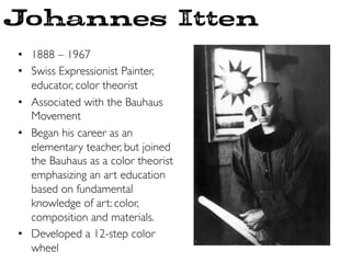
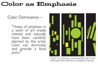
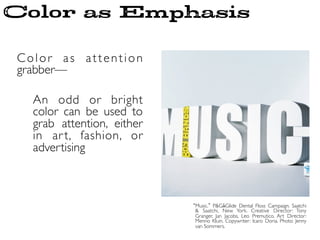
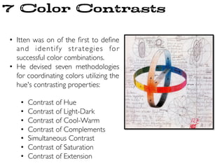

- Johannes Itten was a Swiss painter, educator, and color theorist associated with the Bauhaus art school in Germany. He developed a color wheel and emphasized color theory and fundamentals in art education. - Itten identified 7 methods for combining colors based on their contrasting properties: contrast of hue, light-dark, cool-warm, complements, simultaneous contrast, saturation, and extension. These color contrasts create visual interest and emphasis in art. - Itten's work in defining color combinations and contrasts was influential for artists and designers in understanding how to use color effectively.


