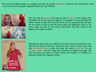
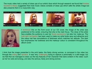
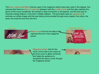
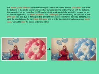
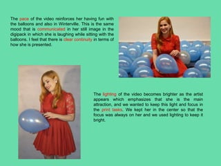
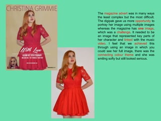
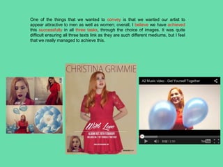
How effective is the combination of
your product and ancillary texts?
Suhena Begum
We had three different tasks to complete and they all needed to interlink. I feel that the combination of the
music video and the digipak/ magazine advert are very effective.
CD album
Magazine advert
Although the artist wore two outfits for the photo shoot we picked the ones
with the red dress for the front, inside and back cover to ensure there was
that connecting feature across the texts. We used a long shot for our
magazine advert, and the image was matched our digipack as again she
had the same red dress on which allows the audience to identify her
digipack through her magazine advert.
One way that we achieved this was the use of colour, as the colours flow
throughout the music video and digipak. For example, the day we filmed the
balloon scene we also did the photo shoot and we requested that she kept
the red dress so that we had the same dress and significant colour in the
music video and also for the photo shoot-which was then used for the
digipak and magazine advert
The music video had a variety of close ups of our artist’s face which through research we found that Andrew
Goodwin’s theory suggested that most music videos consists of close ups which sells the artists image but
also presents them in a voyeuristic way.
I reinforced this on the front cover of our CD cover, the image of the artist was
positioned at the center, ensuring that she is the main focus. The close of the artist
face enables the audience to see her facial expressions but also her make-up. The
bold dark red lipstick has been used to make our artist looks sexy and attractive and
the colour red has connotations of feistiness which matches her attitude. The dark
lips emphasizes her boldness and the makeup/ colour is consistent throughout the
album cover.
I think that the image presented in the print tasks- the feisty strong woman, is conveyed in the video too
through the acting and narrative. It was very challenging trying to capture a personality in a still image, but
we feel that we managed to draw out the key features of her character that were evident in the video- such
as her fun side and energy, and also the serious, feisty and strong woman.
The fonts, colours and filters that we used in the magazine advert were also used in the digipak, this
ensures that there is a flow of continuity between both the ancillary texts and this also matches the
genre of the music excellently. We wanted a clear connection in all aspects, and the font was an
important design feature- more than I initially realised. The print tasks were an opportunity to
promote our artists image and this was being communicated through every aspect, the colour, the
pose, the costume and even the font.
Album cover-Font for the album title
matches the font in the magazine
advert.
Magazine advert- font for the
name of the artist is the same as
the front cover to allow continuity
and helps the audience to
recognize the album cover through
the magazine advert.
CD cover Magazine advert
The theme of the balloons were used throughout the music video and the print tasks. We used
the balloons in the studio scene where we had our artist playing and having fun with the balloons,
this presented her as being fun, bubbly and youthful which we initially wanted to present her as,
so that she appeals to our target audience. The challenging part about using the balloons in the
prink task was that due to filming on two different days we used different coloured balloons, we
used the pink balloons for our inside CD panel and in order to match the balloons on our music
video, we had to alter the colour and make it blue.
The pace of the video reinforces her having fun with
the balloons and also in Winterville. This is the same
mood that is communicated in her still image in the
digipack in which she is laughing while sitting with the
balloons. I feel that there is clear continuity in terms of
how she is presented.
The lighting of the video becomes brighter as the artist
appears which emphasizes that she is the main
attraction, and we wanted to keep this light and focus in
the print tasks. We kept her in the center so that the
focus was always on her and we used lighting to keep it
bright.
The magazine advert was in many ways
the least complex but the most difficult.
The digipak gave us more opportunity to
portray her image using multiple images
whereas the magazine has one image,
which was a challenge. It needed to be
an image that represented key parts of
her character and linked with the music
video. I feel that we achieved this
through using an image in which you
could see her full image, there was the
connecting colour theme and she was
smiling softy but still looked serious.
One of the things that we wanted to convey is that we wanted our artist to
appear attractive to men as well as women; overall, I believe we have achieved
this successfully in all three tasks, through the choice of images. It was quite
difficult ensuring all three texts link as they are such different mediums, but I feel
that we really managed to achieve this.

Q2 evaluation!!!

  • 1.
    How effective isthe combination of your product and ancillary texts? Suhena Begum
  • 2.
    We had threedifferent tasks to complete and they all needed to interlink. I feel that the combination of the music video and the digipak/ magazine advert are very effective. CD album Magazine advert Although the artist wore two outfits for the photo shoot we picked the ones with the red dress for the front, inside and back cover to ensure there was that connecting feature across the texts. We used a long shot for our magazine advert, and the image was matched our digipack as again she had the same red dress on which allows the audience to identify her digipack through her magazine advert. One way that we achieved this was the use of colour, as the colours flow throughout the music video and digipak. For example, the day we filmed the balloon scene we also did the photo shoot and we requested that she kept the red dress so that we had the same dress and significant colour in the music video and also for the photo shoot-which was then used for the digipak and magazine advert
  • 3.
    The music videohad a variety of close ups of our artist’s face which through research we found that Andrew Goodwin’s theory suggested that most music videos consists of close ups which sells the artists image but also presents them in a voyeuristic way. I reinforced this on the front cover of our CD cover, the image of the artist was positioned at the center, ensuring that she is the main focus. The close of the artist face enables the audience to see her facial expressions but also her make-up. The bold dark red lipstick has been used to make our artist looks sexy and attractive and the colour red has connotations of feistiness which matches her attitude. The dark lips emphasizes her boldness and the makeup/ colour is consistent throughout the album cover. I think that the image presented in the print tasks- the feisty strong woman, is conveyed in the video too through the acting and narrative. It was very challenging trying to capture a personality in a still image, but we feel that we managed to draw out the key features of her character that were evident in the video- such as her fun side and energy, and also the serious, feisty and strong woman.
  • 4.
    The fonts, coloursand filters that we used in the magazine advert were also used in the digipak, this ensures that there is a flow of continuity between both the ancillary texts and this also matches the genre of the music excellently. We wanted a clear connection in all aspects, and the font was an important design feature- more than I initially realised. The print tasks were an opportunity to promote our artists image and this was being communicated through every aspect, the colour, the pose, the costume and even the font. Album cover-Font for the album title matches the font in the magazine advert. Magazine advert- font for the name of the artist is the same as the front cover to allow continuity and helps the audience to recognize the album cover through the magazine advert. CD cover Magazine advert
  • 5.
    The theme ofthe balloons were used throughout the music video and the print tasks. We used the balloons in the studio scene where we had our artist playing and having fun with the balloons, this presented her as being fun, bubbly and youthful which we initially wanted to present her as, so that she appeals to our target audience. The challenging part about using the balloons in the prink task was that due to filming on two different days we used different coloured balloons, we used the pink balloons for our inside CD panel and in order to match the balloons on our music video, we had to alter the colour and make it blue.
  • 6.
    The pace ofthe video reinforces her having fun with the balloons and also in Winterville. This is the same mood that is communicated in her still image in the digipack in which she is laughing while sitting with the balloons. I feel that there is clear continuity in terms of how she is presented. The lighting of the video becomes brighter as the artist appears which emphasizes that she is the main attraction, and we wanted to keep this light and focus in the print tasks. We kept her in the center so that the focus was always on her and we used lighting to keep it bright.
  • 7.
    The magazine advertwas in many ways the least complex but the most difficult. The digipak gave us more opportunity to portray her image using multiple images whereas the magazine has one image, which was a challenge. It needed to be an image that represented key parts of her character and linked with the music video. I feel that we achieved this through using an image in which you could see her full image, there was the connecting colour theme and she was smiling softy but still looked serious.
  • 8.
    One of thethings that we wanted to convey is that we wanted our artist to appear attractive to men as well as women; overall, I believe we have achieved this successfully in all three tasks, through the choice of images. It was quite difficult ensuring all three texts link as they are such different mediums, but I feel that we really managed to achieve this.