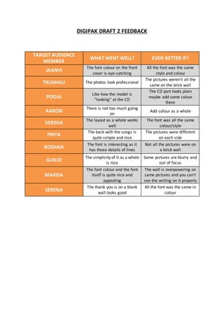
1. DIGIPAK DRAFT 2 FEEDBACK
TARGET AUDIENCE
MEMBER
WHAT WENT WELL? EVEN BETTER IF?
JAANVI
The font colour on the front
cover is eye-catching
All the font was the same
style and colour
TRUSHALI The photos look professional
The pictures weren’t all the
same on the brick wall
POOJA
Like how the model is
“looking” at the CD
The CD part looks plain
maybe add some colour
there
AARON
There is not too much going
on
Add colour as a whole
VERSHA
The layout as a whole works
well
The font was all the same
colour/style
PRIYA
The back with the songs is
quite simple and nice
The pictures were different
on each side
ROSHAN
The font is interesting as it
has those details of lines
Not all the pictures were on
a brick wall
GUILIO
The simplicity of it as a whole
is nice
Some pictures are blurry and
out of focus
MARISA
The font colour and the font
itself is quite nice and
appealing
The wall is overpowering on
same pictures and you can’t
see the writing on it properly
SERENA
The thank you is on a blank
wall looks good
All the font was the same in
colour
2. ALBUM POSTER DRAFT 2 FEEDBACK
TARGET AUDIENCE
MEMBER
WHAT WENT WELL? EVEN BETTER IF?
JAANVI
The wall is out of focus and
the model is highlighted
The model is out of focus a
bit
TRUSHALI
The text at the bottom is
more visible
The bottom panel looks out
of the ordinary and weird
POOJA
The font is nice and links to
the digipak and music video
Could change the image as it
is a bit out of focus
AARON
The record company is
mentioned/seen
There needs to be more
colour to make it more
attracting
VERSHA
The artist is highlighted and
there’s not any unnecessary
information
The bottom panel looks out
of place and doesn’t fit
PRIYA
Emphasise is put on the
model not the wall
The image is out of focus a
bit – maybe use another
image
ROSHAN
The placement of the writing
works
Doesn’t look as professional
as it could so maybe add
more colour
GUILIO
The text works well and is
visible
Change the image and add
colour
MARISA
All the writing is visible and
clear
There needs to be more
emphasise on the bottom
text
SERENA
There is not too much
overpowering information
The image is out of focus and
the poster needs more
colour