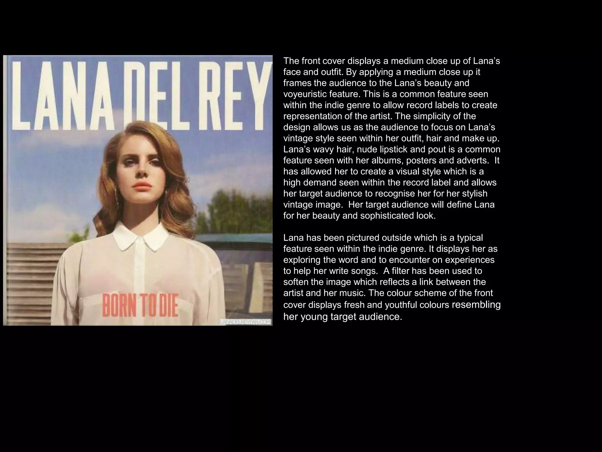
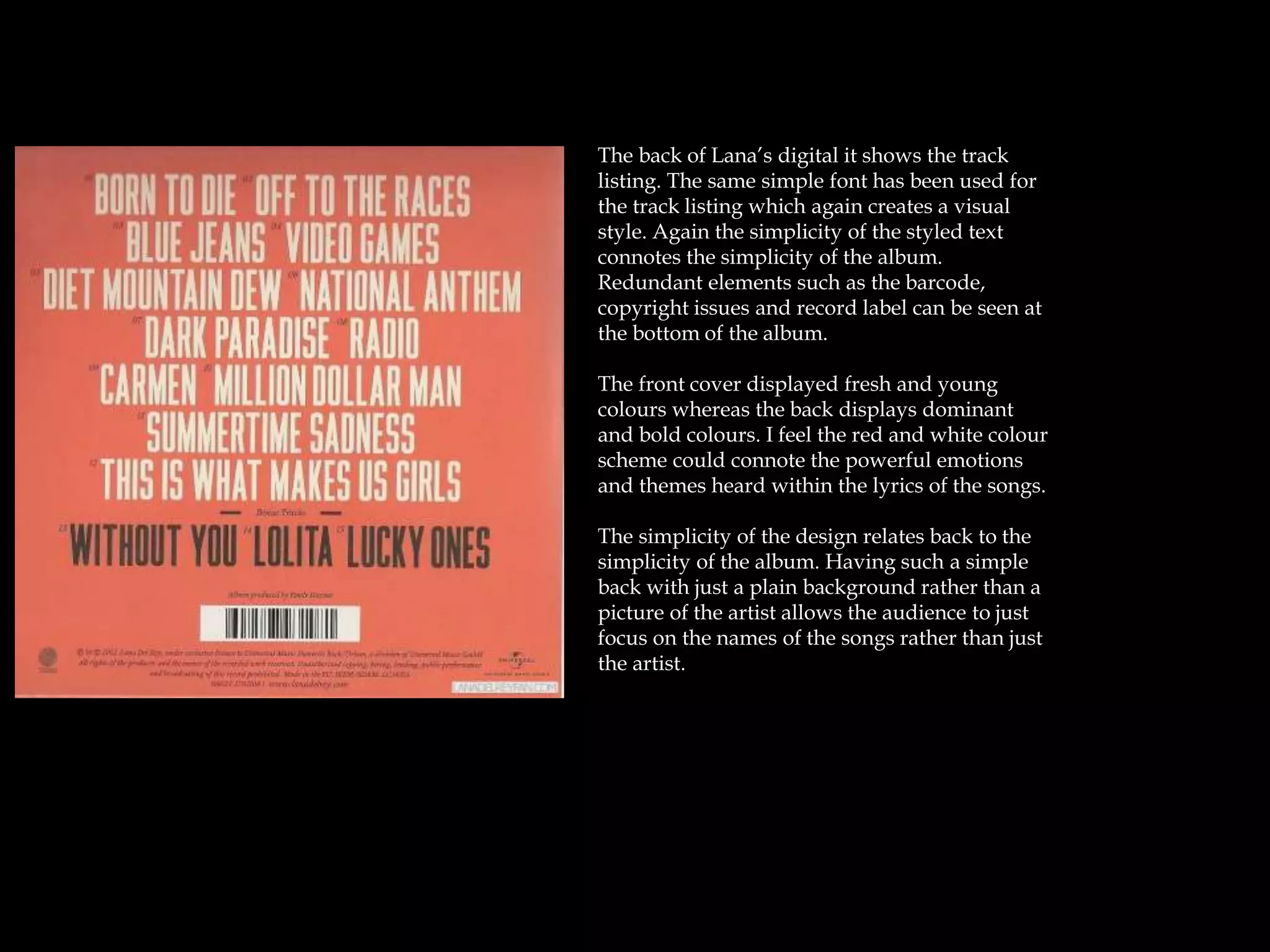
Digipak Analysis
Lana Del Rey
The front cover displays a medium close up of Lana’s
face and outfit. By applying a medium close up it
frames the audience to the Lana’s beauty and
voyeuristic feature. This is a common feature seen
within the indie genre to allow record labels to create
representation of the artist. The simplicity of the
design allows us as the audience to focus on Lana’s
vintage style seen within her outfit, hair and make up.
Lana’s wavy hair, nude lipstick and pout is a common
feature seen with her albums, posters and adverts. It
has allowed her to create a visual style which is a
high demand seen within the record label and allows
her target audience to recognise her for her stylish
vintage image. Her target audience will define Lana
for her beauty and sophisticated look.
Lana has been pictured outside which is a typical
feature seen within the indie genre. It displays her as
exploring the word and to encounter on experiences
to help her write songs. A filter has been used to
soften the image which reflects a link between the
artist and her music. The colour scheme of the front
cover displays fresh and youthful colours resembling
her young target audience.
The back of Lana’s digital it shows the track
listing. The same simple font has been used for
the track listing which again creates a visual
style. Again the simplicity of the styled text
connotes the simplicity of the album.
Redundant elements such as the barcode,
copyright issues and record label can be seen at
the bottom of the album.
The front cover displayed fresh and young
colours whereas the back displays dominant
and bold colours. I feel the red and white colour
scheme could connote the powerful emotions
and themes heard within the lyrics of the songs.
The simplicity of the design relates back to the
simplicity of the album. Having such a simple
back with just a plain background rather than a
picture of the artist allows the audience to just
focus on the names of the songs rather than just
the artist.
The simplicity of white mainly filling the cd makes the colour of the roses become more
eye catching from the background and seem like an important theme throughout the
digipak. The use of the roses could be suggesting the idea of love which could be a
common theme featured in her songs. By placing the roses on a white background could
symbolise the pure innocent love the artist has encountered on.

Anaysis of digipak

  • 1.
  • 2.
    The front coverdisplays a medium close up of Lana’s face and outfit. By applying a medium close up it frames the audience to the Lana’s beauty and voyeuristic feature. This is a common feature seen within the indie genre to allow record labels to create representation of the artist. The simplicity of the design allows us as the audience to focus on Lana’s vintage style seen within her outfit, hair and make up. Lana’s wavy hair, nude lipstick and pout is a common feature seen with her albums, posters and adverts. It has allowed her to create a visual style which is a high demand seen within the record label and allows her target audience to recognise her for her stylish vintage image. Her target audience will define Lana for her beauty and sophisticated look. Lana has been pictured outside which is a typical feature seen within the indie genre. It displays her as exploring the word and to encounter on experiences to help her write songs. A filter has been used to soften the image which reflects a link between the artist and her music. The colour scheme of the front cover displays fresh and youthful colours resembling her young target audience.
  • 3.
    The back ofLana’s digital it shows the track listing. The same simple font has been used for the track listing which again creates a visual style. Again the simplicity of the styled text connotes the simplicity of the album. Redundant elements such as the barcode, copyright issues and record label can be seen at the bottom of the album. The front cover displayed fresh and young colours whereas the back displays dominant and bold colours. I feel the red and white colour scheme could connote the powerful emotions and themes heard within the lyrics of the songs. The simplicity of the design relates back to the simplicity of the album. Having such a simple back with just a plain background rather than a picture of the artist allows the audience to just focus on the names of the songs rather than just the artist.
  • 4.
    The simplicity ofwhite mainly filling the cd makes the colour of the roses become more eye catching from the background and seem like an important theme throughout the digipak. The use of the roses could be suggesting the idea of love which could be a common theme featured in her songs. By placing the roses on a white background could symbolise the pure innocent love the artist has encountered on.