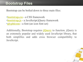
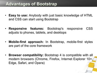
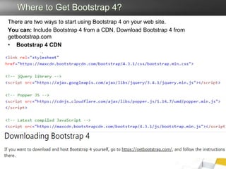
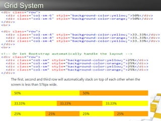
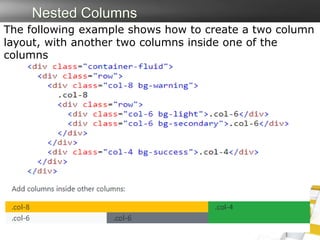
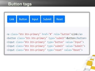
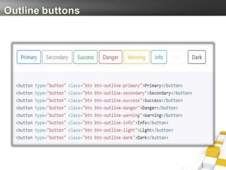
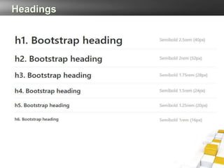
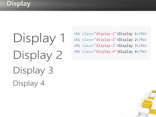
Bootstrap V4
Summary
• What is Bootstrap?
• Bootstrap Files
• Advantages of Bootstrap
• Where to Get Bootstrap 4?
• Bootstrap 4 Grid System
What is Bootstrap?
• Bootstrap is an open-source Javascript framework developed by
the team at Twitter. It is a combination of HTML, CSS, and
Javascript code designed to help build user interface components.
Bootstrap was also programmed to support both HTML5 and
CSS3.
• Also it is called Front-end-framework.
• Bootstrap is a free collection of tools for creating a websites and
web applications.
• It contains HTML and CSS-based design templates for
typography, forms, buttons, navigation and other interface
components, as well as optional JavaScript extensions.
Bootstrap Files
Bootstrap can be boiled down to three main files:
•bootstrap.css - a CSS framework
•bootstrap.js - a JavaScript/jQuery framework
•glyphicons - a font (an icon font set)
Additionally, Bootstrap requires jQuery to function. jQuery is
an extremely popular and widely used JavaScript library, that
both simplifies and adds cross browser compatibility to
JavaScript.
Advantages of Bootstrap
• Easy to use: Anybody with just basic knowledge of HTML
and CSS can start using Bootstrap
• Responsive features: Bootstrap's responsive CSS
adjusts to phones, tablets, and desktops
• Mobile-first approach: In Bootstrap, mobile-first styles
are part of the core framework
• Browser compatibility: Bootstrap 4 is compatible with all
modern browsers (Chrome, Firefox, Internet Explorer 10+,
Edge, Safari, and Opera)
Where to Get Bootstrap 4?
There are two ways to start using Bootstrap 4 on your web site.
You can: Include Bootstrap 4 from a CDN, Download Bootstrap 4 from
getbootstrap.com
• Bootstrap 4 CDN
Containers
Bootstrap 4 requires a containing element to wrap site
contents.
There are two container classes to choose from:
 The .container class provides a responsive fixed width
container
 The .container-fluid class provides a full width container,
spanning the entire width of the viewport
Example of Containers
Bootstrap 4 Grid System
Bootstrap's grid system allows up to 12 columns
across the page.
Grid Classes
The Bootstrap 4 grid system has five classes:
Grid System
Nested Columns
The following example shows how to create a two column
layout, with another two columns inside one of the
columns
Button tags
Outline buttons
Headings
Display
Cards
 A card is a flexible and extensible content container.
 It includes options for headers and footers, a wide variety
of content,
 contextual background colors, and powerful display
options.
 Card titles are used by adding .card-title
 Card subtitles used by adding .card-subtitle
 .card-img-top places an image to the top of the card
 Mix and match multiple content types to create the card
you need, or throw everything in there.
 an optional header and/or footer within a card an be
added
Example
Bootstrap 4 List Groups
To create a basic list group, use an <ul> element with class .list-
group, and <li> elements with class .list-group-item:
Navigation Bars
A navigation bar is a navigation header that is placed at
the top of the page:
Table
The .table class adds basic styling to a table. .table-
striped class adds zebra-stripes. .table-bordered class
adds borders. .table-hover class adds a hover effect
Bootstrap 4 Alerts
Alerts are created with the .alert class, followed by one
of the contextual classes .alert-success, .alert-
info, .alert-warning, .alert-danger, .alert-
primary, .alert-secondary, .alert-light or .alert-dark:
Bootstrap 4 Images
.img-thumbnail class shapes the image to a
thumbnail (bordered)
.rounded-circle class shapes the image to a circle
.rounded class adds rounded corners to an image
Aligning Images
Float an image to the right with the .float-
right class or to the left with .float-left
Centered Image
Center an image by adding the utility classes.mx-auto
and.d-block
Cont..
Bootstrap 4 Forms
Form controls automatically receive some global styling
with Bootstrap
All textual <input>, <textarea>, and <select> elements
with class .form-control have a width of 100%
Bootstrap provides two types of form layouts
• Stacked (full-width) form
– Add a wrapper element with .form-group,
around each form control, to ensure proper
margins and create Stacked (full-width) form
• Inline form
– Add class .form-inline to the <form> element
to all of the elements are inline and left-aligned
Example of Bootstrap form
Borders
Color
Background Color Classes
Bootstrap 4 Text
• Text transform
• <p class="text-lowercase">Lowercased text.</p>
• <p class="text-uppercase">Uppercased text.</p>
• <p class="text-capitalize">Capitalized text.</p>
• Font weight and italics
• <p class="font-weight-bold">Bold text.</p>
• <p class="font-weight-normal">Normal weight
text.</p>
• <p class="font-italic">Italic text.</p>
Text Color
Lecture-03.pptx

Lecture-03.pptx

  • 1.
  • 2.
    Summary • What isBootstrap? • Bootstrap Files • Advantages of Bootstrap • Where to Get Bootstrap 4? • Bootstrap 4 Grid System
  • 3.
    What is Bootstrap? •Bootstrap is an open-source Javascript framework developed by the team at Twitter. It is a combination of HTML, CSS, and Javascript code designed to help build user interface components. Bootstrap was also programmed to support both HTML5 and CSS3. • Also it is called Front-end-framework. • Bootstrap is a free collection of tools for creating a websites and web applications. • It contains HTML and CSS-based design templates for typography, forms, buttons, navigation and other interface components, as well as optional JavaScript extensions.
  • 4.
    Bootstrap Files Bootstrap canbe boiled down to three main files: •bootstrap.css - a CSS framework •bootstrap.js - a JavaScript/jQuery framework •glyphicons - a font (an icon font set) Additionally, Bootstrap requires jQuery to function. jQuery is an extremely popular and widely used JavaScript library, that both simplifies and adds cross browser compatibility to JavaScript.
  • 5.
    Advantages of Bootstrap •Easy to use: Anybody with just basic knowledge of HTML and CSS can start using Bootstrap • Responsive features: Bootstrap's responsive CSS adjusts to phones, tablets, and desktops • Mobile-first approach: In Bootstrap, mobile-first styles are part of the core framework • Browser compatibility: Bootstrap 4 is compatible with all modern browsers (Chrome, Firefox, Internet Explorer 10+, Edge, Safari, and Opera)
  • 6.
    Where to GetBootstrap 4? There are two ways to start using Bootstrap 4 on your web site. You can: Include Bootstrap 4 from a CDN, Download Bootstrap 4 from getbootstrap.com • Bootstrap 4 CDN
  • 7.
    Containers Bootstrap 4 requiresa containing element to wrap site contents. There are two container classes to choose from:  The .container class provides a responsive fixed width container  The .container-fluid class provides a full width container, spanning the entire width of the viewport
  • 8.
  • 9.
    Bootstrap 4 GridSystem Bootstrap's grid system allows up to 12 columns across the page.
  • 10.
    Grid Classes The Bootstrap4 grid system has five classes:
  • 11.
  • 12.
    Nested Columns The followingexample shows how to create a two column layout, with another two columns inside one of the columns
  • 13.
  • 14.
  • 15.
  • 16.
  • 17.
    Cards  A cardis a flexible and extensible content container.  It includes options for headers and footers, a wide variety of content,  contextual background colors, and powerful display options.  Card titles are used by adding .card-title  Card subtitles used by adding .card-subtitle  .card-img-top places an image to the top of the card  Mix and match multiple content types to create the card you need, or throw everything in there.  an optional header and/or footer within a card an be added
  • 18.
  • 19.
    Bootstrap 4 ListGroups To create a basic list group, use an <ul> element with class .list- group, and <li> elements with class .list-group-item:
  • 20.
    Navigation Bars A navigationbar is a navigation header that is placed at the top of the page:
  • 21.
    Table The .table classadds basic styling to a table. .table- striped class adds zebra-stripes. .table-bordered class adds borders. .table-hover class adds a hover effect
  • 22.
    Bootstrap 4 Alerts Alertsare created with the .alert class, followed by one of the contextual classes .alert-success, .alert- info, .alert-warning, .alert-danger, .alert- primary, .alert-secondary, .alert-light or .alert-dark:
  • 23.
    Bootstrap 4 Images .img-thumbnailclass shapes the image to a thumbnail (bordered) .rounded-circle class shapes the image to a circle .rounded class adds rounded corners to an image Aligning Images Float an image to the right with the .float- right class or to the left with .float-left Centered Image Center an image by adding the utility classes.mx-auto and.d-block
  • 24.
  • 25.
    Bootstrap 4 Forms Formcontrols automatically receive some global styling with Bootstrap All textual <input>, <textarea>, and <select> elements with class .form-control have a width of 100% Bootstrap provides two types of form layouts • Stacked (full-width) form – Add a wrapper element with .form-group, around each form control, to ensure proper margins and create Stacked (full-width) form • Inline form – Add class .form-inline to the <form> element to all of the elements are inline and left-aligned
  • 26.
  • 27.
  • 28.
  • 29.
    Bootstrap 4 Text •Text transform • <p class="text-lowercase">Lowercased text.</p> • <p class="text-uppercase">Uppercased text.</p> • <p class="text-capitalize">Capitalized text.</p> • Font weight and italics • <p class="font-weight-bold">Bold text.</p> • <p class="font-weight-normal">Normal weight text.</p> • <p class="font-italic">Italic text.</p>
  • 30.