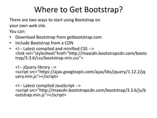
Download to read offline

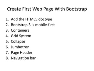
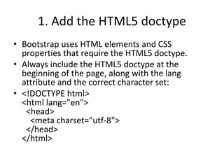
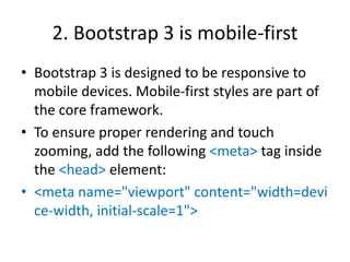
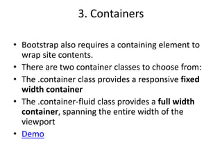
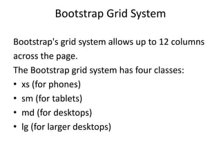
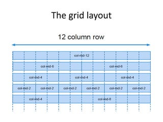
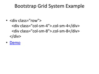

Bootstrap is a leading HTML, CSS, and JavaScript framework that facilitates the development of responsive, mobile-first websites, which can be implemented via download or CDN. The framework includes essential features like a grid system, containers, and various UI components such as jumbotrons and navigation bars, designed to enhance user experience across devices. Key practices include using the HTML5 doctype, mobile-first design principles, and properly configuring meta tags for responsive rendering.

![Bootstrap [part 2]](https://cdn.slidesharecdn.com/ss_thumbnails/javanik-170208155331-thumbnail.jpg?width=640&height=640&fit=bounds)


![Bootstrap [part 1]](https://cdn.slidesharecdn.com/ss_thumbnails/bootstrappart-11-170208154053-thumbnail.jpg?width=640&height=640&fit=bounds)