Download as PDF, PPTX


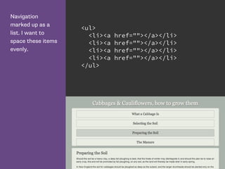
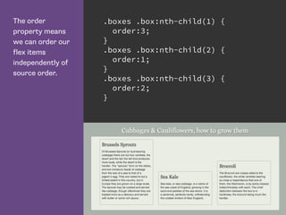
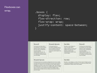
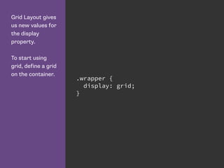
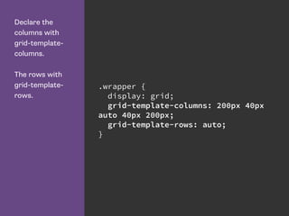
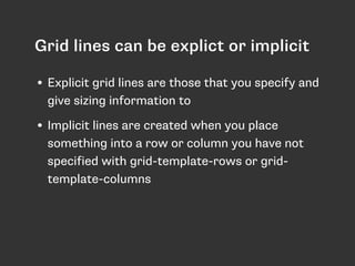
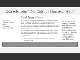
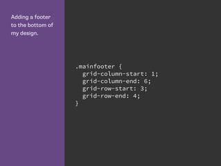
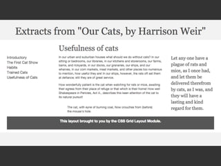
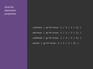
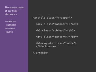
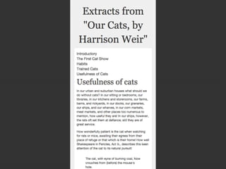
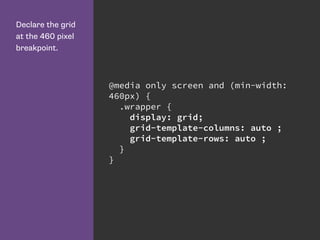
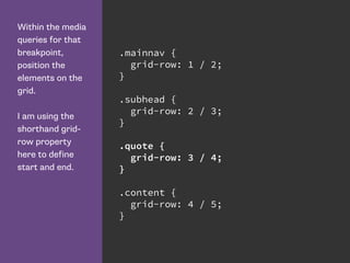
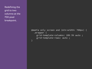
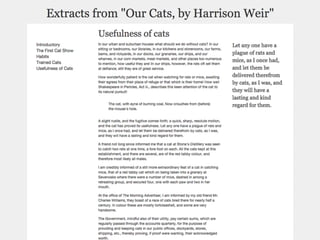
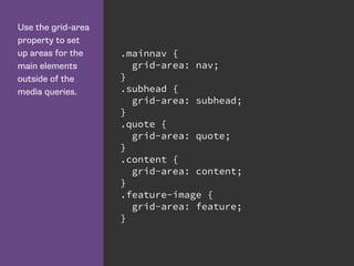
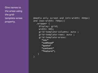
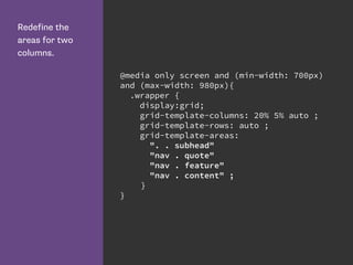
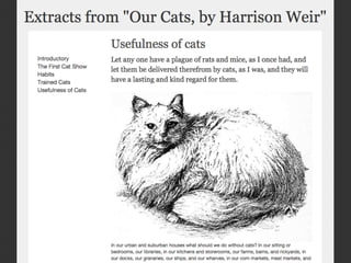
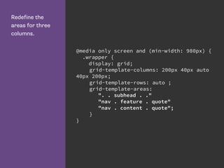
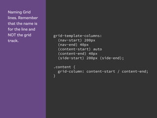

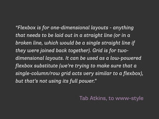
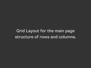

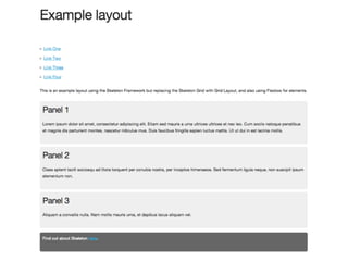
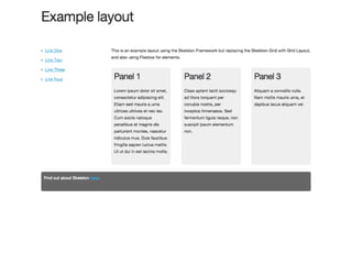

This document provides an overview and examples of CSS Grids and Flexbox layout techniques. It discusses how Flexbox allows items to be laid out in a single direction row or column, and how CSS Grids enable two-dimensional page layouts using rows and columns. Examples are given for creating navigation menus, image galleries, and multi-column page designs using these new CSS properties. Media queries are also used to redefine grid layouts at different screen sizes.


![Getting Started with Apache Spark: Big Data Made Simple [Free Meetup]](https://cdn.slidesharecdn.com/ss_thumbnails/apachesparkgettingstarted-260203175547-8361bcc3-thumbnail.jpg?width=640&height=640&fit=bounds)


