Downloaded 11 times

![points of similarity and/or dissimilarity of collected items/data. It is necessary because
it would not be possible to draw inferences and conclusions if we have a large set of
collected [raw] data.
Frequency Distributions
Frequency: - is the number of times a certain value or set of values occurs in a
specific group.
A frequency distribution is a table that presents data according to some criteria with
the corresponding number of items falling in each class (i.e. with the corresponding
frequencies.). We see at a glance the shape of the distribution, the range of variation,
and any clustering of the values. By presenting a frequency distribution in relative
form, i.e., as percentages, we convert to the familiar base of 100 and make it easy to
compare the distribution of cases between different variables and/or different samples,
each of which may involve different total numbers of cases.
Generally, there are three basic types of frequency distributions: Categorical,
Ungrouped and Grouped frequency distributions.
1. Categorical frequency distribution
– the data are usually qualitative
– the scales of measurements for the data are usually nominal or ordinal
For instance data on blood types of people, political affiliation, economic status (low,
medium and high), religious affiliation are presented by categorical frequency
distributions.
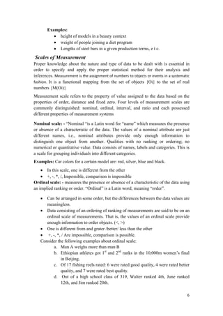
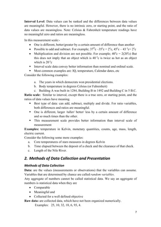
Example: Thirty students, last year, took Stat 100 course and their grades were as
follows. Construct an appropriate frequency distribution for these data.
Table 2.1: Grades of students
B B C B A C
D C C C B B
B A B C D C
A F B F C A
B C C A C D
Solution:
There are five kinds of grades: A, B, C, D and F which may be used as the classes for
constructing the distribution. The procedure for constructing a frequency distribution
for categorical data is given below.
STEP 1. Construct a table as shown below
STEP 2. Tally the data and place the results
STEP 3. Count the Tallies and put the results
9](https://image.slidesharecdn.com/basicstat-151213162239/85/Basic-stat-9-320.jpg)
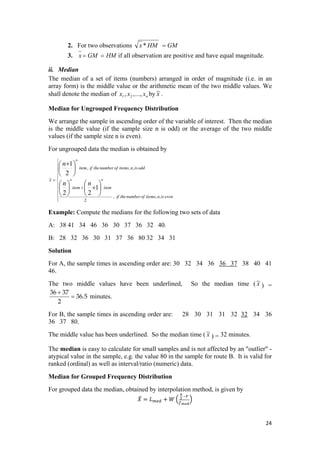

The document provides a comprehensive introduction to statistics, highlighting its historical significance and current applications across various fields. It categorizes statistics into descriptive and inferential statistics, details the stages involved in statistical investigation, and defines key terms such as population and sample. Additionally, the text discusses the limitations of statistics, types of variables, measurement scales, and methods for data collection and presentation.