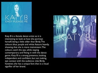
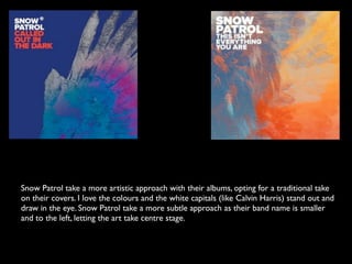
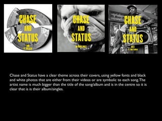
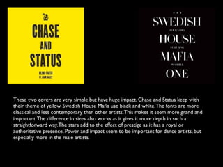
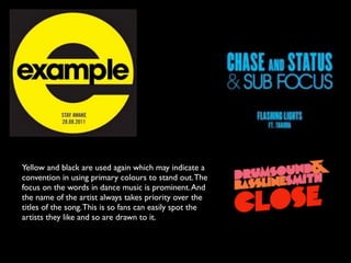
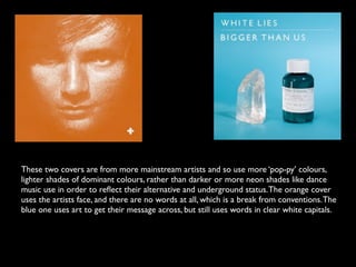
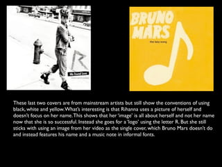
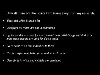
Existing Products
    Research
      CD Covers
Birdy is a young female artist so it is good to look
at how she is presenting herself. She also uses
black and white and simple titling, the same as
Adele. The fonts are unique to the artist and thus
part of the ‘image’ of Birdy. In the cover above the
artist herself features. She looks natural with the
wind in her hair on the location of one of her
videos. She connotes youth and innocence, and
her pose is almost shy and humbling, which means
the audience can emphasis with her. The other
covers have coloured backgrounds but are still
simple.
Katy B is a female dance artist so it is
interesting to look at how she portrays
herself, being a little older than Birdy. The
colours blue, purple and white feature heavily,
showing that she is more mainstream. The
colours catch the eye, while staying
contemporary and fitting in with the dance
genre. Katy B is a strong presence, looking
independent and confident, but not making
eye contact with the audience. Like Birdy,
however, she has a unique font that is a visual
signifier of her brand.
Calvin Harris also has a font that is unique to himself. It is in capitals and very clear and
simple so makes an impact. What is most interesting to me is that stills from Harris’ videos
are used showing that the videos are very important in the marketing of a single. So
important that it becomes the central part and sets the tone for the whole marketing
campaign. I’m thinking about using a video still or use one of the photographs I took on
location like Birdy did to fit in with the conventions of the industry.
I like Two Door Cinema Club’s covers as they are very unusual and stand out. Again their
fonts are unique to them signalling that this is also an important convention that I will
need to look into. I like that the eyes of the cat and dog match the two O’s and the
randomness and retro feel adds to their charm. This matches their style of music so
somehow through these simple techniques the band’s ‘sound’ is conveyed, which is very
clever.
Snow Patrol take a more artistic approach with their albums, opting for a traditional take
on their covers. I love the colours and the white capitals (like Calvin Harris) stand out and
draw in the eye. Snow Patrol take a more subtle approach as their band name is smaller
and to the left, letting the art take centre stage.
Chase and Status have a clear theme across their covers, using yellow fonts and black
and white photos that are either from their videos or are symbolic to each song. The
artist name is much bigger than the title of the song/album and is in the centre so it is
clear that is is their album/singles.
These two covers are very simple but have huge impact. Chase and Status keep with
their theme of yellow. Swedish House Mafia use black and white. The fonts are more
classical and less contemporary than other artists. This makes it seem more grand and
important. The difference in sizes also works as it gives it more depth in such a
straightforward way. The stars add to the effect of prestige as it has a royal or
authoritative presence. Power and impact seem to be important for dance artists, but
especially more in the male artists.
Yellow and black are used again which may indicate a
convention in using primary colours to stand out. The
focus on the words in dance music is prominent. And
the name of the artist always takes priority over the
titles of the song. This is so fans can easily spot the
artists they like and so are drawn to it.
These two covers are from more mainstream artists and so use more ‘pop-py’ colours,
lighter shades of dominant colours, rather than darker or more neon shades like dance
music use in order to reflect their alternative and underground status. The orange cover
uses the artists face, and there are no words at all, which is a break from conventions. The
blue one uses art to get their message across, but still uses words in clear white capitals.
These last two covers are from mainstream artists but still show the conventions of using
black, white and yellow. What’s interesting is that Rihanna uses a picture of herself and
doesn’t focus on her name. This shows that her ‘image’ is all about herself and not her name
now that she is so successful. Instead she goes for a ‘logo’ using the letter R. But she still
sticks with using an image from her video as the single cover, which Bruno Mars doesn’t do
and instead features his name and a music note in informal fonts.
Overall these are the points I am taking away from my research...

• Black and white is used a lot
• Stills from the video are also a convention
• Lighter shades are used for more mainstream artists/songs and darker or
   more neon colours are used for dance music

• Every artist has a font individual to them
• The font styles match the genre and style of music
• Clear fonts in white and capitals are dominant

Ancillary Research

  • 1.
    Existing Products Research CD Covers
  • 2.
    Birdy is ayoung female artist so it is good to look at how she is presenting herself. She also uses black and white and simple titling, the same as Adele. The fonts are unique to the artist and thus part of the ‘image’ of Birdy. In the cover above the artist herself features. She looks natural with the wind in her hair on the location of one of her videos. She connotes youth and innocence, and her pose is almost shy and humbling, which means the audience can emphasis with her. The other covers have coloured backgrounds but are still simple.
  • 3.
    Katy B isa female dance artist so it is interesting to look at how she portrays herself, being a little older than Birdy. The colours blue, purple and white feature heavily, showing that she is more mainstream. The colours catch the eye, while staying contemporary and fitting in with the dance genre. Katy B is a strong presence, looking independent and confident, but not making eye contact with the audience. Like Birdy, however, she has a unique font that is a visual signifier of her brand.
  • 4.
    Calvin Harris alsohas a font that is unique to himself. It is in capitals and very clear and simple so makes an impact. What is most interesting to me is that stills from Harris’ videos are used showing that the videos are very important in the marketing of a single. So important that it becomes the central part and sets the tone for the whole marketing campaign. I’m thinking about using a video still or use one of the photographs I took on location like Birdy did to fit in with the conventions of the industry.
  • 5.
    I like TwoDoor Cinema Club’s covers as they are very unusual and stand out. Again their fonts are unique to them signalling that this is also an important convention that I will need to look into. I like that the eyes of the cat and dog match the two O’s and the randomness and retro feel adds to their charm. This matches their style of music so somehow through these simple techniques the band’s ‘sound’ is conveyed, which is very clever.
  • 6.
    Snow Patrol takea more artistic approach with their albums, opting for a traditional take on their covers. I love the colours and the white capitals (like Calvin Harris) stand out and draw in the eye. Snow Patrol take a more subtle approach as their band name is smaller and to the left, letting the art take centre stage.
  • 7.
    Chase and Statushave a clear theme across their covers, using yellow fonts and black and white photos that are either from their videos or are symbolic to each song. The artist name is much bigger than the title of the song/album and is in the centre so it is clear that is is their album/singles.
  • 8.
    These two coversare very simple but have huge impact. Chase and Status keep with their theme of yellow. Swedish House Mafia use black and white. The fonts are more classical and less contemporary than other artists. This makes it seem more grand and important. The difference in sizes also works as it gives it more depth in such a straightforward way. The stars add to the effect of prestige as it has a royal or authoritative presence. Power and impact seem to be important for dance artists, but especially more in the male artists.
  • 9.
    Yellow and blackare used again which may indicate a convention in using primary colours to stand out. The focus on the words in dance music is prominent. And the name of the artist always takes priority over the titles of the song. This is so fans can easily spot the artists they like and so are drawn to it.
  • 10.
    These two coversare from more mainstream artists and so use more ‘pop-py’ colours, lighter shades of dominant colours, rather than darker or more neon shades like dance music use in order to reflect their alternative and underground status. The orange cover uses the artists face, and there are no words at all, which is a break from conventions. The blue one uses art to get their message across, but still uses words in clear white capitals.
  • 11.
    These last twocovers are from mainstream artists but still show the conventions of using black, white and yellow. What’s interesting is that Rihanna uses a picture of herself and doesn’t focus on her name. This shows that her ‘image’ is all about herself and not her name now that she is so successful. Instead she goes for a ‘logo’ using the letter R. But she still sticks with using an image from her video as the single cover, which Bruno Mars doesn’t do and instead features his name and a music note in informal fonts.
  • 12.
    Overall these arethe points I am taking away from my research... • Black and white is used a lot • Stills from the video are also a convention • Lighter shades are used for more mainstream artists/songs and darker or more neon colours are used for dance music • Every artist has a font individual to them • The font styles match the genre and style of music • Clear fonts in white and capitals are dominant

Editor's Notes