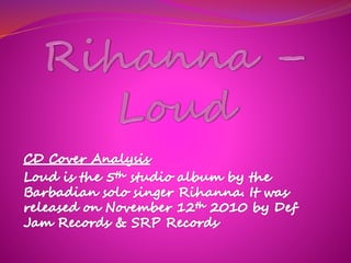
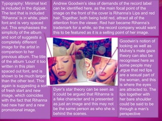
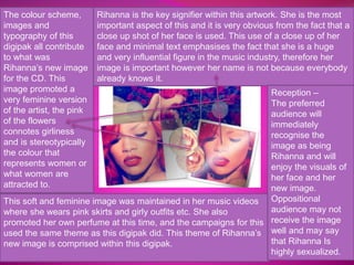
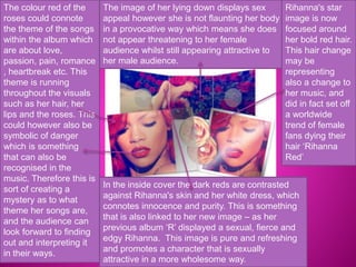
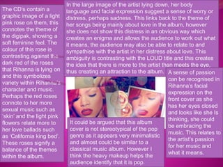
Typography: Minimal text 
is included in the digipak. 
The text that is included 
‘Rihanna’ is in white, plain 
font and is very spaced 
out. This emphasises the 
simplicity of the album 
and sort of suggests a 
completely different 
image for the artist in 
comparison to her 
previous album. The title 
of the album ‘Loud’ it too 
written in this plain 
spaced out font, and is 
shown to be much larger 
than the other text. This 
again is suggesting a sort 
of fresh start and new 
image, which coincides 
with the fact that Rihanna 
had new hair and a new 
promotional image. 
Andrew Goodwin’s idea of demands of the record label 
can be identified here, as the main focal point of the 
image on the front of the cover is Rihanna’s Lips and red 
hair. Together, both being bold red, attract all of the 
attention from the viewer. Red hair became Rihanna’s 
trademark for a while, so the record company would want 
this to be featured as it is a selling point of her image. 
Goodwin’s notion of 
looking as well as 
Mulvey’s male gaze 
theory can also be 
recognised here as 
some people may 
argue that red lips 
are a sexual part of 
the woman, and this 
is where the eyes 
are attracted to. The 
lips together with 
her bare shoulder 
could be said to be 
through a man’s 
perspective 
Dyer’s star theory can be seen as 
it could be argued that Rihanna is 
a fake character and is presented 
as just an image and this may not 
be the same person as who she is 
behind the scenes.
The colour scheme, 
images and 
typography of this 
digipak all contribute 
to what was 
Rihanna’s new image 
for the CD. This 
image promoted a 
very feminine version 
of the artist, the pink 
of the flowers 
connotes girliness 
and is stereotypically 
the colour that 
represents women or 
what women are 
attracted to. 
Rihanna is the key signifier within this artwork. She is the most 
important aspect of this and it is very obvious from the fact that a 
close up shot of her face is used. This use of a close up of her 
face and minimal text emphasises the fact that she is a huge 
and very influential figure in the music industry, therefore her 
image is important however her name is not because everybody 
already knows it. 
This soft and feminine image was maintained in her music videos 
where she wears pink skirts and girly outfits etc. She also 
promoted her own perfume at this time, and the campaigns for this 
used the same theme as this digipak did. This theme of Rihanna’s 
new image is comprised within this digipak. 
Reception – 
The preferred 
audience will 
immediately 
recognise the 
image as being 
Rihanna and will 
enjoy the visuals of 
her face and her 
new image. 
Oppositional 
audience may not 
receive the image 
well and may say 
that Rihanna Is 
highly sexualized.
The colour red of the 
roses could connote 
the theme of the songs 
within the album which 
are about love, 
passion, pain, romance 
, heartbreak etc. This 
theme is running 
throughout the visuals 
such as her hair, her 
lips and the roses. This 
could however also be 
symbolic of danger 
which is something 
that can also be 
recognised in the 
music. Therefore this is 
sort of creating a 
mystery as to what 
theme her songs are, 
and the audience can 
look forward to finding 
out and interpreting it 
in their ways. 
The image of her lying down displays sex 
appeal however she is not flaunting her body 
in a provocative way which means she does 
not appear threatening to her female 
audience whilst still appearing attractive to 
her male audience. 
Rihanna's star 
image is now 
focused around 
her bold red hair. 
This hair change 
may be 
representing 
also a change to 
her music, and 
did in fact set off 
a worldwide 
trend of female 
fans dying their 
hair ‘Rihanna 
Red’ 
In the inside cover the dark reds are contrasted 
against Rihanna's skin and her white dress, which 
connotes innocence and purity. This is something 
that is also linked to her new image – as her 
previous album ‘R’ displayed a sexual, fierce and 
edgy Rihanna. This image is pure and refreshing 
and promotes a character that is sexually 
attractive in a more wholesome way.
The CD’s contain a 
graphic image of a light 
pink rose on them, this 
connotes the theme of 
the digipak, showing a 
soft feminine feel. The 
colour of this rose is 
contrasting against the 
dark red of the roses 
that Rihanna is lying on 
and this symbolizes 
variety within Rihanna’s 
character and music. 
Perhaps the red roses 
connote to her more 
sexual music such as 
‘skin’ and the light pink 
flowers relate more to 
her love ballads such 
as ‘California king bed’. 
These roses signify a 
balance of the themes 
within the album. 
In the large image of the artist lying down, her body 
language and facial expression suggest a sense of worry or 
distress, perhaps sadness. This links back to the theme of 
her songs being mainly about love in the album, however 
she does not show this distress in an obvious way which 
creates an enigma and allows the audience to work out what 
it means, the audience may also be able to relate to and 
sympathise with the artist in her distress about love. This 
ambiguity is contrasting with the LOUD title and this creates 
the idea that there is more to the artist than meets the eye, 
thus creating an attraction to the album. A sense of passion 
can be recognised in 
Rihanna’s facial 
expression on the 
front cover as she 
has her eyes closed 
and looks like she Is 
thinking, she could 
be embracing the 
music. This relates to 
the artist’s passion 
for her music and 
what it means. 
It could be argued that this album 
cover is not stereotypical of the pop 
genre as it appears very minimalistic 
and almost could be similar to a 
classical music album. However I 
think the heavy makeup helps the 
audience identify that it is pop.

Cd cover analysis rihanna – loud

  • 2.
    Typography: Minimal text is included in the digipak. The text that is included ‘Rihanna’ is in white, plain font and is very spaced out. This emphasises the simplicity of the album and sort of suggests a completely different image for the artist in comparison to her previous album. The title of the album ‘Loud’ it too written in this plain spaced out font, and is shown to be much larger than the other text. This again is suggesting a sort of fresh start and new image, which coincides with the fact that Rihanna had new hair and a new promotional image. Andrew Goodwin’s idea of demands of the record label can be identified here, as the main focal point of the image on the front of the cover is Rihanna’s Lips and red hair. Together, both being bold red, attract all of the attention from the viewer. Red hair became Rihanna’s trademark for a while, so the record company would want this to be featured as it is a selling point of her image. Goodwin’s notion of looking as well as Mulvey’s male gaze theory can also be recognised here as some people may argue that red lips are a sexual part of the woman, and this is where the eyes are attracted to. The lips together with her bare shoulder could be said to be through a man’s perspective Dyer’s star theory can be seen as it could be argued that Rihanna is a fake character and is presented as just an image and this may not be the same person as who she is behind the scenes.
  • 3.
    The colour scheme, images and typography of this digipak all contribute to what was Rihanna’s new image for the CD. This image promoted a very feminine version of the artist, the pink of the flowers connotes girliness and is stereotypically the colour that represents women or what women are attracted to. Rihanna is the key signifier within this artwork. She is the most important aspect of this and it is very obvious from the fact that a close up shot of her face is used. This use of a close up of her face and minimal text emphasises the fact that she is a huge and very influential figure in the music industry, therefore her image is important however her name is not because everybody already knows it. This soft and feminine image was maintained in her music videos where she wears pink skirts and girly outfits etc. She also promoted her own perfume at this time, and the campaigns for this used the same theme as this digipak did. This theme of Rihanna’s new image is comprised within this digipak. Reception – The preferred audience will immediately recognise the image as being Rihanna and will enjoy the visuals of her face and her new image. Oppositional audience may not receive the image well and may say that Rihanna Is highly sexualized.
  • 4.
    The colour redof the roses could connote the theme of the songs within the album which are about love, passion, pain, romance , heartbreak etc. This theme is running throughout the visuals such as her hair, her lips and the roses. This could however also be symbolic of danger which is something that can also be recognised in the music. Therefore this is sort of creating a mystery as to what theme her songs are, and the audience can look forward to finding out and interpreting it in their ways. The image of her lying down displays sex appeal however she is not flaunting her body in a provocative way which means she does not appear threatening to her female audience whilst still appearing attractive to her male audience. Rihanna's star image is now focused around her bold red hair. This hair change may be representing also a change to her music, and did in fact set off a worldwide trend of female fans dying their hair ‘Rihanna Red’ In the inside cover the dark reds are contrasted against Rihanna's skin and her white dress, which connotes innocence and purity. This is something that is also linked to her new image – as her previous album ‘R’ displayed a sexual, fierce and edgy Rihanna. This image is pure and refreshing and promotes a character that is sexually attractive in a more wholesome way.
  • 5.
    The CD’s containa graphic image of a light pink rose on them, this connotes the theme of the digipak, showing a soft feminine feel. The colour of this rose is contrasting against the dark red of the roses that Rihanna is lying on and this symbolizes variety within Rihanna’s character and music. Perhaps the red roses connote to her more sexual music such as ‘skin’ and the light pink flowers relate more to her love ballads such as ‘California king bed’. These roses signify a balance of the themes within the album. In the large image of the artist lying down, her body language and facial expression suggest a sense of worry or distress, perhaps sadness. This links back to the theme of her songs being mainly about love in the album, however she does not show this distress in an obvious way which creates an enigma and allows the audience to work out what it means, the audience may also be able to relate to and sympathise with the artist in her distress about love. This ambiguity is contrasting with the LOUD title and this creates the idea that there is more to the artist than meets the eye, thus creating an attraction to the album. A sense of passion can be recognised in Rihanna’s facial expression on the front cover as she has her eyes closed and looks like she Is thinking, she could be embracing the music. This relates to the artist’s passion for her music and what it means. It could be argued that this album cover is not stereotypical of the pop genre as it appears very minimalistic and almost could be similar to a classical music album. However I think the heavy makeup helps the audience identify that it is pop.