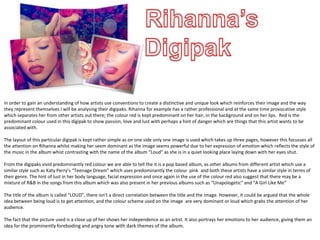
1) The digipak for Rihanna's album "Loud" predominantly uses the color red to represent passion, love, and lust. It focuses attention on Rihanna's powerful expression.
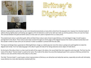
2) Analysis of Britney Spears' "Femme Fatale" digipak shows her represented as elegant through its use of gold, white, and black colors. Her pose suggests seduction while maintaining a classy image.
3) Digipaks are analyzed to understand how artists represent themselves through conventions like color schemes and images that reinforce their brands and music genres.