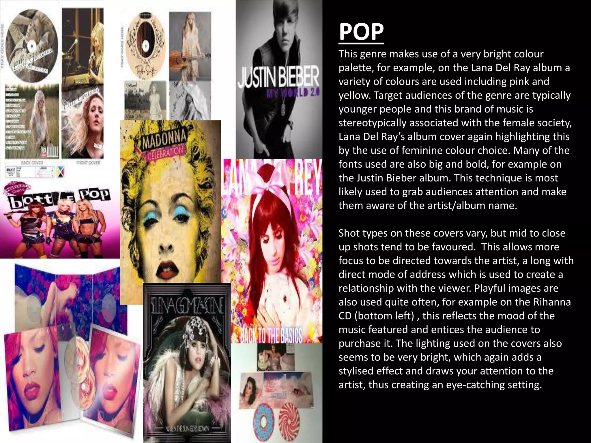
POP 
This genre makes use of a very bright colour 
palette, for example, on the Lana Del Ray album a 
variety of colours are used including pink and 
yellow. Target audiences of the genre are typically 
younger people and this brand of music is 
stereotypically associated with the female society, 
Lana Del Ray’s album cover again highlighting this 
by the use of feminine colour choice. Many of the 
fonts used are also big and bold, for example on 
the Justin Bieber album. This technique is most 
likely used to grab audiences attention and make 
them aware of the artist/album name. 
Shot types on these covers vary, but mid to close 
up shots tend to be favoured. This allows more 
focus to be directed towards the artist, a long with 
direct mode of address which is used to create a 
relationship with the viewer. Playful images are 
also used quite often, for example on the Rihanna 
CD (bottom left) , this reflects the mood of the 
music featured and entices the audience to 
purchase it. The lighting used on the covers also 
seems to be very bright, which again adds a 
stylised effect and draws your attention to the 
artist, thus creating an eye-catching setting.
ROCK 
Rock has a much different feel to it than pop, and 
therefore uses other features on CD’s etc. Colours 
can still be bright, taking the Silent Scream album as 
an example, but many tend to surround a dark 
theme. Due to the target audience of rock music 
tending to be stereotypically ‘dark’ people, the 
lighting and colours tend to follow suit and connote 
a feeling of power and darkness. The typography 
featured is also very much related to the genre in 
the sense it is usually quite jagged, this connotes the 
edginess that is associated with the style of music. 
Shot types again vary, with some covers electing not 
to feature images of the band themselves. An 
example of this would be the ACDC album which 
only features the logo of the band on an edited 
background. Mid shots are also used on both the 
green day and slipknot albums, with editing 
techniques again allowing them to look unique and 
edgy. The images used seem to match the genre 
again, an example being the Green Day digipak 
(bottom right) which houses an image of a bleeding 
wrist, this in turn links to darkness and death and 
portrays the style well. The lighting also helps set 
the scene as it is very dark and gloomy, this creates a 
very mysterious and intense setting.
CLASSICAL 
Classical takes quite a different approach with the 
artist appearing on every cover. The colours used 
range, but they tend to be very plain and simple to 
allow the focus to remain on the image of the 
performer. Photographs are also used, for example 
on the Paul Potts album, which depicts him in 
what seems like an upper class area – this links to 
the music genre. Lighting is again used to add 
focus to the performer, for example, within the 
Katherine Jenkins cover. The typography used is 
also very formal and of similar type, again 
highlighting the upper brow of the genre. It is also 
quite large to draw the attention of the audience 
and notify them of whose album it is. 
The shot types used again vary but are very much 
focused around the artist, and medium close ups 
are often used, examples being the Katherine 
Jenkins and Susan Boyle covers. Long shots are 
also used, for example in the Jonathan & Charlotte 
album. It links the title as it depicts them 
“together”, which is of course the name of the 
album. A black and white effect is also used quite 
often, this perhaps portrays simplicity and natural 
feeling which links very much so to the genre.
RAP 
This again is a very different genre and is often 
associated with gangsters and crime. This is 
portrayed through the images used, with serious 
expressions commonly seen on the artists faces. 
The colours used again range but they tend to be 
fairly dark and again have a focus on the artist. 
This is of course not the case in the Kanye West 
album as a symbol is used, which may represent 
something associated with the music or artist. 
The yellow and black colours could however 
connote an element of danger or warning. 
The shot types used within the covers tend to be 
mid to close-up shots with the performer usually 
being at the centre of the setting. They all seem 
to be in a position where they are posing, and 
they all look ruthless, serious and powerful. The 
lighting is used with good effect, putting 
emphasis on to the artist and creates an 
atmosphere of importance, a good example being 
the Dr.Dre cover. The typography used is big and 
bold which allows it to stand out and grab 
attention, which is what the artists want. It is also 
very modern, for example with the Lil Wayne 
album where the text is very much artistic and 
‘cool’.
Country 
Country CD covers seem to of very similar nature if you 
look at these examples. It is a very Americanised genre 
of music and is stereotypically linked with the 
countryside and cowboys. The images used obviously 
portray this with the wearing of cowboy hats and 
chequered shirts etc. The lighting used is also very 
bright and again highlights the artist and help create 
quite a natural setting in unison with the background 
images, which are very country related with the 
outdoors and woody features being used – these are 
often linked with Country singers. The typography used 
on the covers also tends to have a very western look 
about it, for example the Leann Remes cover looks 
reminiscent of a wanted poster. 
The shot types used again vary but close ups and mid 
shots are used on many occasions. An example of a 
close shot would be the Blake Shelton cover. This adds a 
feeling of relation between the audience and the artist. 
Long shots are also used, for example on the Jason 
Aldean cover, this helps depict the scene and allow the 
viewer to gain a sense of belonging. Furthermore, all of 
the artists are looking directly at the camera which adds 
a direct mode of address, thus increasing the 
relationship between the artist and the fans. This helps 
create a very comfortable setting.

Music digipak and cd cover examples

  • 1.
    POP This genremakes use of a very bright colour palette, for example, on the Lana Del Ray album a variety of colours are used including pink and yellow. Target audiences of the genre are typically younger people and this brand of music is stereotypically associated with the female society, Lana Del Ray’s album cover again highlighting this by the use of feminine colour choice. Many of the fonts used are also big and bold, for example on the Justin Bieber album. This technique is most likely used to grab audiences attention and make them aware of the artist/album name. Shot types on these covers vary, but mid to close up shots tend to be favoured. This allows more focus to be directed towards the artist, a long with direct mode of address which is used to create a relationship with the viewer. Playful images are also used quite often, for example on the Rihanna CD (bottom left) , this reflects the mood of the music featured and entices the audience to purchase it. The lighting used on the covers also seems to be very bright, which again adds a stylised effect and draws your attention to the artist, thus creating an eye-catching setting.
  • 2.
    ROCK Rock hasa much different feel to it than pop, and therefore uses other features on CD’s etc. Colours can still be bright, taking the Silent Scream album as an example, but many tend to surround a dark theme. Due to the target audience of rock music tending to be stereotypically ‘dark’ people, the lighting and colours tend to follow suit and connote a feeling of power and darkness. The typography featured is also very much related to the genre in the sense it is usually quite jagged, this connotes the edginess that is associated with the style of music. Shot types again vary, with some covers electing not to feature images of the band themselves. An example of this would be the ACDC album which only features the logo of the band on an edited background. Mid shots are also used on both the green day and slipknot albums, with editing techniques again allowing them to look unique and edgy. The images used seem to match the genre again, an example being the Green Day digipak (bottom right) which houses an image of a bleeding wrist, this in turn links to darkness and death and portrays the style well. The lighting also helps set the scene as it is very dark and gloomy, this creates a very mysterious and intense setting.
  • 3.
    CLASSICAL Classical takesquite a different approach with the artist appearing on every cover. The colours used range, but they tend to be very plain and simple to allow the focus to remain on the image of the performer. Photographs are also used, for example on the Paul Potts album, which depicts him in what seems like an upper class area – this links to the music genre. Lighting is again used to add focus to the performer, for example, within the Katherine Jenkins cover. The typography used is also very formal and of similar type, again highlighting the upper brow of the genre. It is also quite large to draw the attention of the audience and notify them of whose album it is. The shot types used again vary but are very much focused around the artist, and medium close ups are often used, examples being the Katherine Jenkins and Susan Boyle covers. Long shots are also used, for example in the Jonathan & Charlotte album. It links the title as it depicts them “together”, which is of course the name of the album. A black and white effect is also used quite often, this perhaps portrays simplicity and natural feeling which links very much so to the genre.
  • 4.
    RAP This againis a very different genre and is often associated with gangsters and crime. This is portrayed through the images used, with serious expressions commonly seen on the artists faces. The colours used again range but they tend to be fairly dark and again have a focus on the artist. This is of course not the case in the Kanye West album as a symbol is used, which may represent something associated with the music or artist. The yellow and black colours could however connote an element of danger or warning. The shot types used within the covers tend to be mid to close-up shots with the performer usually being at the centre of the setting. They all seem to be in a position where they are posing, and they all look ruthless, serious and powerful. The lighting is used with good effect, putting emphasis on to the artist and creates an atmosphere of importance, a good example being the Dr.Dre cover. The typography used is big and bold which allows it to stand out and grab attention, which is what the artists want. It is also very modern, for example with the Lil Wayne album where the text is very much artistic and ‘cool’.
  • 5.
    Country Country CDcovers seem to of very similar nature if you look at these examples. It is a very Americanised genre of music and is stereotypically linked with the countryside and cowboys. The images used obviously portray this with the wearing of cowboy hats and chequered shirts etc. The lighting used is also very bright and again highlights the artist and help create quite a natural setting in unison with the background images, which are very country related with the outdoors and woody features being used – these are often linked with Country singers. The typography used on the covers also tends to have a very western look about it, for example the Leann Remes cover looks reminiscent of a wanted poster. The shot types used again vary but close ups and mid shots are used on many occasions. An example of a close shot would be the Blake Shelton cover. This adds a feeling of relation between the audience and the artist. Long shots are also used, for example on the Jason Aldean cover, this helps depict the scene and allow the viewer to gain a sense of belonging. Furthermore, all of the artists are looking directly at the camera which adds a direct mode of address, thus increasing the relationship between the artist and the fans. This helps create a very comfortable setting.