Digipak
By Derrick Damesi
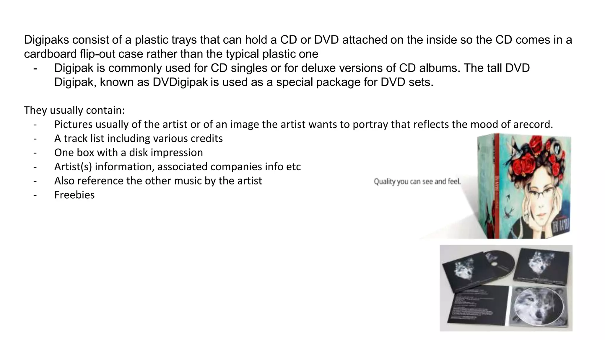
Digipaks consist of a plastic trays that can hold a CD or DVD attached on the inside so the CD comes in a
cardboard flip-out case rather than the typical plastic one
- Digipak is commonly used for CD singles or for deluxe versions of CD albums. The tall DVD
Digipak, known as DVDigipak is used as a special package for DVD sets.
They usually contain:
- Pictures usually of the artist or of an image the artist wants to portray that reflects the mood of arecord.
- A track list including various credits
- One box with a disk impression
- Artist(s) information, associated companies info etc
- Also reference the other music by the artist
- Freebies
Analysis
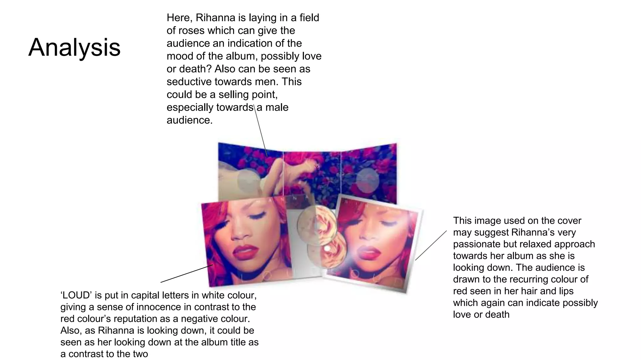
Here, Rihanna is laying in a field
of roses which can give the
audience an indication of the
mood of the album, possibly love
or death? Also can be seen as
seductive towards men. This
could be a selling point,
especially towards a male
audience.
This image used on the cover
may suggest Rihanna’s very
passionate but relaxed approach
towards her album as she is
looking down. The audience is
drawn to the recurring colour of
red seen in her hair and lips
which again can indicate possibly
love or death
‘LOUD’ is put in capital letters in white colour,
giving a sense of innocence in contrast to the
red colour’s reputation as a negative colour.
Also, as Rihanna is looking down, it could be
seen as her looking down at the album title as
a contrast to the two
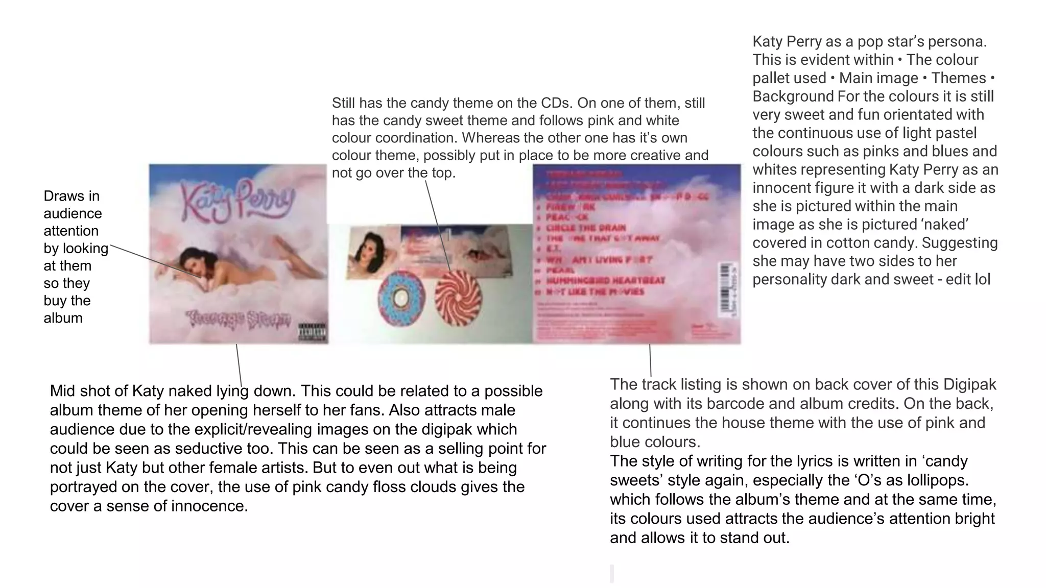
Mid shot of Katy naked lying down. This could be related to a possible
album theme of her opening herself to her fans. Also attracts male
audience due to the explicit/revealing images on the digipak which
could be seen as seductive too. This can be seen as a selling point for
not just Katy but other female artists. But to even out what is being
portrayed on the cover, the use of pink candy floss clouds gives the
cover a sense of innocence.
The track listing is shown on back cover of this Digipak
along with its barcode and album credits. On the back,
it continues the house theme with the use of pink and
blue colours.
The style of writing for the lyrics is written in ‘candy
sweets’ style again, especially the ‘O’s as lollipops.
which follows the album’s theme and at the same time,
its colours used attracts the audience’s attention bright
and allows it to stand out.
Still has the candy theme on the CDs. On one of them, still
has the candy sweet theme and follows pink and white
colour coordination. Whereas the other one has it’s own
colour theme, possibly put in place to be more creative and
not go over the top.
Katy Perry as a pop star’s persona.
This is evident within • The colour
pallet used • Main image • Themes •
Background For the colours it is still
very sweet and fun orientated with
the continuous use of light pastel
colours such as pinks and blues and
whites representing Katy Perry as an
innocent figure it with a dark side as
she is pictured within the main
image as she is pictured ‘naked’
covered in cotton candy. Suggesting
she may have two sides to her
personality dark and sweet - edit lol
Draws in
audience
attention
by looking
at them
so they
buy the
album
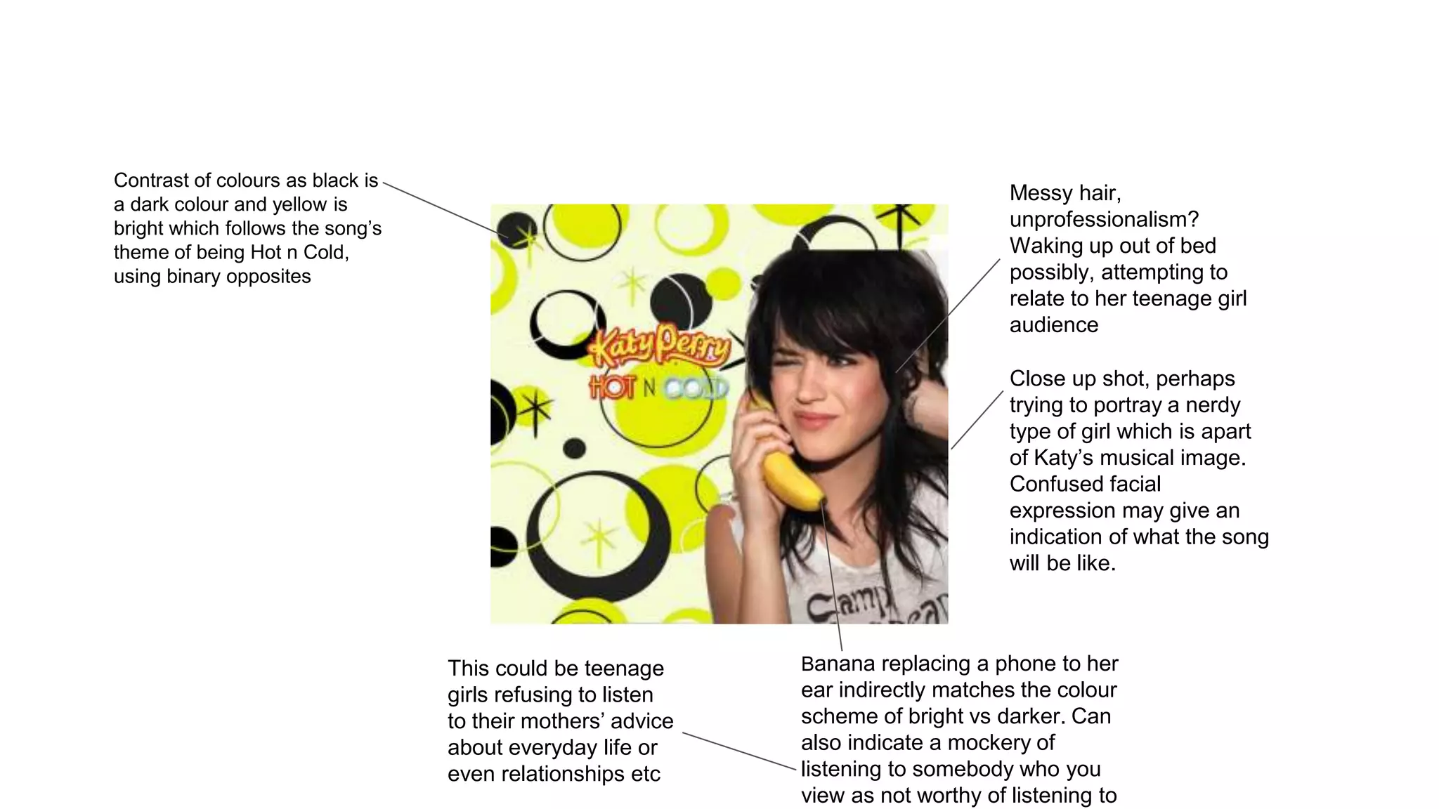
Close up shot, perhaps
trying to portray a nerdy
type of girl which is apart
of Katy’s musical image.
Confused facial
expression may give an
indication of what the song
will be like.
Contrast of colours as black is
a dark colour and yellow is
bright which follows the song’s
theme of being Hot n Cold,
using binary opposites
Messy hair,
unprofessionalism?
Waking up out of bed
possibly, attempting to
relate to her teenage girl
audience
Banana replacing a phone to her
ear indirectly matches the colour
scheme of bright vs darker. Can
also indicate a mockery of
listening to somebody who you
view as not worthy of listening to
This could be teenage
girls refusing to listen
to their mothers’ advice
about everyday life or
even relationships etc
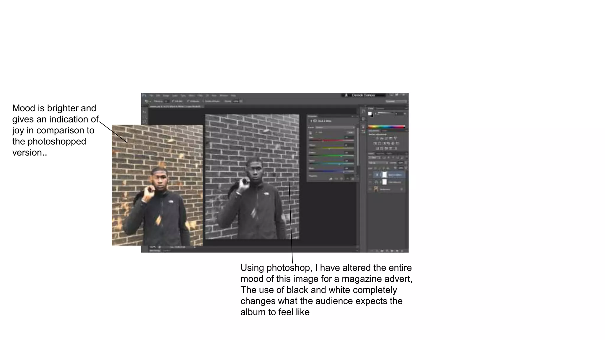
Using photoshop, I have altered the entire
mood of this image for a magazine advert,
The use of black and white completely
changes what the audience expects the
album to feel like
Mood is brighter and
gives an indication of
joy in comparison to
the photoshopped
version..
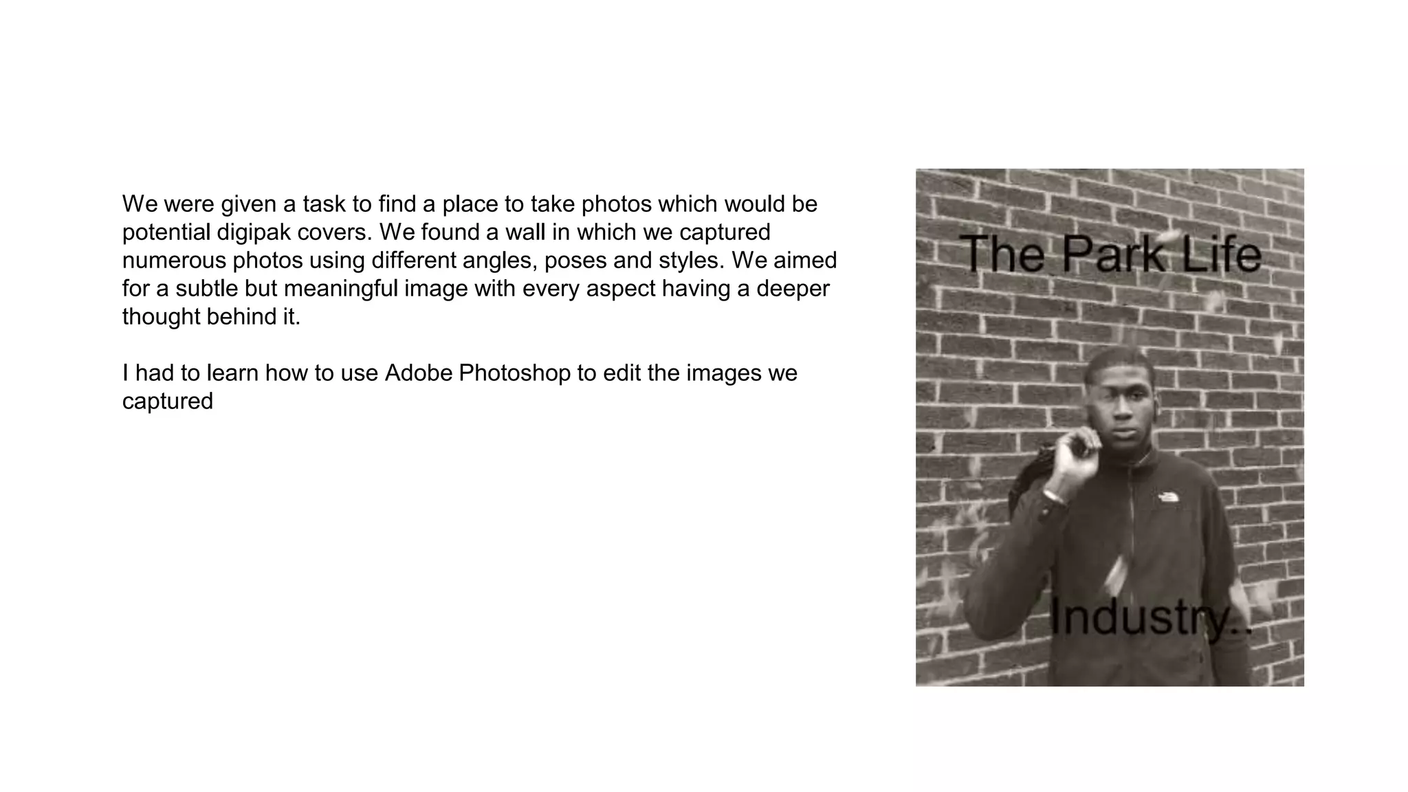
We were given a task to find a place to take photos which would be
potential digipak covers. We found a wall in which we captured
numerous photos using different angles, poses and styles. We aimed
for a subtle but meaningful image with every aspect having a deeper
thought behind it.
I had to learn how to use Adobe Photoshop to edit the images we
captured

digipak slideshow

  • 1.
  • 2.
    Digipaks consist ofa plastic trays that can hold a CD or DVD attached on the inside so the CD comes in a cardboard flip-out case rather than the typical plastic one - Digipak is commonly used for CD singles or for deluxe versions of CD albums. The tall DVD Digipak, known as DVDigipak is used as a special package for DVD sets. They usually contain: - Pictures usually of the artist or of an image the artist wants to portray that reflects the mood of arecord. - A track list including various credits - One box with a disk impression - Artist(s) information, associated companies info etc - Also reference the other music by the artist - Freebies
  • 3.
    Analysis Here, Rihanna islaying in a field of roses which can give the audience an indication of the mood of the album, possibly love or death? Also can be seen as seductive towards men. This could be a selling point, especially towards a male audience. This image used on the cover may suggest Rihanna’s very passionate but relaxed approach towards her album as she is looking down. The audience is drawn to the recurring colour of red seen in her hair and lips which again can indicate possibly love or death ‘LOUD’ is put in capital letters in white colour, giving a sense of innocence in contrast to the red colour’s reputation as a negative colour. Also, as Rihanna is looking down, it could be seen as her looking down at the album title as a contrast to the two
  • 4.
    Mid shot ofKaty naked lying down. This could be related to a possible album theme of her opening herself to her fans. Also attracts male audience due to the explicit/revealing images on the digipak which could be seen as seductive too. This can be seen as a selling point for not just Katy but other female artists. But to even out what is being portrayed on the cover, the use of pink candy floss clouds gives the cover a sense of innocence. The track listing is shown on back cover of this Digipak along with its barcode and album credits. On the back, it continues the house theme with the use of pink and blue colours. The style of writing for the lyrics is written in ‘candy sweets’ style again, especially the ‘O’s as lollipops. which follows the album’s theme and at the same time, its colours used attracts the audience’s attention bright and allows it to stand out. Still has the candy theme on the CDs. On one of them, still has the candy sweet theme and follows pink and white colour coordination. Whereas the other one has it’s own colour theme, possibly put in place to be more creative and not go over the top. Katy Perry as a pop star’s persona. This is evident within • The colour pallet used • Main image • Themes • Background For the colours it is still very sweet and fun orientated with the continuous use of light pastel colours such as pinks and blues and whites representing Katy Perry as an innocent figure it with a dark side as she is pictured within the main image as she is pictured ‘naked’ covered in cotton candy. Suggesting she may have two sides to her personality dark and sweet - edit lol Draws in audience attention by looking at them so they buy the album
  • 5.
    Close up shot,perhaps trying to portray a nerdy type of girl which is apart of Katy’s musical image. Confused facial expression may give an indication of what the song will be like. Contrast of colours as black is a dark colour and yellow is bright which follows the song’s theme of being Hot n Cold, using binary opposites Messy hair, unprofessionalism? Waking up out of bed possibly, attempting to relate to her teenage girl audience Banana replacing a phone to her ear indirectly matches the colour scheme of bright vs darker. Can also indicate a mockery of listening to somebody who you view as not worthy of listening to This could be teenage girls refusing to listen to their mothers’ advice about everyday life or even relationships etc
  • 6.
    Using photoshop, Ihave altered the entire mood of this image for a magazine advert, The use of black and white completely changes what the audience expects the album to feel like Mood is brighter and gives an indication of joy in comparison to the photoshopped version..
  • 7.
    We were givena task to find a place to take photos which would be potential digipak covers. We found a wall in which we captured numerous photos using different angles, poses and styles. We aimed for a subtle but meaningful image with every aspect having a deeper thought behind it. I had to learn how to use Adobe Photoshop to edit the images we captured