This document summarizes and analyzes the album artwork and promotional materials for several musical artists. In 3 sentences:
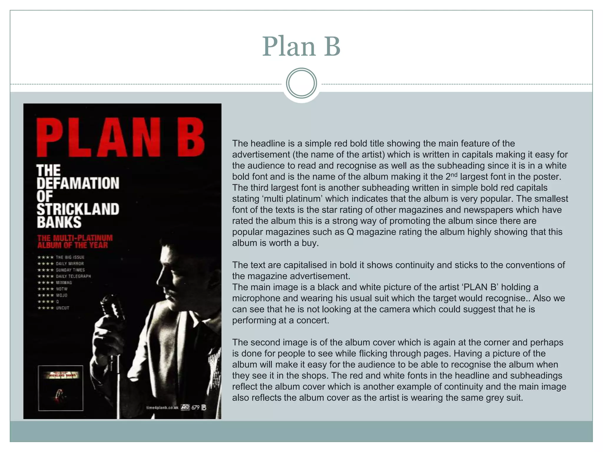
It discusses the album artwork for Emeli Sande, 1975, and Plan B, noting design elements like simple backgrounds, use of color, and images of the artists. Advertisements for Arctic Monkeys, Adele, and Plan B are also examined, highlighting the large font used for the artist and album names, reviews from magazines, and information about the music. Overall, the document analyzes how the visual design of albums and ads target audiences and convey aspects of the artist's image and music.
엑셈 편집부, 『그림으로 명쾌하게 풀어쓴 Practical OWI in Oracle 10g』, 엑셈(2007)
실제 Practical OWI 세미나에서 사용됐던 다양하고 상세한 그림을 그대로 사용하면서 시각적인 효과를 높이고, 상세한 설명을 통해 최대한 그림에 대한 이해를 돕도록 했습니다.
----------------------------------------------------------------------------------------------------------------------
EXEM
- 네이버 블로그: http://blog.naver.com/playexem
- Youtube 엑셈 tv: https://www.youtube.com/channel/UC5wKR_-A0eL_Pn_EMzoauJg
- Maxgauge facebook: https://www.facebook.com/yourmaxgauge/
Ofcom's Second Public Service Broadcasting Review, Phase 1: Annex 6 Researc...TomLoosemore
This slide pack is an annex to Ofcom’s Second PSB Review - Phase One. The full consultation document was published on 10th April 2008, and can be read at http://www.ofcom.org.uk/tv/psb_review/
• This annexe provides a summary of the research evidence base that was drawn on in compiling the consultation document, in particular in relation to Section 3 ‘How well are the public service broadcasters delivering public purposes?’.
8051 Microcontroller Tutorial and Architecture with Applicationselprocus
8051 is an 8-bit family of microcontroller developed by Intel, microcontroller was also referred as “system on a chip” because it has 128 bytes of RAM, 4Kbytes of ROM, 2 Timers, 1 Serial port, and four ports on a single
chip. The CPU can work for only 8bits of data at a time because 8051 is an 8-bit processor.
YTC India are Exclusive distributors, Supplier & Dealers in India for YTC make pneumatic positioners, air filter and pressure regulators, limit switch box, electro pneumatic positioners valve and calibiration positioners, hart and ip converters air and vaccum boster and valves catalog, manuals. YTC Korea products confirm to best International quality and are at par with norgren, parker, abb, rotex, siemens, samson, shavo, smc, watson smith, watts, siemens 760, 6dr5210, ps2, sipart, tzidc in Ytc India.For any Enquiry Call Us: +91-11-2201-4325, Email at : info@ytcindia.com
Website: www.ytcindia.com
Have you ever wondered about the lost city of Atlantis and its profound connection to our modern world? Ruth Elisabeth Hancock’s podcast, “Visions of Atlantis,” delves deep into this intriguing topic in a captivating conversation with Michael Le Flem, author of the enlightening book titled “Visions of Atlantis.” This podcast episode offers a thought-provoking blend of historical inquiry, esoteric wisdom, and contemporary reflections. Let’s embark on a journey of discovery as we unpack the mysteries of ancient civilizations and their relevance to our present existence.
Johnny Depp Long Hair: A Signature Look Through the Yearsgreendigital
Johnny Depp, synonymous with eclectic roles and unparalleled acting prowess. has also been a significant figure in fashion and style. Johnny Depp long hair is a distinctive trademark among the various elements that define his unique persona. This article delves into the evolution, impact. and cultural significance of Johnny Depp long hair. exploring how it has contributed to his iconic status.
Follow us on: Pinterest
Introduction
Johnny Depp is an actor known for his chameleon-like ability to transform into a wide range of characters. from the eccentric Captain Jack Sparrow in "Pirates of the Caribbean" to the introspective Edward Scissorhands. His long hair is one constant throughout his evolving roles and public appearances. Johnny Depp long hair is not a style choice but a significant aspect of his identity. contributing to his allure and mystique. This article explores the journey and significance of Johnny Depp long hair. highlighting how it has become integral to his brand.
The Early Years: A Budding Star with Signature Locks
1980s: The Rise of a Young Heartthrob
Johnny Depp's journey in Hollywood began in the 1980s. with his breakout role in the television series "21 Jump Street." During this time, his hair was short, but it was already clear that Depp had a penchant for unique and edgy styles. By the decade's end, Depp started experimenting with longer hair. setting the stage for a lifelong signature.
1990s: From Heartthrob to Icon
The 1990s were transformative for Johnny Depp his career and personal style. Films like "Edward Scissorhands" (1990) and "Benny & Joon" (1993) saw Depp sporting various hair lengths and styles. But, his long, unkempt hair in "What's Eating Gilbert Grape" (1993) began to draw significant attention. This period marked the beginning of Johnny Depp long hair. which became a defining feature of his image.
The Iconic Roles: Hair as a Character Element
Edward Scissorhands (1990)
In "Edward Scissorhands," Johnny Depp's character had a wild and mane that complemented his ethereal and misunderstood persona. This role showcased how long hair Johnny Depp could enhance a character's depth and mystery.
Captain Jack Sparrow: The Pirate with Flowing Locks
One of Johnny Depp's iconic roles is Captain Jack Sparrow from the "Pirates of the Caribbean" series. Sparrow's long, dreadlocked hair symbolised his rebellious and unpredictable nature. The character's look, complete with beads and trinkets woven into his hair. was a collaboration between Depp and the film's costume designers. This style became iconic and influenced fashion trends and Halloween costumes worldwide.
Other Memorable Characters
Depp's long hair has also been featured in other roles, such as Ichabod Crane in "Sleepy Hollow" (1999). and Roux in "Chocolat" (2000). In these films, his hair added a layer of authenticity and depth to his characters. proving that Johnny Depp with long hair is more than a style—it's a storytelling tool.
Off-Screen Influenc
La transidentité, un sujet qui fractionne les FrançaisIpsos France
Ipsos, l’une des principales sociétés mondiales d’études de marché dévoile les résultats de son étude Ipsos Global Advisor “Pride 2024”. De ses débuts aux Etats-Unis et désormais dans de très nombreux pays, le mois de juin est traditionnellement consacré aux « Marches des Fiertés » et à des événements festifs autour du concept de Pride. A cette occasion, Ipsos a réalisé une enquête dans vingt-six pays dressant plusieurs constats. Les clivages des opinions entre générations s’accentuent tandis que le soutien à des mesures sociétales et d’inclusion en faveur des LGBT+ notamment transgenres continue de s’effriter.
MRS PUNE 2024 - WINNER AMRUTHAA UTTAM JAGDHANEDK PAGEANT
Amruthaa Uttam Jagdhane, a stunning woman from Pune, has won the esteemed title of Mrs. India 2024, which is given out by the Dk Exhibition. Her journey to this prestigious accomplishment is a confirmation of her faithful assurance, extraordinary gifts, and profound commitment to enabling women.
Is your favorite ring slipping and sliding on your finger? You're not alone. Must Read this Guide on What To Do If Your Ring Is Too Big as shared by the experts of Andrews Jewelers.
Care Instructions for Activewear & Swim Suits.pdfsundazesurf80
SunDaze Surf offers top swimwear tips: choose high-quality, UV-protective fabrics to shield your skin. Opt for secure fits that withstand waves and active movement. Bright colors enhance visibility, while adjustable straps ensure comfort. Prioritize styles with good support, like racerbacks or underwire tops, for active beach days. Always rinse swimwear after use to maintain fabric integrity.
From Stress to Success How Oakland's Corporate Wellness Programs are Cultivat...Kitchen on Fire
Discover how Oakland's innovative corporate wellness initiatives are transforming workplace culture, nurturing the well-being of employees, and fostering a thriving environment. From comprehensive mental health support to flexible work arrangements and holistic wellness workshops, these programs are empowering individuals to navigate stress effectively, leading to increased productivity, satisfaction, and overall success.
2. Emeli Sande
The front cover of the album is quite unique, as it goes against the convention of
showing the artists face. Emeli is looking away from the camera making the album
more interesting as it something different because an artist would generally show
their face in order to be recognised. There are also roses around her which could
indicate the genre of her songs.
The simple background makes Emeli appear more prominent within the shot and
so the focus is on her and so this adds to the star image. The text is spaced out
which makes it more effective because of the background as well keeping it simple
and formal.
The cd is simple which is following the colour of the clothing she is wearing at the
front of the cover. Also the CD colour scheme is simple because some artist
usually have brighter colours or even images on their CD. This could be to show
more emphasis on the text. Moreover there is a small font being used at the
bottom of the CD so that it doesn’t take attention away from the actual heading
and some people may not be really interested in reading it since it is about
copyrights.
The colour of the back cover of the album is much brighter compared to the front
of the cover but the same sort of effect is being used. Also the song list are placed
at the centre which takes up more space making it much clear to read and
appealing for the audience because they are simple, but bold.
3. 1975
The main image on the front cover is a black rectangle with white lights around it creating a
white glow, this simplistic album cover is quite appealing to its target audience, as they are an
alternative/indie rock band, the dark greys and blacks are colours commonly associated with
rock. The album cover doesn't’ contain any images of the band, just their logo of a black
rectangle which could show that have more importance to their music and not there their looks
and want to stay alternative. The light around the sides make the name of the band standout
giving it attention. The font used looks unique but yet simple.
The image of the band looking away from the camera shows no direct mode of address to the
audience. There is no connection with the audience, which suggests an attitude which may
appeal to a teenage audience, as they can probably relate to those feelings and behaviours
shown by the positioning and eye contact of the band member. The costume shown is dark
clothing and hoodies. The black hoody may have been used to target its audience as they may
be able to relate to the artist and it is easily accessible. Furthermore, for the older generation
this type of clothing may appear intimidating and associated with anti-social behaviour and
rebellious youth sub-cultures. Also the plain and inexpensive looking clothing could also mean
that they are targeting their album to people who don’t have much interest in fashion or fashion
role models/icons and a lack of care about their appearance.
The back of the dig pack again keeps the black and white theme which is showing consistent
themes throughout the whole pack. The block capitals and two lines are something which is
iconic to the fans as the band uses this style on all their social media, such as twitter. Like all
albums back covers, they have a clear track listing, and production details which are in a small
print at the bottom. The inside of the album folds out to reveal two landscape, similar images of
the band in black and white. The photo highlights the lead vocalist as he is the most
recognisable member and the rest of the band are surrounding him as well as being slightly in
the background. Their body language is again laidback and does not look uncomfortable as
they have their hands in their pockets like many men do, therefore the male fans can relate to
them. They are not smiling or looking at the camera as this portrays a serious side to them and
their music as many of their songs have a deep and meaningful message to them. And the
black and white colours contrast the background and font, putting more emphasis on the text.
4. Artic Monkey Poster
This advert for artic monkeys uses a simple colour scheme which gives a strong
contrast to the name of the artist at the top of the poster since it is in a large font
which instantly would attract the audience and takes up third of the page without
having to use bright colours.
Additionally there are Star ratings from well known music magazines such as
NME and Q magazine which are indie magazine which show the band is
successful and giving people hope that what is being sold is worth it .The stars
stand out against the black background as does the white text
The advert includes information about songs that they have already produced
that have gained recognition which is perhaps used to show previous success.
It does not show the date of the album because it has already been realized
before the poster has been produced and it written in bold white ‘out now’ making
the reader go and purchase it straight away.
5. Adele Poster
The first thing the audience notice with this magazine advert is the artists
name and album name and main image which is clearly shown with a
simple a font also the album is at the bottom left which could be a way of
attracting audiences while turning the page . There is some small print
information in the corner to inform the audience more about the album
and artist as well as previous success is included within this advert to
show that Adele is a successful artist whose music is sold everywhere.
Although it’s typical for artists to have direct mode of address in their
images to ensure instant audience connection, Adele’s success means
that she does need to require the same connection or perhaps it could be
related to the theme of her album.
The lettering is large and easily read on the black background which
ensures that the audience can get all the information that they need
quickly. The colour scheme used for this advert is black white and green
which could represent the sort of songs she sings or it’s not a
stereotypical poster with bright colours.
.
6. Plan B
The headline is a simple red bold title showing the main feature of the
advertisement (the name of the artist) which is written in capitals making it easy for
the audience to read and recognise as well as the subheading since it is in a white
bold font and is the name of the album making it the 2nd largest font in the poster.
The third largest font is another subheading written in simple bold red capitals
stating ‘multi platinum’ which indicates that the album is very popular. The smallest
font of the texts is the star rating of other magazines and newspapers which have
rated the album this is a strong way of promoting the album since there are
popular magazines such as Q magazine rating the album highly showing that this
album is worth a buy.
The text are capitalised in bold it shows continuity and sticks to the conventions of
the magazine advertisement.
The main image is a black and white picture of the artist ‘PLAN B’ holding a
microphone and wearing his usual suit which the target would recognise.. Also we
can see that he is not looking at the camera which could suggest that he is
performing at a concert.
The second image is of the album cover which is again at the corner and perhaps
is done for people to see while flicking through pages. Having a picture of the
album will make it easy for the audience to be able to recognise the album when
they see it in the shops. The red and white fonts in the headline and subheadings
reflect the album cover which is another example of continuity and the main image
also reflects the album cover as the artist is wearing the same grey suit.