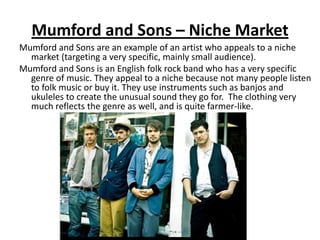
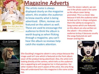
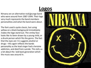
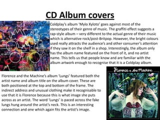
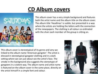
Background Research
    Lucy Kirbyshire
Mumford and Sons – Niche Market
Mumford and Sons are an example of an artist who appeals to a niche
  market (targeting a very specific, mainly small audience).
Mumford and Sons is an English folk rock band who has a very specific
  genre of music. They appeal to a niche because not many people listen
  to folk music or buy it. They use instruments such as banjos and
  ukuleles to create the unusual sound they go for. The clothing very
  much reflects the genre as well, and is quite farmer-like.
Magazine Adverts                                  From the Jessie J advert, we can
     The artists name is always                      see it the photo used is the same
     displayed clearly on the magazine               as the album cover being
     advert, this enables the audience               promoted. This is a clever idea
     to know exactly what is being                   because it tells the audience what
                                                     to look out for in shops and gives
     advertised. Often, reviews are                  them the ability to recognise it.
     featured on the advert as well.                 Song names which are featured
     These are used to encourage the                 on the album are also written on
     audience to think the album is                  the advert – this entices the
                                                     audience to buy it because usually
     worth buying as when flicking                   the songs featured are well
     through a magazine, you can’t                   known and big hits.
     hear the album so reviews help
     catch the readers attention.


Ellie Goulding’s magazine advert is very unique because the
image used isn’t one which is featured on the front album
cover of the product being advertised. Also, the artist isn’t
looking directly at the camera, which tells us the audience
she is appealing to will recognise her in that position. For
other readers that aren’t aware of the artist, the only thing
they will understand from this magazine is the name at the
top.
Logos
Nirvana are an alternative rock/grunge band
who were around from 1987-1994. Their logo
very much represents the band members
personalities and what the band were about.

The font used is quite classic, but using
yellow on a black background immediately
makes the logo stand out. The smiley face
looks like its been drawn by a young child, or
a drunk person which fits the genre. The fact
that the eyes are ‘x’s suggests alcohol or
drugs – this again reflects the bands
personality as the lead singer had a heroine
addiction, and died from suicide. This tells us
a lot about the laid-back generation which
the music was around in.
CD Album covers
                              Coldplay’s album ‘Mylo Xyloto’ goes against most of the
                              stereotypes of their genre of music. The graffiti effect suggests a
                              rap-style album – very different to the actual genre of their music
                              which is alternative rock/post-Britpop. However, the bright colours
                              used really attracts the audience’s and other consumer’s attention
                              if they saw it on the shelf in a shop. Interestingly, the album only
                              has the album name featured on the front of it, and no artist
                              name. This tells us that people know and are familiar with the
                              album artwork enough to recognise that it is a Coldplay album.


Florence and the Machine’s album ‘Lungs’ featured both the
artist name and album title on the album cover. These are
both positioned at the top and bottom of the frame. The
indirect address and unusual clothing make it recognisable to
use that it is Florence because this is what image she puts
across as an artist. The word ‘Lungs’ is paced across the fake
lungs hung around the artist’s neck. This is an interesting
connection and one which again fits the artist’s image.
CD Album covers
                                  This album cover has a very simple background and features
                                  both the artist name and the album title on the album cover.
                                  The album title ‘Headlines’ is subtle, but presented in a way
                                  where the artists are holding the letters with the connection
                                  of the newspapers. The clothing is all colour co-ordinated
                                  with the chair each member of the group is sitting on.


This album cover is stereotypical of its genre and very we
linked to the album name ‘American gangster’. The artist is
dressed in stereotypical gangster clothing and in a dark
setting where we can just about see the artist’s face. The
smoke in the background also suggests the stereotype of
gangsters in a violent way. The album name and artist name
is featured on the album cover in the same place, directly on
the artist himself in a simple font and colour.

Music artist background research

  • 1.
    Background Research Lucy Kirbyshire
  • 2.
    Mumford and Sons– Niche Market Mumford and Sons are an example of an artist who appeals to a niche market (targeting a very specific, mainly small audience). Mumford and Sons is an English folk rock band who has a very specific genre of music. They appeal to a niche because not many people listen to folk music or buy it. They use instruments such as banjos and ukuleles to create the unusual sound they go for. The clothing very much reflects the genre as well, and is quite farmer-like.
  • 3.
    Magazine Adverts From the Jessie J advert, we can The artists name is always see it the photo used is the same displayed clearly on the magazine as the album cover being advert, this enables the audience promoted. This is a clever idea to know exactly what is being because it tells the audience what to look out for in shops and gives advertised. Often, reviews are them the ability to recognise it. featured on the advert as well. Song names which are featured These are used to encourage the on the album are also written on audience to think the album is the advert – this entices the audience to buy it because usually worth buying as when flicking the songs featured are well through a magazine, you can’t known and big hits. hear the album so reviews help catch the readers attention. Ellie Goulding’s magazine advert is very unique because the image used isn’t one which is featured on the front album cover of the product being advertised. Also, the artist isn’t looking directly at the camera, which tells us the audience she is appealing to will recognise her in that position. For other readers that aren’t aware of the artist, the only thing they will understand from this magazine is the name at the top.
  • 4.
    Logos Nirvana are analternative rock/grunge band who were around from 1987-1994. Their logo very much represents the band members personalities and what the band were about. The font used is quite classic, but using yellow on a black background immediately makes the logo stand out. The smiley face looks like its been drawn by a young child, or a drunk person which fits the genre. The fact that the eyes are ‘x’s suggests alcohol or drugs – this again reflects the bands personality as the lead singer had a heroine addiction, and died from suicide. This tells us a lot about the laid-back generation which the music was around in.
  • 5.
    CD Album covers Coldplay’s album ‘Mylo Xyloto’ goes against most of the stereotypes of their genre of music. The graffiti effect suggests a rap-style album – very different to the actual genre of their music which is alternative rock/post-Britpop. However, the bright colours used really attracts the audience’s and other consumer’s attention if they saw it on the shelf in a shop. Interestingly, the album only has the album name featured on the front of it, and no artist name. This tells us that people know and are familiar with the album artwork enough to recognise that it is a Coldplay album. Florence and the Machine’s album ‘Lungs’ featured both the artist name and album title on the album cover. These are both positioned at the top and bottom of the frame. The indirect address and unusual clothing make it recognisable to use that it is Florence because this is what image she puts across as an artist. The word ‘Lungs’ is paced across the fake lungs hung around the artist’s neck. This is an interesting connection and one which again fits the artist’s image.
  • 6.
    CD Album covers This album cover has a very simple background and features both the artist name and the album title on the album cover. The album title ‘Headlines’ is subtle, but presented in a way where the artists are holding the letters with the connection of the newspapers. The clothing is all colour co-ordinated with the chair each member of the group is sitting on. This album cover is stereotypical of its genre and very we linked to the album name ‘American gangster’. The artist is dressed in stereotypical gangster clothing and in a dark setting where we can just about see the artist’s face. The smoke in the background also suggests the stereotype of gangsters in a violent way. The album name and artist name is featured on the album cover in the same place, directly on the artist himself in a simple font and colour.