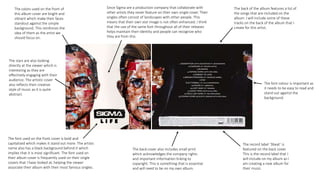
1. The font used on the front cover is bold and
capitalized which makes it stand out more. The artists
name also has a black background behind it which
implies that it is most significant. The font used on
their album cover is frequently used on their single
covers that I have looked at, helping the viewer
associate their album with their most famous singles.
The colors used on the front of
this album cover are bright and
vibrant which make their faces
standout against the simple
background. This reinforces the
idea of them as the artist we
should focus on.
The back of the album features a list of
the songs that are included on the
album. I will include some of these
tracks on the back of the album that I
create for this artist.
The record label ‘3beat’ is
featured on the back cover.
This is the record label that I
will include on my album as I
am creating a new album for
their music.
The stars are also looking
directly at the viewer which is
interesting as they are
effectively engaging with their
audience. The artistic cover
also reflects their creative
style of music as it is quite
abstract.
The back cover also includes small print
which acknowledges the company rights
and important information linking to
copyright. This is something that is essential
and will need to be on my own album.
Since Sigma are a production company that collaborate with
other artists they never feature on their own single cover. Their
singles often consist of landscapes with other people. This
means that their own star image is not often enhanced. I think
that the use of the same font throughout all of their releases
helps maintain their identity and people can recognize who
they are from this.
The font colour is important as
it needs to be easy to read and
stand out against the
background.