
Recommended
More Related Content
What's hot
What's hot (20)
Viewers also liked
Viewers also liked (11)
Similar to Adele 21, Digipak Analysis
Similar to Adele 21, Digipak Analysis (20)
Recently uploaded
Recently uploaded (20)
Adele 21, Digipak Analysis
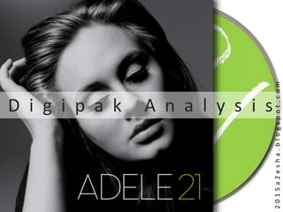
- 1. D i g i p a k A n a l y s i s 2015a2esha.blogspot.com
- 2. The artist’s name and face is prominent on the cover. This makes it very clear for audiences who the artist is and what is on offer. The colour palette is dark, but mixed with whites, greys and a pop of green makes it is oddly contemporary. An old and new union could also be descriptive of her musical style. The use of dark tones adds a vintage and aged feel. The result is very ‘classic’ for the genre, especially a female artist. The black and white/sepia, aged look could be suggesting that Adele is a well established artist. It could also be a reflection of her music being capable of lasting for years after its release. Or at least this is hinted at the audience. 21 being Adele’s second studio album, the digipak gives a more established feel than the first. Both albums reflect an age, and so 21 could be considered as older and wiser to its predecessor. A vinyl version of the album was also released alongside this CD version, appealing to a mainstream and more niche audience. The aged look and suggested longevity of the album is again insinuated for the audience. F r o n t : The front cover is not busy; the simplicity creates a raw and fresh look can be related to the type of artist Adele is portrayed as and the songs that are on the album.
- 3. 1 2
- 4. 1 The exposed eyelids draws attention to the heavy make-up, typical of female artists. The whole look is very classic with clean lines and the winged eyeliner adds a ‘vintage’ Hollywood feel. Adele does not directly address the audience, instead she looks down. This is fitting with the tracks on the album as they are directly addressed to a particular individual. The posing and body language adds a sense of stardom. It could be described as sombre, reflective of the tracks. This is all conventional of the genre. The costume is dark and no details can be picked out. This ensures that nothing else detracts from Adele herself as the main focal point and selling point. The pose that Adele strikes was spoofed multiple times, adding to the ‘iconic’ and ‘age old’ feel that the album is trying to portray. Further publicity was an added plus.
- 5. 2 The modern and clean sans serif font contrasts the worn and vintage effect that has been added to the rest of the front cover. The white makes the text stand out, even more so as it looks brighter than the light grey tones found in the image. The green however is completely different from the colour palette in the image. It again stands out and adds a contemporary and lively feel, reflecting the stereotype of the age 21. The thing lines of the font add to the already present simplicity of the artist’s and album’s name. The large size of the font ensures that it is the first thing that audiences notice, immediately informing them of the crucial information. The same style is evident in Adele’s previous album cover, with the bold white name and coloured title. This subconsciously connects Adele’s work for audiences. 21 looks older, intentionally as it is the second album.
- 6. B a c k & S p i n e s : The artist’s face also features on the back cover, this time not centred as it is not the most significant information, upstaged by the track list. The less desirable but equally important information is delegated to the bottom of the cover, and is much smaller. It is similar to a credit block. All of this information conforms to the colour scheme and does not incorporate the accent colour, making it even more subtle. The black and white/sepia, aged theme continues to the back and the spines of the digipak. The continues colour theme on the outer sides gives a feeling of completeness. The spines both face inwards, matching any other digipaks users may have on their shelves. The song titles suggest what mood the album is and this is reflected in the colour scheme of the album cover. The background is lit centrally, drawing the eye to where the information is.
- 7. 1 2 3 4
- 8. 1 The tracklist is the most important information on the back cover and a conventional use of the back panel. The text is centred, creating a cleaner look. The colour scheme of the artist name and album name from the front panel continues here, with the green accent colour numbering the tracks. The capitalisation of each letter is also part of that style. The numbers are in a smaller font size as they are not the most significant piece of information. The song titles suggest what mood the album is and this is reflected in the colour scheme of the album cover. They also suggest multiple meanings about Adele’s facial expression which is to the right of this tracklist. The length in time of each track is not listed, which is conventional of other digipaks. Perhaps this is elsewhere in the package. The tracklist is sandwiched by two songs that were released as singles before the release of the full album. This may be to create familiarity with audiences and aid recognition of who the artist is and why they should buy the album.
- 9. 2 3 The logo of the label on which the album was released on is in the bottom left of the back cover. The logo is small and discreet. ℗ = Sound recording copyright symbol. © = Copyright symbol, for works other than sound recordings. The Label Code (LC) was introduced in 1977 in order to unmistakably identify the different record labels . Subsidiaries do not necessarily have their own codes and often use that of the parent company. This code is for XL Recordings. The barcode is in the bottom left and positioned horizontally. It is conventional to be placed on the back panel. Both the artist’s website and the record label’s website is featured. The artist’s name and album name are styled in exactly the same way as they are on the front cover. This continuity makes the package feel whole. The spines are completely black and not exposed to the lighted backgrounds of the front and back covers. The catalogue no. is the identification no. a label assigns to a release. It is used for tracking purposes by both the label and the distributor. The spines are relatively empty, making it easier to pick the album out from a shelved storage position.
- 10. 4 Like the front cover Adele is also present on the back., again consolidating herself as the artist. This photo looks like it is from the same shoot as the previous shot of Adele. Although, the make-up looks different in the lighting and with Adele’s eyes open. Adele does directly address the audience, looking straight down the lens of the camera. Her expression is more neutral. This could almost be rewarding audiences who have picked up the digipak and turned to the back cover to see the tracklist and/or the price. The costume in this photo is also dark and no details can be picked out. This ensures that nothing else detracts from Adele herself as the main focal point and selling point.
- 11. D i s k : The disk itself is very different to the exterior of the digipak. It has a very contemporary feel, whereas the cover tries to recreate a ‘classic’ look. The green colour was used sparingly on the cover as an accent, but here it is the applied all over. 21 is prominent over the entire CD, as the font replicates a brush stroke or chalk. Again, juxtaposing the exterior of the digipak. The younger look if this disk reflects the age 21 and reminding that Adele is still early in her career, however deceptive the cover may be. The label’s logo along with the same copyright information from the back cover appear again here. This is a conventional practice.