Durg CALL GIRL ❤ 82729*64427❤ CALL GIRLS IN durg ESCORTS
Media Studies AS Evaluation
1. Developing and Challenging Conventions
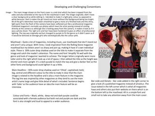
Image – The main image shown on the front cover is a mid shot which has been cropped from the
sides and also extended at the top to fit the masthead in well. The image originally didn’t have
a clear background so while editing it, I decided to make it a light grey colour as opposed to
white because I feel it makes the girl stand out more without the background being too bright.
All of the girl’s blemishes have been smoothed to give a more of a finished look and the shiny,
light parts from the flash of the camera have been softened just like a professional magazine.
Published magazine’s normally use photos which have the artist posing instead of smiling
directly at the camera so although she is looking away from the camera, it makes it look as if it
was a photo shoot. The right arm and hair have been hardened to give an effect of professional
lighting. The top was originally red but changed to purple to fit the genre so it didn’t seem as if
it would be directed at teenage girls who stereotypically like the colour pink.
Masthead – Quite a lot of magazines, including music, use mastheads that don’t stand out
and aren’t very unique. With mine, I took inspiration from the Rolling Stone magazine
masthead but my letters aren’t as sharp and join up, making it have it’s own individual
style. These is 3Dfx outer drop shadow used on the title to make it separate from the
image and catch the reader’s attention. The name and font ‘Amplify’ fit well with the
genre and look of magazine I wanted to achieve. The longer letters originally were more
taller and to the right which took up a lot of space, I then edited the title so the height was
shorter and more upright. It’s a dark purple to match the top and give a darker feel so the
other fonts and background could lighten it up a little.
Colour and Fonts – Black, white, deep red and dark purple could be
associated with a female audience but both red and purple are dark and the
font is also straight and loud to appeal to a wider audience.
Main Headline – 3Dfx outer drop shadow used on ‘Chloé’, capitalised, bold,
big, central and different colour to the title to make it clear that the main
image is related to the headline and is also a main feature in the magazine.
The tag line was inspired by other magazines as they tend to use the main
artist’s name large and give little detail of what’s included. Sentence begins
with ‘talks’ so the audience have an idea the main feature will be an
interview.
Bar code and Details – Bar code added in the right corner to
give a look of a published magazine instead of amateur. The
issue stated in the left corner which is what all magazines
have and others also put their website on there which is on
the bottom left to the masthead. All in a simple font and
small not to take any attention away from the main cover.
2. Developing and Challenging Conventions
Images – The black and white image has been
edited the most, using the spot healing
blush to soften the skin and get rid of all
the blemishes and then brightness and
contrast was used after the black and
white effects to add more effect. The
images bring more variety to the page
and a visual for the audience to make it
more interesting.
Title – The ‘content’s is bold and white with a highlighted purple
background, no effects to keep it simple but effective and
also has a similar feel to the logo of the magazine because
of the curly, soft edges and letters.
Fonts – The titles for the sections have a
similar font as the contents page to
keep a running theme and then the
font for the information is simple and
small as it doesn’t need that much
attention because it’s the
information.
Sections and Numbers – It’s split into
sections of Features, Monthly
and Competitions to show the
reader what is included inside
the magazine, this is just like
very other contents page. The
numbers stand out the most to
make it clear what page each
feature is.
Logo – On other contents pages I have seen, the logo is
normally small and somewhere near the top or
next to ‘Contents’ but it’s placed on the bottom
right because otherwise it would be too
cramped so gives an organised feel.
Colours – The colour scheme carries on from the front cover,
using purple (the main colour of the magazine; logo),
dark red, black and white but with a darker grey
background. The other contents pages that I have
looked at normally do have the same colour scheme
as the front cover but sometimes may change it if it’s
a special edition or something like that, it also keeps
it neat.
3. Developing and Challenging Conventions
Logo and Page Numbers – Again, the
logo is shown in the bottom right
like a lot of the magazine I had
studied so it added a professional
feel to it and makes it obvious,
along with the page numbers,
that it belongs in a magazine.
Image – The image shown on the
right hasn’t had much editing
done to it because I felt that not
much needed to be done. The
background is different from any
other photos in interviews
because they will normally be a
plain background that sometimes
is also the background for the
text but making it separate still
worked as well.
Font – The text for her name is very large and clear to make it
obvious of who the article is referring to, also relating to the
image on the right. The font for the beginning paragraph and sub
line are both the same to mix it up a little and also separate the
interview from the main title. The font for the interview is plain
and simple like a lot of other magazines because it is the
information and the detail so doesn’t have to be fancy for people
to want to read it.
Colour – The colour scheme is
slightly different from the rest of
the magazine for edge and style. It
also contrasts with the picture
because the image was meant to
reflect her being a girl wearing the
dress but being edgy, wearing
converse, a denim jacket and
jewellery but because it was more
subtle than I intended, it was
important for the colours to oppose
the picture.
4. Representation
• My intentions for the magazine was to make it an alternative, indie, pop rock magazine but because I had a lot of ideas for it, it
didn’t have one generic or obvious style because I based it mostly on my music taste but because I like a bit of everything, I
couldn’t choose a particular one. This made it difficult to define the genre and although it’s completed, I would call it an indie
rock/pop rock magazine so it has a mixture of styles.
• I didn’t take inspiration from one particular magazine because I looked more at the structure and layout of different music
magazines to decide what I wanted to do with mine. This means that my magazine has a lot of variety and different styles, it’s
definitely individual because the genre is unique to any published magazine and doesn’t have all the same features as the same
magazine because it’s a lot of different styles incorporated with my own.
• The main front cover image took a lot of editing to get how it is but because I took a lot of time perfecting it, I didn’t take into
consideration the defined style of the magazine and when I had finished editing it, I realised the image could be more suited to a
pop magazine because her lips were bright pink, her top looked pink although it was red and the background was white. However,
her outfit was quite edgy and in keeping with the style of the magazine; with a vest top and a rocky, leather, black gilet. I felt that
pink is stereotypically a girly colour not associated with indie rock, so it wouldn’t appeal to boys and the audience of music taste I
wanted it to appeal to. To change this, I change her top to a dark blue, purple to appeal to a further male audience and made the
background a light grey for individuality. I kept her lips bright pink for a contrast of the dark colours on the cover and in her
clothes.
• The font of the title has already been spoken about in Developing and Challenging Conventions but the reason I chose it was
because It wasn’t too loud and ‘rock’ but it also wasn’t pretty or ‘pop’ so it was a good in between. I also felt it was associated
with indie rock because the name ‘amplify’ is related to guitars and turning up music, it also has a similar style to the popular Amp
company ‘Marshall’ so again can be associated to that similar font.
• The images in the contents page represented both the style and contexts of the magazine. The image of the artist also shown on
the front cover, in black and white, looking as though she is screaming represents the genre of the magazine by showing an edgier
style and making it more intriguing. The picture of a concert represents the context of the magazine and shows what is included
so doesn’t give much away about the style of the magazine.
• The image in the double page spread has also been talked about but I felt it doesn’t represent the magazine’s style because she
looks more girly than first intended, however her pose makes it a bit more stylish and contrasts what she is wearing. The colour
for the double page spread is interesting because it’s very bright and eye catching but makes it a lot more interesting and brings
the unique style of the magazine back into it.
5. Institutions
• I believe that there are very little alternative, indie rock, pop rock magazines in the market, if any. I think there is definitely a
massive place in the market for my magazine because it has a unique style to any other music magazine published and gives a
chance for the artists looked past for not fitting a particular category of magazines to be interviewed and share their story and
music to a wider audience. The closest magazines related to mine will have to be Kerrang! And NME. The reason for this being, is
because they both offer a chance for different music and styles to come together but yet they still aren’t as close to mine.
• IPC Media Ltd (International Publishing Corporation) is a British magazine and digital publisher based in the UK, a subsidiary of
Time Inc and sells over 350 million copies a year. It has three separate magazine divisions focusing on different target audiences;
Connect for women (Teen Now, Woman’s Own, Now, Pick Me Up!), Southbank for upmarket women (Marie Claire, InStyle, Look,
Essentials) and Inspire for men (Country Life, The Field, Shooting Times, NME).
• Bauer Media Group is a media company popular amongst a total of 16 countries but based in Germany. It was founded in 1875
and sell around 38 million magazines weekly. As well a owning a number of Television channels, it publishes well known
magazines such as Take a Break and music magazines; Q, Mojo and Kerrang!
• Emap International Limited is a British media company specialising in publication of magazines and media conferences. The
magazines they produce include; Architects Journal, Broadcast, Nursing Times and Retail Week.
• My music magazine is very unique in the sense that it gives a chance for bands such as The 1975 and The Neighbourhood, with
big fan bases to be noticed by not only their fans but an even larger target audience as they aren’t heavily featured in any
magazines because they don’t have the right style or genre of music. My magazine offers a chance of individuality and
togetherness by bringing the misfits and different people together in one place to enjoy the one thing they all love; music.
6. Target Audience
• It is important for any form of media to have a planned or directed target audience so they can specify elements of what they are
doing knowing that there will be a high demographic of particular ages buying that product. Although the company can’t be sure
that everyone that age or of those interests will like the product, or even people of different ages and interests to the required
target audience, it’s still important to have an original structure to base it around. This is will have to be done stereotypically and
generically to have a rough idea of the type of audience they want to aim for. Especially when coming to music magazines because
when the style is of one genre, than obviously it will appeal to an audience of that music taste and that’s where age plays a big
part in target audience.
• My aimed target audience for my magazine are young adults of both genders, between the ages roughly of 16 – 30. My reason for
choosing this age gap is because indie rock has become increasingly popular recently in today’s music industry, however, as it has
modernised and updated slightly, with bands such as The 1975 being noticed, a new audience would have been created but
formed out of music genre’s such as pop rock, alternative and indie.
• The reason why I’ve chosen this target group is because I have similar interests and I fit into the age criteria so it’s easier to base it
roughly around my tastes and what I like but also think about it amongst a large amount of people as not everyone it’s aimed for
will be exactly the same. This is important when it comes to gender because I am aiming it at both gender’s but it’s harder to
know what the other gender will want, this is why it’s based around stereotype, therefore it’s easier to structure the magazine
around the style and genre of music it’s aimed at, in this case; indie rock/alternative.
• I made a questionnaire when I made the original title to see if the general target audience liked and understand the style of music
the magazine would be aimed at. The questionnaire was given to an audience of 16 – 18, which is the younger target audience, to
get a wider idea of the variety of ages who would read the magazine like I intended.
7. Attracting an Audience
• Colour – The main colour scheme for the front cover and contents page was dark red, dark purple, black and white. The reason I
chose these colours to attract an audience of 16 – 30 year olds in to Indie Rock is because they aren’t bright and overwhelming
but it’s also not too dark or boring, therefore attracting a good in between. Purple is the main colour of the magazine, being used
for the title, although it can be seen as a stereotypically ‘girly’ colour, it isn’t used in a girly manner because it’s a deep colour, as
an alternative to black which will be too much but it’s also an ‘underrated’ colour because magazines tend to use colours in a
gender-biased way or too make it more attractive, but the purple gives a different element to it and does attract a youthful
audience because of the colour.
• Images – The front cover image is of a girl, which can be more appealing to females because they want a role model to look up to
and tend to take more interest in them instead of just looking at pictures of them. This is also why it appeals to boys as well
because some will be interested her as an artist but others will find her attractive, which will draw them to the magazine and then
they may find that they actually want to read on and buy it. The image of the concert in the contents page attracts the audience
based on their interests because if they like concert reviews or looking at images from concerts, then they will find it interesting.
• Font – My main font for the title attracts the target audience as it has a similar font to Rolling Stone magazine which has an
audience of about the same age but the style is different because it’s more of a variety whereas mine isn’t very flexible and is
mainly targeted at indie/rock. The cover line fonts give an effect of shouting to have that effect on the reader and feel as if the
magazine is drawing them in.
• Cover lines – The cover lines on the front cover can attract a wider audience because they may be interested in different features
of the magazine which will interest them. For example, on the cover it tells the audience about a completion ‘score free concert
entry’ which can draw an audience of it’s own that are interested in that competition. A main attraction of the magazine is the
artist featured on the cover, in this issue, she is well known and already has a fan base from her well known band, therefore it will
attract their fans who will be of a similar style of the magazine anyway and the demographic.
8. Technologies
• The camera I used was a Nikon D7000, I originally wasn’t going to use it but as it is of a higher standard than the one I was going
to use, it meant that the picture’s came out of a professional standard. However, a problem with the camera was that if the flash
wasn’t on, the picture would come out a bit dull, regardless of the lighting but when it was on flash, it would leave the person in
the image, looking very shiny and you could see where the flash had got parts of the skin. Luckily, this could be smoothed out on
Photoshop.
• Photoshop CC was used for this particular project. As Photoshop is of a very high standard, it meant that all of the images could
be perfected but it would take time to learn how to do it and also the process was difficult too because it was complex. I used this
programme for my front cover and an image used in the contents page, I personally feel they came out the best compared to the
other features. In my front cover image, I used the programme to remove any blemishes and the shininess from the flash on the
camera on the girl, this gave a smooth look. I also tanned her skin slightly so she didn’t look washed out from the lights around
and on the camera. The whole girl was hardened to be more in focus and in a clearer image for the audience to notice her
features more. The whole background was covered over with to give the effect of a professional backdrop, this also looked more
realistic as the shadow of the girl was still kept from the original image. In the main headline and the title, I used an outer shadow
to give a 3 dimensional effect to both words and make them known that they were the main attraction on the front cover (besides
the image).
• I also used Microsoft Office Publisher for my double page spread and contents page. As it isn’t as technical as Photoshop CC, there
wasn’t as much time and effort gone into the process of making each feature. This meant it had a lot of limitations in comparison
to Photoshop because you couldn’t edit photos, remove backgrounds, add effects and so on.
• The internet played a very big and helpful part in the making of my music magazine because it meant I could do a lot of research
prior and during the process. When we were first assigned our coursework, I researched for a lot of fonts to use for the title and
cover lines, where I found them all on the internet. I also looked for inspiration and examples online of professional, published
music magazines, some similar to mine but some just for the overall structure.
9. Skill Improvement
• At the beginning of the assignment, I had never used Photoshop before or had to make a magazine so it was very difficult at the
beginning but once I go used to the equipment, it gradually became easier but it was never easy.
• I wasn’t used to the programme I was using so not only was I doing something I hadn’t done before but I was doing it on
something I didn’t know how to use. My Photoshop skills were very limited at the start as it was only the simple tools I could
used, I found it helpful to search online how to do particular techniques but I had to learn it that way instead of learning which
individual tab did what.
• I already knew how to use Publisher as it doesn’t have many complexities like Photoshop and when I did my work on the
application, is was very quick and easy to do. However, because it’s very easy to use, there wasn’t much skill I needed to have so
the improvements on the magazine weren’t drastic.
• At the start of the year, before we had used the equipment and applications for our music magazines, we had a preliminary task
to make a front cover for a school magazine. I made it on publisher so the design and fonts are very simple, it is also incomplete
but gives a rough idea of the skill I had at the beginning of the year.
• In comparison to my completed front cover, the first, school magazine has a blurred image with an unprofessional looking
background. The fonts are also very simple and the colours are too bright. It’s definitely fair to say I have made many
improvements and learnt different skills of editing software which have come in handy.