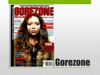
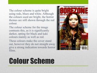
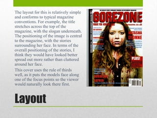
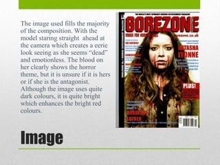
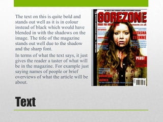
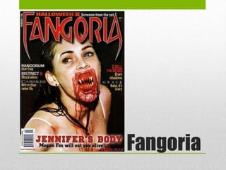
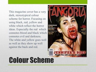
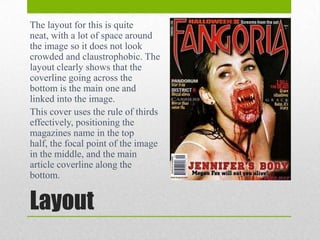
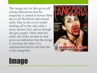
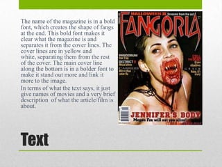
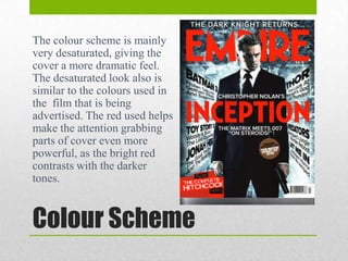
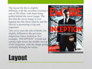
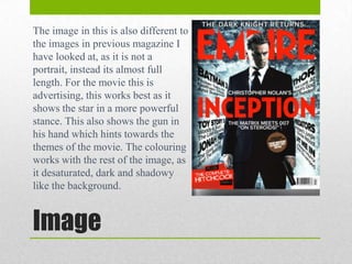
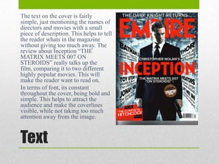
Magazine Covers
Alice Sophie Turrell
Gorezone
The colour scheme is quite bright
using reds, blues and white. Although
the colours used are bright, the horror
themes are still shown through the red
colour.
The colour scheme for the image
contrasts this, as it is significantly
darker, opting for black and kaki
colours mainly as well as red.
These colours make the cover stand
out, however they do not straight away
give a strong indication towards horror
films.

Colour Scheme
The layout for this is relatively simple
and conforms to typical magazine
conventions. For example, the title
stretches across the top of the
magazine, with the slogan underneath.
The positioning of the image is central
to the magazine, with the stories
surrounding her face. In terms of the
overall positioning of the stories, I
think they would have looked better
spread out more rather than cluttered
around her face.
This cover uses the rule of thirds
well, as it puts the models face along
one of the focus points so the viewer
would naturally look there first.

Layout
The image used fills the majority
of the composition. With the
model staring straight ahead at
the camera which creates a eerie
look seeing as she seems “dead”
and emotionless. The blood on
her clearly shows the horror
theme, but it is unsure if it is hers
or if she is the antagonist.
Although the image uses quite
dark colours, it is quite bright
which enhances the bright red
colours.

Image
The text on this is quite bold and
stands out well as it is in colour
instead of black which would have
blended in with the shadows on the
image. The title of the magazine
stands out well due to the shadow
and the sharp font.
In terms of what the text says, it just
gives the reader a taster of what will
be in the magazine. For example just
saying names of people or brief
overviews of what the article will be
about.

Text
Fangoria
This magazine cover has a very
dark, stereotypical colour
scheme for horror. Focusing on
using black, red, yellow and
white which reflect the horror
ideas. Especially the red which
connotes blood and black which
connotes evil and darkness.
The white and yellow goes well
as well as they show up well
against the back and red.

Colour Scheme
The layout for this is quite
neat, with a lot of space around
the image so it does not look
crowded and claustrophobic. The
layout clearly shows that the
coverline going across the
bottom is the main one and
linked into the image.
This cover uses the rule of thirds
effectively, positioning the
magazines name in the top
half, the focal point of the image
in the middle, and the main
article coverline along the
bottom.

Layout
The image use for this gives off
strong indications that the
magazine is aimed at horror films
due to all the blood and animal
teeth. Due to the cover model
looking off to the side adds a
more sinister feel, and as though
she got caught. Other than the
teeth, she looks normal so that
gives an indication that the image
is showing the ideas of a
supernatural horror and that she
is the antagonist.

Image
The name of the magazine is in a bold
font, which creates the shape of fangs
at the end. This bold font makes it
clear what the magazine is and
separates it from the cover lines. The
cover lines are in yellow and
white, separating them from the rest
of the cover. The main cover line
along the bottom is in a bolder font to
make it stand out more and link it
more to the image.
In terms of what the text says, it just
give names of movies and a very brief
description of what the article/film is
about.

Text
Empire
The colour scheme is mainly
very desaturated, giving the
cover a more dramatic feel.
The desaturated look also is
similar to the colours used in
the film that is being
advertised. The red used helps
make the attention grabbing
parts of cover even more
powerful, as the bright red
contrasts with the darker
tones.

Colour Scheme
The layout for this is slightly
different, with the coverline creating a
sort of 3D effect, with them being
pulled behind the cover image. The
fact that the cover image is over
lapping the title shows that he and the
film he is promoting is big and
important.
This cover uses the rule of thirds, but
slightly different to the previous
magazines I have looked at. For
example, “INCEPTION” is bold and
cutting right across the middle section
of the magazine, with the image going
vertically through the centre.

Layout
The image in this is also different to
the images in previous magazine I
have looked at, as it is not a
portrait, instead its almost full
length. For the movie this is
advertising, this works best as it
shows the star in a more powerful
stance. This also shows the gun in
his hand which hints towards the
themes of the movie. The colouring
works with the rest of the image, as
it desaturated, dark and shadowy
like the background.

Image
The text on the cover is fairly
simple, just mentioning the names of
directors and movies with a small
piece of description. This helps to tell
the reader whats in the magazine
without giving too much away. The
review about Inception “THE
MATRIX MEETS 007 ON
STEROIDS” really talks up the
film, comparing it to two different
highly popular movies. This will
make the reader want to read on.
In terms of font, its constant
throughout the cover, being bold and
simple. This helps to attract the
audience and make the coverlines
visible, while not taking too much
attention away from the image.

Text

Magazine Covers

  • 1.
  • 2.
  • 3.
    The colour schemeis quite bright using reds, blues and white. Although the colours used are bright, the horror themes are still shown through the red colour. The colour scheme for the image contrasts this, as it is significantly darker, opting for black and kaki colours mainly as well as red. These colours make the cover stand out, however they do not straight away give a strong indication towards horror films. Colour Scheme
  • 4.
    The layout forthis is relatively simple and conforms to typical magazine conventions. For example, the title stretches across the top of the magazine, with the slogan underneath. The positioning of the image is central to the magazine, with the stories surrounding her face. In terms of the overall positioning of the stories, I think they would have looked better spread out more rather than cluttered around her face. This cover uses the rule of thirds well, as it puts the models face along one of the focus points so the viewer would naturally look there first. Layout
  • 5.
    The image usedfills the majority of the composition. With the model staring straight ahead at the camera which creates a eerie look seeing as she seems “dead” and emotionless. The blood on her clearly shows the horror theme, but it is unsure if it is hers or if she is the antagonist. Although the image uses quite dark colours, it is quite bright which enhances the bright red colours. Image
  • 6.
    The text onthis is quite bold and stands out well as it is in colour instead of black which would have blended in with the shadows on the image. The title of the magazine stands out well due to the shadow and the sharp font. In terms of what the text says, it just gives the reader a taster of what will be in the magazine. For example just saying names of people or brief overviews of what the article will be about. Text
  • 7.
  • 8.
    This magazine coverhas a very dark, stereotypical colour scheme for horror. Focusing on using black, red, yellow and white which reflect the horror ideas. Especially the red which connotes blood and black which connotes evil and darkness. The white and yellow goes well as well as they show up well against the back and red. Colour Scheme
  • 9.
    The layout forthis is quite neat, with a lot of space around the image so it does not look crowded and claustrophobic. The layout clearly shows that the coverline going across the bottom is the main one and linked into the image. This cover uses the rule of thirds effectively, positioning the magazines name in the top half, the focal point of the image in the middle, and the main article coverline along the bottom. Layout
  • 10.
    The image usefor this gives off strong indications that the magazine is aimed at horror films due to all the blood and animal teeth. Due to the cover model looking off to the side adds a more sinister feel, and as though she got caught. Other than the teeth, she looks normal so that gives an indication that the image is showing the ideas of a supernatural horror and that she is the antagonist. Image
  • 11.
    The name ofthe magazine is in a bold font, which creates the shape of fangs at the end. This bold font makes it clear what the magazine is and separates it from the cover lines. The cover lines are in yellow and white, separating them from the rest of the cover. The main cover line along the bottom is in a bolder font to make it stand out more and link it more to the image. In terms of what the text says, it just give names of movies and a very brief description of what the article/film is about. Text
  • 12.
  • 13.
    The colour schemeis mainly very desaturated, giving the cover a more dramatic feel. The desaturated look also is similar to the colours used in the film that is being advertised. The red used helps make the attention grabbing parts of cover even more powerful, as the bright red contrasts with the darker tones. Colour Scheme
  • 14.
    The layout forthis is slightly different, with the coverline creating a sort of 3D effect, with them being pulled behind the cover image. The fact that the cover image is over lapping the title shows that he and the film he is promoting is big and important. This cover uses the rule of thirds, but slightly different to the previous magazines I have looked at. For example, “INCEPTION” is bold and cutting right across the middle section of the magazine, with the image going vertically through the centre. Layout
  • 15.
    The image inthis is also different to the images in previous magazine I have looked at, as it is not a portrait, instead its almost full length. For the movie this is advertising, this works best as it shows the star in a more powerful stance. This also shows the gun in his hand which hints towards the themes of the movie. The colouring works with the rest of the image, as it desaturated, dark and shadowy like the background. Image
  • 16.
    The text onthe cover is fairly simple, just mentioning the names of directors and movies with a small piece of description. This helps to tell the reader whats in the magazine without giving too much away. The review about Inception “THE MATRIX MEETS 007 ON STEROIDS” really talks up the film, comparing it to two different highly popular movies. This will make the reader want to read on. In terms of font, its constant throughout the cover, being bold and simple. This helps to attract the audience and make the coverlines visible, while not taking too much attention away from the image. Text