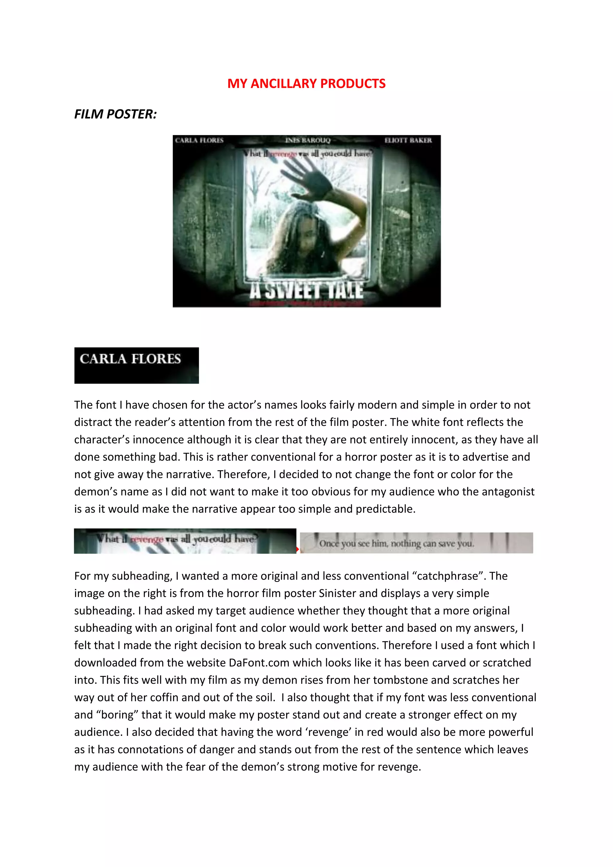
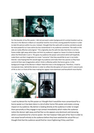
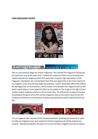
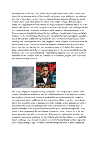
The document discusses the design choices made for ancillary products promoting a horror film, including a film poster and magazine cover. For the film poster, a conventional font was used for actors' names but not the demon's to avoid revealing the antagonist. An original "carved" font was used for the subheading to stand out. Scratched walls in the background leave the time frame open for audience imagination. A demon image is used as the main visual as it is conventional for horror posters. For the magazine cover, a conventional slogan and red color were used but with original glowing and font effects. A smoky forest background fits the horror genre while not revealing the time period. Both the poster and cover use direct eye contact from characters


![Evaluation teaser trailer[1]](https://cdn.slidesharecdn.com/ss_thumbnails/evaluationteasertrailer1-120329060048-phpapp01-thumbnail.jpg?width=640&height=640&fit=bounds)


