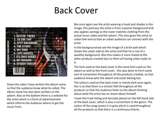
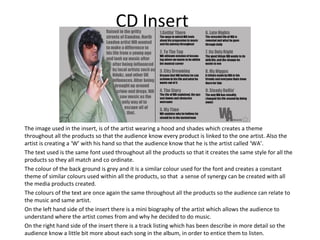
How effective is the combination of
 your main product and ancillary
               texts?


             Rahul Yadev
Main Products And Ancillary Text
My main product which we had to do was a music promo video as a promotional
package for the release of an album.
The ancillary texts which we had to also do to be part of the package was a CD
cover (Front, Back, Insert Booklet) and also an advert for a magazine.
In order to create all these products I had to carry out research that would look at
the forms and conventions of current media products and try and adapt or
challenge them conventions so that it would attract my target market.
I wanted to create a video that had similar features to the rest of the videos in the
genre but have slight differences. I also wanted my artist to stand out and be
different compared to normal rap videos.
I wanted to create the ancillary text so that they weren't like all the others in the
category, this was done by using different sorts of images of the artist normally
used and the text was plain, bold and simple rather than an urban font, e.g. graffiti.
Also the colours used were dark, but done in such a way that my artist would stand
out.
http://www.youtube.com/watch?
v=_FRRT_YtgwY


                                  My
                                Products
Magazine Advert
       We can firstly see in the advert the brick wall which represents
       the artist is from the road, and therefore links to the video due
       to majority of the video being recorded on a road in central
       London. It also gives an urban feel to the advert and video. The
       same background was used to the back album cover.
       The text used is in simple block writing and in a dark shade of
       colour, this is due to making it seem sinister as rap music tends
       to be, and it also links to the video as there is little light during
       the video, and also the effect of writing on a brick wall gives
       the graffiti look and makes it look urban.
       The artist image used for the advert is the same one used for
       the back cover of my CD cover. This image represents the artist
       from being from the road, and from a poorer background who
       is trying to make some success, by showing of a ‘W’ sign rather
       than a gang sign, this relates to the video as the artist is talking
       about getting to a better destination and becoming successful,
       so the image represent him making a change.
       The release date is a convention which is used in most adverts
       as this is done to inform the audience when its released, this
       convention can be seen in Jay-Z’s advertisement.
       The way I chose the image for the advert is that I wanted it to
       link with the cover in some way so that the audience see a
       resemblance and it has a form of synergy and people will
       recognise where its from .
Front Cover
     We firstly see the artist wearing a hood and shades in the
     image, this portrays the artist is from a poorer background and
     also applies synergy as the cover matches clothing from the
     actual music video. This also gives the artist an urban feel and
     so that an urban audience can connect with the artist.
     In the background we see the image of London buses and Big
     Ben, which is similar to what we see in the video, as the video
     is based in London, this therefore shows synergy in the
     products as they share ideas of being in a high end place like
     Central London, and the artist wanting to live life in a high end
     place.
     I have also included a parental advisory logo as this warns
     audience that there is explicit content and this is a convention
     in rap music as explicit content can attract listeners of this
     genre.
     The font used on the front cover is the same font used on the
     advert, this was done to form some sort of synergy and so that
     there is a convention throughout all the products and that
     audience know who the advert and cover belong too.
     The colours used on the front cover as mainly dark and the
     image has been grey scaled so that it matches all the other
     products as they are all mainly dark with little lighting, this can
     give an image that the artist is hidden but trying to break out
     the poorer life.
Back Cover
                                                    We once again see the artist wearing a hood and shades in the
                                                    image, this portrays the artist is from a poorer background and
                                                    also applies synergy as the cover matches clothing from the
                                                    actual music video and the advert. This also gives the artist an
                                                    urban feel and so that an urban audience can connect with the
                                                    artist.
                                                    In the background we see the image of a brick wall which
                                                    shows the urban side to the artist and that he is not of a
                                                    wealthy background. Also this makes it more linked to the
                                                    other products created due to them all having urban looks to
                                                    it.
                                                    The font used on the back cover is the same font used on the
                                                    advert as well as the front cover. this was done to form some
                                                    sort of convention throughout all the products created, so that
                                                    audience know who the advert and cover belong too.
                                                    The colours used on the back cover is mainly dark once again,
Down the sides I have written the album name
                                                    this is so that there is a sinister feel throughout all the
so that the audience know what its called. The
                                                    products so that the audience listen to the album thinking
album name has also been written on the
                                                    about what the artist has to reveal about himself.
advert. Also at the bottom there is a website for
the artist which is a form of advertisement         I have the track listing and barcode placed on the left hand side
which informs the audience where to get the         of the back cover, which is also a convention in the genre. The
music from.                                         colour of the song names is in grey which is used throughout
                                                    all the products so that there is a continuous theme.
CD Insert


The image used in the insert, is of the artist wearing a hood and shades which creates a theme
throughout all the products so that the audience know every product is linked to the one artist. Also the
artist is creating a ‘W’ with his hand so that the audience know that he is the artist called ‘WA’.
The text used is the same font used throughout all the products so that it creates the same style for all the
products so they all match and co ordinate.
The colour of the back ground is grey and it is a similar colour used for the font and creates a constant
theme of similar colours used within all the products, so that a sense of synergy can be created with all
the media products created.
The colours of the text are once again the same throughout all the products so the audience can relate to
the music and same artist.
On the left hand side of the insert there is a mini biography of the artist which allows the audience to
understand where the artist comes from and why he decided to do music.
On the right hand side of the insert there is a track listing which has been describe in more detail so the
audience know a little bit more about each song in the album, in order to entice them to listen.
Conclusion About Effect Of
               Combination
I feel that the combination of the all the products created are very well blended
so that they create a sense of similar forms and conventions with each other, as
well as other real media products. The way all the colours used in every product
are similar with a dark shade but at times lighter colours used, this created a
continuous theme throughout every product so that the audience know when
they see them colours, who the work would belong too. The images used in all the
products all link to each other as the posture in each image are similar and give
the urban feel, with similar clothing worn in the products including the video. Also
the fact that the artist is creating a ‘W’ in the images used, this creates a branding
image which is linked to the artist so that the audience know it is linked to him.
Also I think that the locations used in the images all link the music video as the
locations in the images are a brick wall and a image of central London with a
landmark. This can also be seen in the video as the location of the video is in
Central London with a landmark in there too.

Q2

  • 1.
    How effective isthe combination of your main product and ancillary texts? Rahul Yadev
  • 2.
    Main Products AndAncillary Text My main product which we had to do was a music promo video as a promotional package for the release of an album. The ancillary texts which we had to also do to be part of the package was a CD cover (Front, Back, Insert Booklet) and also an advert for a magazine. In order to create all these products I had to carry out research that would look at the forms and conventions of current media products and try and adapt or challenge them conventions so that it would attract my target market. I wanted to create a video that had similar features to the rest of the videos in the genre but have slight differences. I also wanted my artist to stand out and be different compared to normal rap videos. I wanted to create the ancillary text so that they weren't like all the others in the category, this was done by using different sorts of images of the artist normally used and the text was plain, bold and simple rather than an urban font, e.g. graffiti. Also the colours used were dark, but done in such a way that my artist would stand out.
  • 3.
  • 4.
    Magazine Advert We can firstly see in the advert the brick wall which represents the artist is from the road, and therefore links to the video due to majority of the video being recorded on a road in central London. It also gives an urban feel to the advert and video. The same background was used to the back album cover. The text used is in simple block writing and in a dark shade of colour, this is due to making it seem sinister as rap music tends to be, and it also links to the video as there is little light during the video, and also the effect of writing on a brick wall gives the graffiti look and makes it look urban. The artist image used for the advert is the same one used for the back cover of my CD cover. This image represents the artist from being from the road, and from a poorer background who is trying to make some success, by showing of a ‘W’ sign rather than a gang sign, this relates to the video as the artist is talking about getting to a better destination and becoming successful, so the image represent him making a change. The release date is a convention which is used in most adverts as this is done to inform the audience when its released, this convention can be seen in Jay-Z’s advertisement. The way I chose the image for the advert is that I wanted it to link with the cover in some way so that the audience see a resemblance and it has a form of synergy and people will recognise where its from .
  • 5.
    Front Cover We firstly see the artist wearing a hood and shades in the image, this portrays the artist is from a poorer background and also applies synergy as the cover matches clothing from the actual music video. This also gives the artist an urban feel and so that an urban audience can connect with the artist. In the background we see the image of London buses and Big Ben, which is similar to what we see in the video, as the video is based in London, this therefore shows synergy in the products as they share ideas of being in a high end place like Central London, and the artist wanting to live life in a high end place. I have also included a parental advisory logo as this warns audience that there is explicit content and this is a convention in rap music as explicit content can attract listeners of this genre. The font used on the front cover is the same font used on the advert, this was done to form some sort of synergy and so that there is a convention throughout all the products and that audience know who the advert and cover belong too. The colours used on the front cover as mainly dark and the image has been grey scaled so that it matches all the other products as they are all mainly dark with little lighting, this can give an image that the artist is hidden but trying to break out the poorer life.
  • 6.
    Back Cover We once again see the artist wearing a hood and shades in the image, this portrays the artist is from a poorer background and also applies synergy as the cover matches clothing from the actual music video and the advert. This also gives the artist an urban feel and so that an urban audience can connect with the artist. In the background we see the image of a brick wall which shows the urban side to the artist and that he is not of a wealthy background. Also this makes it more linked to the other products created due to them all having urban looks to it. The font used on the back cover is the same font used on the advert as well as the front cover. this was done to form some sort of convention throughout all the products created, so that audience know who the advert and cover belong too. The colours used on the back cover is mainly dark once again, Down the sides I have written the album name this is so that there is a sinister feel throughout all the so that the audience know what its called. The products so that the audience listen to the album thinking album name has also been written on the about what the artist has to reveal about himself. advert. Also at the bottom there is a website for the artist which is a form of advertisement I have the track listing and barcode placed on the left hand side which informs the audience where to get the of the back cover, which is also a convention in the genre. The music from. colour of the song names is in grey which is used throughout all the products so that there is a continuous theme.
  • 7.
    CD Insert The imageused in the insert, is of the artist wearing a hood and shades which creates a theme throughout all the products so that the audience know every product is linked to the one artist. Also the artist is creating a ‘W’ with his hand so that the audience know that he is the artist called ‘WA’. The text used is the same font used throughout all the products so that it creates the same style for all the products so they all match and co ordinate. The colour of the back ground is grey and it is a similar colour used for the font and creates a constant theme of similar colours used within all the products, so that a sense of synergy can be created with all the media products created. The colours of the text are once again the same throughout all the products so the audience can relate to the music and same artist. On the left hand side of the insert there is a mini biography of the artist which allows the audience to understand where the artist comes from and why he decided to do music. On the right hand side of the insert there is a track listing which has been describe in more detail so the audience know a little bit more about each song in the album, in order to entice them to listen.
  • 8.
    Conclusion About EffectOf Combination I feel that the combination of the all the products created are very well blended so that they create a sense of similar forms and conventions with each other, as well as other real media products. The way all the colours used in every product are similar with a dark shade but at times lighter colours used, this created a continuous theme throughout every product so that the audience know when they see them colours, who the work would belong too. The images used in all the products all link to each other as the posture in each image are similar and give the urban feel, with similar clothing worn in the products including the video. Also the fact that the artist is creating a ‘W’ in the images used, this creates a branding image which is linked to the artist so that the audience know it is linked to him. Also I think that the locations used in the images all link the music video as the locations in the images are a brick wall and a image of central London with a landmark. This can also be seen in the video as the location of the video is in Central London with a landmark in there too.