Analysing Magazine Adverts
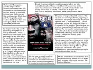
There is clear relationship between this magazine advert and other
 The layout of the magazine
                                                 material by this artist. The use of Serif font style is consistent for his
 advert is simple with the
                                                 name. The colour scheme of the advert uses dark colours which is seen
 information about the artist and
                                                 through out his work on albums. There is also an image of the
 the date of the concert aligned to
                                                 artist, directly addressing the audience, which is also common of this
 the right separate to the centred
                                                 artist.
 information at the bottom, so
 that most important details stand                                                    The choice of image of the artist- up close with
 out. The image takes up the                                                         half of his face showing is effective, suggesting to
 whole of the advert so there is no                                                  the audience that going to the concert they will see
 white space, which makes the                                                        the whole artist , a form of promoting . The font
 advert look professional.                                                           colours used contrast well against the image, for
                                                                                     clear reading by the audience. The artist name is in
                                                                                     large font to ensure that the audience don't miss
The designer makes this advert                                                       his name. The font style for his name appears the
eye catching through the use of a                                                    same in the artist other material creating a clear
close up of the artist , which                                                       brand identity. The image includes the artist
instantly drag the attention of the                                                  wearing a pricey watch showing genre
audience to the face of the artist.                                                  characteristics.
The use of contrasting colours is
also essential in drawing attention                                                  There is suggestion of genre characteristic in this
of the audience, as the colours                                                      advert is restricted compared to other material of
clearly distinguish the information                                                  the artist. Wealth is shown through the expensive
from the image. The information                                                      watch. But due to the close up of the image, the
is short but detailed enough for                                                     designer has not included much genre
the audience to know what the                                                        characteristics of the artist as a way of getting the
advert is about, helping promote                                                     audience come and see him live.
the artist effectively. The use of
blue on the advert stands out
alone, so the audience instant look     The star image is created through the             On this advert there is no information about
                                        close up shot of the artist and his               the music industry, it seems that this advert
in that direction and realise its the
                                        consistent font style for his name, these
brand identity of the artist, due to                                                      only promotes the place the concert of this
                                        two aspects appear over and over again
the consistent font style.                                                                artist will be held.
                                        in his material creating a brand identity.
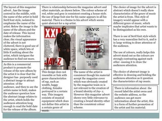
The layout of this magazine       There is relationship between the magazine advert and         The choice of image for the advert is
advert , has the image            other materials, as shown below. The colour scheme of         abstract which doesn't really show
centred in the middle, with       red, white and grey is consistent creating a house style.     characteristics of the genre of music
the name of the artist in bold    the use of large font size for his name appears in all his    the artist is from. This style of
Serif font style, isolated to     material. There is a theme to his advert which seems          imagery would appear with a
emphasise the name of the         quiet abstract for a rap artist.                              different genre of music, which
artist. Below the image is the                                                                  maybe implicates that artist wants to
name of the album and the                                                                       be distinguished as his own.
date of release. This layout
makes the information                                                                           There is use of Serif font style which
clear, the visual appearance                                                                    has a very masculine feel to it, and is
of the advert is not                                                                            in large writing to draw attention of
cluttered, there is good use of                                                                 the audience.
white space, which lets of
little if nothing about the                                                                     The use of colours, really helps this
artist, which intrigues the                                                                     advert stand out as the colours are
audience to find out more.                                                                      strongly contrasting against each
                                                                                                other causing it to draw the
As this is a commercial                                                                         audiences attention.
product to promote the
release of the new album by       This design does not        The name of the artist is         The choice of abstract image is
the artist it is clear that the   resemble or link with       consistent though his material    effective in drawing and holding the
designer has purposely used       genre characteristics       accept the magazine cover         audiences attention as it question
a abstract image to attract       of rap, such as             which was obviously created       the characteristics of rap music.
attention of the                  wealth, baggy               by the magazine team so is
audience, and then to see the     clothing, females           not relevant to the creation of    There is information about the
artists name in bold, makes       portrayed in a certain      a brand identity of Jay- z.        record label the artist owns and
the audience question how         way. This imagery           However this magazine advert       the website address, so the
the abstract image relates to     consists of musical         shows very little relevance to     audience can get more
the artist, which holds the       equipment which does        creating a brand identity other    information about the artist, this
audiences attention long          not define this artist in   than the consistent colour         is a form of further promotion of
enough to read the bold date      a certain genre of          scheme.                            the artist and his material.
for the release of the album.     music.

Analysing magazine adverts

  • 1.
  • 2.
    There is clearrelationship between this magazine advert and other The layout of the magazine material by this artist. The use of Serif font style is consistent for his advert is simple with the name. The colour scheme of the advert uses dark colours which is seen information about the artist and through out his work on albums. There is also an image of the the date of the concert aligned to artist, directly addressing the audience, which is also common of this the right separate to the centred artist. information at the bottom, so that most important details stand The choice of image of the artist- up close with out. The image takes up the half of his face showing is effective, suggesting to whole of the advert so there is no the audience that going to the concert they will see white space, which makes the the whole artist , a form of promoting . The font advert look professional. colours used contrast well against the image, for clear reading by the audience. The artist name is in large font to ensure that the audience don't miss The designer makes this advert his name. The font style for his name appears the eye catching through the use of a same in the artist other material creating a clear close up of the artist , which brand identity. The image includes the artist instantly drag the attention of the wearing a pricey watch showing genre audience to the face of the artist. characteristics. The use of contrasting colours is also essential in drawing attention There is suggestion of genre characteristic in this of the audience, as the colours advert is restricted compared to other material of clearly distinguish the information the artist. Wealth is shown through the expensive from the image. The information watch. But due to the close up of the image, the is short but detailed enough for designer has not included much genre the audience to know what the characteristics of the artist as a way of getting the advert is about, helping promote audience come and see him live. the artist effectively. The use of blue on the advert stands out alone, so the audience instant look The star image is created through the On this advert there is no information about close up shot of the artist and his the music industry, it seems that this advert in that direction and realise its the consistent font style for his name, these brand identity of the artist, due to only promotes the place the concert of this two aspects appear over and over again the consistent font style. artist will be held. in his material creating a brand identity.
  • 3.
    The layout ofthis magazine There is relationship between the magazine advert and The choice of image for the advert is advert , has the image other materials, as shown below. The colour scheme of abstract which doesn't really show centred in the middle, with red, white and grey is consistent creating a house style. characteristics of the genre of music the name of the artist in bold the use of large font size for his name appears in all his the artist is from. This style of Serif font style, isolated to material. There is a theme to his advert which seems imagery would appear with a emphasise the name of the quiet abstract for a rap artist. different genre of music, which artist. Below the image is the maybe implicates that artist wants to name of the album and the be distinguished as his own. date of release. This layout makes the information There is use of Serif font style which clear, the visual appearance has a very masculine feel to it, and is of the advert is not in large writing to draw attention of cluttered, there is good use of the audience. white space, which lets of little if nothing about the The use of colours, really helps this artist, which intrigues the advert stand out as the colours are audience to find out more. strongly contrasting against each other causing it to draw the As this is a commercial audiences attention. product to promote the release of the new album by This design does not The name of the artist is The choice of abstract image is the artist it is clear that the resemble or link with consistent though his material effective in drawing and holding the designer has purposely used genre characteristics accept the magazine cover audiences attention as it question a abstract image to attract of rap, such as which was obviously created the characteristics of rap music. attention of the wealth, baggy by the magazine team so is audience, and then to see the clothing, females not relevant to the creation of There is information about the artists name in bold, makes portrayed in a certain a brand identity of Jay- z. record label the artist owns and the audience question how way. This imagery However this magazine advert the website address, so the the abstract image relates to consists of musical shows very little relevance to audience can get more the artist, which holds the equipment which does creating a brand identity other information about the artist, this audiences attention long not define this artist in than the consistent colour is a form of further promotion of enough to read the bold date a certain genre of scheme. the artist and his material. for the release of the album. music.