
Recommended
More Related Content
What's hot
What's hot (19)
Similar to Media work 1.
Similar to Media work 1. (20)
Recently uploaded
Recently uploaded (20)
Media work 1.
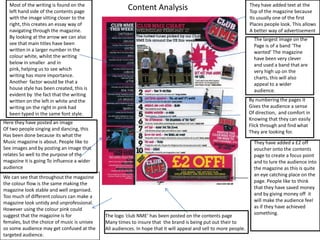
- 1. Most of the writing is found on the left hand side of the contents page with the image sitting closer to the right, this creates an essay way of navigating through the magazine. By looking at the arrow we can also see that main titles have been written in a larger number in the colour white, whilst the writing below in smaller and in pink, helping us to see which writing has more importance. Another factor would be that a house style has been created, this is evident by the fact that the writing written on the left in white and the writing on the right in pink had been typed in the same font style. They have added text at the Top of the magazine because Its usually one of the first Places people look. This allows A better way of advertisement Content Analysis The largest image on the Page is of a band ‘The wanted’ The magazine have been very clever and used a band that are very high up on the charts, this will also appeal to a wider audience. By numbering the pages it Gives the audience a sense Of direction, and comfort in Knowing that they can easily Flick through and find what They are looking for. Here they have posted an image Of two people singing and dancing, this Has been done because its what the Music magazine is about. People like to See images and by posting an image that relates So well to the purpose of the magazine it is going To influence a wider audience They have added a £2 off voucher onto the contents page to create a focus point and to lure the audience into the magazine as this is quite an eye catching place on the page. People like to think that they have saved money and by giving money off it will make the audience feel as if they have achieved something. We can see that throughout the magazine the colour flow is the same making the magazine look stable and well organised. Too much of different colours can make a magazine look untidy and unprofessional. However using the colour pink could suggest that the magazine is for females, but the choice of music is unisex so some audience may get confused at the targeted audience. The logo ‘club NME’ has been posted on the contents page Many times to insure that the brand is being put out their to All audiences. In hope that it will appeal and sell to more people.
- 2. The size of the title ‘contents’ Is there so show its audience that This is where you will be navigated around the magazine. It has been Made large so that people cant miss It. There is also a date just above it in a bout the same size writing, this is there to show there so that the audience know when the magazine was published. As the magazine appears to involve Lots of drumming, using more than One image of a drum set could excite The target audience making them More likely to read the magazine. Around the page we can see that There are many plotted images with Number on the top left hand side of Them, this has been done to make Working the magazine simple for Its readers. The numbers are there To navigate the reader to the page That they are interested in reading. By adding images it can sometimes Make finding what you are looking For more simple than reading Written information. The images are Connected to the numbers on the Right hand side of the page underneath ‘Features’. This could help people who Cant remember artists by name, the Images will support them. The colour flow of orange black And white seem to appeal more Towards a male audience.. The choice Of colours look quite dark and mysterious Making the page look quite dull. The colours However do tie in with the aim of the magazine which Is rock music.. So it seems that the magazine Is based on one specific audience. ‘Exclusive’ is a powerful word As people like to know and be Given information that isn't already Out in the open... A lot of people like Different. So using the word exclusive is clever because more people are going to want whatever it is that is ‘exclusive’ meaning that there will be more people watching the music channel and turning up at gigs. By adding so many images, It makes the page seem boring. There is little information to lure the reader in and there is nothing That would appeal to a wider audience.
- 3. The title ‘contents’ has been posted in three stages in very Large writing. This has been done to make the page look more Artistic as hip-hop and R&B is about being artistic, so they are trying To relate everything posted on the magazine to the music and The music artists. The text on this page is easy to read and sub headings are used to direct the readers to the different sections of the magazine. This magazine is divided into sub-divided contents. In this magazine the contents are divided into two main sections; Features and fashion. By splitting the two it appeals to a wider audience and allows people to navigate in a much more simple way ‘Vibe’ is the logo of the magazine, Usually the logo is written the largest In order to catch the readers eye and to Insure that they know who they are Getting their entertainment from. But in This case it has been written very small And in black, making it not the main focus The main focus on this page would be the very large image. we can see that the magazine is based on R&B as the man himself Is a rapper. He is showing off his wealth by flashing his different diamond necklaces as well as his diamond bracelets. He’s even topless showing off his grills and tattoos which is most focused in the Hip-Hop glamour world. With the three main colours Being red black and white The magazine looks much more Masculine , red usually connotes a sense of power or aggression but in the case of the magazine it seems to be power and strength. The large image of the main especially supports the idea of a masculine look in the magazine, however, the music is aimed at both men and women so in my opinion the colours could be toned down a little bit.