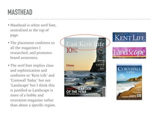
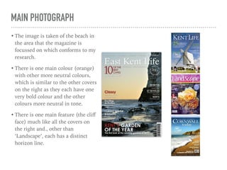
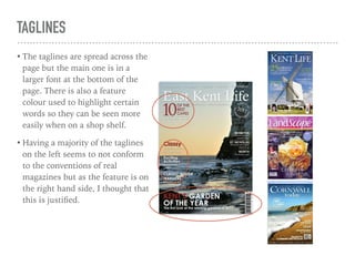
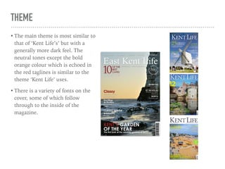
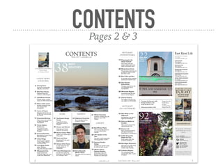
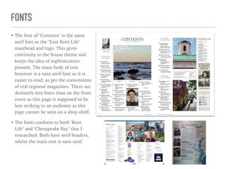
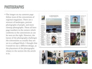
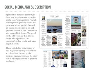
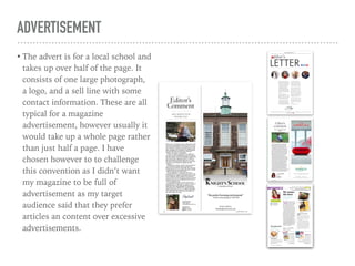
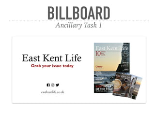
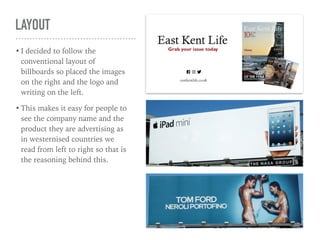
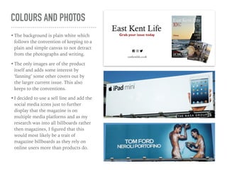
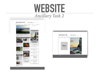
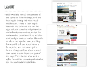
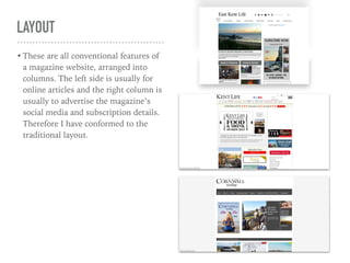
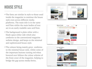
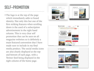
EVALUATION QUESTION 1
“In what ways does you media product use,
develop, or challenge forms and conventions of
real media products?”
THE FIRST FOUR PAGES FROM AN ORIGINAL REGIONAL MAGAZINE
FRONT
COVER
Page 1
MASTHEAD
• Masthead is white serif font,
centralised at the top of
page.
• The placement conforms to
all the magazines I
researched, and promotes
brand awareness.
• The serif font implies class
and sophistication and
conforms to ‘Kent Life’ and
‘Cornwall Today’ but not
‘Landscape’ but I think this
is justified as Landscape is
more of a hobby and
recreation magazine rather
than about a specific region.
MAIN PHOTOGRAPH
• The image is taken of the beach in
the area that the magazine is
focussed on which conforms to my
research.
• There is one main colour (orange)
with other more neutral colours,
which is similar to the other covers
on the right as they each have one
very bold colour and the other
colours more neutral in tone.
• There is one main feature (the cliff
face) much like all the covers on
the right and., other than
‘Landscape’, each has a distinct
horizon line.
TAGLINES
• The taglines are spread across the
page but the main one is in a
larger font at the bottom of the
page. There is also a feature
colour used to highlight certain
words so they can be seen more
easily when on a shop shelf.
• Having a majority of the taglines
on the left seems to not conform
to the conventions of real
magazines but as the feature is on
the right hand side, I thought that
this is justified.
THEME
• The main theme is most similar to
that of ‘Kent Life’s’ but with a
generally more dark feel. The
neutral tones except the bold
orange colour which is echoed in
the red taglines is similar to the
theme ‘Kent Life’ uses.
• There is a variety of fonts on the
cover, some of which follow
through to the inside of the
magazine.
CONTENTSPages 2 & 3
LAYOUT
• The contents is arranged in
columns and in different
sections. This makes it easier for
the reader to find specific
articles and is a condensed way
of displaying all the whole
contents over a double page.
• The layout is most similar to
‘Kent Life’ with the columns
and photos with page numbers
on them, but this is varied and
includes some different features
that might appeal to my target
audience, such as council
meetings as this is aimed at a
middle class audience.
FONTS
• The font of ‘Contents’ is the same
serif font as the ‘East Kent Life’
masthead and logo. This gives
continuity to the house theme and
keeps the idea of sophistication
present. The main body of text
however is a sans serif font as it is
easier to read, as per the conventions
of real regional magazines. There are
distinctly less fonts than on the front
cover as this page is supposed to be
less striking to an audience as this
page cannot be seen on a shop shelf.
• The fonts conform to both ‘Kent
Life’ and ‘Chesapeake Bay’ that I
researched. Both have serif headers,
whilst the main text is sans serif.
PHOTOGRAPHS
• The images on my contents page
follow most of the conventions of
regional magazines. There are a
mixture of landscapes, portrait
photographs of people, and more
closeup photographs. These all have
page numbers in the corners which
conforms to the conventions as can
be seen on the right. However, the
layout of the photographs challenges
the conventions as usually they are
set in a collaged block. I thought that
I would try out a different design, as
the placement of the photographs
relates to the section the the article
is in.
SOCIAL MEDIA AND SUBSCRIPTION
• I placed two boxes on the far right
hand side as they are not obtrusive
to the pages’ main content. Four of
the magazines’ previous covers are
presented with a special offer with
an online subscription to try and
promote readers to visit the website
and buy multiple issues. The social
media addresses are then printed
below which promotes the
magazine’s online profile and ways
to get in touch.
• These both follow conventions of
real magazines as they usually have
social media addresses on the
contents page and promote the other
issues with special offers to promote
the brand.
EDITOR’S
COMMENT
AND
ADVERT
Page 4
EDITOR’S COMMENT
• A handwritten signature is printed
at the bottom of the comment
which gives the page a personal
feel and follows the conventions
of general editor’s comments. The
photographs give the same effect
and are also true to the
conventions of editor’s comments
in real magazines. I followed to
this trope as I think it is important
for an audience to feel connected
personally to the person who has
written the article.
ADVERTISEMENT
• The advert is for a local school and
takes up over half of the page. It
consists of one large photograph,
a logo, and a sell line with some
contact information. These are all
typical for a magazine
advertisement, however usually it
would take up a whole page rather
than just half a page. I have
chosen however to to challenge
this convention as I didn’t want
my magazine to be full of
advertisement as my target
audience said that they prefer
articles an content over excessive
advertisements.
BILLBOARDAncillary Task 1
LAYOUT
• I decided to follow the
conventional layout of
billboards so placed the images
on the right and the logo and
writing on the left.
• This makes it easy for people to
see the company name and the
product they are advertising as
in westernised countries we
read from left to right so that is
the reasoning behind this.
COLOURS AND PHOTOS
•The background is plain white which
follows the convention of keeping to a
plain and simple canvas to not detract
from the photographs and writing.
•The only images are of the product
itself and adds some interest by
‘fanning’ some other covers out by
the larger current issue. This also
keeps to the conventions.
•I decided to use a sell line and add the
social media icons just to further
display that the magazine is on
multiple media platforms and as my
research was into all billboards rather
then magazines, I figured that this
would most likely be a trait of
magazine billboards as they rely on
online users more than products do.
WEBSITEAncillary Task 2
LAYOUT
• I followed the typical conventions of
the layout of the homepage, with the
heading in the top left with social
media icons. There is then a split
between two columns; the smaller
right column contains self promotion
and subscription services, whilst the
main section contains various articles
which might attract a reader. The main
article at the top also has a scrolling
feature which draws attention as a
focus point, and the subscription
button changes colour when hovered
over to set it as an important part of
the page. There is also a bar which
splits the articles into categories under
the title and social media links.
LAYOUT
• These are all conventional features of
a magazine website, arranged into
columns. The left side is usually for
online articles and the right column is
usually to advertise the magazine’s
social media and subscription details.
Therefore I have conformed to the
traditional layout.
HOUSE STYLE
•The fonts are similar in style to those used
inside the magazine to continue the house
style even across different media
platforms. The main title is in the same
serif font whilst the main bodies of text
are in an easily readable sans serif font.
•The background is plain white with a
blank space either side which also
conforms to the conventional magazine
website design, and keeps to the minimal
and sophisticated house style.
•The colours being mainly greys conforms
to the minimal house style, whilst some of
the important buttons turning red when
hovered over follows the colour scheme of
the front cover of the magazine, helping to
bridge the gap across media forms.
SELF-PROMOTION
• The logo is at the top of the page
which immediately adds to brand
identity. Not only this but one of the
first striking features when scrolling
down is the used of a subscription
advertisement in the right hand
column. This is very clear self
promotion that can be seen on all
magazine websites so is definitely a
main featured convention that I have
made sure to include in my final
media product. The social media icons
are also clearly displayed at the top
and bottom of each page, with a
Twitter feed being displayed in the
right column of the home page.

A2 Evaluation Question 1

  • 1.
    EVALUATION QUESTION 1 “Inwhat ways does you media product use, develop, or challenge forms and conventions of real media products?”
  • 2.
    THE FIRST FOURPAGES FROM AN ORIGINAL REGIONAL MAGAZINE
  • 3.
  • 4.
    MASTHEAD • Masthead iswhite serif font, centralised at the top of page. • The placement conforms to all the magazines I researched, and promotes brand awareness. • The serif font implies class and sophistication and conforms to ‘Kent Life’ and ‘Cornwall Today’ but not ‘Landscape’ but I think this is justified as Landscape is more of a hobby and recreation magazine rather than about a specific region.
  • 5.
    MAIN PHOTOGRAPH • Theimage is taken of the beach in the area that the magazine is focussed on which conforms to my research. • There is one main colour (orange) with other more neutral colours, which is similar to the other covers on the right as they each have one very bold colour and the other colours more neutral in tone. • There is one main feature (the cliff face) much like all the covers on the right and., other than ‘Landscape’, each has a distinct horizon line.
  • 6.
    TAGLINES • The taglinesare spread across the page but the main one is in a larger font at the bottom of the page. There is also a feature colour used to highlight certain words so they can be seen more easily when on a shop shelf. • Having a majority of the taglines on the left seems to not conform to the conventions of real magazines but as the feature is on the right hand side, I thought that this is justified.
  • 7.
    THEME • The maintheme is most similar to that of ‘Kent Life’s’ but with a generally more dark feel. The neutral tones except the bold orange colour which is echoed in the red taglines is similar to the theme ‘Kent Life’ uses. • There is a variety of fonts on the cover, some of which follow through to the inside of the magazine.
  • 8.
  • 9.
    LAYOUT • The contentsis arranged in columns and in different sections. This makes it easier for the reader to find specific articles and is a condensed way of displaying all the whole contents over a double page. • The layout is most similar to ‘Kent Life’ with the columns and photos with page numbers on them, but this is varied and includes some different features that might appeal to my target audience, such as council meetings as this is aimed at a middle class audience.
  • 10.
    FONTS • The fontof ‘Contents’ is the same serif font as the ‘East Kent Life’ masthead and logo. This gives continuity to the house theme and keeps the idea of sophistication present. The main body of text however is a sans serif font as it is easier to read, as per the conventions of real regional magazines. There are distinctly less fonts than on the front cover as this page is supposed to be less striking to an audience as this page cannot be seen on a shop shelf. • The fonts conform to both ‘Kent Life’ and ‘Chesapeake Bay’ that I researched. Both have serif headers, whilst the main text is sans serif.
  • 11.
    PHOTOGRAPHS • The imageson my contents page follow most of the conventions of regional magazines. There are a mixture of landscapes, portrait photographs of people, and more closeup photographs. These all have page numbers in the corners which conforms to the conventions as can be seen on the right. However, the layout of the photographs challenges the conventions as usually they are set in a collaged block. I thought that I would try out a different design, as the placement of the photographs relates to the section the the article is in.
  • 12.
    SOCIAL MEDIA ANDSUBSCRIPTION • I placed two boxes on the far right hand side as they are not obtrusive to the pages’ main content. Four of the magazines’ previous covers are presented with a special offer with an online subscription to try and promote readers to visit the website and buy multiple issues. The social media addresses are then printed below which promotes the magazine’s online profile and ways to get in touch. • These both follow conventions of real magazines as they usually have social media addresses on the contents page and promote the other issues with special offers to promote the brand.
  • 13.
  • 14.
    EDITOR’S COMMENT • Ahandwritten signature is printed at the bottom of the comment which gives the page a personal feel and follows the conventions of general editor’s comments. The photographs give the same effect and are also true to the conventions of editor’s comments in real magazines. I followed to this trope as I think it is important for an audience to feel connected personally to the person who has written the article.
  • 15.
    ADVERTISEMENT • The advertis for a local school and takes up over half of the page. It consists of one large photograph, a logo, and a sell line with some contact information. These are all typical for a magazine advertisement, however usually it would take up a whole page rather than just half a page. I have chosen however to to challenge this convention as I didn’t want my magazine to be full of advertisement as my target audience said that they prefer articles an content over excessive advertisements.
  • 16.
  • 17.
    LAYOUT • I decidedto follow the conventional layout of billboards so placed the images on the right and the logo and writing on the left. • This makes it easy for people to see the company name and the product they are advertising as in westernised countries we read from left to right so that is the reasoning behind this.
  • 18.
    COLOURS AND PHOTOS •Thebackground is plain white which follows the convention of keeping to a plain and simple canvas to not detract from the photographs and writing. •The only images are of the product itself and adds some interest by ‘fanning’ some other covers out by the larger current issue. This also keeps to the conventions. •I decided to use a sell line and add the social media icons just to further display that the magazine is on multiple media platforms and as my research was into all billboards rather then magazines, I figured that this would most likely be a trait of magazine billboards as they rely on online users more than products do.
  • 19.
  • 20.
    LAYOUT • I followedthe typical conventions of the layout of the homepage, with the heading in the top left with social media icons. There is then a split between two columns; the smaller right column contains self promotion and subscription services, whilst the main section contains various articles which might attract a reader. The main article at the top also has a scrolling feature which draws attention as a focus point, and the subscription button changes colour when hovered over to set it as an important part of the page. There is also a bar which splits the articles into categories under the title and social media links.
  • 21.
    LAYOUT • These areall conventional features of a magazine website, arranged into columns. The left side is usually for online articles and the right column is usually to advertise the magazine’s social media and subscription details. Therefore I have conformed to the traditional layout.
  • 22.
    HOUSE STYLE •The fontsare similar in style to those used inside the magazine to continue the house style even across different media platforms. The main title is in the same serif font whilst the main bodies of text are in an easily readable sans serif font. •The background is plain white with a blank space either side which also conforms to the conventional magazine website design, and keeps to the minimal and sophisticated house style. •The colours being mainly greys conforms to the minimal house style, whilst some of the important buttons turning red when hovered over follows the colour scheme of the front cover of the magazine, helping to bridge the gap across media forms.
  • 23.
    SELF-PROMOTION • The logois at the top of the page which immediately adds to brand identity. Not only this but one of the first striking features when scrolling down is the used of a subscription advertisement in the right hand column. This is very clear self promotion that can be seen on all magazine websites so is definitely a main featured convention that I have made sure to include in my final media product. The social media icons are also clearly displayed at the top and bottom of each page, with a Twitter feed being displayed in the right column of the home page.