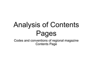
The document analyzes the codes and conventions used in regional magazine contents pages. It provides examples from three magazines and notes common features like splitting contents into sections, using images to represent articles, and displaying contact information. General codes include a plain white background, splitting contents into categories, grouping article images together with page numbers, and repeating the magazine title, issue number and date. The purpose is to make key information easily accessible and encourage readers to explore specific articles.
Can AI do good? at 'offtheCanvas' India HCI preludeAlan Dix
Invited talk at 'offtheCanvas' IndiaHCI prelude, 29th June 2024.
https://www.alandix.com/academic/talks/offtheCanvas-IndiaHCI2024/
The world is being changed fundamentally by AI and we are constantly faced with newspaper headlines about its harmful effects. However, there is also the potential to both ameliorate theses harms and use the new abilities of AI to transform society for the good. Can you make the difference?
Dive into the innovative world of smart garages with our insightful presentation, "Exploring the Future of Smart Garages." This comprehensive guide covers the latest advancements in garage technology, including automated systems, smart security features, energy efficiency solutions, and seamless integration with smart home ecosystems. Learn how these technologies are transforming traditional garages into high-tech, efficient spaces that enhance convenience, safety, and sustainability.
Ideal for homeowners, tech enthusiasts, and industry professionals, this presentation provides valuable insights into the trends, benefits, and future developments in smart garage technology. Stay ahead of the curve with our expert analysis and practical tips on implementing smart garage solutions.
You could be a professional graphic designer and still make mistakes. There is always the possibility of human error. On the other hand if you’re not a designer, the chances of making some common graphic design mistakes are even higher. Because you don’t know what you don’t know. That’s where this blog comes in. To make your job easier and help you create better designs, we have put together a list of common graphic design mistakes that you need to avoid.
Unleash Your Inner Demon with the "Let's Summon Demons" T-Shirt. Calling all fans of dark humor and edgy fashion! The "Let's Summon Demons" t-shirt is a unique way to express yourself and turn heads.
https://dribbble.com/shots/24253051-Let-s-Summon-Demons-Shirt
Hello everyone! I am thrilled to present my latest portfolio on LinkedIn, marking the culmination of my architectural journey thus far. Over the span of five years, I've been fortunate to acquire a wealth of knowledge under the guidance of esteemed professors and industry mentors. From rigorous academic pursuits to practical engagements, each experience has contributed to my growth and refinement as an architecture student. This portfolio not only showcases my projects but also underscores my attention to detail and to innovative architecture as a profession.
Between Filth and Fortune- Urban Cattle Foraging Realities by Devi S Nair, An...Mansi Shah
This study examines cattle rearing in urban and rural settings, focusing on milk production and consumption. By exploring a case in Ahmedabad, it highlights the challenges and processes in dairy farming across different environments, emphasising the need for sustainable practices and the essential role of milk in daily consumption.
Expert Accessory Dwelling Unit (ADU) Drafting ServicesResDraft
Whether you’re looking to create a guest house, a rental unit, or a private retreat, our experienced team will design a space that complements your existing home and maximizes your investment. We provide personalized, comprehensive expert accessory dwelling unit (ADU)drafting solutions tailored to your needs, ensuring a seamless process from concept to completion.
7 Alternatives to Bullet Points in PowerPointAlvis Oh
So you tried all the ways to beautify your bullet points on your pitch deck but it just got way uglier. These points are supposed to be memorable and leave a lasting impression on your audience. With these tips, you'll no longer have to spend so much time thinking how you should present your pointers.
2. Kent Life Contents
The title of the magazine is
again printed at the top of
the left page as it is is the
first thing seen. The date
of the magazine is also
given underneath.
A list of useful contact
information is given in the
leftmost column, so readers
can get involved and have their
say on the magazine and the
content it produces.
The contents is split into
sections so the articles that are
most interesting to a specific
reader can be found more
easily.
An collage of pictures from different articles with the page numbers in the corners is a large
feature on the page. These would probably be the first images seen on the page when opened
and so may immediately make someone search for an article from the photograph.
Another subscription
box is added to the
page incase someone
has simply bought the
magazine as a one-
off and may wish to
subscribe to monthly
issues.
A featured page number is set inside an
image of a hat to make it more
interesting and may give a hint to the
themes in the article.
Varied text gives contrast and
shows the importance of this
small quote at the bottom.
3. Chesapeake Bay Contents
The title reads ‘In The Issue’
rather than ‘Contents’ which is a
contrast to typical magazine
codes and conventions. The
name of the magazine is also
not explicitly printed anywhere
on the page, although it may be
in smaller less significant text.
The contents list is also split
into sections for ease when
looking for a specific type of
article.
Notes about the photographer
and location images were
taken is printed in small font in
the bottom corner.
The date of the magazine is printed in
the top right corner in small text as it is
not the most important part.
Plain white background so text is clear
and can be easily read.
A map of the area that the
magazine is based in is
presented as a graphic
feature down the right of
the contents page.
Uneven column theme across
the page, with an image column
and then two text columns.
There images are placed in a
column down the left side with
page numbers and a short
description to indicate the ideas
and themes explored inside the
articles.
4. Love Food in Cornwall
Contents
Title is on the left page
and in a bright pink font
which stands out
immediately.
A banner of
photographs from
some of the
articles stretches
across the width of
the double page
and is the main
feature.
There are two bright colours used
along with black text as this is
visually interesting and in high
contrast to the plain white
background. This is ordered in article
sections and in a column layout.
The previous cover of the magazine is
displayed as a small image in the top
right corner so readers can look out for
that issue if it is still in shops.
The same ‘bubble’
serif font is used for
the page numbers
which are printed for
every article which is
featured with an
image.
Social media, the
magazine title, and page
numbers are printed in
small text across the
bottom of the double page
so the reader can get
involved in the magazine in
other ways.
5. General Codes and
Conventions
• The background is usually plain white which provides contrast with the text.
• The contents can use a whole double page spread, or just the right side with a large full page
advert on the left page.
• The list of contents itself is almost always split into types of articles, with bold headings over
each category.
• Images from featured articles are printed in boxes and columns usually grouped together.
These are then given page numbers and/or captions so they can be easily found by the reader.
• The title of the magazine is usually displayed again at the top of the page with the issue number
and date.
• There is usually one overarching colour theme which becomes the house theme for the whole
magazine.