The document analyzes the codes and conventions of magazine covers. It examines the covers of three magazines - Kent Life, Landscape, and Cornwall Today. Some common elements identified across magazine covers include placing the masthead in large white text at the top, using a striking central photograph, and adding overlays or taglines around the photo to promote articles. Location bars and award listings are also used to interest readers. Barcodes and prices are kept small and out of the way to not detract from the visual elements intended to attract buyers.
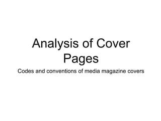
This is Emily's answer to the first question of our evaluation for our music magazine. The question is, "In what way does your media product use, develop or challenge codes and conventions of real media products?".
This is Emily's answer to the first question of our evaluation for our music magazine. The question is, "In what way does your media product use, develop or challenge codes and conventions of real media products?".
7 Alternatives to Bullet Points in PowerPointAlvis Oh
So you tried all the ways to beautify your bullet points on your pitch deck but it just got way uglier. These points are supposed to be memorable and leave a lasting impression on your audience. With these tips, you'll no longer have to spend so much time thinking how you should present your pointers.
Book Formatting: Quality Control Checks for DesignersConfidence Ago
This presentation was made to help designers who work in publishing houses or format books for printing ensure quality.
Quality control is vital to every industry. This is why every department in a company need create a method they use in ensuring quality. This, perhaps, will not only improve the quality of products and bring errors to the barest minimum, but take it to a near perfect finish.
It is beyond a moot point that a good book will somewhat be judged by its cover, but the content of the book remains king. No matter how beautiful the cover, if the quality of writing or presentation is off, that will be a reason for readers not to come back to the book or recommend it.
So, this presentation points designers to some important things that may be missed by an editor that they could eventually discover and call the attention of the editor.
Transforming Brand Perception and Boosting Profitabilityaaryangarg12
In today's digital era, the dynamics of brand perception, consumer behavior, and profitability have been profoundly reshaped by the synergy of branding, social media, and website design. This research paper investigates the transformative power of these elements in influencing how individuals perceive brands and products and how this transformation can be harnessed to drive sales and profitability for businesses.
Through an exploration of brand psychology and consumer behavior, this study sheds light on the intricate ways in which effective branding strategies, strategic social media engagement, and user-centric website design contribute to altering consumers' perceptions. We delve into the principles that underlie successful brand transformations, examining how visual identity, messaging, and storytelling can captivate and resonate with target audiences.
Methodologically, this research employs a comprehensive approach, combining qualitative and quantitative analyses. Real-world case studies illustrate the impact of branding, social media campaigns, and website redesigns on consumer perception, sales figures, and profitability. We assess the various metrics, including brand awareness, customer engagement, conversion rates, and revenue growth, to measure the effectiveness of these strategies.
The results underscore the pivotal role of cohesive branding, social media influence, and website usability in shaping positive brand perceptions, influencing consumer decisions, and ultimately bolstering sales and profitability. This paper provides actionable insights and strategic recommendations for businesses seeking to leverage branding, social media, and website design as potent tools to enhance their market position and financial success.
You could be a professional graphic designer and still make mistakes. There is always the possibility of human error. On the other hand if you’re not a designer, the chances of making some common graphic design mistakes are even higher. Because you don’t know what you don’t know. That’s where this blog comes in. To make your job easier and help you create better designs, we have put together a list of common graphic design mistakes that you need to avoid.
Between Filth and Fortune- Urban Cattle Foraging Realities by Devi S Nair, An...Mansi Shah
This study examines cattle rearing in urban and rural settings, focusing on milk production and consumption. By exploring a case in Ahmedabad, it highlights the challenges and processes in dairy farming across different environments, emphasising the need for sustainable practices and the essential role of milk in daily consumption.
2. Kent Life Cover
The masthead is at the top
of the page in large text. It
is whiter and stands out
against the blue of the
background to make it
easily readable.
The photograph is of a main
feature in a long shot towards
the bottom. It is clearly related
to a region the magazine is
based around.
A separate image is laid over
the top to create interest in a
feature article inside.
Some places that can be visited in the
area are listed in a bar across the top of
the cover and suggest to the reader
some of the places that could be
featured inside the magazine.
Tag lines which describe some of the
main articles are placed surrounding
the main feature image to give the
audience an Idea of the themes that are
covered inside.
The barcode and price are placed in the
corner to not obscure the image and
are quite small as they are least
important part of the front.
3. Landscape Cover
The masthead is again placed
across the top in white text. The
first four letter (‘Land’) are in a
plain sans serif font whereas
‘Scape’ is still sans serif but has
more flourish.
The photograph is of a main
feature in a long shot towards
the bottom. It is clearly related
to a region the magazine is
based around.
The barcode is very small and
insignificant in the corner.
The background of the masthead is
different to the main image; it is a very
close-up shot of flower petals. This is a
very bright photograph but allows the
white font of the mastheads to stand
out.
A competition sticker is added to the
main image to appeal to the audience
that they could gain from buying the
magazine.
A main tagline is placed at the bottom
of the page in a large serif font but
gives little details to what article it may
be referencing. This is ambiguous and
may cause the reader intrigue.
The main image is a close-up of
some flowers which are rightly
coloured and compliment the
pink colours at the top.
There images are placed in a
column down the left side to
indicate the ideas and themes
explored inside the articles.
4. Cornwall Today Cover
The title is again in what font but it
is a serif font and contains the
place that the magazine focusses
on. It is clearly readable against
the gradient blue from the
photograph behind.
A transparent sticker made up of
text is used to promote a
competition inside that may cause
the reader to think that they are
gaining something else when
buying the magazine.
The image is in focus in the
foreground of the sea but the
background is slightly out of
focus. The colours are vivid
and compliment each other
and it is the most striking
feature on the cover.
A bar at the top of the page announces
that the magazine won ‘Regional
magazine of the year 2014’ which could
be a big advertising and selling point for
the brand.
A few tag lines are placed down the
right side of the page in a block san
serif font. These do not obscure the
photograph in any way and are clearly
readable.
Lots of the smaller articles in the
magazine are listed in a transparent bar
across the bottom of the page. A reader
who is looking closely at the front cover
might look at the this and it may make
their decision to buy it final as all the
content is readily labelled on the front
cover.
5. General Codes and
Conventions
• The masthead is usually in white font and found in large text at the top of the page.
• The image can be from a closeup to a long shot but it is always the main striking feature of
the cover.
• Overlays such as images or competitions can be placed over the main image in a non-
obscuring fashion so as to interest the audience in articles other than the main featured one
and is more interesting than simple tag lines.
• Tag lines are used to frame the main photograph and act as an insight into the magazine’s
themes.
• A bar can sometimes be found at the bottom or the top of the cover which can identify key
places or awards to further interest the reader.
• The barcode is placed inconspicuously in one of the bottom corners along with the price.