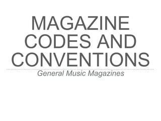
General music magazines follow several conventions for their front covers, contents pages, and double page spreads. The front cover typically features the magazine's short, memorable masthead in a large, non-serif font at the top. It also includes a close-up photo of a person or group making eye contact with the viewer. Subtitles around the photo advertise other articles in smaller, varied fonts that match the color scheme. The contents pages list articles along with page numbers in larger fonts than the descriptions. Double page spreads vary more but commonly use large central images and multiple columns of small text in different colors for readability.
This is Emily's answer to the first question of our evaluation for our music magazine. The question is, "In what way does your media product use, develop or challenge codes and conventions of real media products?".
Similar to Magazine Codes and Conventions - General Music Magazines (20)
Book Formatting: Quality Control Checks for DesignersConfidence Ago
This presentation was made to help designers who work in publishing houses or format books for printing ensure quality.
Quality control is vital to every industry. This is why every department in a company need create a method they use in ensuring quality. This, perhaps, will not only improve the quality of products and bring errors to the barest minimum, but take it to a near perfect finish.
It is beyond a moot point that a good book will somewhat be judged by its cover, but the content of the book remains king. No matter how beautiful the cover, if the quality of writing or presentation is off, that will be a reason for readers not to come back to the book or recommend it.
So, this presentation points designers to some important things that may be missed by an editor that they could eventually discover and call the attention of the editor.
Hello everyone! I am thrilled to present my latest portfolio on LinkedIn, marking the culmination of my architectural journey thus far. Over the span of five years, I've been fortunate to acquire a wealth of knowledge under the guidance of esteemed professors and industry mentors. From rigorous academic pursuits to practical engagements, each experience has contributed to my growth and refinement as an architecture student. This portfolio not only showcases my projects but also underscores my attention to detail and to innovative architecture as a profession.
Unleash Your Inner Demon with the "Let's Summon Demons" T-Shirt. Calling all fans of dark humor and edgy fashion! The "Let's Summon Demons" t-shirt is a unique way to express yourself and turn heads.
https://dribbble.com/shots/24253051-Let-s-Summon-Demons-Shirt
Dive into the innovative world of smart garages with our insightful presentation, "Exploring the Future of Smart Garages." This comprehensive guide covers the latest advancements in garage technology, including automated systems, smart security features, energy efficiency solutions, and seamless integration with smart home ecosystems. Learn how these technologies are transforming traditional garages into high-tech, efficient spaces that enhance convenience, safety, and sustainability.
Ideal for homeowners, tech enthusiasts, and industry professionals, this presentation provides valuable insights into the trends, benefits, and future developments in smart garage technology. Stay ahead of the curve with our expert analysis and practical tips on implementing smart garage solutions.
3. MASTHEAD
➤ Front covers tend to have a short and memorable masthead
➤ This is placed at the top of the page so that it is the first thing
to be seen and can be seen when stacked on a shelf
➤ It is usually the largest sized font on the page and is not a serif
font
➤ It may have a logo or look like a logo as a whole to make it
more memorable for potential consumers
4. PHOTOGRAPH
➤ The photograph is usually a mid-shot or a close-up of one
person or a small group of people
➤ Eye contact is usually made between the model and the
camera so that it feels more personal and connecting to
buyers in shops (direct address)
➤ The colours in the photo match with the font colours and other
coloured features on the cover
5. CAPTIONS AND SUBTITLES
➤ The subtitles tell the audience about other articles that may be
of interest to the readers
➤ These tend to be placed around the model
➤ They may contain key words which will be in larger or bold
fonts
➤ The font on these is usually different to the masthead
6. OTHER FEATURES
➤ A barcode is normally placed in an inconspicuous place so as
to not detract form the image or to cover up any text
➤ Badges containing information that may be useful or of
importance may be placed on the page, either around the
model or even overlapping the photo
➤ Other text such as quotes may be placed on around the model
like the subtitles, but these would tend to be in a different font
➤ The issue number or date may also be printed near the
masthead
8. ➤ Heading at the top
➤ Largest font on page
➤ Short and memorable
➤ Closeup shot of
model
➤ Eye contact/direct
address
➤ Simple black colours
match colour scheme
➤ Smaller features
subheadings
➤ Small but different
sized fonts
➤ Matches colour
scheme
➤ Placed around
model
➤ Main feature subheading
➤ Large text
➤ Different font from heading
➤ Smaller font for explanation
➤ Issue date next to
masthead
➤ Yellow colour matches
subheadings
10. HEADING
➤ Large font at the top of page
➤ Matches colour scheme of front cover
➤ Similar font to page numbers and other continuous text that
appears through the magazine
11. IMAGE
➤ Another photo from the double page spread feature and front
cover
➤ Main feature of the page, usually centralised
➤ Colours complimented by overall colour-scheme, the same as
the cover
➤ Other images from different articles dispersed across page
12. LIST OF PAGES
➤ Clear list of page numbers and explanations about each page
➤ Page numbers normally larger font than the explanation
➤ Important words may be bold or larger in order to stand out as
important articles for the reader
13. MESSAGE FROM THE EDITOR
➤ Small section with a letter form the editor to the reader
explaining about what’s inside the magazine
➤ Personal and engaging to the reader
➤ Sometimes contains a portrait image of the editor - usually a
mid shot
14. SOCIAL MEDIA / PROMOTION
➤ Social media links and icons so that the audience can keep up
to date with the magazine
➤ Email, website, Facebook, Twitter, Snapchat, Instagram,
YouTube
➤ Monthly subscriptions
16. ➤ Heading at the top
➤ Largest font
➤ Matches magazine name
font (‘KERRANG!’)
➤ Monthly subscription
➤ Website and phone
number
➤ List of contents
➤ Subheadings and
page numbers stand
out - larger fonts and
different colours
➤ Message from the
editor
➤ Small section boxed in
but noticeable to the
reader
➤ Close-up shot of editor
➤ Use of a signature for
handwritten feel
➤ Large image
➤ Fairly centralised
➤ Matches black/white
colour scheme
➤ Other featured articles
➤ Imposed over other
image to draw attention
to it
18. OVERALL DESIGN
➤ Double page spreads tend to differ a lot and there are not
many codes and conventions that are followed throughout
different magazines
➤ Therefore I have analysed one spread and given details of
some very general points which can be see throughout this
type of media, but even then these can differ depending on the
intent and style of the article
20. ➤ Image is very large
➤ Mainly on left hand page but
crosses over to right side
➤ Plain colours in photo make
the writing stand out
➤ Page numbers
placed at the top in
very small font
➤ Does not distrust the
text or main image
➤ Main body of text is
small font
➤ Arranged in columns
keeps the article neat
➤ Different colour for
the questions so
easier to peruse
➤ Article title is just her name
➤ Font matches the photo
(graffiti/brick wall)
➤ Red capital letters stand out
➤ Overlays the image of Rita