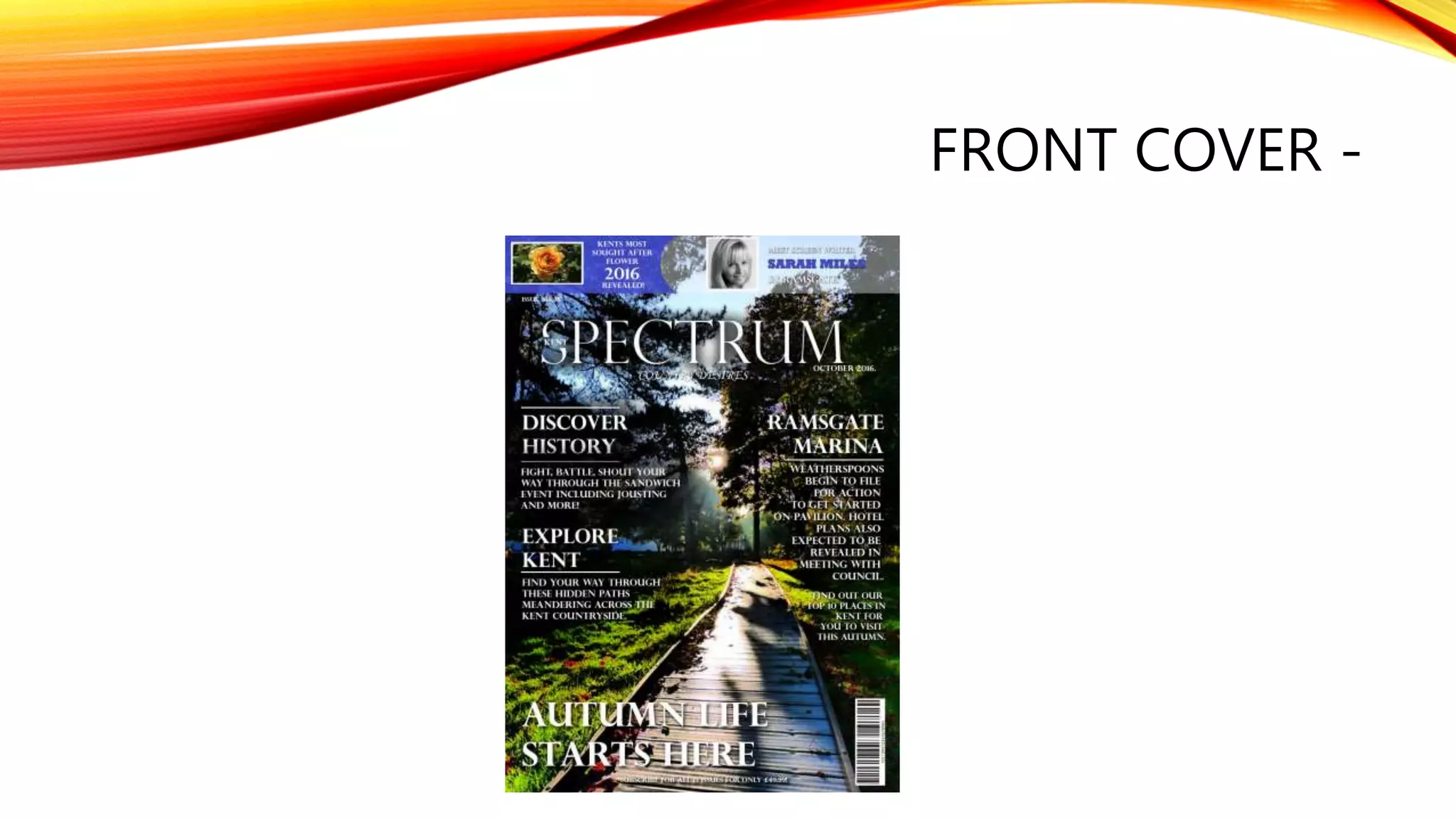
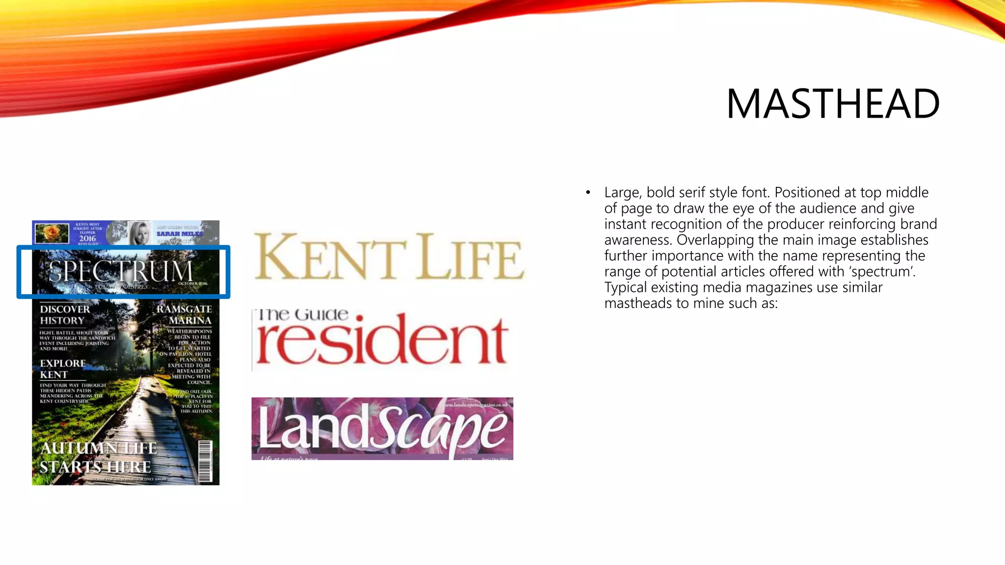
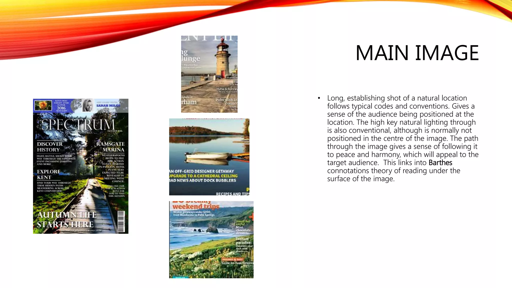
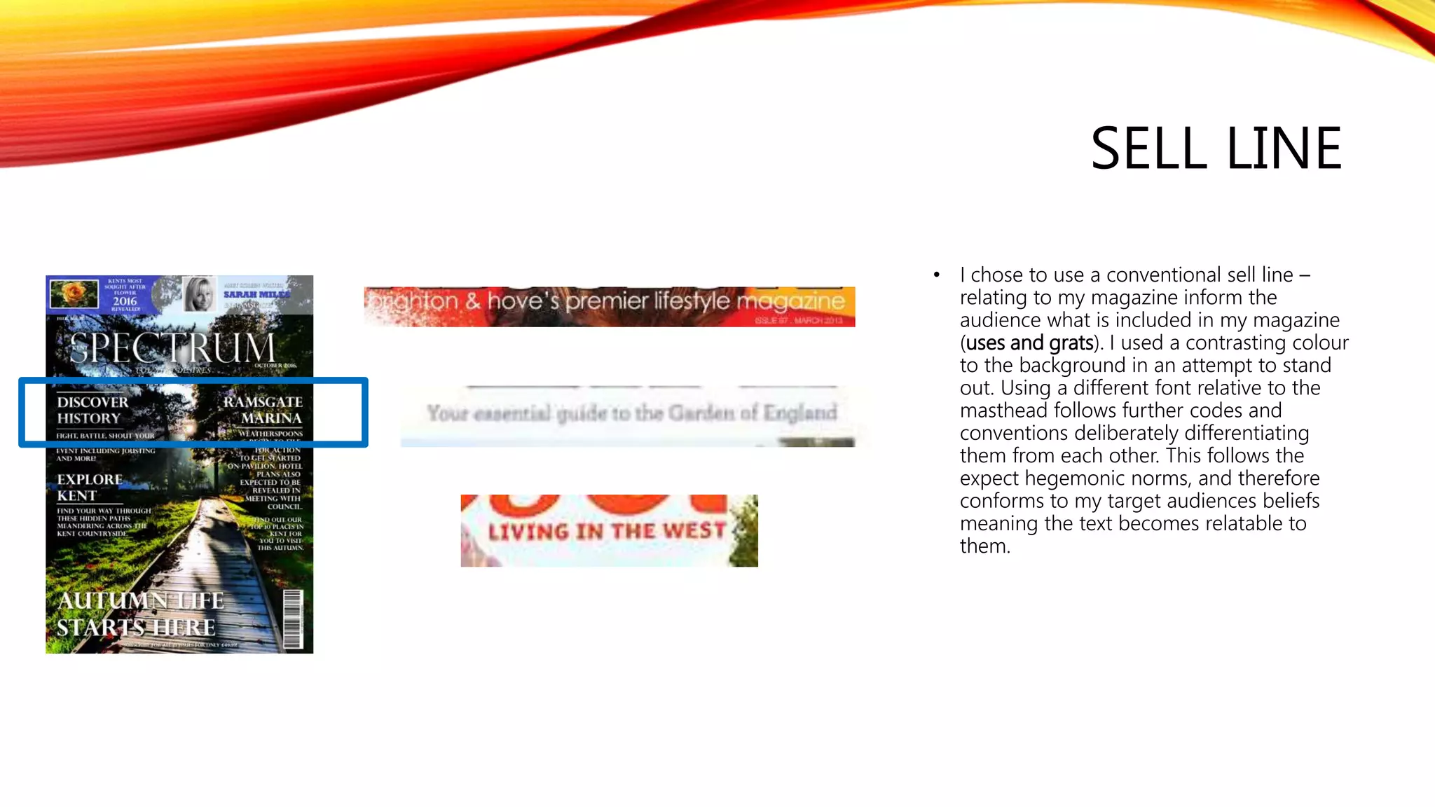
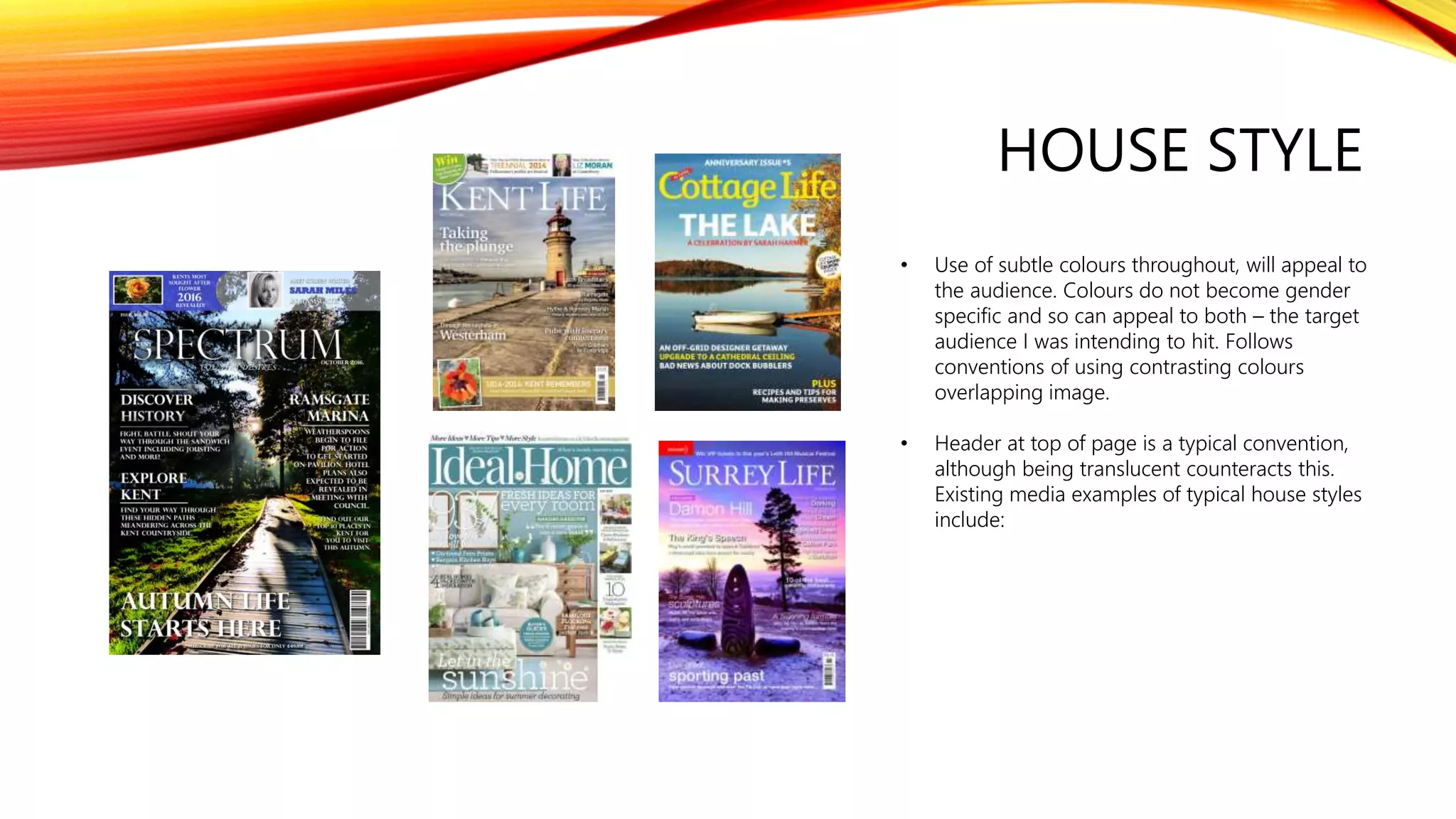
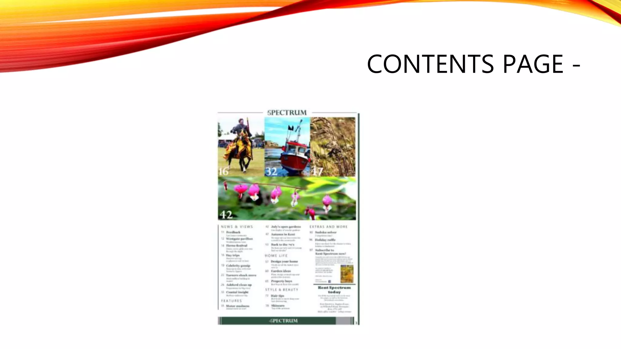
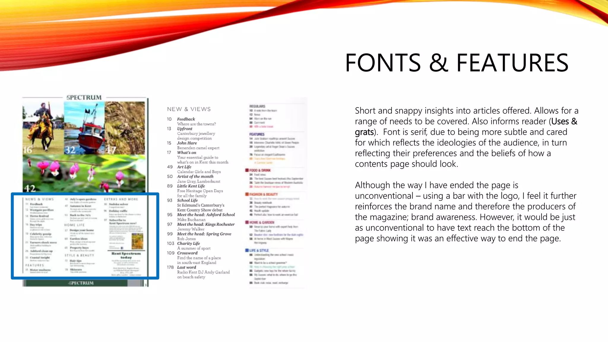
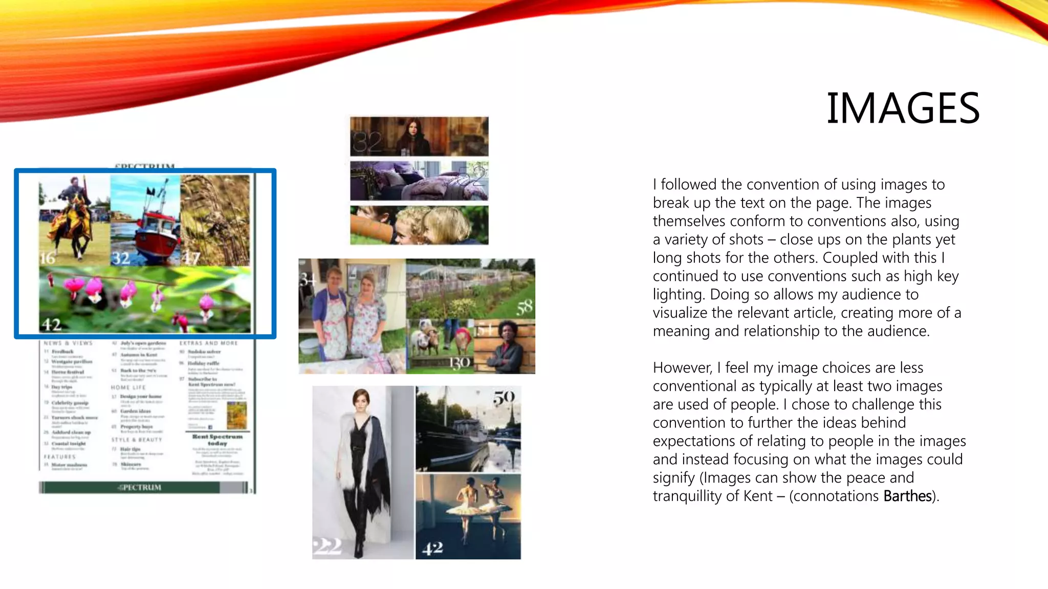
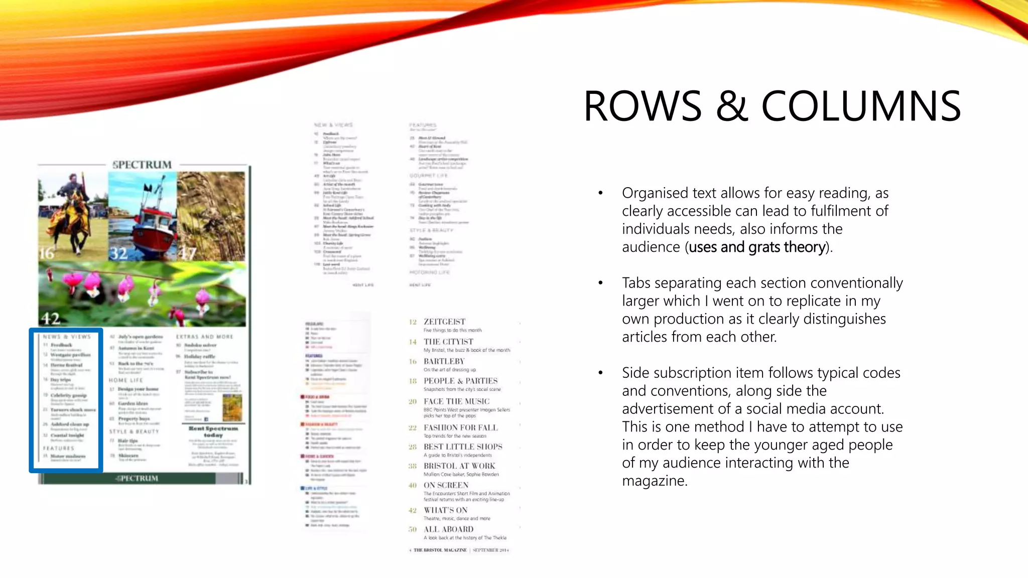
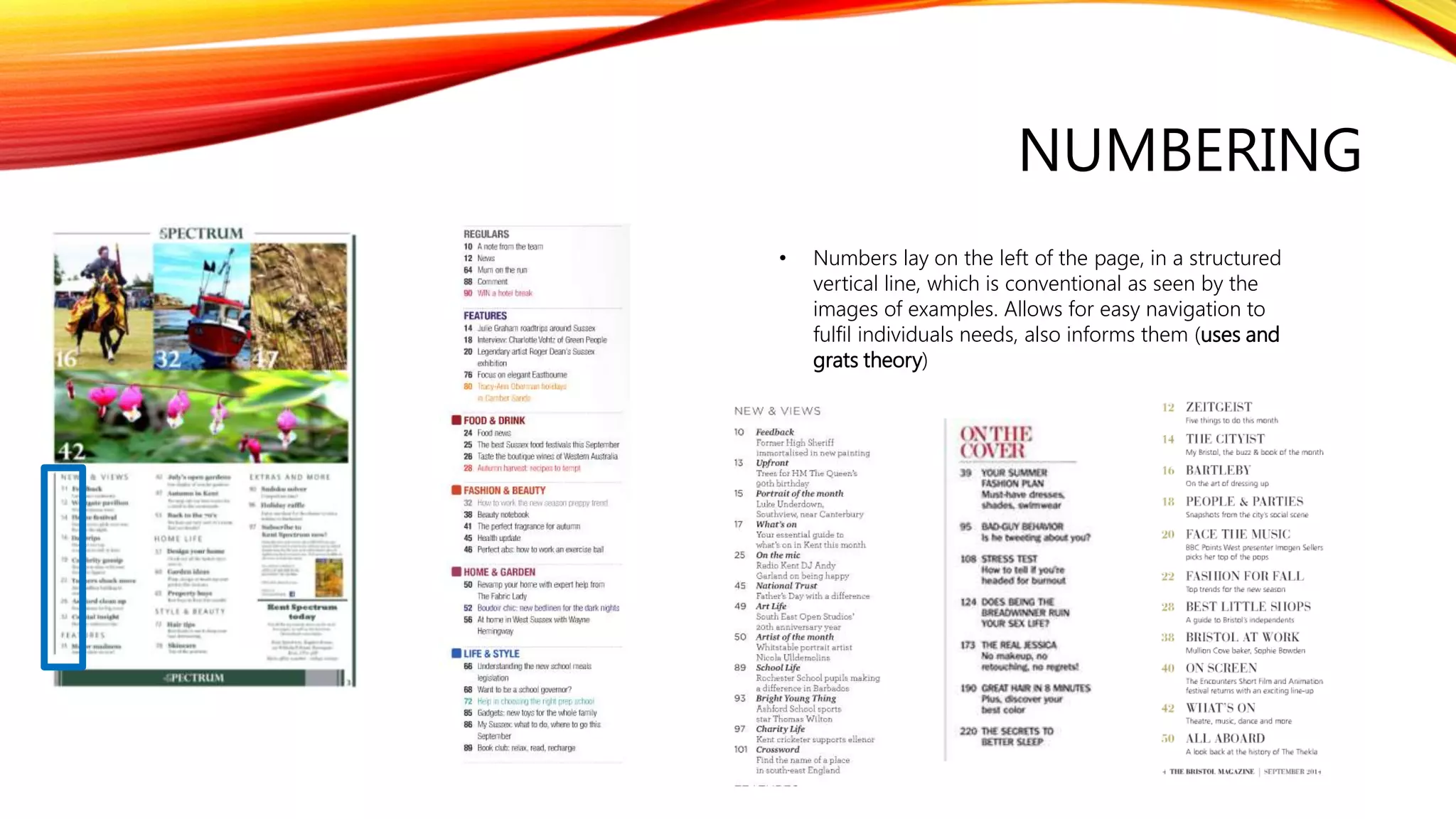
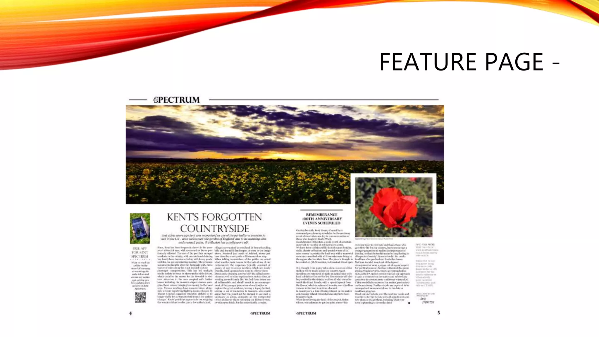
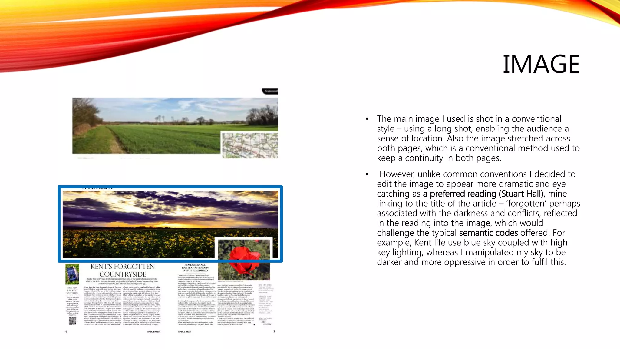
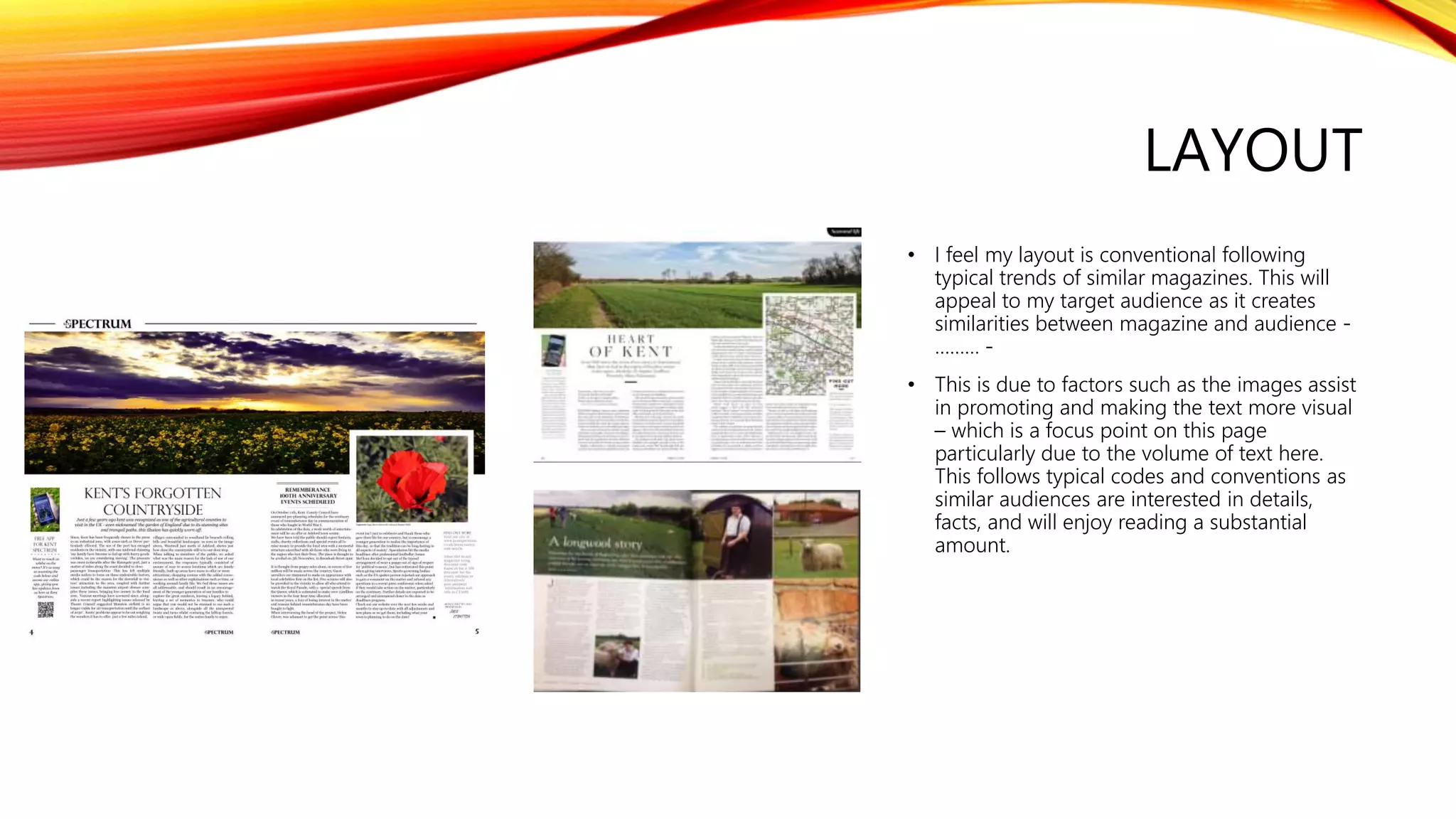
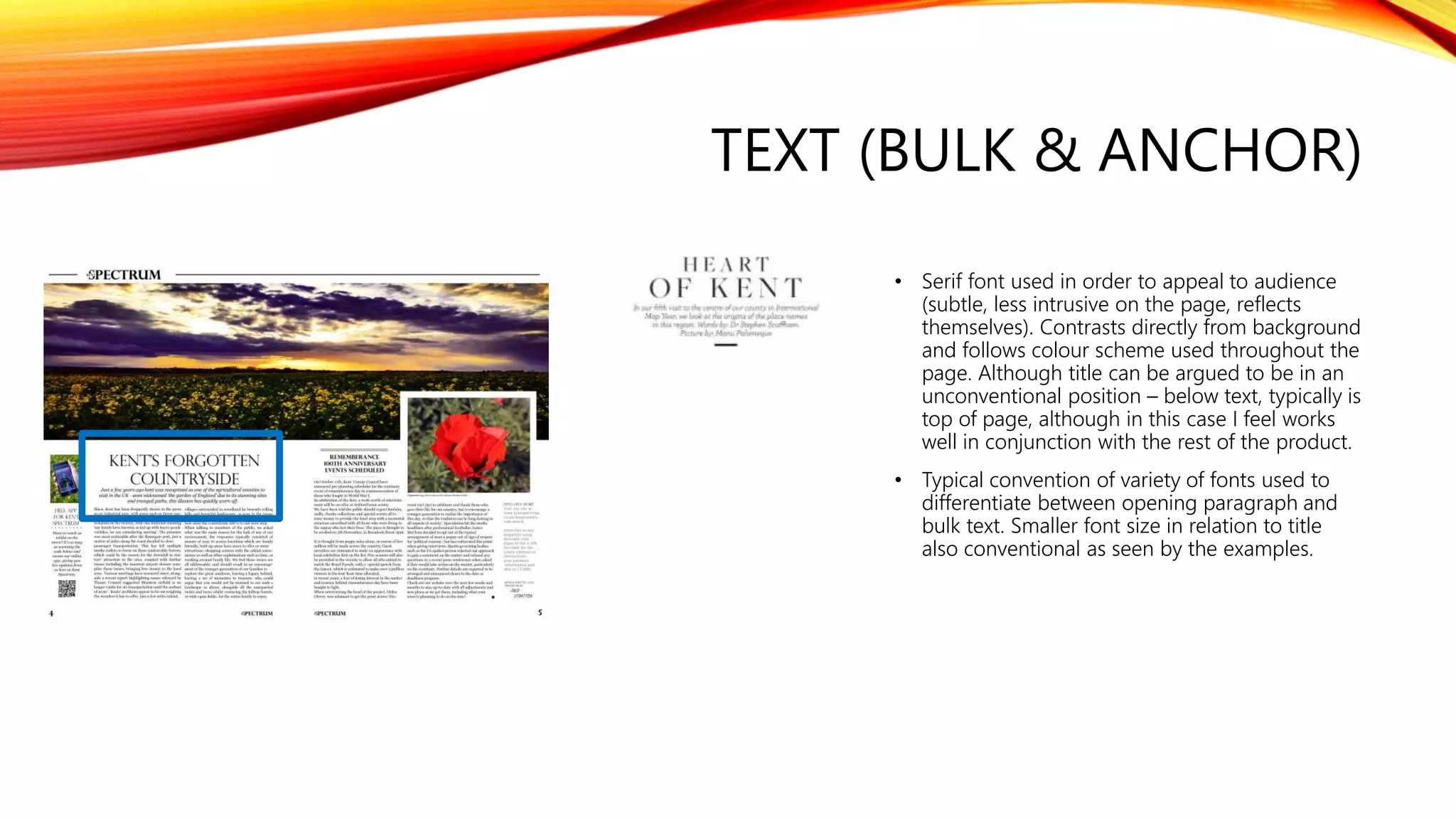
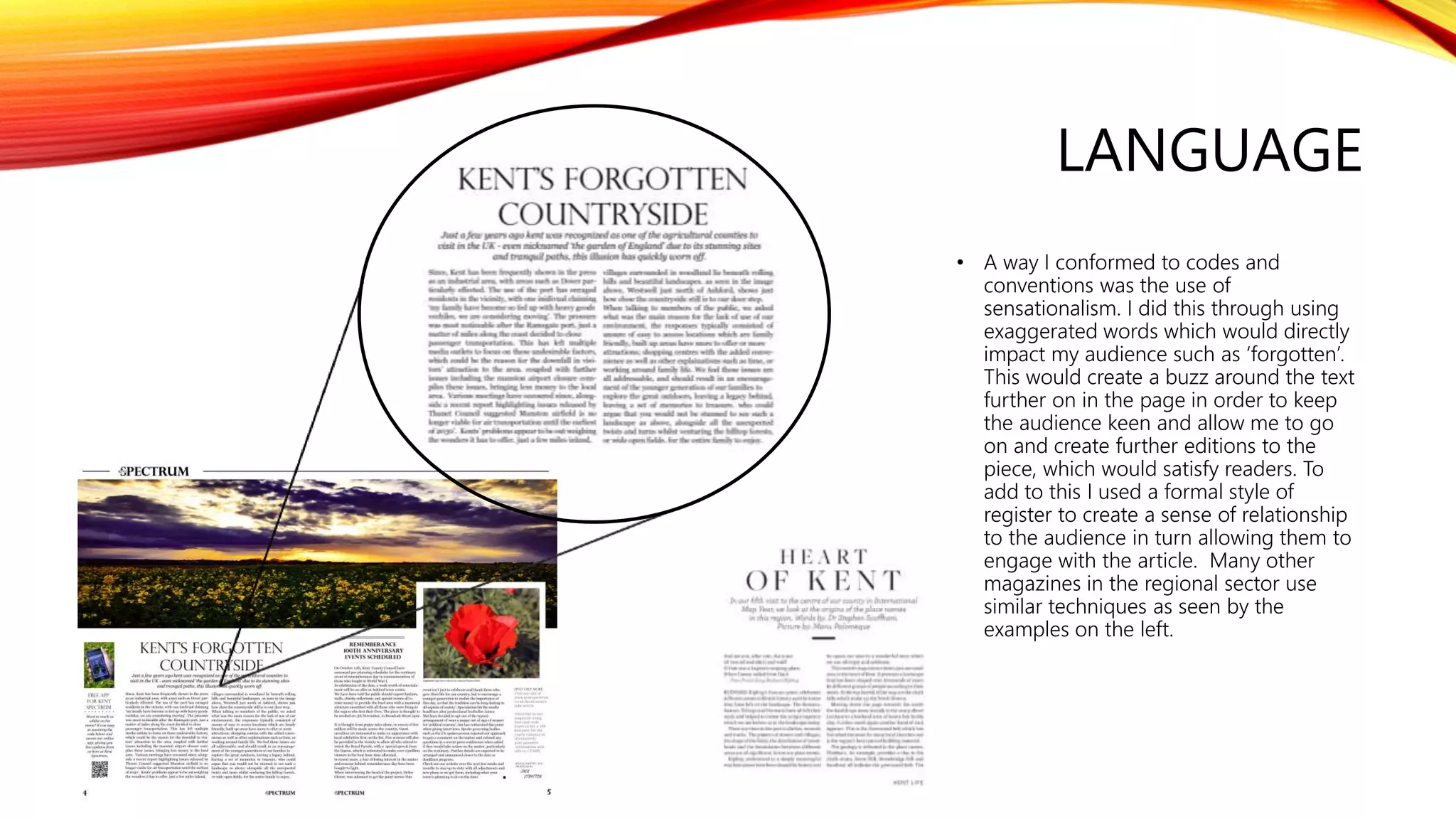
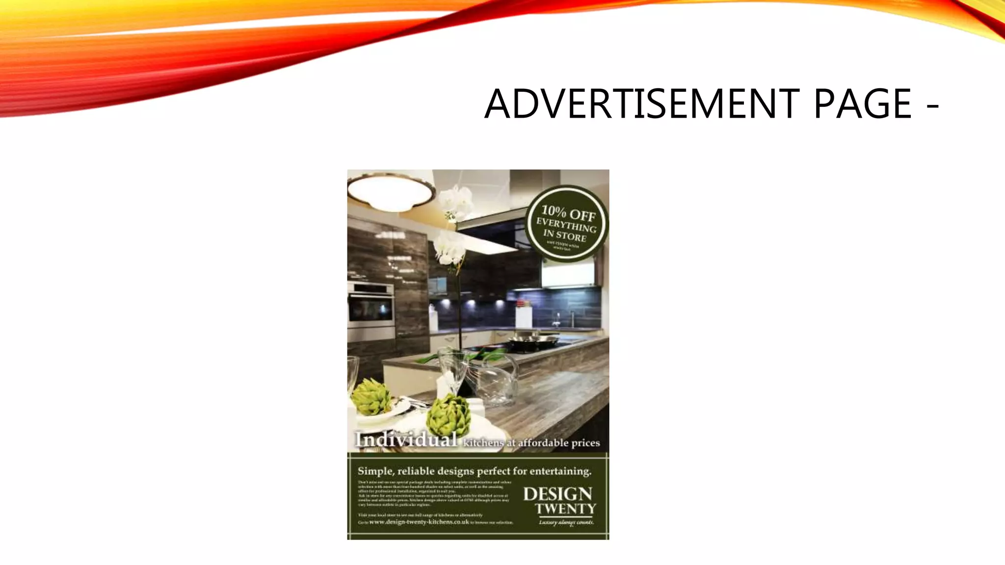
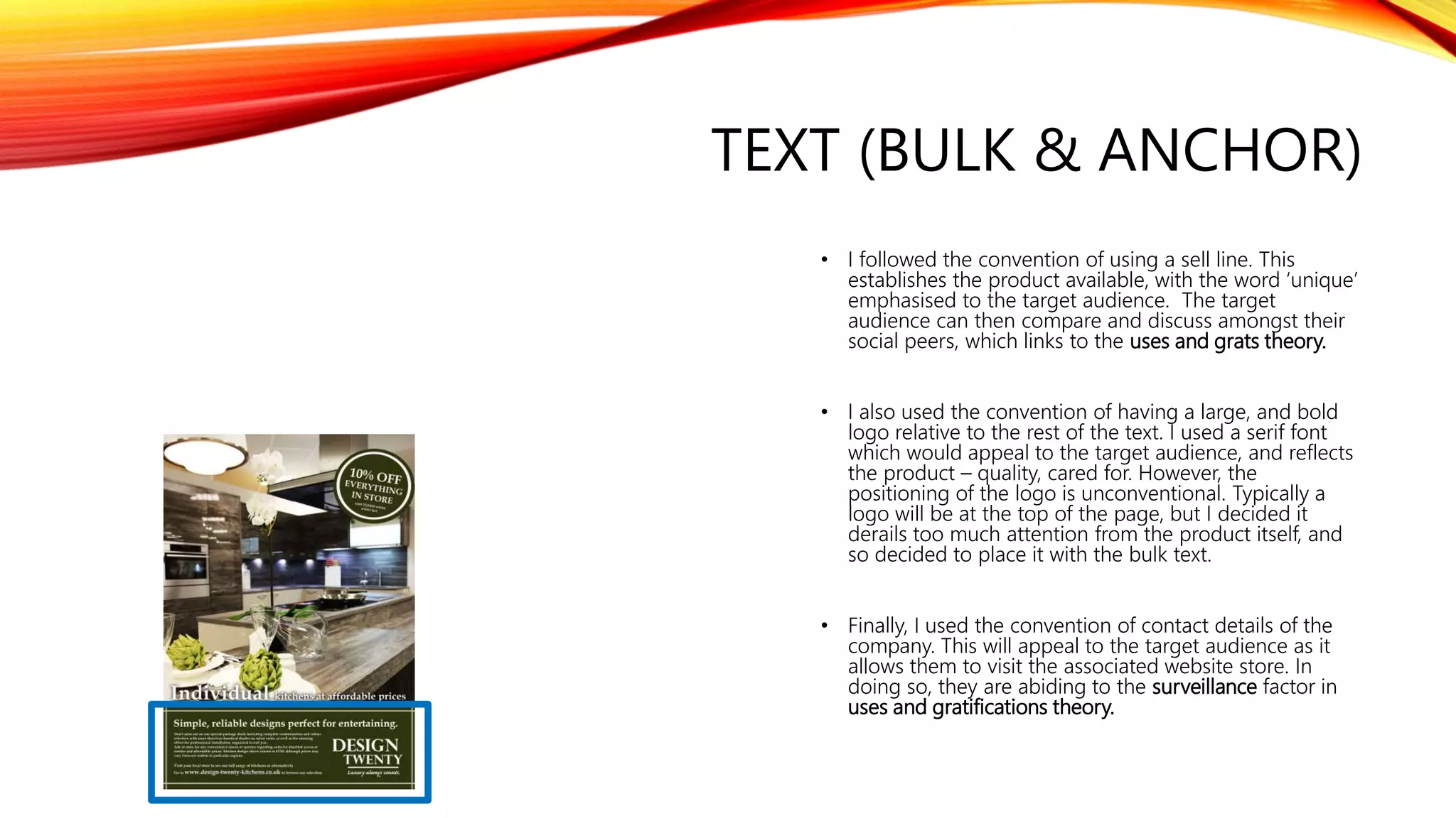
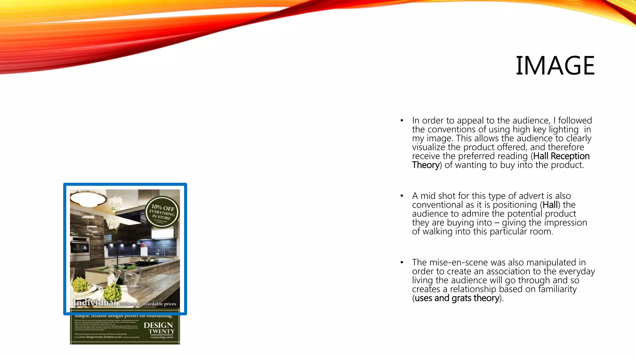
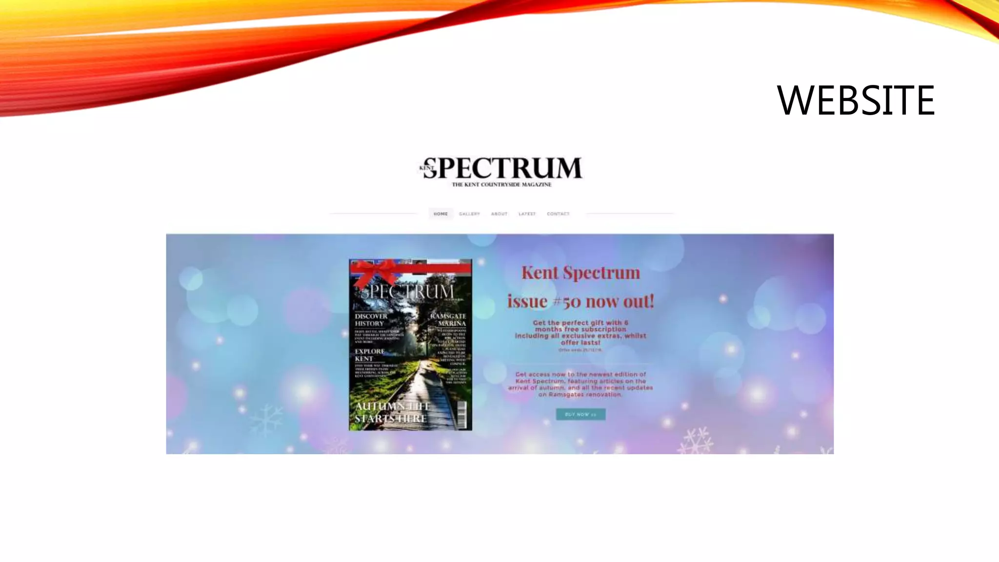
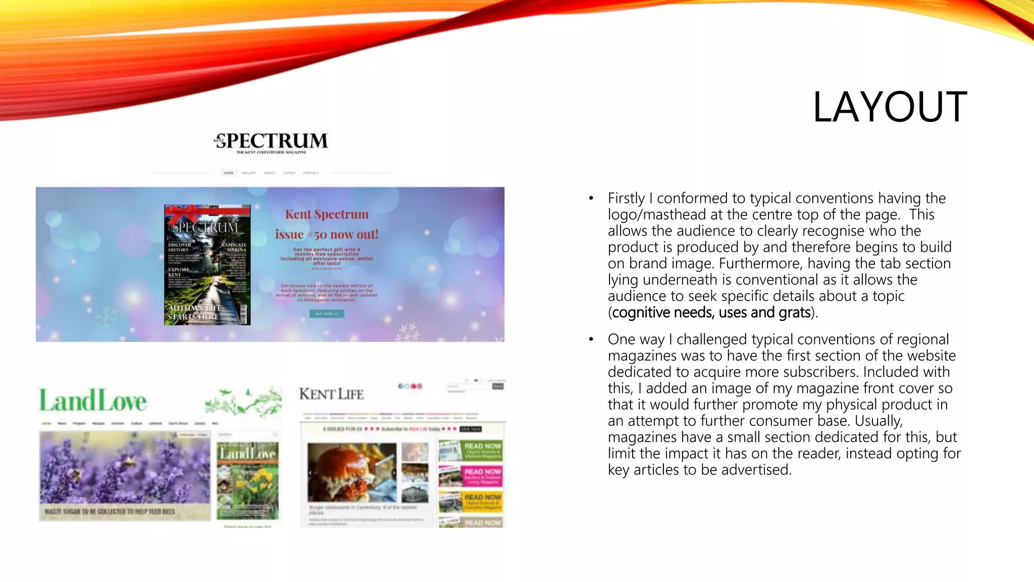
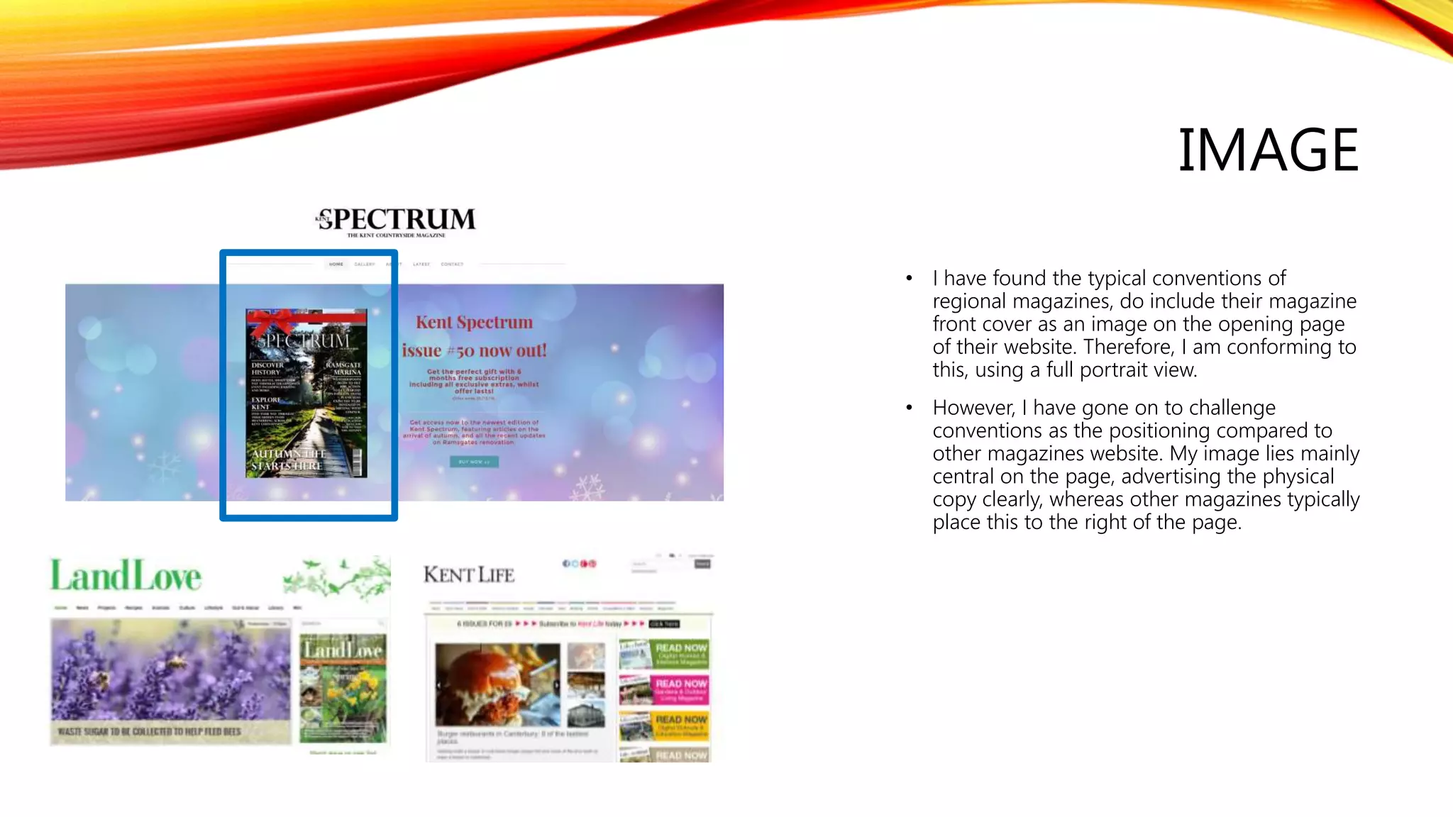
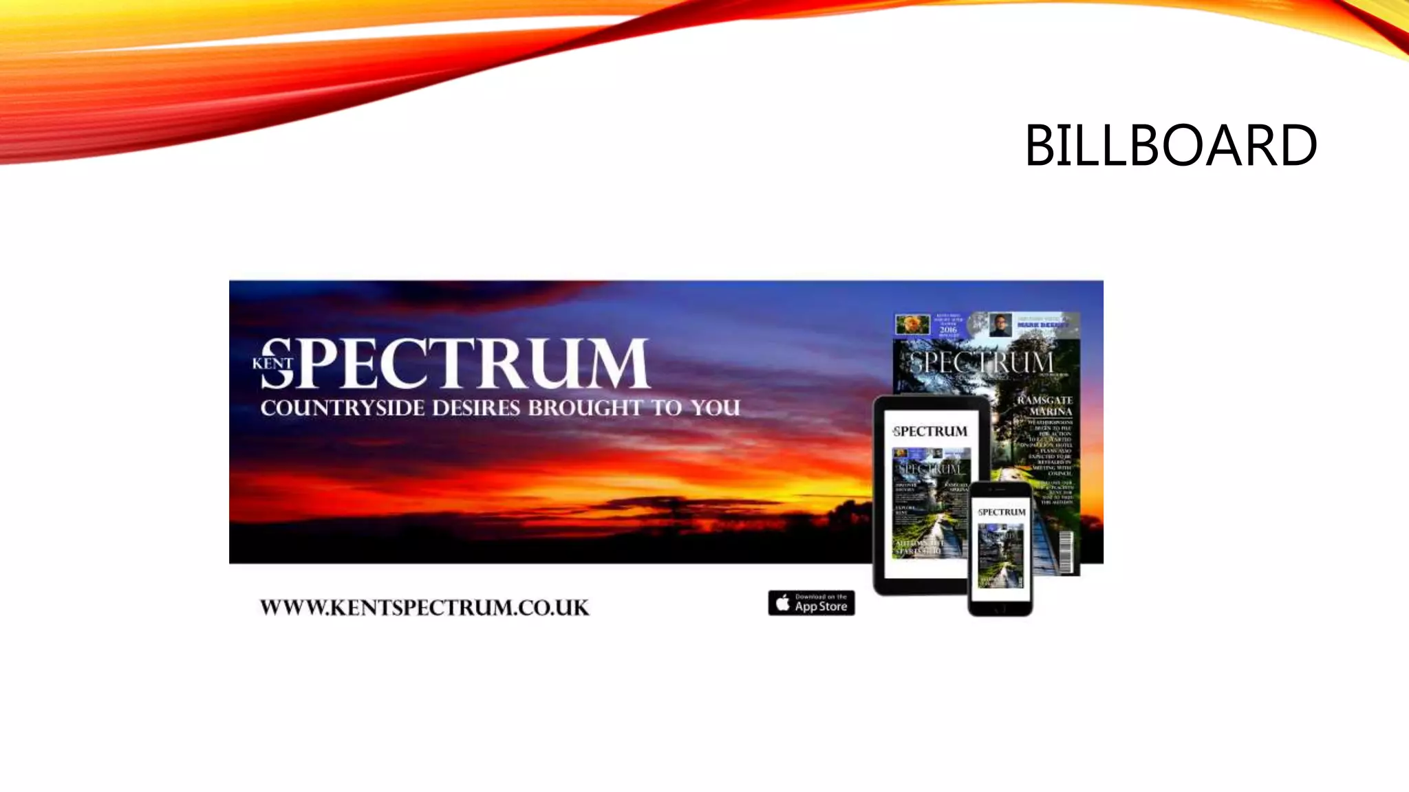
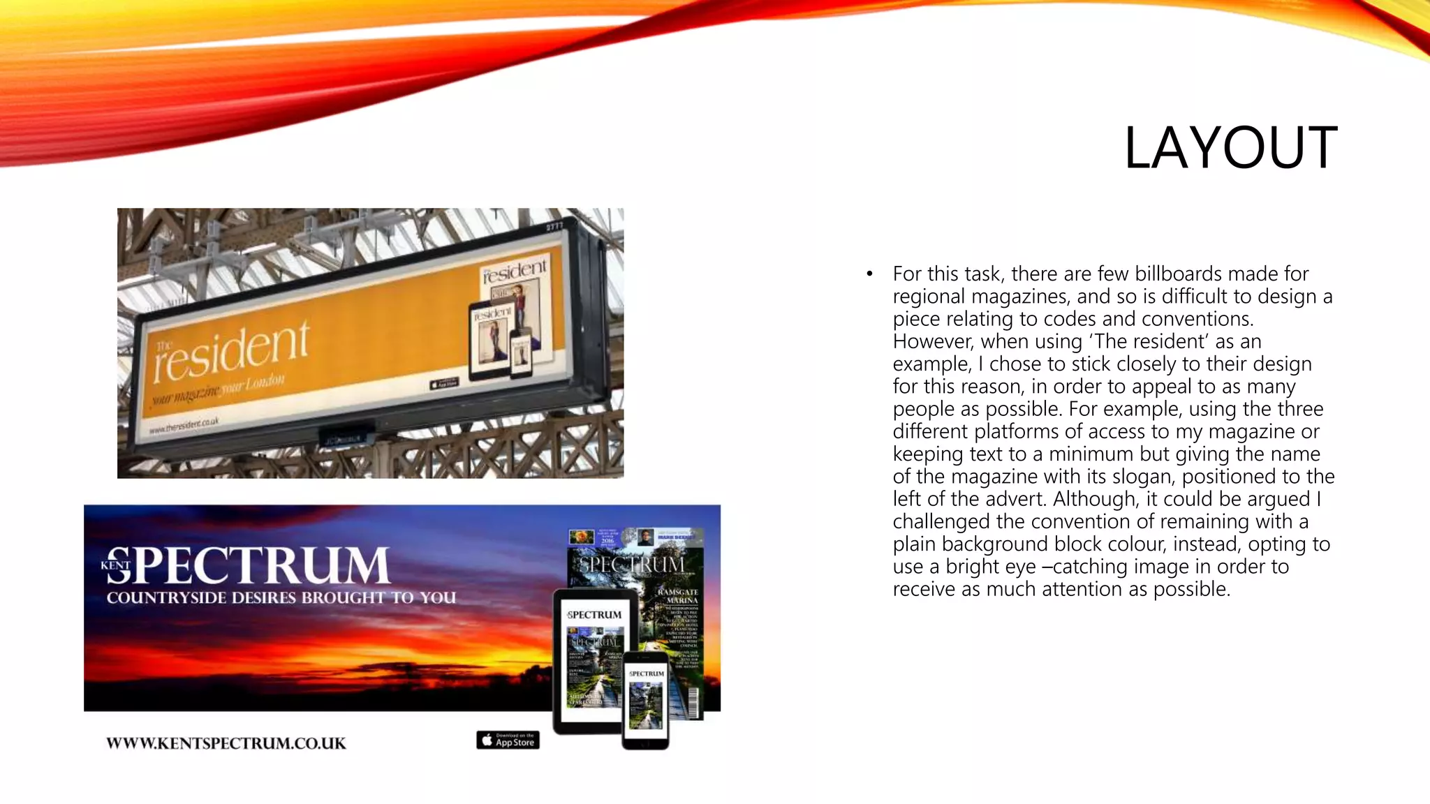
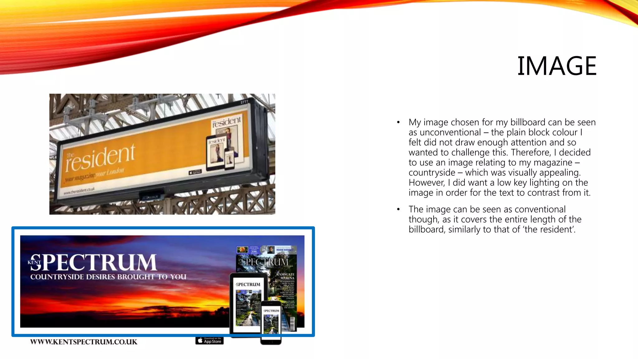
SlideShare a Scribd company logo
EVALUATION QUESTION ONE
“In what ways does your product use, develop, or challenge forms and
conventions of real media products?"
FRONT COVER -
MASTHEAD
• Large, bold serif style font. Positioned at top middle
of page to draw the eye of the audience and give
instant recognition of the producer reinforcing brand
awareness. Overlapping the main image establishes
further importance with the name representing the
range of potential articles offered with ‘spectrum’.
Typical existing media magazines use similar
mastheads to mine such as:
MAIN IMAGE
• Long, establishing shot of a natural location
follows typical codes and conventions. Gives a
sense of the audience being positioned at the
location. The high key natural lighting through
is also conventional, although is normally not
positioned in the centre of the image. The path
through the image gives a sense of following it
to peace and harmony, which will appeal to the
target audience. This links into Barthes
connotations theory of reading under the
surface of the image.
SELL LINE
• I chose to use a conventional sell line –
relating to my magazine inform the
audience what is included in my magazine
(uses and grats). I used a contrasting colour
to the background in an attempt to stand
out. Using a different font relative to the
masthead follows further codes and
conventions deliberately differentiating
them from each other. This follows the
expect hegemonic norms, and therefore
conforms to my target audiences beliefs
meaning the text becomes relatable to
them.
HOUSE STYLE
• Use of subtle colours throughout, will appeal to
the audience. Colours do not become gender
specific and so can appeal to both – the target
audience I was intending to hit. Follows
conventions of using contrasting colours
overlapping image.
• Header at top of page is a typical convention,
although being translucent counteracts this.
Existing media examples of typical house styles
include:
CONTENTS PAGE -
FONTS & FEATURES
Short and snappy insights into articles offered. Allows for a
range of needs to be covered. Also informs reader (Uses &
grats). Font is serif, due to being more subtle and cared
for which reflects the ideologies of the audience, in turn
reflecting their preferences and the beliefs of how a
contents page should look.
Although the way I have ended the page is
unconventional – using a bar with the logo, I feel it further
reinforces the brand name and therefore the producers of
the magazine; brand awareness. However, it would be just
as unconventional to have text reach the bottom of the
page showing it was an effective way to end the page.
IMAGES
I followed the convention of using images to
break up the text on the page. The images
themselves conform to conventions also, using
a variety of shots – close ups on the plants yet
long shots for the others. Coupled with this I
continued to use conventions such as high key
lighting. Doing so allows my audience to
visualize the relevant article, creating more of a
meaning and relationship to the audience.
However, I feel my image choices are less
conventional as typically at least two images
are used of people. I chose to challenge this
convention to further the ideas behind
expectations of relating to people in the images
and instead focusing on what the images could
signify (Images can show the peace and
tranquillity of Kent – (connotations Barthes).
ROWS & COLUMNS
• Organised text allows for easy reading, as
clearly accessible can lead to fulfilment of
individuals needs, also informs the
audience (uses and grats theory).
• Tabs separating each section conventionally
larger which I went on to replicate in my
own production as it clearly distinguishes
articles from each other.
• Side subscription item follows typical codes
and conventions, along side the
advertisement of a social media account.
This is one method I have to attempt to use
in order to keep the younger aged people
of my audience interacting with the
magazine.
NUMBERING
• Numbers lay on the left of the page, in a structured
vertical line, which is conventional as seen by the
images of examples. Allows for easy navigation to
fulfil individuals needs, also informs them (uses and
grats theory)
FEATURE PAGE -
IMAGE
• The main image I used is shot in a conventional
style – using a long shot, enabling the audience a
sense of location. Also the image stretched across
both pages, which is a conventional method used to
keep a continuity in both pages.
• However, unlike common conventions I decided to
edit the image to appear more dramatic and eye
catching as a preferred reading (Stuart Hall), mine
linking to the title of the article – ‘forgotten’ perhaps
associated with the darkness and conflicts, reflected
in the reading into the image, which would
challenge the typical semantic codes offered. For
example, Kent life use blue sky coupled with high
key lighting, whereas I manipulated my sky to be
darker and more oppressive in order to fulfil this.
LAYOUT
• I feel my layout is conventional following
typical trends of similar magazines. This will
appeal to my target audience as it creates
similarities between magazine and audience -
……… -
• This is due to factors such as the images assist
in promoting and making the text more visual
– which is a focus point on this page
particularly due to the volume of text here.
This follows typical codes and conventions as
similar audiences are interested in details,
facts, and will enjoy reading a substantial
amount.
TEXT (BULK & ANCHOR)
• Serif font used in order to appeal to audience
(subtle, less intrusive on the page, reflects
themselves). Contrasts directly from background
and follows colour scheme used throughout the
page. Although title can be argued to be in an
unconventional position – below text, typically is
top of page, although in this case I feel works
well in conjunction with the rest of the product.
• Typical convention of variety of fonts used to
differentiate between opening paragraph and
bulk text. Smaller font size in relation to title
also conventional as seen by the examples.
LANGUAGE
• A way I conformed to codes and
conventions was the use of
sensationalism. I did this through using
exaggerated words which would directly
impact my audience such as ‘forgotten’.
This would create a buzz around the text
further on in the page in order to keep
the audience keen and allow me to go
on and create further editions to the
piece, which would satisfy readers. To
add to this I used a formal style of
register to create a sense of relationship
to the audience in turn allowing them to
engage with the article. Many other
magazines in the regional sector use
similar techniques as seen by the
examples on the left.
ADVERTISEMENT PAGE -
TEXT (BULK & ANCHOR)
• I followed the convention of using a sell line. This
establishes the product available, with the word ‘unique’
emphasised to the target audience. The target
audience can then compare and discuss amongst their
social peers, which links to the uses and grats theory.
• I also used the convention of having a large, and bold
logo relative to the rest of the text. I used a serif font
which would appeal to the target audience, and reflects
the product – quality, cared for. However, the
positioning of the logo is unconventional. Typically a
logo will be at the top of the page, but I decided it
derails too much attention from the product itself, and
so decided to place it with the bulk text.
• Finally, I used the convention of contact details of the
company. This will appeal to the target audience as it
allows them to visit the associated website store. In
doing so, they are abiding to the surveillance factor in
uses and gratifications theory.
IMAGE
• In order to appeal to the audience, I followed
the conventions of using high key lighting in
my image. This allows the audience to clearly
visualize the product offered, and therefore
receive the preferred reading (Hall Reception
Theory) of wanting to buy into the product.
• A mid shot for this type of advert is also
conventional as it is positioning (Hall) the
audience to admire the potential product
they are buying into – giving the impression
of walking into this particular room.
• The mise-en-scene was also manipulated in
order to create an association to the everyday
living the audience will go through and so
creates a relationship based on familiarity
(uses and grats theory).
WEBSITE
LAYOUT
• Firstly I conformed to typical conventions having the
logo/masthead at the centre top of the page. This
allows the audience to clearly recognise who the
product is produced by and therefore begins to build
on brand image. Furthermore, having the tab section
lying underneath is conventional as it allows the
audience to seek specific details about a topic
(cognitive needs, uses and grats).
• One way I challenged typical conventions of regional
magazines was to have the first section of the website
dedicated to acquire more subscribers. Included with
this, I added an image of my magazine front cover so
that it would further promote my physical product in
an attempt to further consumer base. Usually,
magazines have a small section dedicated for this, but
limit the impact it has on the reader, instead opting for
key articles to be advertised.
IMAGE
• I have found the typical conventions of
regional magazines, do include their magazine
front cover as an image on the opening page
of their website. Therefore, I am conforming to
this, using a full portrait view.
• However, I have gone on to challenge
conventions as the positioning compared to
other magazines website. My image lies mainly
central on the page, advertising the physical
copy clearly, whereas other magazines typically
place this to the right of the page.
BILLBOARD
LAYOUT
• For this task, there are few billboards made for
regional magazines, and so is difficult to design a
piece relating to codes and conventions.
However, when using ‘The resident’ as an
example, I chose to stick closely to their design
for this reason, in order to appeal to as many
people as possible. For example, using the three
different platforms of access to my magazine or
keeping text to a minimum but giving the name
of the magazine with its slogan, positioned to the
left of the advert. Although, it could be argued I
challenged the convention of remaining with a
plain background block colour, instead, opting to
use a bright eye –catching image in order to
receive as much attention as possible.
IMAGE
• My image chosen for my billboard can be seen
as unconventional – the plain block colour I
felt did not draw enough attention and so
wanted to challenge this. Therefore, I decided
to use an image relating to my magazine –
countryside – which was visually appealing.
However, I did want a low key lighting on the
image in order for the text to contrast from it.
• The image can be seen as conventional
though, as it covers the entire length of the
billboard, similarly to that of ‘the resident’.

More Related Content

What's hot

Codes and conventions of adverts in regional magazines
Codes and conventions of adverts in regional magazinesCodes and conventions of adverts in regional magazines
Codes and conventions of adverts in regional magazines
HTezcanli1
 
Evaluation 1
Evaluation 1Evaluation 1
Evaluation 1
Martha Ralph-Harding
 
Ancillary task 2 codes and conventions of regional magazine websites
Ancillary task 2   codes and conventions of regional magazine websitesAncillary task 2   codes and conventions of regional magazine websites
Ancillary task 2 codes and conventions of regional magazine websites
ciaran claris
 
Advert pages research pdf
Advert pages research pdfAdvert pages research pdf
Advert pages research pdf
Martha Ralph-Harding
 
Evaluation
EvaluationEvaluation
Evaluation
Isobelle White
 
Evaluation
EvaluationEvaluation
Evaluation
Isobelle White
 
Codes and conventions of regional magazine contents pages
Codes and conventions of regional magazine contents pagesCodes and conventions of regional magazine contents pages
Codes and conventions of regional magazine contents pages
HTezcanli1
 
Codes and conventions of a regional magazine
Codes and conventions of a regional magazineCodes and conventions of a regional magazine
Codes and conventions of a regional magazine
billybetterknow
 
Evaluation questions 4 & 5
Evaluation questions 4 & 5Evaluation questions 4 & 5
Evaluation questions 4 & 5
Amber Stagg
 
AS media Evaluation
AS media EvaluationAS media Evaluation
AS media Evaluation
Raheem17
 
Evaluation question 1 a2
Evaluation question 1 a2Evaluation question 1 a2
Evaluation question 1 a2
Amber Stagg
 
Question 1
Question 1Question 1
Question 1
Michael Whitehead
 
Evaluation question 1
Evaluation question 1Evaluation question 1
Evaluation question 1
billybetterknow
 
Evaluation 1
Evaluation 1Evaluation 1
Evaluation 1
mollybeck_
 
Front cover research pdf
Front cover research pdfFront cover research pdf
Front cover research pdf
Martha Ralph-Harding
 
Codes and Conventions of Regional Magazines - Front Covers
Codes and Conventions of Regional Magazines - Front CoversCodes and Conventions of Regional Magazines - Front Covers
Codes and Conventions of Regional Magazines - Front Covers
harrygoldsmithmedia
 
Website research
Website research Website research
Website research
Martha Ralph-Harding
 
Codes and conventions regional websites
Codes and conventions regional websitesCodes and conventions regional websites
Codes and conventions regional websites
Amber Stagg
 
Regional magazine websites c&c
Regional magazine websites c&cRegional magazine websites c&c
Regional magazine websites c&c
billybetterknow
 

What's hot (20)

Codes and conventions of adverts in regional magazines
Codes and conventions of adverts in regional magazinesCodes and conventions of adverts in regional magazines
Codes and conventions of adverts in regional magazines
 
Evaluation 1
Evaluation 1Evaluation 1
Evaluation 1
 
Ancillary task 2 codes and conventions of regional magazine websites
Ancillary task 2   codes and conventions of regional magazine websitesAncillary task 2   codes and conventions of regional magazine websites
Ancillary task 2 codes and conventions of regional magazine websites
 
Advert pages research pdf
Advert pages research pdfAdvert pages research pdf
Advert pages research pdf
 
Evaluation
EvaluationEvaluation
Evaluation
 
Evaluation
EvaluationEvaluation
Evaluation
 
Codes and conventions of regional magazine contents pages
Codes and conventions of regional magazine contents pagesCodes and conventions of regional magazine contents pages
Codes and conventions of regional magazine contents pages
 
Codes and conventions of a regional magazine
Codes and conventions of a regional magazineCodes and conventions of a regional magazine
Codes and conventions of a regional magazine
 
Evaluation questions 4 & 5
Evaluation questions 4 & 5Evaluation questions 4 & 5
Evaluation questions 4 & 5
 
Question one
Question oneQuestion one
Question one
 
AS media Evaluation
AS media EvaluationAS media Evaluation
AS media Evaluation
 
Evaluation question 1 a2
Evaluation question 1 a2Evaluation question 1 a2
Evaluation question 1 a2
 
Question 1
Question 1Question 1
Question 1
 
Evaluation question 1
Evaluation question 1Evaluation question 1
Evaluation question 1
 
Evaluation 1
Evaluation 1Evaluation 1
Evaluation 1
 
Front cover research pdf
Front cover research pdfFront cover research pdf
Front cover research pdf
 
Codes and Conventions of Regional Magazines - Front Covers
Codes and Conventions of Regional Magazines - Front CoversCodes and Conventions of Regional Magazines - Front Covers
Codes and Conventions of Regional Magazines - Front Covers
 
Website research
Website research Website research
Website research
 
Codes and conventions regional websites
Codes and conventions regional websitesCodes and conventions regional websites
Codes and conventions regional websites
 
Regional magazine websites c&c
Regional magazine websites c&cRegional magazine websites c&c
Regional magazine websites c&c
 

Similar to Evaluation question one

Brad Matthews Advanced Portfolio - Evaluation Question 1
Brad Matthews Advanced Portfolio - Evaluation Question 1Brad Matthews Advanced Portfolio - Evaluation Question 1
Brad Matthews Advanced Portfolio - Evaluation Question 1
Brad Matthews
 
Evaluation question one
Evaluation question oneEvaluation question one
Evaluation question one
Hannah St. George
 
A2 Evaluation Question 1
A2 Evaluation Question 1A2 Evaluation Question 1
A2 Evaluation Question 1
PaigeRebecca
 
Conventions Evaluation Question
Conventions Evaluation QuestionConventions Evaluation Question
Conventions Evaluation Question
emilyjcole
 
Question 1
Question 1Question 1
Question 1
keeleyforrester13
 
Question 1
Question 1 Question 1
Question 1
jeannine hyde
 
Question 1
Question 1 Question 1
Question 1
maxinescott
 
Evaluation question seven
Evaluation question sevenEvaluation question seven
Evaluation question seven
Hannah St. George
 
Question 1
Question 1Question 1
Question 1
Michael Whitehead
 
Evaluation Question 1
Evaluation Question 1 Evaluation Question 1
Evaluation Question 1
nathan gkikas
 
Evaluation Question 1: In what ways does your media product use, develop or c...
Evaluation Question 1: In what ways does your media product use, develop or c...Evaluation Question 1: In what ways does your media product use, develop or c...
Evaluation Question 1: In what ways does your media product use, develop or c...
geehardy
 
Evaluation question one
Evaluation question oneEvaluation question one
Evaluation question one
Hannah St. George
 
Evaluation 1
Evaluation 1Evaluation 1
Evaluation 1
mollybeck_
 
Evaluation question one
Evaluation question oneEvaluation question one
Evaluation question one
Hannah St. George
 
Main task evaluation!
Main task evaluation!Main task evaluation!
Main task evaluation!
rebeccapollen2405
 
Main task evaluation! 4
Main task evaluation! 4Main task evaluation! 4
Main task evaluation! 4
Rebecca Pollen
 
Evaluation- Question 1
Evaluation- Question 1Evaluation- Question 1
Evaluation- Question 1
lozsheriston
 
Ailbhe O'Neill A2 Media Production Evaluation
Ailbhe O'Neill A2 Media Production EvaluationAilbhe O'Neill A2 Media Production Evaluation
Ailbhe O'Neill A2 Media Production Evaluation
Finn Neill
 
In what ways does your media product
In what ways does your media productIn what ways does your media product
In what ways does your media productJohn Smith
 
Eval q1
Eval q1Eval q1
Eval q1
luciahoyle12
 

Similar to Evaluation question one (20)

Brad Matthews Advanced Portfolio - Evaluation Question 1
Brad Matthews Advanced Portfolio - Evaluation Question 1Brad Matthews Advanced Portfolio - Evaluation Question 1
Brad Matthews Advanced Portfolio - Evaluation Question 1
 
Evaluation question one
Evaluation question oneEvaluation question one
Evaluation question one
 
A2 Evaluation Question 1
A2 Evaluation Question 1A2 Evaluation Question 1
A2 Evaluation Question 1
 
Conventions Evaluation Question
Conventions Evaluation QuestionConventions Evaluation Question
Conventions Evaluation Question
 
Question 1
Question 1Question 1
Question 1
 
Question 1
Question 1 Question 1
Question 1
 
Question 1
Question 1 Question 1
Question 1
 
Evaluation question seven
Evaluation question sevenEvaluation question seven
Evaluation question seven
 
Question 1
Question 1Question 1
Question 1
 
Evaluation Question 1
Evaluation Question 1 Evaluation Question 1
Evaluation Question 1
 
Evaluation Question 1: In what ways does your media product use, develop or c...
Evaluation Question 1: In what ways does your media product use, develop or c...Evaluation Question 1: In what ways does your media product use, develop or c...
Evaluation Question 1: In what ways does your media product use, develop or c...
 
Evaluation question one
Evaluation question oneEvaluation question one
Evaluation question one
 
Evaluation 1
Evaluation 1Evaluation 1
Evaluation 1
 
Evaluation question one
Evaluation question oneEvaluation question one
Evaluation question one
 
Main task evaluation!
Main task evaluation!Main task evaluation!
Main task evaluation!
 
Main task evaluation! 4
Main task evaluation! 4Main task evaluation! 4
Main task evaluation! 4
 
Evaluation- Question 1
Evaluation- Question 1Evaluation- Question 1
Evaluation- Question 1
 
Ailbhe O'Neill A2 Media Production Evaluation
Ailbhe O'Neill A2 Media Production EvaluationAilbhe O'Neill A2 Media Production Evaluation
Ailbhe O'Neill A2 Media Production Evaluation
 
In what ways does your media product
In what ways does your media productIn what ways does your media product
In what ways does your media product
 
Eval q1
Eval q1Eval q1
Eval q1
 

Recently uploaded

Template Jadual Bertugas Kelas (Boleh Edit)
Template Jadual Bertugas Kelas (Boleh Edit)Template Jadual Bertugas Kelas (Boleh Edit)
Template Jadual Bertugas Kelas (Boleh Edit)
rosedainty
 
Unit 8 - Information and Communication Technology (Paper I).pdf
Unit 8 - Information and Communication Technology (Paper I).pdfUnit 8 - Information and Communication Technology (Paper I).pdf
Unit 8 - Information and Communication Technology (Paper I).pdf
Thiyagu K
 
Mule 4.6 & Java 17 Upgrade | MuleSoft Mysore Meetup #46
Mule 4.6 & Java 17 Upgrade | MuleSoft Mysore Meetup #46Mule 4.6 & Java 17 Upgrade | MuleSoft Mysore Meetup #46
Mule 4.6 & Java 17 Upgrade | MuleSoft Mysore Meetup #46
MysoreMuleSoftMeetup
 
How libraries can support authors with open access requirements for UKRI fund...
How libraries can support authors with open access requirements for UKRI fund...How libraries can support authors with open access requirements for UKRI fund...
How libraries can support authors with open access requirements for UKRI fund...
Jisc
 
Fish and Chips - have they had their chips
Fish and Chips - have they had their chipsFish and Chips - have they had their chips
Fish and Chips - have they had their chips
GeoBlogs
 
How to Make a Field invisible in Odoo 17
How to Make a Field invisible in Odoo 17How to Make a Field invisible in Odoo 17
How to Make a Field invisible in Odoo 17
Celine George
 
Language Across the Curriculm LAC B.Ed.
Language Across the  Curriculm LAC B.Ed.Language Across the  Curriculm LAC B.Ed.
Language Across the Curriculm LAC B.Ed.
Atul Kumar Singh
 
How to Break the cycle of negative Thoughts
How to Break the cycle of negative ThoughtsHow to Break the cycle of negative Thoughts
How to Break the cycle of negative Thoughts
Col Mukteshwar Prasad
 
Welcome to TechSoup New Member Orientation and Q&A (May 2024).pdf
Welcome to TechSoup   New Member Orientation and Q&A (May 2024).pdfWelcome to TechSoup   New Member Orientation and Q&A (May 2024).pdf
Welcome to TechSoup New Member Orientation and Q&A (May 2024).pdf
TechSoup
 
Students, digital devices and success - Andreas Schleicher - 27 May 2024..pptx
Students, digital devices and success - Andreas Schleicher - 27 May 2024..pptxStudents, digital devices and success - Andreas Schleicher - 27 May 2024..pptx
Students, digital devices and success - Andreas Schleicher - 27 May 2024..pptx
EduSkills OECD
 
Model Attribute Check Company Auto Property
Model Attribute  Check Company Auto PropertyModel Attribute  Check Company Auto Property
Model Attribute Check Company Auto Property
Celine George
 
How to Create Map Views in the Odoo 17 ERP
How to Create Map Views in the Odoo 17 ERPHow to Create Map Views in the Odoo 17 ERP
How to Create Map Views in the Odoo 17 ERP
Celine George
 
ESC Beyond Borders _From EU to You_ InfoPack general.pdf
ESC Beyond Borders _From EU to You_ InfoPack general.pdfESC Beyond Borders _From EU to You_ InfoPack general.pdf
ESC Beyond Borders _From EU to You_ InfoPack general.pdf
Fundacja Rozwoju Społeczeństwa Przedsiębiorczego
 
Palestine last event orientationfvgnh .pptx
Palestine last event orientationfvgnh .pptxPalestine last event orientationfvgnh .pptx
Palestine last event orientationfvgnh .pptx
RaedMohamed3
 
Cambridge International AS A Level Biology Coursebook - EBook (MaryFosbery J...
Cambridge International AS  A Level Biology Coursebook - EBook (MaryFosbery J...Cambridge International AS  A Level Biology Coursebook - EBook (MaryFosbery J...
Cambridge International AS A Level Biology Coursebook - EBook (MaryFosbery J...
AzmatAli747758
 
Synthetic Fiber Construction in lab .pptx
Synthetic Fiber Construction in lab .pptxSynthetic Fiber Construction in lab .pptx
Synthetic Fiber Construction in lab .pptx
Pavel ( NSTU)
 
CLASS 11 CBSE B.St Project AIDS TO TRADE - INSURANCE
CLASS 11 CBSE B.St Project AIDS TO TRADE - INSURANCECLASS 11 CBSE B.St Project AIDS TO TRADE - INSURANCE
CLASS 11 CBSE B.St Project AIDS TO TRADE - INSURANCE
BhavyaRajput3
 
Home assignment II on Spectroscopy 2024 Answers.pdf
Home assignment II on Spectroscopy 2024 Answers.pdfHome assignment II on Spectroscopy 2024 Answers.pdf
Home assignment II on Spectroscopy 2024 Answers.pdf
Tamralipta Mahavidyalaya
 
The geography of Taylor Swift - some ideas
The geography of Taylor Swift - some ideasThe geography of Taylor Swift - some ideas
The geography of Taylor Swift - some ideas
GeoBlogs
 
The French Revolution Class 9 Study Material pdf free download
The French Revolution Class 9 Study Material pdf free downloadThe French Revolution Class 9 Study Material pdf free download
The French Revolution Class 9 Study Material pdf free download
Vivekanand Anglo Vedic Academy
 

Recently uploaded (20)

Template Jadual Bertugas Kelas (Boleh Edit)
Template Jadual Bertugas Kelas (Boleh Edit)Template Jadual Bertugas Kelas (Boleh Edit)
Template Jadual Bertugas Kelas (Boleh Edit)
 
Unit 8 - Information and Communication Technology (Paper I).pdf
Unit 8 - Information and Communication Technology (Paper I).pdfUnit 8 - Information and Communication Technology (Paper I).pdf
Unit 8 - Information and Communication Technology (Paper I).pdf
 
Mule 4.6 & Java 17 Upgrade | MuleSoft Mysore Meetup #46
Mule 4.6 & Java 17 Upgrade | MuleSoft Mysore Meetup #46Mule 4.6 & Java 17 Upgrade | MuleSoft Mysore Meetup #46
Mule 4.6 & Java 17 Upgrade | MuleSoft Mysore Meetup #46
 
How libraries can support authors with open access requirements for UKRI fund...
How libraries can support authors with open access requirements for UKRI fund...How libraries can support authors with open access requirements for UKRI fund...
How libraries can support authors with open access requirements for UKRI fund...
 
Fish and Chips - have they had their chips
Fish and Chips - have they had their chipsFish and Chips - have they had their chips
Fish and Chips - have they had their chips
 
How to Make a Field invisible in Odoo 17
How to Make a Field invisible in Odoo 17How to Make a Field invisible in Odoo 17
How to Make a Field invisible in Odoo 17
 
Language Across the Curriculm LAC B.Ed.
Language Across the  Curriculm LAC B.Ed.Language Across the  Curriculm LAC B.Ed.
Language Across the Curriculm LAC B.Ed.
 
How to Break the cycle of negative Thoughts
How to Break the cycle of negative ThoughtsHow to Break the cycle of negative Thoughts
How to Break the cycle of negative Thoughts
 
Welcome to TechSoup New Member Orientation and Q&A (May 2024).pdf
Welcome to TechSoup   New Member Orientation and Q&A (May 2024).pdfWelcome to TechSoup   New Member Orientation and Q&A (May 2024).pdf
Welcome to TechSoup New Member Orientation and Q&A (May 2024).pdf
 
Students, digital devices and success - Andreas Schleicher - 27 May 2024..pptx
Students, digital devices and success - Andreas Schleicher - 27 May 2024..pptxStudents, digital devices and success - Andreas Schleicher - 27 May 2024..pptx
Students, digital devices and success - Andreas Schleicher - 27 May 2024..pptx
 
Model Attribute Check Company Auto Property
Model Attribute  Check Company Auto PropertyModel Attribute  Check Company Auto Property
Model Attribute Check Company Auto Property
 
How to Create Map Views in the Odoo 17 ERP
How to Create Map Views in the Odoo 17 ERPHow to Create Map Views in the Odoo 17 ERP
How to Create Map Views in the Odoo 17 ERP
 
ESC Beyond Borders _From EU to You_ InfoPack general.pdf
ESC Beyond Borders _From EU to You_ InfoPack general.pdfESC Beyond Borders _From EU to You_ InfoPack general.pdf
ESC Beyond Borders _From EU to You_ InfoPack general.pdf
 
Palestine last event orientationfvgnh .pptx
Palestine last event orientationfvgnh .pptxPalestine last event orientationfvgnh .pptx
Palestine last event orientationfvgnh .pptx
 
Cambridge International AS A Level Biology Coursebook - EBook (MaryFosbery J...
Cambridge International AS  A Level Biology Coursebook - EBook (MaryFosbery J...Cambridge International AS  A Level Biology Coursebook - EBook (MaryFosbery J...
Cambridge International AS A Level Biology Coursebook - EBook (MaryFosbery J...
 
Synthetic Fiber Construction in lab .pptx
Synthetic Fiber Construction in lab .pptxSynthetic Fiber Construction in lab .pptx
Synthetic Fiber Construction in lab .pptx
 
CLASS 11 CBSE B.St Project AIDS TO TRADE - INSURANCE
CLASS 11 CBSE B.St Project AIDS TO TRADE - INSURANCECLASS 11 CBSE B.St Project AIDS TO TRADE - INSURANCE
CLASS 11 CBSE B.St Project AIDS TO TRADE - INSURANCE
 
Home assignment II on Spectroscopy 2024 Answers.pdf
Home assignment II on Spectroscopy 2024 Answers.pdfHome assignment II on Spectroscopy 2024 Answers.pdf
Home assignment II on Spectroscopy 2024 Answers.pdf
 
The geography of Taylor Swift - some ideas
The geography of Taylor Swift - some ideasThe geography of Taylor Swift - some ideas
The geography of Taylor Swift - some ideas
 
The French Revolution Class 9 Study Material pdf free download
The French Revolution Class 9 Study Material pdf free downloadThe French Revolution Class 9 Study Material pdf free download
The French Revolution Class 9 Study Material pdf free download
 

Evaluation question one

  • 1. EVALUATION QUESTION ONE “In what ways does your product use, develop, or challenge forms and conventions of real media products?"
  • 3. MASTHEAD • Large, bold serif style font. Positioned at top middle of page to draw the eye of the audience and give instant recognition of the producer reinforcing brand awareness. Overlapping the main image establishes further importance with the name representing the range of potential articles offered with ‘spectrum’. Typical existing media magazines use similar mastheads to mine such as:
  • 4. MAIN IMAGE • Long, establishing shot of a natural location follows typical codes and conventions. Gives a sense of the audience being positioned at the location. The high key natural lighting through is also conventional, although is normally not positioned in the centre of the image. The path through the image gives a sense of following it to peace and harmony, which will appeal to the target audience. This links into Barthes connotations theory of reading under the surface of the image.
  • 5. SELL LINE • I chose to use a conventional sell line – relating to my magazine inform the audience what is included in my magazine (uses and grats). I used a contrasting colour to the background in an attempt to stand out. Using a different font relative to the masthead follows further codes and conventions deliberately differentiating them from each other. This follows the expect hegemonic norms, and therefore conforms to my target audiences beliefs meaning the text becomes relatable to them.
  • 6. HOUSE STYLE • Use of subtle colours throughout, will appeal to the audience. Colours do not become gender specific and so can appeal to both – the target audience I was intending to hit. Follows conventions of using contrasting colours overlapping image. • Header at top of page is a typical convention, although being translucent counteracts this. Existing media examples of typical house styles include:
  • 8. FONTS & FEATURES Short and snappy insights into articles offered. Allows for a range of needs to be covered. Also informs reader (Uses & grats). Font is serif, due to being more subtle and cared for which reflects the ideologies of the audience, in turn reflecting their preferences and the beliefs of how a contents page should look. Although the way I have ended the page is unconventional – using a bar with the logo, I feel it further reinforces the brand name and therefore the producers of the magazine; brand awareness. However, it would be just as unconventional to have text reach the bottom of the page showing it was an effective way to end the page.
  • 9. IMAGES I followed the convention of using images to break up the text on the page. The images themselves conform to conventions also, using a variety of shots – close ups on the plants yet long shots for the others. Coupled with this I continued to use conventions such as high key lighting. Doing so allows my audience to visualize the relevant article, creating more of a meaning and relationship to the audience. However, I feel my image choices are less conventional as typically at least two images are used of people. I chose to challenge this convention to further the ideas behind expectations of relating to people in the images and instead focusing on what the images could signify (Images can show the peace and tranquillity of Kent – (connotations Barthes).
  • 10. ROWS & COLUMNS • Organised text allows for easy reading, as clearly accessible can lead to fulfilment of individuals needs, also informs the audience (uses and grats theory). • Tabs separating each section conventionally larger which I went on to replicate in my own production as it clearly distinguishes articles from each other. • Side subscription item follows typical codes and conventions, along side the advertisement of a social media account. This is one method I have to attempt to use in order to keep the younger aged people of my audience interacting with the magazine.
  • 11. NUMBERING • Numbers lay on the left of the page, in a structured vertical line, which is conventional as seen by the images of examples. Allows for easy navigation to fulfil individuals needs, also informs them (uses and grats theory)
  • 13. IMAGE • The main image I used is shot in a conventional style – using a long shot, enabling the audience a sense of location. Also the image stretched across both pages, which is a conventional method used to keep a continuity in both pages. • However, unlike common conventions I decided to edit the image to appear more dramatic and eye catching as a preferred reading (Stuart Hall), mine linking to the title of the article – ‘forgotten’ perhaps associated with the darkness and conflicts, reflected in the reading into the image, which would challenge the typical semantic codes offered. For example, Kent life use blue sky coupled with high key lighting, whereas I manipulated my sky to be darker and more oppressive in order to fulfil this.
  • 14. LAYOUT • I feel my layout is conventional following typical trends of similar magazines. This will appeal to my target audience as it creates similarities between magazine and audience - ……… - • This is due to factors such as the images assist in promoting and making the text more visual – which is a focus point on this page particularly due to the volume of text here. This follows typical codes and conventions as similar audiences are interested in details, facts, and will enjoy reading a substantial amount.
  • 15. TEXT (BULK & ANCHOR) • Serif font used in order to appeal to audience (subtle, less intrusive on the page, reflects themselves). Contrasts directly from background and follows colour scheme used throughout the page. Although title can be argued to be in an unconventional position – below text, typically is top of page, although in this case I feel works well in conjunction with the rest of the product. • Typical convention of variety of fonts used to differentiate between opening paragraph and bulk text. Smaller font size in relation to title also conventional as seen by the examples.
  • 16. LANGUAGE • A way I conformed to codes and conventions was the use of sensationalism. I did this through using exaggerated words which would directly impact my audience such as ‘forgotten’. This would create a buzz around the text further on in the page in order to keep the audience keen and allow me to go on and create further editions to the piece, which would satisfy readers. To add to this I used a formal style of register to create a sense of relationship to the audience in turn allowing them to engage with the article. Many other magazines in the regional sector use similar techniques as seen by the examples on the left.
  • 18. TEXT (BULK & ANCHOR) • I followed the convention of using a sell line. This establishes the product available, with the word ‘unique’ emphasised to the target audience. The target audience can then compare and discuss amongst their social peers, which links to the uses and grats theory. • I also used the convention of having a large, and bold logo relative to the rest of the text. I used a serif font which would appeal to the target audience, and reflects the product – quality, cared for. However, the positioning of the logo is unconventional. Typically a logo will be at the top of the page, but I decided it derails too much attention from the product itself, and so decided to place it with the bulk text. • Finally, I used the convention of contact details of the company. This will appeal to the target audience as it allows them to visit the associated website store. In doing so, they are abiding to the surveillance factor in uses and gratifications theory.
  • 19. IMAGE • In order to appeal to the audience, I followed the conventions of using high key lighting in my image. This allows the audience to clearly visualize the product offered, and therefore receive the preferred reading (Hall Reception Theory) of wanting to buy into the product. • A mid shot for this type of advert is also conventional as it is positioning (Hall) the audience to admire the potential product they are buying into – giving the impression of walking into this particular room. • The mise-en-scene was also manipulated in order to create an association to the everyday living the audience will go through and so creates a relationship based on familiarity (uses and grats theory).
  • 21. LAYOUT • Firstly I conformed to typical conventions having the logo/masthead at the centre top of the page. This allows the audience to clearly recognise who the product is produced by and therefore begins to build on brand image. Furthermore, having the tab section lying underneath is conventional as it allows the audience to seek specific details about a topic (cognitive needs, uses and grats). • One way I challenged typical conventions of regional magazines was to have the first section of the website dedicated to acquire more subscribers. Included with this, I added an image of my magazine front cover so that it would further promote my physical product in an attempt to further consumer base. Usually, magazines have a small section dedicated for this, but limit the impact it has on the reader, instead opting for key articles to be advertised.
  • 22. IMAGE • I have found the typical conventions of regional magazines, do include their magazine front cover as an image on the opening page of their website. Therefore, I am conforming to this, using a full portrait view. • However, I have gone on to challenge conventions as the positioning compared to other magazines website. My image lies mainly central on the page, advertising the physical copy clearly, whereas other magazines typically place this to the right of the page.
  • 24. LAYOUT • For this task, there are few billboards made for regional magazines, and so is difficult to design a piece relating to codes and conventions. However, when using ‘The resident’ as an example, I chose to stick closely to their design for this reason, in order to appeal to as many people as possible. For example, using the three different platforms of access to my magazine or keeping text to a minimum but giving the name of the magazine with its slogan, positioned to the left of the advert. Although, it could be argued I challenged the convention of remaining with a plain background block colour, instead, opting to use a bright eye –catching image in order to receive as much attention as possible.
  • 25. IMAGE • My image chosen for my billboard can be seen as unconventional – the plain block colour I felt did not draw enough attention and so wanted to challenge this. Therefore, I decided to use an image relating to my magazine – countryside – which was visually appealing. However, I did want a low key lighting on the image in order for the text to contrast from it. • The image can be seen as conventional though, as it covers the entire length of the billboard, similarly to that of ‘the resident’.