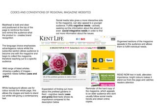
CODES AND CONVENTIONS OF REGIONAL MAGAZINE WEBSITES
Social media tabs gives a more interactive side
to the magazine, can also appeal to a younger
audience. Fulfills cognitive needs - actively
seeking out the information about the advert or
even social integrative needs in order to find
out more information about the issues.
Organised sections of the magazine
appeals to the audience and allows
them to fulfill individual needs.
READ NOW text in bold, alleviates
importance, bright colours makes it
stand out from the page and catches
readers attention
The language choice emphasises
advantageous nature whilst the
subscribe section allows audience to
become one with the magazine and
begin to collect the magazine,
therefore reaching out to a specific
audience
Reminder of the hard copy of
the magazine, which appeals
to an older audience who dont
usually follow social media
trends and obtain online
copies.
Expectation of finding out more
about the prettiest gardens in
Kent - cognitive needs (uses
and grats) Bold texts shows its
importance compared to the
description below
Wild range of listed articles
showing a gallery of images -
cognitive needs fulfilled (uses and
grats)
Masthead is bold and clear
and positioned at the top of the
page to reinforce the brand
and remind the audience what
the product is - creates brand
recognition
White background allows use for
colour across the whole page, this
allows the images and texts to stand
out whilst still giving a contemporary
feel.
ABSOLUTE BRIGHTON
Masthead is very large and bold to
grab the readers attention, also
contrasts with the dark background to
further stand out.
Hyperlinks with the sections to also help the reader
guide round the magazine. A search icon in the corner
helps to navigate around the magazine and helps
people find what they specifically want therefore
fulfilling cognitive needs (uses and grats )
Features on the home screen to
read. The pictures contrast to the
background and make it more
aesthetically pleasing, this fulfills
people cognitive needs.
Black background
allows use for colour
across the whole page,
this allows the images
and texts to stand out
whilst still giving a
contemporary feel.
Wild range of
listed articles
showing a gallery
of images -
cognitive needs
fulfilled (uses and
grats)
The little amounts of text and the
array of images highlights the fact
that it is for a younger audience and
the serif font gives it a very
contemporary informal feel
THE LONDON MAGAZINE
White background allows use for
colour across the whole page, this
allows the images and texts to stand
out whilst still giving a contemporary
feel.
Different hyperlinks with different
titles and drop down bars that fall
when you scroll over them, this
allows the audience to find the
specific topic they are looking for
therefore fulfilling cognitive needs
(uses and grats)
One large image on the home page
with the magazine title in the middle
of it, gives a more formal approach.
The picture is effective as it gives a
very tranquil feel however stands out.
The date of the magazine is
positioned below to keep the readers
informed and up to date with the
current trends and articles.
A logo is added above of the
masthead, this creates a very
sophisticated feel therefore
reaching out to an older
audience.
A san serif font is used to give
a sophisticated feel, therefore
attracting the higher classes
and possibly an older
audience.
The Bristol Magazine
Masthead is bold and clear and positioned at the top of
the page to reinforce the brand and remind the
audience what the product is - creates brand
recognition - also contrasts with the blue background
Organised sections of the
magazine appeals to the
audience and allows them to
fulfill individual needs.
Wild range of
listed articles
showing a gallery
of images -
cognitive needs
fulfilled (uses and
grats)
White background allows use for
colour across the whole page, this
allows the images and texts to stand
out whilst still giving a contemporary
feel.
Hyperlinks with the sections to also help the reader
guide round the magazine. A search icon in the corner
helps to navigate around the magazine and helps
people find what they specifically want therefore
fulfilling cognitive needs (uses and grats )
Contact us button allows the
reader to find out further
information about the articles or
the issues of the magazine -
this fulfills any further cognitive
needs (uses and grats)
Essex Life Magazine
Essex Life has exactly the same layout as Kent
Life. The only difference is the logo at the top
however it uses the same font as well.
The search bar helps navigate the reader
around the website and help find the specific
article they are looking for therefore helps fulfill
needs (uses ad grats)
Social media tabs gives a more interactive side
to the magazine, can also appeal to a younger
audience. Fulfills cognitive needs - actively
seeking out the information about the advert or
even social integrative needs in order to find
out more information about the issues.
Wild range of listed articles showing a gallery of
images - cognitive needs fulfilled (uses and
grats)
Organised sections of the magazine appeals to
the audience and allows them to fulfill
individual needs.
White background allows use for colour across
the whole page, this allows the images and
texts to stand out whilst still giving a
contemporary feel.
Summary of Regional Magazine
Websites
After analysing the websites I found that the typical codes and conventions are;
-The Masthead at the top of the page, typically the left but occasionally in the middle.
-Articles are often grouped together in rows and columns of two although a feature article
lies above all of the others.
-A subscribe section is sometimes found at the top of the home page or to the right side of
the page
-Links to other sites such as social media are visible
-Discounts and offers can be found to encourage the audience to look on their website
-Titles are usually in a serif font which grabs the readers attention and makes it easy to
read, however the text is usually in a san serif font to keep the formality
-Generally multiple images are used on the home page to advertise a ray of articles, and to
entice the reader into reading the magazine.

Ancillary Task 2 Codes and conventions

  • 1.
    CODES AND CONVENTIONSOF REGIONAL MAGAZINE WEBSITES Social media tabs gives a more interactive side to the magazine, can also appeal to a younger audience. Fulfills cognitive needs - actively seeking out the information about the advert or even social integrative needs in order to find out more information about the issues. Organised sections of the magazine appeals to the audience and allows them to fulfill individual needs. READ NOW text in bold, alleviates importance, bright colours makes it stand out from the page and catches readers attention The language choice emphasises advantageous nature whilst the subscribe section allows audience to become one with the magazine and begin to collect the magazine, therefore reaching out to a specific audience Reminder of the hard copy of the magazine, which appeals to an older audience who dont usually follow social media trends and obtain online copies. Expectation of finding out more about the prettiest gardens in Kent - cognitive needs (uses and grats) Bold texts shows its importance compared to the description below Wild range of listed articles showing a gallery of images - cognitive needs fulfilled (uses and grats) Masthead is bold and clear and positioned at the top of the page to reinforce the brand and remind the audience what the product is - creates brand recognition White background allows use for colour across the whole page, this allows the images and texts to stand out whilst still giving a contemporary feel.
  • 2.
    ABSOLUTE BRIGHTON Masthead isvery large and bold to grab the readers attention, also contrasts with the dark background to further stand out. Hyperlinks with the sections to also help the reader guide round the magazine. A search icon in the corner helps to navigate around the magazine and helps people find what they specifically want therefore fulfilling cognitive needs (uses and grats ) Features on the home screen to read. The pictures contrast to the background and make it more aesthetically pleasing, this fulfills people cognitive needs. Black background allows use for colour across the whole page, this allows the images and texts to stand out whilst still giving a contemporary feel. Wild range of listed articles showing a gallery of images - cognitive needs fulfilled (uses and grats) The little amounts of text and the array of images highlights the fact that it is for a younger audience and the serif font gives it a very contemporary informal feel
  • 3.
    THE LONDON MAGAZINE Whitebackground allows use for colour across the whole page, this allows the images and texts to stand out whilst still giving a contemporary feel. Different hyperlinks with different titles and drop down bars that fall when you scroll over them, this allows the audience to find the specific topic they are looking for therefore fulfilling cognitive needs (uses and grats) One large image on the home page with the magazine title in the middle of it, gives a more formal approach. The picture is effective as it gives a very tranquil feel however stands out. The date of the magazine is positioned below to keep the readers informed and up to date with the current trends and articles. A logo is added above of the masthead, this creates a very sophisticated feel therefore reaching out to an older audience. A san serif font is used to give a sophisticated feel, therefore attracting the higher classes and possibly an older audience.
  • 4.
    The Bristol Magazine Mastheadis bold and clear and positioned at the top of the page to reinforce the brand and remind the audience what the product is - creates brand recognition - also contrasts with the blue background Organised sections of the magazine appeals to the audience and allows them to fulfill individual needs. Wild range of listed articles showing a gallery of images - cognitive needs fulfilled (uses and grats) White background allows use for colour across the whole page, this allows the images and texts to stand out whilst still giving a contemporary feel. Hyperlinks with the sections to also help the reader guide round the magazine. A search icon in the corner helps to navigate around the magazine and helps people find what they specifically want therefore fulfilling cognitive needs (uses and grats ) Contact us button allows the reader to find out further information about the articles or the issues of the magazine - this fulfills any further cognitive needs (uses and grats)
  • 5.
    Essex Life Magazine EssexLife has exactly the same layout as Kent Life. The only difference is the logo at the top however it uses the same font as well. The search bar helps navigate the reader around the website and help find the specific article they are looking for therefore helps fulfill needs (uses ad grats) Social media tabs gives a more interactive side to the magazine, can also appeal to a younger audience. Fulfills cognitive needs - actively seeking out the information about the advert or even social integrative needs in order to find out more information about the issues. Wild range of listed articles showing a gallery of images - cognitive needs fulfilled (uses and grats) Organised sections of the magazine appeals to the audience and allows them to fulfill individual needs. White background allows use for colour across the whole page, this allows the images and texts to stand out whilst still giving a contemporary feel.
  • 6.
    Summary of RegionalMagazine Websites After analysing the websites I found that the typical codes and conventions are; -The Masthead at the top of the page, typically the left but occasionally in the middle. -Articles are often grouped together in rows and columns of two although a feature article lies above all of the others. -A subscribe section is sometimes found at the top of the home page or to the right side of the page -Links to other sites such as social media are visible -Discounts and offers can be found to encourage the audience to look on their website -Titles are usually in a serif font which grabs the readers attention and makes it easy to read, however the text is usually in a san serif font to keep the formality -Generally multiple images are used on the home page to advertise a ray of articles, and to entice the reader into reading the magazine.