
Recommended
More Related Content
What's hot
What's hot (20)
Similar to Kerrang contents page analysis.
Similar to Kerrang contents page analysis. (20)
More from liamjamesvernon16
Kerrang contents page analysis.
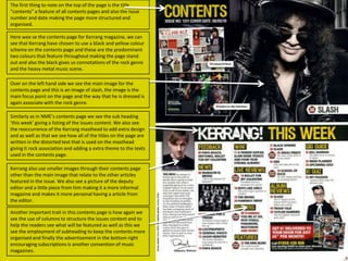
- 1. The first thing to note on the top of the page is the title “contents” a feature of all contents pages and also the issue number and date making the page more structured and organised. Here wee se the contents page for Kerrang magazine, we can see that Kerrang have chosen to use a black and yellow colour scheme on the contents page and these are the predominant two colours that feature throughout making the page stand out and also the black gives us connotations of the rock genre and the heavy metal music scene. Over on the left hand side we see the main image for the contents page and this is an image of slash, the image is the main focus point on the page and the way that he is dressed is again associate with the rock genre. Similarly as in NME’s contents page we see the sub heading ‘this week’ giving a listing of the issues content. We also see the reoccurrence of the Kerrang masthead to add extra design and as well as that we see how all of the titles on the page are written in the distorted text that is used on the masthead giving it rock association and adding a extra theme to the texts used in the contents page. Kerrang also use smaller images through their contents page other than the main image that relate to the other articles featured in the issue. We also see a picture of the deputy editor and a little piece from him making it a more informal magazine and makes it more personal having a article from the editor. Another important trait in this contents page is how again we see the use of columns to structure the issues content and to help the readers see what will be featured as well as this we see the employment of subheading to keep the contents more organised and finally the advertisement in the bottom right encouraging subscriptions is another convention of music magazines.