CODES AND CONVENTIONS OF
MAGAZINE CONTENTS AND DOUBLE
PAGE SPREADS
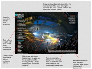
Main image taking up a
huge amount of space on
the spread, typical for
Country Weekly – it’s the
first thing the audience is
drawn to.
Color scheme
keeps in with
issue house
style –
professional
consistency
Lists of content
easily follow
able by
contrasting
colours
Text contrasting the
background making it
easy to read while bein
able to keep in with
professional house style
Image and stand alone text identifies the
main context of the issue drawing the
reader to this since it stands out from the
rest of the contents spread
Key information bold –
such as page
numbers, artist names,
features and
departments
Magazine
name and
date of
issue –
recent info
CODES AND CONVENTIONS OF
COUNTRY WEEKLY CONTENTS
• One large bold image in covering the entirety of the contents spread. This is
the usual convention for Country Weekly to appeal to the reader. I will not
incorporate this in my magazine as this is only typical to this particular
company and doesn’t have the same effect as multiple smaller images to
draw attention of a reader to different topics to engage them
• Consistent layout with other issues with half of the spread on the whole
magazine and half on the main topic and focus
• Each issue tends to have a different colour scheme dependant on main
focus and topics so colours usually gender neutral to entice all audiences.
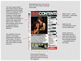
Date of issue – recent
information – informative
(uses and grat)
Bold Masthead with a red NME to
stand out and to keep in with their
house style.
Bold lines with
contrasting text to split
up the contents list.
Colour scheme is
black/white and red –
keep to this with black
text, white background
and red page numbers
– separates these to
the reader
Only text that breaks the
house style is a promotion to
attract the reader into buying
the magazine
The main image used for
this contents page is placed
towards the top of the page
below the masthead. This is
a conventional look for a
magazine contents page.
The image is quite large
which brings the attention of
detail to the image rather
than the text. There’s no
direct address which can be
an opposite effect of
grabbing the readers
attention.
The subtitle for the main
article is much larger
signaling the importance
to the reader. The text is
also much larger than the
rest of the article to further
show this
CODES AND CONVENTIONS OF NME
CONTENTS
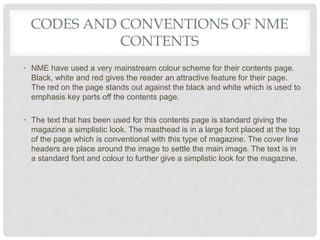
• NME have used a very mainstream colour scheme for their contents page.
Black, white and red gives the reader an attractive feature for their page.
The red on the page stands out against the black and white which is used to
emphasis key parts off the contents page.
• The text that has been used for this contents page is standard giving the
magazine a simplistic look. The masthead is in a large font placed at the top
of the page which is conventional with this type of magazine. The cover line
headers are place around the image to settle the main image. The text is in
a standard font and colour to further give a simplistic look for the magazine.
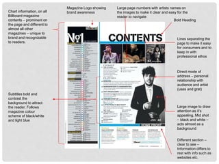
Magazine Logo showing
brand awareness
Lines separating the
page to make it easy
for consumers and to
keep in with
professional ethos
Bold Heading
Large page numbers with artists names on
the images to make it clear and easy for the
reader to navigate
Direct mode of
address – personal
relationship with
audience and artist
(uses and grat)
Large image to draw
attention as it’s
appealing. Mid shot
– black and white –
acts almost as a
background
Different section –
clear to see –
Information differs to
rest with info such as
websites etc.
Chart information, on all
Billboard magazine
contents – prominent on
the page and different to
almost all other
magazines – unique to
brand and recognizable
to readers.
Subtitles bold and
contrast the
background to attract
the reader. Follows
magazine colour
scheme of black/white
and light blue
CODES AND CONVENTIONS OF
BILLBOARD CONTENTS
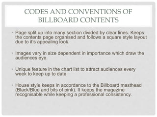
• Page split up into many section divided by clear lines. Keeps
the contents page organised and follows a square style layout
due to it’s appealing look.
• Images vary in size dependent in importance which draw the
audiences eye.
• Unique feature in the chart list to attract audiences every
week to keep up to date
• House style keeps in accordance to the Billboard masthead
(Black/Blue and bits of pink). It keeps the magazine
recognisable while keeping a professional consistency.
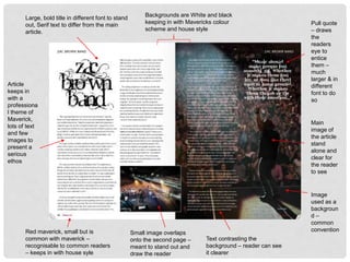
Pull quote
– draws
the
readers
eye to
entice
them –
much
larger & in
different
font to do
so
Image
used as a
backgroun
d –
common
convention
Main
image of
the article
stand
alone and
clear for
the reader
to see
Text contrasting the
background – reader can see
it clearer
Small image overlaps
onto the second page –
meant to stand out and
draw the reader
Large, bold title in different font to stand
out, Serif text to differ from the main
article.
Backgrounds are White and black
keeping in with Mavericks colour
scheme and house style
Red maverick, small but is
common with maverick –
recognisable to common readers
– keeps in with house syle
Article
keeps in
with a
professiona
l theme of
Maverick,
lots of text
and few
images to
present a
serious
ethos
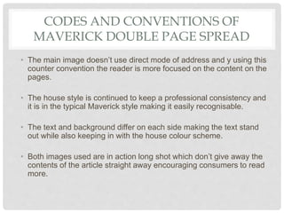
CODES AND CONVENTIONS OF
MAVERICK DOUBLE PAGE SPREAD
• The main image doesn’t use direct mode of address and y using this
counter convention the reader is more focused on the content on the
pages.
• The house style is continued to keep a professional consistency and
it is in the typical Maverick style making it easily recognisable.
• The text and background differ on each side making the text stand
out while also keeping in with the house colour scheme.
• Both images used are in action long shot which don’t give away the
contents of the article straight away encouraging consumers to read
more.
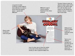
Direct mode
of address –
Uses and grat
Billboard Logo &
colours present
keeping to the colour
scheme
Long shot of artist
covering a whole page to
draw attention to it and to
show what the article’s
about – typical with
Billboard
Text is on a
different
background
than the rest of
the spread –
clearly shows
where the
information is
Use of a drop cap to draw the reader
to the start of the article and then it
carries on with a typical smaller font.
Different font
which is larger
to give an
overview of the
article.
‘Primary Colours’ given an
effect to make it seem 3D to
stand out, the colours also
fit in with the titles as all
colours on the spread are
primary colours – keeps in
with house style
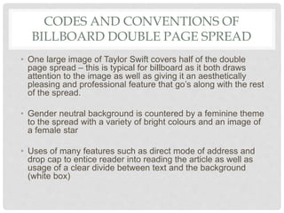
CODES AND CONVENTIONS OF
BILLBOARD DOUBLE PAGE SPREAD
• One large image of Taylor Swift covers half of the double
page spread – this is typical for billboard as it both draws
attention to the image as well as giving it an aesthetically
pleasing and professional feature that go’s along with the rest
of the spread.
• Gender neutral background is countered by a feminine theme
to the spread with a variety of bright colours and an image of
a female star
• Uses of many features such as direct mode of address and
drop cap to entice reader into reading the article as well as
usage of a clear divide between text and the background
(white box)
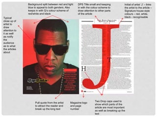
Typical
close up of
artist to
draw
attention to
it as well
as notify
the
audience
as to what
the articles
about
Background split between red and light
blue to appeal to both genders. Also
keeps in with Q’s colour scheme of
red/white and black
Magazine logo
and page
number
Pull quote from the artist
to attract the reader and
break up the long text
Two Drop caps used to
show which parts of the
article are most important
as well as breaking up the
text
DPS Title small and keeping
in with the colour scheme to
draw attention to other parts
of the article
Initial of artist ‘J’ – links
the artist to the article –
Signature house style
colours – red, white,
black - recognisable
CODES AND CONVENTIONS OF Q’S
DOUBLE PAGE SPREAD
• The first thing we notice on this spread is the big ‘J’ on the article. This
is one of their unique selling points as it stands out from the text on the
article; it also has that contemporary feeling of the genre hip hop as the
background of the image of Jay Z looks like something you would see
on a hip hop music video.
• The signature house style of the magazine is continued on the double
page spread which creates a professional consistency and allows the
page to be easily recognisable – this is something I will do in my
magazine
• Image of artist uses half the double page spread, this emphasises that
this is the subject of the article
• White background makes the text stand out while complying with the
colour scheme.

Codes and conventions contents

  • 1.
    CODES AND CONVENTIONSOF MAGAZINE CONTENTS AND DOUBLE PAGE SPREADS
  • 2.
    Main image takingup a huge amount of space on the spread, typical for Country Weekly – it’s the first thing the audience is drawn to. Color scheme keeps in with issue house style – professional consistency Lists of content easily follow able by contrasting colours Text contrasting the background making it easy to read while bein able to keep in with professional house style Image and stand alone text identifies the main context of the issue drawing the reader to this since it stands out from the rest of the contents spread Key information bold – such as page numbers, artist names, features and departments Magazine name and date of issue – recent info
  • 3.
    CODES AND CONVENTIONSOF COUNTRY WEEKLY CONTENTS • One large bold image in covering the entirety of the contents spread. This is the usual convention for Country Weekly to appeal to the reader. I will not incorporate this in my magazine as this is only typical to this particular company and doesn’t have the same effect as multiple smaller images to draw attention of a reader to different topics to engage them • Consistent layout with other issues with half of the spread on the whole magazine and half on the main topic and focus • Each issue tends to have a different colour scheme dependant on main focus and topics so colours usually gender neutral to entice all audiences.
  • 4.
    Date of issue– recent information – informative (uses and grat) Bold Masthead with a red NME to stand out and to keep in with their house style. Bold lines with contrasting text to split up the contents list. Colour scheme is black/white and red – keep to this with black text, white background and red page numbers – separates these to the reader Only text that breaks the house style is a promotion to attract the reader into buying the magazine The main image used for this contents page is placed towards the top of the page below the masthead. This is a conventional look for a magazine contents page. The image is quite large which brings the attention of detail to the image rather than the text. There’s no direct address which can be an opposite effect of grabbing the readers attention. The subtitle for the main article is much larger signaling the importance to the reader. The text is also much larger than the rest of the article to further show this
  • 5.
    CODES AND CONVENTIONSOF NME CONTENTS • NME have used a very mainstream colour scheme for their contents page. Black, white and red gives the reader an attractive feature for their page. The red on the page stands out against the black and white which is used to emphasis key parts off the contents page. • The text that has been used for this contents page is standard giving the magazine a simplistic look. The masthead is in a large font placed at the top of the page which is conventional with this type of magazine. The cover line headers are place around the image to settle the main image. The text is in a standard font and colour to further give a simplistic look for the magazine.
  • 6.
    Magazine Logo showing brandawareness Lines separating the page to make it easy for consumers and to keep in with professional ethos Bold Heading Large page numbers with artists names on the images to make it clear and easy for the reader to navigate Direct mode of address – personal relationship with audience and artist (uses and grat) Large image to draw attention as it’s appealing. Mid shot – black and white – acts almost as a background Different section – clear to see – Information differs to rest with info such as websites etc. Chart information, on all Billboard magazine contents – prominent on the page and different to almost all other magazines – unique to brand and recognizable to readers. Subtitles bold and contrast the background to attract the reader. Follows magazine colour scheme of black/white and light blue
  • 7.
    CODES AND CONVENTIONSOF BILLBOARD CONTENTS • Page split up into many section divided by clear lines. Keeps the contents page organised and follows a square style layout due to it’s appealing look. • Images vary in size dependent in importance which draw the audiences eye. • Unique feature in the chart list to attract audiences every week to keep up to date • House style keeps in accordance to the Billboard masthead (Black/Blue and bits of pink). It keeps the magazine recognisable while keeping a professional consistency.
  • 8.
    Pull quote – draws the readers eyeto entice them – much larger & in different font to do so Image used as a backgroun d – common convention Main image of the article stand alone and clear for the reader to see Text contrasting the background – reader can see it clearer Small image overlaps onto the second page – meant to stand out and draw the reader Large, bold title in different font to stand out, Serif text to differ from the main article. Backgrounds are White and black keeping in with Mavericks colour scheme and house style Red maverick, small but is common with maverick – recognisable to common readers – keeps in with house syle Article keeps in with a professiona l theme of Maverick, lots of text and few images to present a serious ethos
  • 9.
    CODES AND CONVENTIONSOF MAVERICK DOUBLE PAGE SPREAD • The main image doesn’t use direct mode of address and y using this counter convention the reader is more focused on the content on the pages. • The house style is continued to keep a professional consistency and it is in the typical Maverick style making it easily recognisable. • The text and background differ on each side making the text stand out while also keeping in with the house colour scheme. • Both images used are in action long shot which don’t give away the contents of the article straight away encouraging consumers to read more.
  • 10.
    Direct mode of address– Uses and grat Billboard Logo & colours present keeping to the colour scheme Long shot of artist covering a whole page to draw attention to it and to show what the article’s about – typical with Billboard Text is on a different background than the rest of the spread – clearly shows where the information is Use of a drop cap to draw the reader to the start of the article and then it carries on with a typical smaller font. Different font which is larger to give an overview of the article. ‘Primary Colours’ given an effect to make it seem 3D to stand out, the colours also fit in with the titles as all colours on the spread are primary colours – keeps in with house style
  • 11.
    CODES AND CONVENTIONSOF BILLBOARD DOUBLE PAGE SPREAD • One large image of Taylor Swift covers half of the double page spread – this is typical for billboard as it both draws attention to the image as well as giving it an aesthetically pleasing and professional feature that go’s along with the rest of the spread. • Gender neutral background is countered by a feminine theme to the spread with a variety of bright colours and an image of a female star • Uses of many features such as direct mode of address and drop cap to entice reader into reading the article as well as usage of a clear divide between text and the background (white box)
  • 12.
    Typical close up of artistto draw attention to it as well as notify the audience as to what the articles about Background split between red and light blue to appeal to both genders. Also keeps in with Q’s colour scheme of red/white and black Magazine logo and page number Pull quote from the artist to attract the reader and break up the long text Two Drop caps used to show which parts of the article are most important as well as breaking up the text DPS Title small and keeping in with the colour scheme to draw attention to other parts of the article Initial of artist ‘J’ – links the artist to the article – Signature house style colours – red, white, black - recognisable
  • 13.
    CODES AND CONVENTIONSOF Q’S DOUBLE PAGE SPREAD • The first thing we notice on this spread is the big ‘J’ on the article. This is one of their unique selling points as it stands out from the text on the article; it also has that contemporary feeling of the genre hip hop as the background of the image of Jay Z looks like something you would see on a hip hop music video. • The signature house style of the magazine is continued on the double page spread which creates a professional consistency and allows the page to be easily recognisable – this is something I will do in my magazine • Image of artist uses half the double page spread, this emphasises that this is the subject of the article • White background makes the text stand out while complying with the colour scheme.