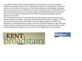
The document discusses how the author's media product uses, develops, and challenges conventions of real media.
It summarizes that the magazine's masthead, layout, colors, fonts, and cover photo generally conform to conventions but also challenge them in some ways. For example, using a landscape photo rather than a model on the cover.
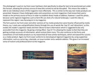
The ancillary tasks of a billboard and website complement the magazine by promoting it across different platforms. The billboard uses simple, eye-catching design that can be understood from a distance, and promotes the magazine's online and social media presence. The website features relevant images and multiple linked pages for an engaging user experience.
The document discusses how the creator used various media technologies throughout the research, construction, planning, and evaluation of their media project, including using YouTube for photography tutorials, Adobe Photoshop for image editing, Prezi for presenting work, and Weebly to build the project website. Media technologies helped with research, skills development, communication of ideas, and creating professional-looking final products that met industry standards. Feedback from focus groups aided improvements and ensured the work appealed to the target audience.
The document discusses the production of a regional magazine media product and how it conforms to conventions of real magazines. It summarizes how each element of the magazine production, including the front cover, contents page, and billboard, follows conventions in terms of layout, design choices, and content. This includes using familiar fonts, logos and slogans on the cover, incorporating reader submissions on the contents page, and promoting the magazine's cross-platform availability on the billboard. The document provides examples from other magazines to demonstrate how the magazine production under evaluation aligns with standard magazine formats and codes.
The document discusses the design elements of the front cover, double page spread, and contents page of the magazine "MSL". Key elements included on the front cover are the masthead, sell lines, main image, barcode, and price. For the double page spread, conventions like stand firsts, captions, and pull quotes are followed. The contents page includes headers, subheaders, and continuity of brand identity from the front cover. Feedback was mainly positive but suggested some areas could be less busy.
Q1 In what ways does your media product use, develop or challenge forms and ...briege simmonds
The document discusses how the media product uses and develops conventions of real media forms. It describes taking inspiration from Rolling Stone magazine for the masthead design, including a selling line like many magazines to attract readers, and using headlines similar to Q magazine. Conventionally, it includes the date, price, and barcode, but develops this by adding the email address. Photos are used conventionally to create eye contact. Splashes and a band index also follow conventions. The ransom note style quote is unconventional but aims to intrigue readers. Cover lines and placement of the title aim to inform and engage readers. Large pictures on their own page and credits for photos are also conventional. More photos were added to be visual and show aspects of the
The document discusses the ways in which the media product follows conventions of real magazines.
It describes how the front cover includes typical elements like the main image and cover lines, while challenging conventions through manipulations in Photoshop and a vibrant design.
The contents page challenges stereotypes by having a dominating color and informal tone.
The double page spread challenges white backgrounds through a custom background in Photoshop and varied fonts and sizes.
This document contains an evaluation of a student's media studies project creating a music magazine. The student summarizes how they used conventions from real magazines in their design. They explain the layout choices made for the front cover, contents page, and double page spread. The student also responds to questions addressing how the magazine represents social groups, what publisher might distribute it, who the target audience is, and how they attracted this audience. The student reflects on what they learned about technologies like Photoshop through constructing the magazine.
The document discusses how the media product Pulverizer uses and challenges conventions of real heavy metal magazines. It follows many conventions from magazines like Terrorizer in terms of cover design, masthead placement, barcode positioning, and contents page layout. However, it also challenges some conventions by using an aged paper background on the contents page and excluding drop capitals. The goal is to create a magazine that looks professional but also stands out from its peers.
The document discusses the design of a magazine cover, contents page, and article spread. It addresses how these designs follow conventions of real magazines in their genres or challenge conventions. The cover follows conventions like prominent masthead and placement of key information. The contents page lists articles clearly but uses an unconventional layout. The article spread places a large image on one page as is typical but includes an atypical teaser.
The document discusses the construction of a music magazine. It describes the development of various design elements including the cover, contents page, articles, and house style. Techniques like fonts, colors, images, and language are discussed in the context of representing the target audience and codes of conventions. The document also reflects on what was learned from the process, including skills with Photoshop, photography, lighting, and how the magazine addresses and attracts its intended readership.
The student created a local newspaper that both conformed to and challenged conventions of real newspapers. While keeping a typical tabloid layout and ideas from magazines, the logo, fonts, and lack of typical masthead made it unique. Audience feedback on social media was overall positive but pointed out some areas for improvement, such as clarity that it was a newspaper and making the masthead more prominent. The student learned that maintaining some newspaper principles was important to clearly communicate the product as a newspaper.
The document summarizes the ways in which the student used new media technologies in constructing their media coursework project on a local newspaper called "Rock & Rose." They used social media like Facebook to get audience feedback, blogging platforms like Blogger to share work and get feedback from teachers, and websites of existing newspapers and magazines for research and inspiration. The student found new media technologies made the project much more feasible and helped improve their work based on online feedback.
The document discusses how the media product uses and develops conventions of real magazines. It examines conventions used in the front cover, contents page, advertisements, and website. For the front cover, conventions like the masthead, color scheme, sell lines, barcodes, and images are used. The contents page follows conventions such as images, page numbers, editors' info, layout, and color scheme. Advertisements use conventions like short text, product image placement, branding, and contact info. The website adheres to conventions with its masthead, homepage image, social media links, articles, and contact page. The document analyzes how the media product both develops and challenges some conventions of real magazines.
The document discusses how the media product uses and develops conventions of real media. It summarizes the key design elements and conventions used for the front cover, contents page, editorial, advert, website, and billboard for a regional fashion magazine.
For each section, it highlights design choices that conform to typical magazine conventions, such as using large, clear mastheads and logos; short descriptive text; column layouts; high contrast images; and listing names and topics to generate reader interest. It also discusses some unconventional elements, like the contents page layout. Overall, the document focuses on how the project both adheres to and innovates on established magazine conventions across different media formats.
The document discusses how the media product uses and develops conventions of real magazines. It summarizes the key design elements and conventions used for the front cover, contents page, editorial, advert, website, and billboard sections of the magazine. Across all sections, common magazine conventions are followed such as using large, clear logos and mastheads; columns of text and images; short descriptive captions; contact and social media information; and consistent color schemes. The front cover includes a model, location shot, and credits to engage readers. Advertisements focus on local businesses and products. The website and billboard utilize multiple platforms to expand the audience and increase accessibility. Overall, the media product draws from conventions of fashion, regional, and online
The document summarizes the design process for a college magazine targeted at 16-19 year old students. Key points include:
- The cover features a relaxed student to convey comfort. Font and layout aim to feel modern rather than traditional.
- The contents page continues themes of informality and maturity. Pictures show social spaces and language is straightforward.
- Student feedback was positive about the bold colors, readable fonts, and messages of understanding their interests.
- Areas for improvement include adding more cover text, changing the cover photo angle, and increasing font sizes for sections on the contents page. Better planning of photo locations could also aid the editing process.
The document discusses the media product's use of conventions and challenges to magazine conventions. The cover follows conventions like magazine layout but uses an unconventional close-up image. The contents page generally follows conventions but has an unconventional layout. The double page spread follows conventions like dominant images but challenges conventions through limited text.
This document provides an evaluation of Abbie Fowler's media product. It discusses how the product uses and develops conventions from real media products like Mixmag magazine. Specifically, it repeats conventions like masthead positioning and main image, puff promotion, and strapline placement from Mixmag. It also challenges conventions by making some elements like stories and sections clearer. Photoshop was used to help create effects and maintain a consistent color scheme. The document discusses how the product represents particular social groups that would be interested in club music. Overall, it reflects on the learning process of constructing the media product and meeting the demands of the production process.
The document discusses the process of creating a magazine cover, contents page, and center spread for an alternative rock magazine. The creator looked to MOJO magazine for inspiration on conventions and forms to emulate, such as using a large bold heading, placing cover lines and images prominently, and including pull quotes and photos on the contents page. The creator learned Photoshop and InDesign skills like removing backgrounds from images and laying out pages. Comparing the preliminary and final products, the creator felt they learned to make the magazine more professional through additional research and an audience focus.
The document provides an analysis by James Willis of their media product. It discusses how the product uses, develops, and challenges conventions of real media. It is summarized as follows:
[1] The product follows conventions of real magazines in its layout and design to look familiar, but also tries to be unique and eye-catching. [2] Elements are developed further, like the contents page using a double page spread design and combining ideas from other magazines. [3] Some elements challenge conventions, like only featuring a male model on covers despite targeting both genders. The document examines how the product represents social groups and might be distributed.
My magazine targets 18-30 year olds interested in indie/rock music. It develops rather than challenges conventions by using attractive imagery and focusing on a main image and content on the cover similar to other magazines. The magazine represents this target audience through its styling, choice of featured artists, and photos taken in a location emulating the genre. Distribution through conventional retail stores is preferred to reach a broad audience and drive sales based on the content of each issue.
The document provides details about the process of creating a dance music magazine as a media product. It describes conducting a survey to identify the target audience as mainly male aged 16-26 interested in dance music genres like house and acid house. Inspiration was taken from existing magazines like Mixmag in terms of design conventions. The magazine aims to appeal to its target audience through the cover star, articles and representing associated subcultures. It will be distributed monthly through an existing publisher and promoted at music festivals.
The document discusses the ways in which the author's media product follows conventions of real media products. Specifically, the author placed the masthead, header, footer, barcode, date, issue number and price on the front cover following conventions. The contents page also follows conventions with page numbers and images. Inspiration was drawn from the Kerrang magazine for layout. Throughout the product, conventions are followed for the front cover, contents page and double page spread regarding images, titles, fonts and page elements. Some conventions around continuity of style are challenged through experimentation with different fonts. Shot types and story topics also emulate conventions of music magazines.
The document discusses how the student's media product compares to real media products in its use of conventions and forms. It describes how the masthead conforms to expectations by being positioned in the top left corner but challenges conventions with its unique title font. The layout conforms to magazine conventions but includes developed elements like a quote in the double page spread. The student learned about using tools in Photoshop and InDesign to edit images and layout pages professionally. Overall it improved from the preliminary task by having a more balanced and appealing design.
The document discusses how the student's media product follows conventions of real magazines. It describes including elements like a masthead, header, footer, barcode and price on the front cover. The contents page includes page numbers and images. Shot types like medium close-ups were used for consistency. Feature stories about artists and albums were included as these are conventional. Descriptions of the front cover, contents page and double page spread show how conventions like large central images and lists of contents were followed to make the media product seem realistic. Some experimentation with font styles also occurred.
The document discusses the learning process of designing magazines from a college magazine to a music magazine. Some key lessons learned were to take more risks with designs to stand out, research the target audience to better appeal to them, and develop skills to create more intriguing imagery. Specifically, the author learned to alter fonts using DaFont and InDesign to change font styles, colors and weights to make the magazines look more professional and interesting to readers. They also learned to hand-draw coverlines to add variety to the front cover and connect it to the main image.
- The magazine uses conventions typical of music magazines like having the name in bold letters at the top with the logo, but also challenges some conventions.
- It includes features expected on magazine covers like the price and barcode, and follows conventions for layouts inside like the double page spread.
- The magazine represents its target audience of 16-21 year old "indie" teenagers through its images, language, and music-focused content and features.
The document discusses how the media product uses and challenges conventions of real magazines. It uses page numbers for navigation, edits the main image over the masthead on the cover as most magazines do. However, it challenges the convention of using primary colors by using purple, black, grey and white instead. The writing style is informal to suit the target audience. Consistent fonts are used but some are changed for emphasis. Pull quotes, cover lines, barcodes, and direct address photography are used, but one photo challenges the convention of direct address. The product represents females in its color scheme and layout but features an equal number of males and females. It mostly represents white people due to the featured bands and models all being white and the alternative
This video uses natural lighting and cinematography to tell a narrative of a young boy attempting to win the heart of an admirer over the course of a day. Shots involve shallow depth of field and silhouettes to create a pure, cinematic style. Though unconventional to use a child as the protagonist and film on a grey beach day, this adds to the realistic, indie short film appeal of the video.
Charlie Barker created a regional magazine and evaluated how it used and developed conventions of real magazines. Audience feedback helped shape the design and content. Technologies like Facebook, YouTube, Photoshop and Weebly were used at different stages of production to research, plan, construct and evaluate the work. The magazine employed conventions of layout, color scheme, imagery and content while also challenging conventions in some ways based on audience feedback.
During the research and planning stages, the group exclusively used the internet to gather information on psychological thrillers by watching examples on YouTube and reviewing other presentations. They created blogs on Blogger to store research.
In the construction stage, they used Final Cut Pro for video editing and Photoshop for image editing. Final Cut Pro provided professional effects while Photoshop allowed editing of the film poster and review page. They filmed using a Canon camera.
For evaluation, they used PowerPoint and Prezi to record answers and uploaded the presentation to SlideShare to share online along with their blogs. They utilized various media technologies throughout the project.
The combination of the main product (a short film) and ancillary texts (poster and film review) is somewhat effective but also inconsistent. While the poster style is continued across titles and fonts, creating mystery, its dark background does not match the bright, outdoor setting of the film. Additionally, the ancillary texts are darker than the bright, outdoor filming location shown in the final film. However, the poster image does promote the film's mysterious nature and prompt questions from audiences as intended. Overall, the inconsistency between the dark ancillary texts and brighter film is noticeable but the poster accomplishes the goal of piquing interest in the short film's mystery.
The document evaluates the media product "The MAD House" soap opera trailer and its use of conventions and challenges to conventions of real soap opera trailers and media. It discusses how the trailer follows conventions like using multiple narrative threads, graphics, logos, music and voice over. It also challenges some conventions by using longer continuous shots instead of quick cuts to draw audiences in emotionally. The document also evaluates the trailer's magazine and billboard ancillary products and how they effectively synergize with the main trailer product through shared visual elements, storyline and branding to promote across platforms.
3a) what have you learnt from audience donejdhtgdfd
The document discusses feedback received from audiences on ancillary texts created for a music video production. It describes showing initial drafts of album covers, photos, and a poster to a focus group. Feedback included making the band name larger on the album cover, adding more detail to legal text, and using one large stretched photo instead of two for the inside cover. For the poster, the group felt it didn't look like a poster and was missing additional marketing information. The document concludes by showing the final ancillary texts, stating many changes were made throughout the process based on focus group feedback.
This music video uses a black and white color scheme with occasional colored filters. Close-ups of band members' faces are used frequently with a shallow depth of field. Shots are edited in a continuous looping pattern. A handheld camera creates unsteady shots, adding to the aggressive nature of the song. The video has an ambiguous narrative and builds intensity through its editing and climaxing soundtrack. It depicts the band members as intense rock artists through harsh lighting and winds, supported by theories of masculinity in rock genres.
The designer Christos Paphiti created an advertisement for a regional magazine but realized it did not match the style of other ads, so he retook photos and designed a new ad. This slideshow will show the different versions of the redesigned advertisement.
This document provides an evaluation of a student's media studies project to create a music magazine. The student discusses how they used conventions from real magazines like Rolling Stone in their design. They explain the features included on the front cover and contents page to follow industry standards. For a double page spread interview, the student arranged images and text conventionally and credited contributors as required. They believe Bauer Media could potentially publish their magazine due to its relationship-building content and cross-platform convergence. The student reflects on learning Photoshop skills like layers and editing images to make their magazine look professional.
This document provides an evaluation of a student's media studies project to create a music magazine. The student summarizes how they used conventions from real magazines in their design. They explain the layout and content of the front cover, contents page, and double page spread. The student also reflects on what they learned about technologies like Photoshop and fonts in constructing the magazine. Overall, the document evaluates how the student's media product represented target audiences and could be distributed by a publisher based on research.
Thierry Preston completed an A2 Media Studies evaluation of a regional magazine they created. They conducted extensive research on existing magazines to determine conventions to emulate or challenge. Audience feedback from a focus group was invaluable throughout the process, helping with design choices and content. Various media technologies were used at different stages, including Photoshop for image editing, Facebook for audience feedback, Weebly to create the magazine website, and SlideShare for the final evaluation presentation.
The document summarizes how the magazine uses, develops, and challenges conventions of real magazines in its design. For the front cover, it follows conventions like including a masthead, main image, price and date, but challenges conventions by placing the masthead sideways and not including additional design elements. For the contents page, it uses conventional elements like columns and main images but challenges conventions by omitting the editor's letter. The double page spread develops conventions through the main image but also follows conventions with design choices like drop caps and bylines.
Hina Depala evaluated their music magazine media product. They researched conventions from real music magazines to develop and challenge conventional forms in their magazine. This included layout, size, content, and colors. They analyzed examples of music magazine covers and double page spreads to understand conventions. Their target audience was ages 16-28 from social classes B, C1, and C2 located in London interested in new musicians. They aimed to attract this audience through cross-media promotion like TV ads. Their closest competitors were established brands like NME targeting the same audience.
The document discusses the student's media product, a music magazine, and how it uses and challenges conventions of real music magazines. The front cover uses conventions like a bold title overlapping the main image. However, the emotions portrayed by the model are unconventional. The contents page varies article fonts by color but uses unconventional images, background, and font type. The double page spread merges images with text and headlines similarly to real magazines but sets out text and uses images differently. The magazine represents young indie rock-loving females and could be distributed in local shops to this target audience. The student learned about technologies like Blogger, Fireworks, and digital cameras through constructing the magazine.
This document discusses the target audience and methods for attracting and addressing the audience for a music magazine. The target audience is males and females aged 16-25 interested in indie, pop, and rock music and technology. Focus groups were used to get feedback from the target audience.
The front cover uses a neutral image of an artist making eye contact to appeal to both genders. The masthead and anchor text create intrigue. The contents page uses social media links and sections for easy navigation to engage younger readers. Competitions and calls to action like "free" and "win" entice readers.
Pull quotes and bold artist names catch attention in articles. Large spanning images create a personal relationship with the artist
The document discusses the student's magazine project. They used conventions like mastheads, cover lines and image placement typical of magazines like Kerrang. The layout and style was intentionally very conventional to make the magazine seem realistic. The language, fonts and colors used were also conventional to attract a general male audience aged 18-25. During the project, the student learned to use software like Paint.net, Word, Blogspot and 1001fonts to design the magazine covers, layouts and track their progress. Overall, the software was relatively easy to use and helped the student produce their magazine.
The document discusses how the media product uses and develops conventions of real magazines. It analyzes the front cover, contents page, billboard, and website elements. For each element, it identifies conventions used in other magazines that were followed in the media product. These include using a masthead on the front cover and website, images and page numbers on the contents page, contact information on the website, and promotion of social media links. It aims to follow reader expectations created by real magazine conventions while adding some unconventional elements like a colored line on the billboard for branding.
The document summarizes a student's media project creating a music magazine. The student used conventions from real music magazines like NME in their magazine's design but also challenged some conventions. They included a front cover, contents page, and double page interview spread that drew inspiration from NME in terms of layout, images, and use of color while also making some unique design choices. The magazine's target audience is described as males and females aged 15-25 interested in indie music.
The document discusses the codes, conventions, and genres used in creative works. It focuses on the conventions the author followed and challenged in their magazine covering street style fashion.
The author summarizes the conventions they followed for the magazine cover page masthead, date/website placement, and white background. They challenged conventions by making the masthead more prominent than the main image and focusing on the background scene rather than accessories.
The author discusses how they engaged audiences through surveys to understand needs and define unique selling points. The magazine would be distributed both online through digital magazine sites and the author's app, and in print through local bookshops popular with youngsters. The author's production and technology skills improved through practicing photography, editing
My magazine challenges conventions by focusing on street style fashion in Pakistan to promote freedom of expression among teenagers. It represents social groups interested in Western street style seen in magazines like Grazia and Elle. The magazine would be distributed both online through sites like Issuu and as a print publication through bookshops and shopping malls to engage audiences. Working on this project helped improve the creator's photography, editing, and presentation skills through learning techniques like using Photoshop and integrating technologies like blogs, social media, and presentation software.
The document discusses the codes, conventions, and genres used in creative works. It focuses on the conventions the author followed and challenged in their magazine covering street style fashion.
The author summarizes the conventions they followed for the magazine cover page masthead, date and website placement. They challenged conventions by focusing more on the background mise-en-scene rather than just the main object.
The author engaged audiences through surveys to understand their needs and interests. The magazine would be distributed both online through digital magazine sites and the author's app, and in print through local bookshops popular with young people.
My magazine challenges conventions by focusing on street style fashion in Pakistan to promote freedom of expression among teenagers. It represents social groups interested in Western street style seen in magazines like Grazia and Elle. The magazine would be distributed both online through sites like Issuu and as a print publication through bookshops and shopping malls to engage audiences. Working on this project helped improve the creator's photography, editing, and presentation skills through learning tools like Photoshop and developing a stronger understanding of composition. Technologies like blogs, social media, and embedding tools were integrated at different stages of the project from planning to content sharing.
My magazine challenges conventions by focusing on street style fashion in Pakistan to promote freedom of expression among teenagers. It represents social groups interested in Western street style seen in magazines like Grazia and Elle. The magazine would be distributed both online through sites like Issuu and as a print publication through bookshops and stores popular with young people. Through this project, my photography, editing, and presentation skills improved as I learned techniques like camera angles and integrated technologies like blogs, social media, and editing software.
The document discusses how a media product follows and challenges conventions. It summarizes how the magazine cover follows conventions through the use of a masthead, direct address for the main image, and a consistent color scheme. It challenges conventions by placing the main image off-center. The contents page follows conventions through its organization and branding consistency, while one image challenges conventions by using indirect address. The article page follows conventions with its headline, standfirst, and byline, while challenging conventions by only using one main image instead of multiple like typical magazines.
This document contains an evaluation of a student's media studies coursework project to create a music magazine. The student summarizes their use of conventions from their magazine of inspiration ("Q" magazine) in designing the layout, structure, and content of their magazine. This includes replicating elements like the location of the masthead, adding artist listings on the cover, and using consistent colors. The student also discusses some ways their magazine differs, such as through more casual clothing of their model and personal responses in the interview feature. The evaluation reflects on how the magazine represents social groups like young R&B fans and troubled young men through the images and language used.
Amy Walker created a local newspaper called "The Manchester Independent" that drew upon conventions from real newspapers like layout, style, and content. She received overall positive feedback that her newspaper looked professional and was balanced between tabloid and broadsheet styles. However, one reviewer noted the images could have been larger. Amy reflects that she successfully emulated real newspapers while creating her own style and house conventions across her various media pieces.
Amy created a local newspaper called "The Manchester Independent" that drew upon conventions from other newspapers like the Metro and Salford Advertiser. She aimed for a neutral style that balanced images and text like a tabloid while maintaining a formal tone like a broadsheet. Feedback praised the balanced layout and local stories but noted images could be larger. Amy researched newspapers online and used Photoshop for layouts, Premiere for her radio ad, and Excel to analyze market research findings. Overall, her media product successfully emulated real newspaper conventions.
The student learned many skills from their preliminary task to the final production that improved the professional quality of their work. Specifically, they learned how to better use lighting, select appropriate fonts, implement a consistent style, utilize layers in Photoshop, and incorporate industry conventions like well-designed mastheads. They were able to apply these lessons to create a double page spread for their final project that had unique colors, professional positioning of images, and an eye-catching "lens flare" effect. Overall, their skills in Photoshop and understanding of magazine design greatly increased, allowing them to produce a higher quality final product.
The student learned about various technologies through creating a music magazine. They used a Canon 600D digital camera to take photographs, which allowed for instant viewing and large storage capacity. Photoshop was used to manipulate images and add text. They used their mobile phone to conveniently take photos and communicate with others. PowerPoint and SlideShare helped create and share an online evaluation presentation. A projector was used to project an image onto the student's body for the cover. Through tutorials and practice, the student improved their skills with these technologies, creating a higher quality final product than would have been possible otherwise.
My target audience for the electronic music magazine is males and females aged 16-25. Feedback from a focus group on Facebook helped address what this age group would want in a magazine. While the initial research found more male interest, the magazine aims to attract both genders equally through neutral colors and inclusion of both male and female models. Features like bold text, imagery, and uncluttered layout align with conventions of magazines for this age range. Eye-catching images and direct addresses to the reader are intended to attract and engage the young audience.
Harris Publications would be the best media institution to distribute my electronic music magazine. As the largest publisher of music magazines in the US, selling over 285,000 copies monthly, Harris Publications has expertise in the genre and a large customer base. Their experience publishing "Scratch" magazine shows their ability to promote similar electronic music titles. Their large scale of operations also means my magazine's production costs would be relatively low.
The document discusses how the media product represents social groups. It summarizes that the identity of the model on the cover is blurred, suggesting that anyone has potential to succeed in the music industry. Medium close-ups of male and female models are used to allow both genders to relate. Convention is broken by having a male model on the cover rather than female, challenging stereotypes. The layout uses many images and little text consistent with attracting a young audience that prefers visuals over words.
The document discusses the conventions used in media products and how the author's magazine challenges and develops some of those conventions. Some of the common conventions the magazine uses include a masthead, features, columns, images and page numbers positioned at the top of the page. However, it challenges conventions by placing the main image across a double page spread rather than splitting it, and by having a male model on the cover rather than a female to challenge gender norms. The magazine also includes unconventional elements like social media links to better engage its target audience. Overall, the magazine draws from standard industry conventions but also adapts them to better suit its specific purpose and audience.
The document discusses how the media product uses, develops, and challenges conventions of real media products. It summarizes the key design elements and layout features used in magazines and how the media product incorporates or adapts these conventions. For example, it uses common elements like a masthead, features, and images but challenges conventions by placing the masthead behind an image rather than above it. It also discusses the target audience, how to attract this audience, and what technologies and skills were learned through constructing the media product.
This slide is special for master students (MIBS & MIFB) in UUM. Also useful for readers who are interested in the topic of contemporary Islamic banking.
This presentation was provided by Steph Pollock of The American Psychological Association’s Journals Program, and Damita Snow, of The American Society of Civil Engineers (ASCE), for the initial session of NISO's 2024 Training Series "DEIA in the Scholarly Landscape." Session One: 'Setting Expectations: a DEIA Primer,' was held June 6, 2024.
हिंदी वर्णमाला पीपीटी, hindi alphabet PPT presentation, hindi varnamala PPT, Hindi Varnamala pdf, हिंदी स्वर, हिंदी व्यंजन, sikhiye hindi varnmala, dr. mulla adam ali, hindi language and literature, hindi alphabet with drawing, hindi alphabet pdf, hindi varnamala for childrens, hindi language, hindi varnamala practice for kids, https://www.drmullaadamali.com
Main Java[All of the Base Concepts}.docxadhitya5119
This is part 1 of my Java Learning Journey. This Contains Custom methods, classes, constructors, packages, multithreading , try- catch block, finally block and more.
A review of the growth of the Israel Genealogy Research Association Database Collection for the last 12 months. Our collection is now passed the 3 million mark and still growing. See which archives have contributed the most. See the different types of records we have, and which years have had records added. You can also see what we have for the future.
it describes the bony anatomy including the femoral head , acetabulum, labrum . also discusses the capsule , ligaments . muscle that act on the hip joint and the range of motion are outlined. factors affecting hip joint stability and weight transmission through the joint are summarized.
ISO/IEC 27001, ISO/IEC 42001, and GDPR: Best Practices for Implementation and...PECB
Denis is a dynamic and results-driven Chief Information Officer (CIO) with a distinguished career spanning information systems analysis and technical project management. With a proven track record of spearheading the design and delivery of cutting-edge Information Management solutions, he has consistently elevated business operations, streamlined reporting functions, and maximized process efficiency.
Certified as an ISO/IEC 27001: Information Security Management Systems (ISMS) Lead Implementer, Data Protection Officer, and Cyber Risks Analyst, Denis brings a heightened focus on data security, privacy, and cyber resilience to every endeavor.
His expertise extends across a diverse spectrum of reporting, database, and web development applications, underpinned by an exceptional grasp of data storage and virtualization technologies. His proficiency in application testing, database administration, and data cleansing ensures seamless execution of complex projects.
What sets Denis apart is his comprehensive understanding of Business and Systems Analysis technologies, honed through involvement in all phases of the Software Development Lifecycle (SDLC). From meticulous requirements gathering to precise analysis, innovative design, rigorous development, thorough testing, and successful implementation, he has consistently delivered exceptional results.
Throughout his career, he has taken on multifaceted roles, from leading technical project management teams to owning solutions that drive operational excellence. His conscientious and proactive approach is unwavering, whether he is working independently or collaboratively within a team. His ability to connect with colleagues on a personal level underscores his commitment to fostering a harmonious and productive workplace environment.
Date: May 29, 2024
Tags: Information Security, ISO/IEC 27001, ISO/IEC 42001, Artificial Intelligence, GDPR
-------------------------------------------------------------------------------
Find out more about ISO training and certification services
Training: ISO/IEC 27001 Information Security Management System - EN | PECB
ISO/IEC 42001 Artificial Intelligence Management System - EN | PECB
General Data Protection Regulation (GDPR) - Training Courses - EN | PECB
Webinars: https://pecb.com/webinars
Article: https://pecb.com/article
-------------------------------------------------------------------------------
For more information about PECB:
Website: https://pecb.com/
LinkedIn: https://www.linkedin.com/company/pecb/
Facebook: https://www.facebook.com/PECBInternational/
Slideshare: http://www.slideshare.net/PECBCERTIFICATION
A Strategic Approach: GenAI in EducationPeter Windle
Artificial Intelligence (AI) technologies such as Generative AI, Image Generators and Large Language Models have had a dramatic impact on teaching, learning and assessment over the past 18 months. The most immediate threat AI posed was to Academic Integrity with Higher Education Institutes (HEIs) focusing their efforts on combating the use of GenAI in assessment. Guidelines were developed for staff and students, policies put in place too. Innovative educators have forged paths in the use of Generative AI for teaching, learning and assessments leading to pockets of transformation springing up across HEIs, often with little or no top-down guidance, support or direction.
This Gasta posits a strategic approach to integrating AI into HEIs to prepare staff, students and the curriculum for an evolving world and workplace. We will highlight the advantages of working with these technologies beyond the realm of teaching, learning and assessment by considering prompt engineering skills, industry impact, curriculum changes, and the need for staff upskilling. In contrast, not engaging strategically with Generative AI poses risks, including falling behind peers, missed opportunities and failing to ensure our graduates remain employable. The rapid evolution of AI technologies necessitates a proactive and strategic approach if we are to remain relevant.
Thinking of getting a dog? Be aware that breeds like Pit Bulls, Rottweilers, and German Shepherds can be loyal and dangerous. Proper training and socialization are crucial to preventing aggressive behaviors. Ensure safety by understanding their needs and always supervising interactions. Stay safe, and enjoy your furry friends!
Introduction to AI for Nonprofits with Tapp NetworkTechSoup
Dive into the world of AI! Experts Jon Hill and Tareq Monaur will guide you through AI's role in enhancing nonprofit websites and basic marketing strategies, making it easy to understand and apply.
Introduction to AI for Nonprofits with Tapp Network
Media studies evaluation a2 done
1. Question 1
In what ways does your media product,
use, develop or challenge forms and
conventions of real media products.
2. If we observe aspects within my media production, such as layout, use of colour, imagery,
mastheads, language and attention to media theory as well as real media product comparisons.
We can see how codes and conventions of real media products can be challenged, developed
and used. As we can see in my magazine front cover my masthead reads, ‘Kent Broadstairs’, the
title conveniently fits the genre of a regional magazine whilst giving the specific area covered
within it. The masthead is positioned at the top left of the page to intentionally catch the
attention of the reader.
From conducting my research I have found that my Target audience tend to read from top to
bottom and from left to right, meaning my masthead neatly introduces the magazine. This idea
of a title in the top left is the common theme for most regional magazines. My title ‘Kent
Broadstairs’ automatically gives the reader a clear idea of what the magazine is about and what
type of content it is going to contain (information about Broadstairs in Kent), the title is similar
to likeminded regional magazine’s such as ‘Northern life’ ‘Bygone Kent’ and ‘Local living’.
3. The colours used within my masthead conformed to the codes and conventions of a regional magazine because
like most magazines, the colour’s I used had as my house style throughout the magazine, e.g. using the same
blue for my page numbers, smaller subtext, and directional points. The blue on contrasts strongly with the
black next to it, which makes it appear more visually striking and highlights how the magazine focuses on
Broadstairs, whilst also attracting potential readers.
I used the font ‘century’ for my masthead and my other texts just as my sell line, this creates a sense of
elegance yet neatness. This once again conforms to my codes and conventions of a regional magazine as
Broadstairs is considered an elegant and tidy place. I made this decision with the use of my focus group who
helped me decide between different font, they decided this pleases to my demographic more than a more
formal sans serif font.
4. The photograph I used on my front cover had been shot specifically to allow for text to be positioned just under
the horizon, allowing the primary source of view (the sunset) to not be disrupted. This means the reader is
able to see individual area’s of the magazine more effectively. This is similar to the way real media products are
presented. However I have challenged codes and conventions as most magazines I had researched used a
model as the primary source of focus in order to establish direct mode of address, however I used this photo
because some regional magazines such as Kent life use shots of a natural landscape, I used this idea to
represent the region I was focusing on in my magazine.
The font used on my front cover and other sections of my media production were heavily influenced by media
theory, e.g. I used uses and gratification theory through the use of words like ‘top 15’ and ‘attractions’, as this
evokes the reader’s cognitive needs and their desire to learn information which is suggested to be only
accessible from this magazine. By giving a listing effect, ‘top 15’ I’m allowing the reader to feel that they are
getting multiple accounts of information, which entices them more. This also conforms to the forms and
conventions of real media products as my researched all have similar techniques, which aid toward the success
as a media product. Again my front cover conforms to stereotypical regional magazines by using supportive
information, such as a price tag, a barcode, an issue number and a website address. This gives it an increased
sense of realism and professionalism to the magazine.
5. • If we look at my other media pieces, like my double page advert and my contents, we can see how codes
and conventions has been met, for example in my double page spread the content is marginalised to allow
the reader to identify and read separate sections of the page. My inspiration, which is ‘Kent Life’, which
uses the same 4 sections contents against a white background, this gives the text more opportunity to
stand out. I also used a different coloured font to highlight the page colours and subsections of the
contents, this follows the codes of conventions of most regional magazines. I have also used the drop
shadow tool on my image on my first contents page, this makes the image stand out and gives it the effect
of a collage, which is similar to the techniques used in Kent life. This also appeals to the reader as it makes
it seem far more personal and also influences the reader to feel that the image (Viking bay) Is accessible to
all and has a family orientated effect. This uses and gratification theory, which states that it ‘enhances
social interaction’ and focuses on the ‘social and psychological needs of the reader.
• I followed the codes and convention’s again of a regional magazine by putting my title ‘Kent Broadstairs’ in
the top left corner of my contents page, this reinforces the name and theme of the magazine. I initially
didn’t have this layout and tried to keep my contents simplistic and plain, trying to give it a modern, smart
look. However my focus group didn’t agree with this because they thought the region I was working with
was more family (fun) orientated instead of being a more modern approach (conventionally somewhere
like Kensington or Chelsea).
6. Moreover my contents page and advertisement we can see how I have challenged codes and conventions, this
is because they do not challenge a direct mode of address and they don’t contain any direct models facing the
reader. Even thou direct mode of address captivated the reader I have decided to go against that as I feel that
my images are suitable to present what the magazine is going to contain, I have used text within the photos to
highlight what each photo is about. However I have used direct mode of address in the content of my magazine
, I ask the audience ‘are celebrities the new bathers’, this gives the reader social interaction and evokes the
reader’s companionship motives as they feel part of an actual conversation rather that reading a block of text.
Attention to detail such as page numbers, the date of issue, issue number and the magazine name were also
placed on the page as this is heavily used in most media pieces as it provides uniformity amongst pages.
I have followed codes and conventions of other media products for my advert by creating a very simplistic,
smart double page image of a speaker and a vinyl. Adverts through magazines such as Kent Life appeal to a
demographic which are from a higher class and tend to spend more money on products. The adverts are very
slick and contain minimal text. I have used these codes and conventions to build my advert, which is just on
page mirrored over to the next. The image’s only text is ‘ION’, which highlights the simplistic style and classy
look of the product.
8. • By looking at my ancillary tasks, we can see how my billboard and advert both successfully combine with my main product to
create a more effective and realistic piece. Trying to find research examples of billboards advertisements for regional
examples proved to be very difficult, I based my ancillary task on a billboard for a national magazine and also used my focus
group to help gain idea’s. For example I found an example of a billboard from ‘Resident Magazine’ where its very simplistic
and contains the title of the magazine, and presents the media platforms available to access it. After conducting my
research I found that the type of audience who view billboard advertisements only glance at them as they are normally on a
bridge or by a road, therefor the idea to keep them simple and informative seems ideal. This research has led to me creating
my billboard mainly imaged based so it can be understood by anyone. The use of the IPad and IPhone presenting the cover
of the magazine, in this way I'm presenting how I have interlinked technology with magazine’s.
• The limited wording used within my billboard advertisement were the words Mobile and Online as well as the social media
links (Facebook, Instagram, Twitter) and the website are all in large, bold fonts making it accessible to read from a distance
and for all ages. Also I am appealing to a younger audience by putting my social media links, as a younger demographic tend
to use these sites more than old. This gives it association between social networking (which also act as advertising) and the
magazine. The three thumbnail images of social media sites are very well recognised and can be spotted from just a glance,
suggesting that the public will feel the need to check them out. The magazine’s title ‘Kent Life’ was also included in the top
left in a large font, whilst using the same colour scheme’s as all of my production pieces. This also maintains the link
between the different pieces of media and also establishes a brand identity. My research also suggests that the target
demographic read from left to right and up to down, therefor by having my title in the top left it will be the first thing read.
The use of colours in my piece all work well with the idea of having an eye catching banner. The large bold white text stands
out against the dark blue background, which is important seeing as banners are glanced and not analysed. The blue’s used
throughout create a sense of calm and relaxation towards the reader, influencing them to enjoy the billboard visually.
9. My second ancillary task, the website for my regional magazine. I Have used two hyperlinked pages (and a
third page that is a store) to create a sense of realism. The use of image’s on the site are all relevant to the
region in question. They are all aesthetically pleasing image’s of Broadstairs scenery, therefor pleasing to the
needs of the readers (site visitors). I have used the title ‘KENT Broadstairs’ in the top centre of my cover page. I
have written a small introduction to the site and Broadstairs, the language used is quite informal and is labelled
as being written by the editor at the end. This mode of address makes the reader have a more personal feel
towards the site, and therefor Broadstairs. The text used finish’s with ‘take a look’, the use of this imperative
sentence coaches the reader into wanting to look at the magazine. The use of the gallery and store reinforces
the website with my region, whilst giving the reader an idea of the content they are going to receive in my
magazine. The store not only adds to the authenticity of the site but also allows the reader to understand other
similar products, (e.g.) the local schools magazine. The style of the website, being simplistic and modern is
similar to my style of magazine, which is going to appeal to my target audience.
11. My audiences feedback has played a crucial part in the production of my magazine, in all area’s, such as
research, planning and evaluation. The ideas given to me helped me develop my layout, colour scheme and
photography. This was important as the magazine’s success as a media product is based upon its appeal to the
people it is aimed towards. However I had to be careful with how much information I extracted from my
audience feedback, because too much feedback may lead to my creativity becoming stunted and therefor
meaning I don’t create my ideal production. I have structured my magazine using the codes and conventions
collected about other regional magazines. I began by creating a focus group with 13 members aged between
16-35, all who are considered my target audience and who live in the region in question.
This focus group was very important as it contained my peers, experts in the area of media and regular visitors
of Broadstairs, all of these people were regular users of media products such as regional magazines. This
diverse range of people with different interests helped my to develop the best media production I could. The
diversity proved useful as the whole group were sharing the same idea’s, this meant that the feedback I
received would give me an overall successful and unbiased result.
12. I collected qualitative and quantative data, for example I used mediums such as questionnaires, group chats on
social media sites such as Facebook, and also face to face talks with media experts.. Throughout the
construction of my media production I would show various drafts and ideas to my focus group, this led to
discussions which highlighted area’s that needed improvement, as well as area’s which they thought were
good. This was incredibly useful when I was creating my contents page, this is because my contents page is
very text intensive, I initially thought the volume of text was going to deter readers as it was a lot to take in,
however my focus group told me that if I structured it in neat columns the text would become easily readable.
They also told me to unify my font size, which helped the production to look more organised and approachable.
By having this help I was able to fit in with the codes and conventions of other media products.
I showed my focus group a selection of shots that I was considering using for my front cover, this was important
to me as it was the first thing anyone looking at my production would see. I had two images, both of a scenic
view of broadstairs. However each image had been taken with a separate camera and at different times of the
day. The focus group discussed the different photo’s pro’s and con’s, they decided that the image of the sunset
over Broadstairs with the better quality image was more appealing as a front cover. They said ‘the better
quality of the image mixed with the more intense colour is more likely to capture the eye of your audience’.
This helped me to create a faster final production as well as being more captivating.
13. • I asked my focus group to give me some advice on my front cover of my production, this is the response I
got :
14. Question 4
How did you use media technologies
in research and construction, planning
and evaluation stages.
15. Media technologies was an important element in my research, construction, planning and evaluation
stages of my media production. Media technologies are an excellent way to convey idea’s and thoughts
around a group, for example the use of Facebook, texting and email aided me greatly when I set up a
focus group. Another example of where media technologies became useful is the management of
producing my magazines, for example I arranged meetings with my models for my photographs and was
able to use alarms and timers to manage my time more for different sections of my production.
Throughout my production my research was incredibly useful, for example I was a novice when it came
to photography with a professional camera, so websites such as YouTube became very useful for tutorials
on how to work different parts of the camera (e.g. i.s.o , shutter speed), these tutorials allowed me to
develop my skills and therefor taking a better quality image. YouTube gives accessibility to all types of
tutorials, I also managed to gain tutorials on how to use Photoshop and Prezi. This better understanding
of technologies allowed me to be able to produce work to a higher standard and more time efficiently.
Adobe Photoshop was my primary piece of media technology when it came to the construction stages of
my media production. The professionalism of Photoshop meant that I was able to produce a piece that
had professional qualities to it, as well allowing me to meet the codes and conventions of regional
magazines that I had researched.
The internet was another good example of media technologies to aid me during my production phase,
with access to the internet I was able view other regional magazines in order to collect my research, as
well as allowing me to access sites such as dafont which give me accessibility to thousands of different
fonts which give me the ability to produce a more professional piece of work.
Prezi has also become very useful as it allows me to portray my idea’s, codes and conventions and my
evaluation with my friends/peers, teachers and my focus group. This enhancement of communication
has allowed me to develop my work to a more precise quality. Initially Prezi was quite a complicated site,
however after a few short YouTube tutorials I was able to navigate around it with ease. Prezi allows me to
convey my work in an aesthetically pleasing way and making it much more manageable to read than a
bulk of text. This was achieved by the use of colours, layout, movement between paths or slides.. Also
the use of images allows the viewer to gain a greater understanding of what they are reading.
16. Weebly, a website set up to help develop a website of your choice. This was the primary software I used for the
development of my magazine’s website (ancillary task) as it allowed for a simple yet effective design . It allowed
for me to be able to put my own photo’s into it, and gave me the option to put a gallery of image’s of the local
scenery, which my focus group suggested I should try and integrate into my production. The template’s given
were very useful a it helped to develop a layout which I thought gave a professional look whilst also using
codes and conventions of other regional magazine websites. Again I used tutorials to improve my skills of the
software whilst I was using it.
The construction stages of my work, were very camera intensive, meaning I had to use the best camera for the
job. I picked the Canon EOS 55oD. This camera was fitted with a 18mm 1.8 lens. This lens meant that I was able
to capture the best shots of aesthetically pleasing scenery by being able to wide shots and allowing the right
amount of light into the lens, as I didn’t want to over/under exposure my shots. The camera meant I was able
to capture clear, sharp shots which fitted with the codes and conventions of regional magazines. This meant I
was able to produce image’s which had a professional nature and were as similar to the real examples as
possible.