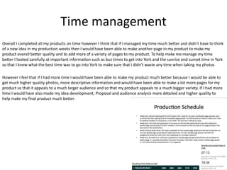
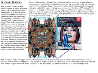
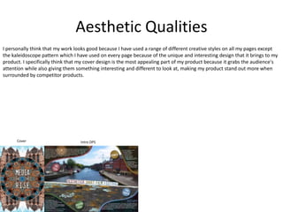
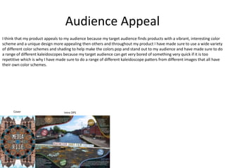
Evaluation
Research
Audience analysis strengths and weaknesses
Strengths- I think one of the strengths of my audience analysis is that I went into detail when talking about the type of
designs and styles that would be most appealing to my target audience of males and females aged 16-25 when looking at
existing products. I did this by looking at both male and female magazines as well as looking at a variety of magazines that
all had different specific designs such as fashion, film and Photoshop magazines to get a much larger variety of creative and
interesting ideas. This was a strength because it meant that I had a good idea of what has already been made allowing me
to make sure I created a product that was unique and different to other competitor products on the market. I think another
strength of my audience analysis is that when doing research on the type of information that I was going to include in my
product I covered many different topics so that my product has something for everyone helping to increase the size of the
audience.
Weaknesses- I think one of the weaknesses of my audience analysis is that although I slightly did some research on the
inside of magazines looking at topics such as how they have laid out their double page spread to make it look appealing to
their audience and the text to picture ratio that they have used to suit their target audience. I think that I should have done
a lot more research on the type of information they have put in their magazine, if it is presented as formal or informal, does
it use any ads? If so how many are there and why are they showing these ads to their target audience. If they don’t have
any ads then why have they not used any. Although I covered many different topics about information that I could put into
my product I think that I could have been more descriptive talking more about why I am going to talk about this, where in
my product will I use this information and how much information should I use so that my audience isn’t put off of buying my
product.
Conclusion- I think that these weaknesses of my audience analysis has resulted in my product being a much lower quality
then it could have been. If I improve on these weaknesses my product will not only be a better quality but it will be more
appealing to my target audience because the information in my product will be a lot better suited for the target audience
and will mean that my final product looks a lot more professional.
Planning
Idea Development and Proposal strengths and weaknesses
Strengths- I think one of the strengths of my idea development is that I had a descriptive mood board that covered all the
aspects of my product and had labels on everything that was key to the design of my product. This mood board allowed me
to collect a range od artistic ideas that helped me stick to the theme of making something that was different, unusual and
that would stand out. This mood board was a major strength in the creation of my product because it went into detail about
my color scheme, which types of text I would use for my masthead, sub headings and information, the space that I would
use between each letter in my title, the type of background that I want for my double page spread, different types of
images that I want to collect, etc. Another strength of my idea development is my proposal that goes into a large amount of
detail explaining why I am doing key parts of my product, how I am going to follow through with these ideas as well as
talking about the equipment that I will need and the health and safety that I need to focus on when using it. This meant
that I didn’t waste anytime when making my product and meant that I didn’t need to worry about thinking of any ideas in
my production weeks, allowing me not to waste any time while doing my production. Another aspect of my Idea
Development which was extremely useful in the production of my product was my production schedule where I had
information on bus times to York, sunset and sunrise times in York as well as deadlines of when I was going to finish each
part of my product. This allowed me to know the best time to go into York for photo’s because certain points of the day are
better then other points for photography, increasing the chances of me getting the best quality of photos possible.
Weaknesses- I think one of my weaknesses for my Idea Development is that when I was talking about the layout of my
product I went into very little detail and instead of using experiments I used past work. These are both disadvantages
because this meant that I didn’t do any experiments, meaning that I not only didn’t learn any new skills but I also didn’t get
to test any ideas that I had for my product. Because I didn’t test any of my ideas, I didn’t know that some of them wouldn’t
work in my product and meant that I had to come up with new ideas in the production weeks, wasting production time on
something that wouldn’t of happened if I tested my ideas.
Conclusion- These weaknesses have resulted in my product being much lower quality. For example because I didn’t do any
experiments and test my ideas I had to spend time thinking of a new idea instead of spending that extra time making
another page where I was going to add an advertisement, this would of made my product more professional and more
appealing to my target audience however I didn’t have time to complete it. This also meant that some pages were a lot
lower quality then others because of bad planning, for example the page called “wake up” looks out of place with my other
pages, making my product visually unappealing to my target audience.
Time management
Overall I completed all my products on time however I think that If I managed my time much better and didn’t have to think
of a new idea in my production weeks then I would have been able to make another page in my product to make my
product overall better quality and to add more of a variety of pages to my product. To help make me manage my time
better I looked carefully at important information such as bus times to get into York and the sunrise and sunset time in York
so that I knew what the best time was to go into York to make sure that I didn’t waste any time when taking my photos
However I feel that if I had more time I would have been able to make my product much better because I would be able to
get much higher quality photos, more descriptive information and would have been able to make a lot more pages for my
product so that it appeals to a much larger audience and so that my product appeals to a much bigger variety. If I had more
time I would have also made my idea development, Proposal and audience analysis more detailed and higher quality to
help make my final product much better.
Technical Quality's
Both my product and the existing
product has used an artistic and unique
theme to symbolize that both these
magazines are to do with the artistic
community. This gives the audience a
rough idea of what the magazine will
talk about before the audience even
reads the book. For example on my
product I have used a kaleidoscope style
that has been created by the image in
the background to create an artistic
pattern to get the audiences attention
when it is scattered in with a range of
other products whereas the existing
product has used a model painted in the
same color as the program just brighter
so that it stands out more and so that it
also stands out to their target audience.
Because of this color that they have
used people who regally use Photoshop
will automatically assume the style of
background and color must mean it’s a
product from the brand Photoshop.
Both my product and the existing product has changed to size of certain text to add emphasis on
certain words, for example for my product I have made sure that the words “media” and “rise” are
larger then the rest because they are the words that will most likely get people to be interested in
reading my product whereas the existing product has made sure that the word “Photoshop” is the
largest text on the page so that people who use the program Photoshop instantly know that this
magazine is talking about again the program Photoshop. They have also used a simple but bold text to
make sure that it stands out however for my product I didn’t need to do this because the only text I
had on my cover was the masthead.
Both my product and the existing product has put images on the cover that have something to do with the topics that we discuss in our
products. For example the existing product has put images of the tools that you use in Photoshop as well as the program logo. In my product I
have used the image of the minster for the background so that the audience knows that my product is to do with something in York.
Technical Quality's
Both my product and the existing product
has used a color scheme that makes each
color bolder and stand out more to the
audience. For example in the existing
product the black text makes the red stand
out more then if it was just red by itself and
in my product I have used a white
background behind the title to make the
title stand out more and so that the first
thing the audience looks at is the title
instead of anything else. In my product I
have also tried to make sure that I used a
color scheme that matched the background
image to help keep consistency and to help
make my sections of text look in place. The
existing products color scheme wouldn’t
look in place with the background image
normally but because the characters in the
image are using quite dark clothes the black
blends in and looks in place.
Both my product and the existing product
has used a small amount of information,
this is to make sure that our audience isn’t
overwhelmed by a massive amount of text
and because the target audience for both
my product and the existing one has an
audience that prefers to have information
that gets straight to the point instead of
giving them a tone of unnecessary
information. However the existing product
has used three different types of font styles
where as I have only two. The existing
product has used a simple but bold font
style for their title to grab their audiences
attention while they’re flicking through the
pages of their product, this title is especially
good for their target audience because the
words “Breaking the rule” will relate to their
target audience of teens who are going
through a point in their lives where they
care less about rules. Whereas in my
product I have used a font style that is
similar to the other text on the page to keep
consistency to help make my page more
visually appealing. This existing product has
a slightly higher image to text ratio on their
page compared to mine. I think that this is
because this film is very well known so they
don’t need a large amount of text explaining
what the film is about because their target
audience already knows what the base of
the story is, whereas my topic isn’t very well
known so I have included two separate
pages, one being the introduction page that
you can see on this page.
Aesthetic Qualities
I personally think that my work looks good because I have used a range of different creative styles on all my pages except
the kaleidoscope pattern which I have used on every page because of the unique and interesting design that it brings to my
product. I specifically think that my cover design is the most appealing part of my product because it grabs the audience's
attention while also giving them something interesting and different to look at, making my product stand out more when
surrounded by competitor products.
Cover Intro DPS
Audience Appeal
I think that my product appeals to my audience because my target audience finds products with a vibrant, interesting color
scheme and a unique design more appealing then others and throughout my product I have made sure to use a wide variety
of different color schemes and shading to help make the colors pop and stand out to my audience and have made sure to do
a range of different kaleidoscopes because my target audience can get very bored of something very quick if it is too
repetitive which is why I have made sure to do a range of different kaleidoscope patters from different images that all have
their own color schemes.
Cover Intro DPS

client project Evaluation

  • 1.
  • 2.
    Research Audience analysis strengthsand weaknesses Strengths- I think one of the strengths of my audience analysis is that I went into detail when talking about the type of designs and styles that would be most appealing to my target audience of males and females aged 16-25 when looking at existing products. I did this by looking at both male and female magazines as well as looking at a variety of magazines that all had different specific designs such as fashion, film and Photoshop magazines to get a much larger variety of creative and interesting ideas. This was a strength because it meant that I had a good idea of what has already been made allowing me to make sure I created a product that was unique and different to other competitor products on the market. I think another strength of my audience analysis is that when doing research on the type of information that I was going to include in my product I covered many different topics so that my product has something for everyone helping to increase the size of the audience. Weaknesses- I think one of the weaknesses of my audience analysis is that although I slightly did some research on the inside of magazines looking at topics such as how they have laid out their double page spread to make it look appealing to their audience and the text to picture ratio that they have used to suit their target audience. I think that I should have done a lot more research on the type of information they have put in their magazine, if it is presented as formal or informal, does it use any ads? If so how many are there and why are they showing these ads to their target audience. If they don’t have any ads then why have they not used any. Although I covered many different topics about information that I could put into my product I think that I could have been more descriptive talking more about why I am going to talk about this, where in my product will I use this information and how much information should I use so that my audience isn’t put off of buying my product. Conclusion- I think that these weaknesses of my audience analysis has resulted in my product being a much lower quality then it could have been. If I improve on these weaknesses my product will not only be a better quality but it will be more appealing to my target audience because the information in my product will be a lot better suited for the target audience and will mean that my final product looks a lot more professional.
  • 3.
    Planning Idea Development andProposal strengths and weaknesses Strengths- I think one of the strengths of my idea development is that I had a descriptive mood board that covered all the aspects of my product and had labels on everything that was key to the design of my product. This mood board allowed me to collect a range od artistic ideas that helped me stick to the theme of making something that was different, unusual and that would stand out. This mood board was a major strength in the creation of my product because it went into detail about my color scheme, which types of text I would use for my masthead, sub headings and information, the space that I would use between each letter in my title, the type of background that I want for my double page spread, different types of images that I want to collect, etc. Another strength of my idea development is my proposal that goes into a large amount of detail explaining why I am doing key parts of my product, how I am going to follow through with these ideas as well as talking about the equipment that I will need and the health and safety that I need to focus on when using it. This meant that I didn’t waste anytime when making my product and meant that I didn’t need to worry about thinking of any ideas in my production weeks, allowing me not to waste any time while doing my production. Another aspect of my Idea Development which was extremely useful in the production of my product was my production schedule where I had information on bus times to York, sunset and sunrise times in York as well as deadlines of when I was going to finish each part of my product. This allowed me to know the best time to go into York for photo’s because certain points of the day are better then other points for photography, increasing the chances of me getting the best quality of photos possible. Weaknesses- I think one of my weaknesses for my Idea Development is that when I was talking about the layout of my product I went into very little detail and instead of using experiments I used past work. These are both disadvantages because this meant that I didn’t do any experiments, meaning that I not only didn’t learn any new skills but I also didn’t get to test any ideas that I had for my product. Because I didn’t test any of my ideas, I didn’t know that some of them wouldn’t work in my product and meant that I had to come up with new ideas in the production weeks, wasting production time on something that wouldn’t of happened if I tested my ideas. Conclusion- These weaknesses have resulted in my product being much lower quality. For example because I didn’t do any experiments and test my ideas I had to spend time thinking of a new idea instead of spending that extra time making another page where I was going to add an advertisement, this would of made my product more professional and more appealing to my target audience however I didn’t have time to complete it. This also meant that some pages were a lot lower quality then others because of bad planning, for example the page called “wake up” looks out of place with my other pages, making my product visually unappealing to my target audience.
  • 4.
    Time management Overall Icompleted all my products on time however I think that If I managed my time much better and didn’t have to think of a new idea in my production weeks then I would have been able to make another page in my product to make my product overall better quality and to add more of a variety of pages to my product. To help make me manage my time better I looked carefully at important information such as bus times to get into York and the sunrise and sunset time in York so that I knew what the best time was to go into York to make sure that I didn’t waste any time when taking my photos However I feel that if I had more time I would have been able to make my product much better because I would be able to get much higher quality photos, more descriptive information and would have been able to make a lot more pages for my product so that it appeals to a much larger audience and so that my product appeals to a much bigger variety. If I had more time I would have also made my idea development, Proposal and audience analysis more detailed and higher quality to help make my final product much better.
  • 5.
    Technical Quality's Both myproduct and the existing product has used an artistic and unique theme to symbolize that both these magazines are to do with the artistic community. This gives the audience a rough idea of what the magazine will talk about before the audience even reads the book. For example on my product I have used a kaleidoscope style that has been created by the image in the background to create an artistic pattern to get the audiences attention when it is scattered in with a range of other products whereas the existing product has used a model painted in the same color as the program just brighter so that it stands out more and so that it also stands out to their target audience. Because of this color that they have used people who regally use Photoshop will automatically assume the style of background and color must mean it’s a product from the brand Photoshop. Both my product and the existing product has changed to size of certain text to add emphasis on certain words, for example for my product I have made sure that the words “media” and “rise” are larger then the rest because they are the words that will most likely get people to be interested in reading my product whereas the existing product has made sure that the word “Photoshop” is the largest text on the page so that people who use the program Photoshop instantly know that this magazine is talking about again the program Photoshop. They have also used a simple but bold text to make sure that it stands out however for my product I didn’t need to do this because the only text I had on my cover was the masthead. Both my product and the existing product has put images on the cover that have something to do with the topics that we discuss in our products. For example the existing product has put images of the tools that you use in Photoshop as well as the program logo. In my product I have used the image of the minster for the background so that the audience knows that my product is to do with something in York.
  • 6.
    Technical Quality's Both myproduct and the existing product has used a color scheme that makes each color bolder and stand out more to the audience. For example in the existing product the black text makes the red stand out more then if it was just red by itself and in my product I have used a white background behind the title to make the title stand out more and so that the first thing the audience looks at is the title instead of anything else. In my product I have also tried to make sure that I used a color scheme that matched the background image to help keep consistency and to help make my sections of text look in place. The existing products color scheme wouldn’t look in place with the background image normally but because the characters in the image are using quite dark clothes the black blends in and looks in place. Both my product and the existing product has used a small amount of information, this is to make sure that our audience isn’t overwhelmed by a massive amount of text and because the target audience for both my product and the existing one has an audience that prefers to have information that gets straight to the point instead of giving them a tone of unnecessary information. However the existing product has used three different types of font styles where as I have only two. The existing product has used a simple but bold font style for their title to grab their audiences attention while they’re flicking through the pages of their product, this title is especially good for their target audience because the words “Breaking the rule” will relate to their target audience of teens who are going through a point in their lives where they care less about rules. Whereas in my product I have used a font style that is similar to the other text on the page to keep consistency to help make my page more visually appealing. This existing product has a slightly higher image to text ratio on their page compared to mine. I think that this is because this film is very well known so they don’t need a large amount of text explaining what the film is about because their target audience already knows what the base of the story is, whereas my topic isn’t very well known so I have included two separate pages, one being the introduction page that you can see on this page.
  • 7.
    Aesthetic Qualities I personallythink that my work looks good because I have used a range of different creative styles on all my pages except the kaleidoscope pattern which I have used on every page because of the unique and interesting design that it brings to my product. I specifically think that my cover design is the most appealing part of my product because it grabs the audience's attention while also giving them something interesting and different to look at, making my product stand out more when surrounded by competitor products. Cover Intro DPS
  • 8.
    Audience Appeal I thinkthat my product appeals to my audience because my target audience finds products with a vibrant, interesting color scheme and a unique design more appealing then others and throughout my product I have made sure to use a wide variety of different color schemes and shading to help make the colors pop and stand out to my audience and have made sure to do a range of different kaleidoscopes because my target audience can get very bored of something very quick if it is too repetitive which is why I have made sure to do a range of different kaleidoscope patters from different images that all have their own color schemes. Cover Intro DPS

Editor's Notes

  • #7 Font size Image to text ratio Font type