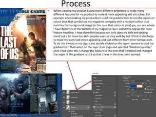
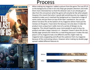
Production Reflection
Your Name
Process
• When creating my product I used many different processes to make many
different features for my product to make it more appealing and attractive. For
example when making my production I used the gradient tool to mix the signature
colour blue that symbolises my magazine company with a random colour that
matches the background image (in this case that colour is pink) you can see where
I have done this at the bottom of my magazine cover and at the top on the main
feature headline. I have done this because not only does my title and writing
stand out a lot more to catch peoples eyes as they walk by but I think it also helps
to make my work look more appealing and just different from other competitors.
To do this I went on my layers and double clicked on the layer I wanted to add the
gradient to. I then when on the layer style page and selected “Gradient overlay”
once I had done this I change the colours to the ones that I wanted and changed
the angle of the gradient to -33 so that it was in the direction I wanted.
• When making my magazine I added a picture from the game The Last Of US
as the background so that it not only helps get peoples attention and make
them more interested but so that the whoever sees it can already get an
idea from this one picture what the game will actually be like when played.
However this meant that when I would add something onto my magazine I
needed to make sure it matched the background so I imported a image of
some cracks and put them on top of the layer I wanted on. You can see
where I’ve done this at the bottom of my magazine where I have put the
reviews on the game. I have done this because not only does it make the
product more unique but it adds more of a variety of designs to my
magazine. This should hopefully cause more people to want to buy my
product and take a larger interest in it. However I haven’t done this for my
double page spread and I think this is a bad thing because it makes the two
peace's of my magazine look a lot different and this might make my
magazine look unappealing and off put the audience from my magazine
because of the contrasting colours. However when making my double page
spread I added different features to
Process
Before
After

6. production reflection

  • 1.
  • 2.
    Process • When creatingmy product I used many different processes to make many different features for my product to make it more appealing and attractive. For example when making my production I used the gradient tool to mix the signature colour blue that symbolises my magazine company with a random colour that matches the background image (in this case that colour is pink) you can see where I have done this at the bottom of my magazine cover and at the top on the main feature headline. I have done this because not only does my title and writing stand out a lot more to catch peoples eyes as they walk by but I think it also helps to make my work look more appealing and just different from other competitors. To do this I went on my layers and double clicked on the layer I wanted to add the gradient to. I then when on the layer style page and selected “Gradient overlay” once I had done this I change the colours to the ones that I wanted and changed the angle of the gradient to -33 so that it was in the direction I wanted.
  • 3.
    • When makingmy magazine I added a picture from the game The Last Of US as the background so that it not only helps get peoples attention and make them more interested but so that the whoever sees it can already get an idea from this one picture what the game will actually be like when played. However this meant that when I would add something onto my magazine I needed to make sure it matched the background so I imported a image of some cracks and put them on top of the layer I wanted on. You can see where I’ve done this at the bottom of my magazine where I have put the reviews on the game. I have done this because not only does it make the product more unique but it adds more of a variety of designs to my magazine. This should hopefully cause more people to want to buy my product and take a larger interest in it. However I haven’t done this for my double page spread and I think this is a bad thing because it makes the two peace's of my magazine look a lot different and this might make my magazine look unappealing and off put the audience from my magazine because of the contrasting colours. However when making my double page spread I added different features to Process Before After

Editor's Notes

  • #3 Discuss the tools and processes used in your production. Log your thoughts and feelings about your work.
  • #4 Discuss the tools and processes used in your production. Log your thoughts and feelings about your work.