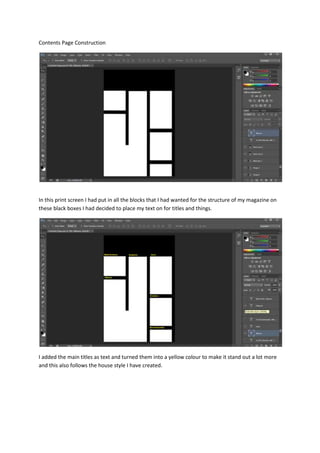
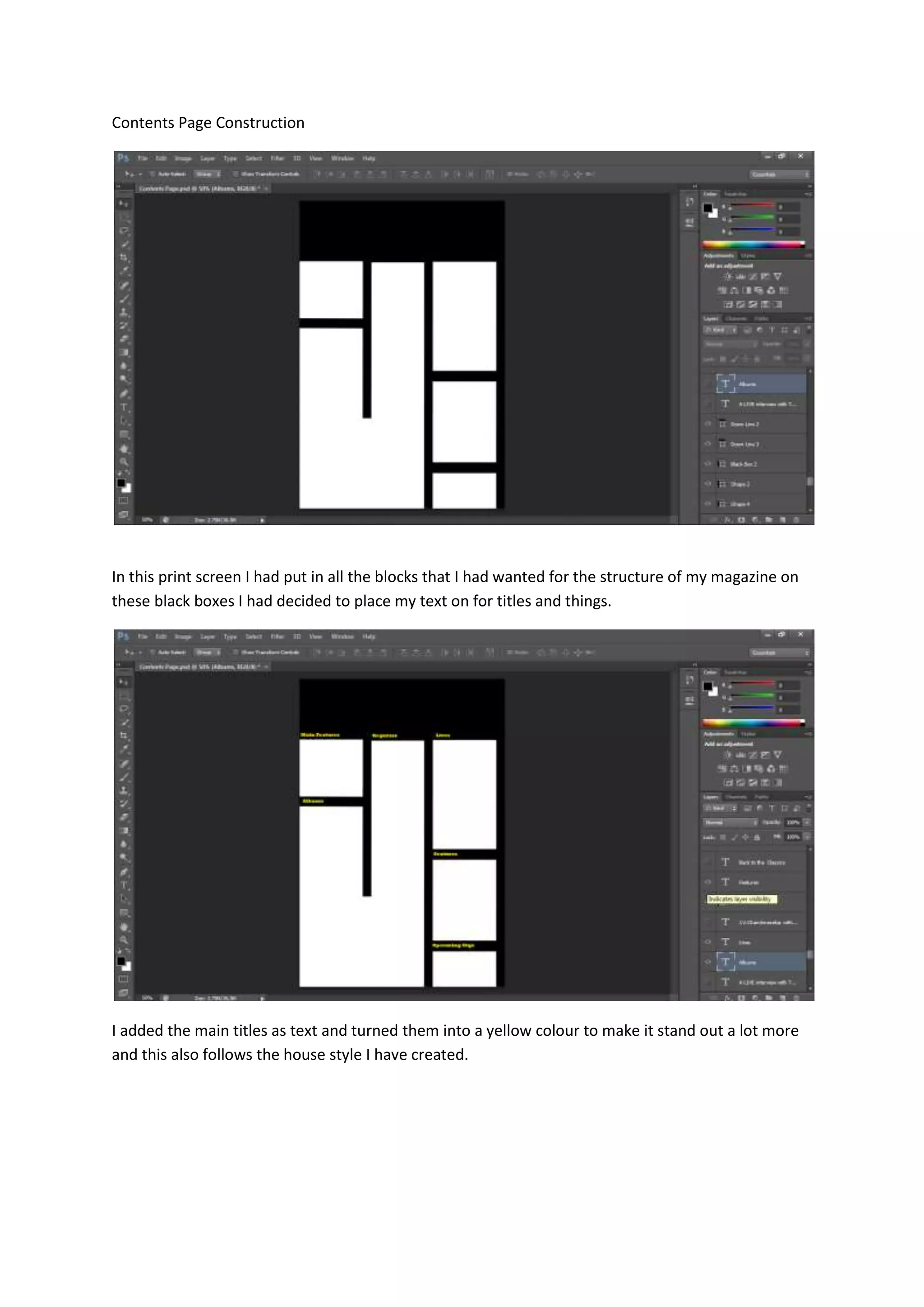
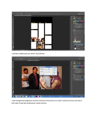
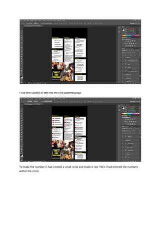
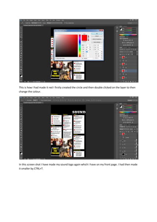
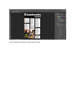
Contents Page Construction

In this print screen I had put in all the blocks that I had wanted for the structure of my magazine on
these black boxes I had decided to place my text on for titles and things.

I added the main titles as text and turned them into a yellow colour to make it stand out a lot more
and this also follows the house style I have created.
I had then added pictures which I had altered.

I had changed the brightness and the contrast of the picture to make it stand out more and also it
will make it look like professional poster picture.
The other picture I had done the same effect which was to alter the contrast and colour this is to
make sure that this picture also stands more and t make it look like it has the full effect of a
magazine.

I had then created another black box in the bottom corner to create this sticker type sign. I had then
created a white rectangular box on top of it. I had then created a smaller black box on top of the
white this is to make it look like a little sticker. I had then entered writing on top of the black box
which was in all caps lock. To make it stand out more I had slanted it back a little bit to make it look
more professional. I did this by pressing: CTRL T and then whilst repositioning it I had made sure to
hold down shift as well this will make it look slanted.
I had then added all the text into the contents page.

To make the numbers I had created a small circle and made it red. Then I had entered the numbers
within the circle.
This is how I had made it red I firstly created the circle and then double clicked on the layer to then
change the colour.

In this screen shot I have made my sound logo again which I have on my front page. I had then made
it smaller by CTRL+T.
In this I had finally created the Contents sign at the top.

Contents page construction

  • 1.
    Contents Page Construction Inthis print screen I had put in all the blocks that I had wanted for the structure of my magazine on these black boxes I had decided to place my text on for titles and things. I added the main titles as text and turned them into a yellow colour to make it stand out a lot more and this also follows the house style I have created.
  • 2.
    I had thenadded pictures which I had altered. I had changed the brightness and the contrast of the picture to make it stand out more and also it will make it look like professional poster picture.
  • 3.
    The other pictureI had done the same effect which was to alter the contrast and colour this is to make sure that this picture also stands more and t make it look like it has the full effect of a magazine. I had then created another black box in the bottom corner to create this sticker type sign. I had then created a white rectangular box on top of it. I had then created a smaller black box on top of the white this is to make it look like a little sticker. I had then entered writing on top of the black box which was in all caps lock. To make it stand out more I had slanted it back a little bit to make it look more professional. I did this by pressing: CTRL T and then whilst repositioning it I had made sure to hold down shift as well this will make it look slanted.
  • 4.
    I had thenadded all the text into the contents page. To make the numbers I had created a small circle and made it red. Then I had entered the numbers within the circle.
  • 5.
    This is howI had made it red I firstly created the circle and then double clicked on the layer to then change the colour. In this screen shot I have made my sound logo again which I have on my front page. I had then made it smaller by CTRL+T.
  • 6.
    In this Ihad finally created the Contents sign at the top.