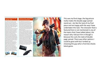
Production Reflection
Your Name
Process
• i like this background because it is
dark and has a main character in
the middle, this is good because I
can design things around the
character and this should make
the magazine look good.
• The tools I used to create this was
copy and paste with text to write
inform gamer.
• The tools where easy to use and
this part of the process did not
take long to create this section
Process
• This section took a little longer to
design because I had to find a
suitable slogan to put at the
bottom of the game magazine,
however I am very pleased with
this and look great on my
magazine. I added some game
consoles at the top to kind of
advertise them. This gives the
magazine more depth and more
enjoyable to view at.
• The tools used in this section was
gain copy and paste for both sets
of images.
Process
• I really like this section because it
starting to look a lot more like an
magazine, with the advertisements
circling around the main focus point
which is the charter look really good
because the style of these sub
heading match the colour scheme I
have chosen which is dark and
gloomy. The colour red suits the sub
heading down at the bottom which
adds even more depth.
• The tools I used to create this was
text and shape fill.
Process
• The things I really like about this
section is the whole layout and this
is just how I planned it, this makes
me happy because my work has
payed off. The idea of adding in sub
heading really improved my work
and added so much more depth into
it.
• The tools used in this final piece was
text and shape fill. I decided to add a
little thing in for the buyers so they
would feel like buying the magazine
they would get something out of it. I
decided to change the colour of the
key words because this can highlight
the main points and hopefully put it
into short for them.
in my first stages of creating the double page spread I set out some
spacers, these helped my to get my first set of paragraphs in line with
everything else, the generates a better product over all if every thing is
neat and symmetrical. The title at the top was hard to get to fit because
the words wouldn’t change size but the orange box around it would so I
had to rearrange the word size and the box overall so I could get a good
ratio of size to width.
The font size is 12 and I feel like this is a good size because any bigger and
I wouldn’t be able fit all the words in, the overall finish of the double page
spread for this section is very good and I am pleased with my results. The
colours I did choose to go with was just a standard white and orange,
these two colours contrast very well and I feel like they should attract the
readers eye. Even though there are only two colours it is definitely much
brighter and bubblier than other colours used on other magazines and it’s
a massive difference from my front cover I decided to design, this can be
very refreshing to the consumer.
In my second stage I added another column, this
time I wrote about ps4 and Xbox one, I feel like
this was a good topic to add in because lots of
people get on the bandwagon about saying
which console is better so I used this debate to
my advantage and decided to add a very
informal approach to the situation, I made sure
both ideas I had for the debate ended on equal
terms so know one felt disproved and wrong.
Also made sure I appealed to both sides of the
spectrum from Xbox to ps4. this was a good
move because know one can think there
favoured console was wrongly viewed upon.
The final stage of my double page spread I
decided to add some photos at the bottom to
add some more detail to the bottom, this
makes the product more visually pleasing. I
found this stage very easy because all I had to
do was find the required pictures to match the
subject of game. I might add some more
pictures at the side where there is much more
space, this could attract more people.
This was my final stage, the big picture
really makes the double page spread
stand out. i do like the look of my final
piece and am happy with the way I have
undertaken this task. The character that is
featured here is not mentioned in any of
the topics that I have talked about, the
reason why I did put him in though is
because this suits the style of double
page spread. There was other options I
could've gone with but I ended up
choosing this guy who is from bio shocks
latest game.

6. production reflection(3)

  • 1.
  • 2.
    Process • i likethis background because it is dark and has a main character in the middle, this is good because I can design things around the character and this should make the magazine look good. • The tools I used to create this was copy and paste with text to write inform gamer. • The tools where easy to use and this part of the process did not take long to create this section
  • 3.
    Process • This sectiontook a little longer to design because I had to find a suitable slogan to put at the bottom of the game magazine, however I am very pleased with this and look great on my magazine. I added some game consoles at the top to kind of advertise them. This gives the magazine more depth and more enjoyable to view at. • The tools used in this section was gain copy and paste for both sets of images.
  • 4.
    Process • I reallylike this section because it starting to look a lot more like an magazine, with the advertisements circling around the main focus point which is the charter look really good because the style of these sub heading match the colour scheme I have chosen which is dark and gloomy. The colour red suits the sub heading down at the bottom which adds even more depth. • The tools I used to create this was text and shape fill.
  • 5.
    Process • The thingsI really like about this section is the whole layout and this is just how I planned it, this makes me happy because my work has payed off. The idea of adding in sub heading really improved my work and added so much more depth into it. • The tools used in this final piece was text and shape fill. I decided to add a little thing in for the buyers so they would feel like buying the magazine they would get something out of it. I decided to change the colour of the key words because this can highlight the main points and hopefully put it into short for them.
  • 6.
    in my firststages of creating the double page spread I set out some spacers, these helped my to get my first set of paragraphs in line with everything else, the generates a better product over all if every thing is neat and symmetrical. The title at the top was hard to get to fit because the words wouldn’t change size but the orange box around it would so I had to rearrange the word size and the box overall so I could get a good ratio of size to width. The font size is 12 and I feel like this is a good size because any bigger and I wouldn’t be able fit all the words in, the overall finish of the double page spread for this section is very good and I am pleased with my results. The colours I did choose to go with was just a standard white and orange, these two colours contrast very well and I feel like they should attract the readers eye. Even though there are only two colours it is definitely much brighter and bubblier than other colours used on other magazines and it’s a massive difference from my front cover I decided to design, this can be very refreshing to the consumer.
  • 7.
    In my secondstage I added another column, this time I wrote about ps4 and Xbox one, I feel like this was a good topic to add in because lots of people get on the bandwagon about saying which console is better so I used this debate to my advantage and decided to add a very informal approach to the situation, I made sure both ideas I had for the debate ended on equal terms so know one felt disproved and wrong. Also made sure I appealed to both sides of the spectrum from Xbox to ps4. this was a good move because know one can think there favoured console was wrongly viewed upon.
  • 8.
    The final stageof my double page spread I decided to add some photos at the bottom to add some more detail to the bottom, this makes the product more visually pleasing. I found this stage very easy because all I had to do was find the required pictures to match the subject of game. I might add some more pictures at the side where there is much more space, this could attract more people.
  • 9.
    This was myfinal stage, the big picture really makes the double page spread stand out. i do like the look of my final piece and am happy with the way I have undertaken this task. The character that is featured here is not mentioned in any of the topics that I have talked about, the reason why I did put him in though is because this suits the style of double page spread. There was other options I could've gone with but I ended up choosing this guy who is from bio shocks latest game.

Editor's Notes

  • #3 Discuss the tools and processes used in your production. Log your thoughts and feelings about your work.
  • #4 Discuss the tools and processes used in your production. Log your thoughts and feelings about your work.
  • #5 Discuss the tools and processes used in your production. Log your thoughts and feelings about your work.
  • #6 Discuss the tools and processes used in your production. Log your thoughts and feelings about your work.