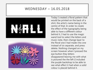
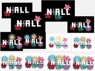
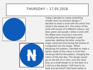
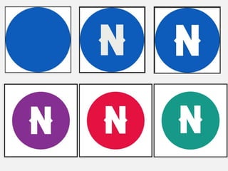
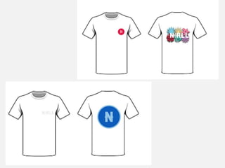
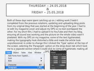
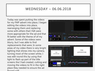
2. WEEK ONE – 13.04.2018
In our first week of production we
focused mainly on our initial plans
and research. We discussed what
products we would consider
creating, as well as making a rough
draft of what sort of product we
were wanting to create for our final
project. For our research, we
created surveys and interviews in
order to help us further with what
products we should be creating
and what is most popular amongst
our target audience. We also
analysed existing products,
explaining what we liked about
them and what we would consider
“mimicking” from these products
when it comes to creating our own.
3. WEEK TWO – 20.04.2018
At the beginning of our second
week we finished any research we
hadn't done previously. The
following day we started on our
Product Experiments, where we
created draft version of our
products, however making sure
they didn’t look like exact replicas
of what we were going to create on
the final few weeks. I used
Photoshop to create a poster,
expanding my knowledge of the
application further; cutting out
certain images and feathering
others, I also created a Photoshop
version of areal image taken from
Google as well as learning how to
flip images so they are the exact
opposite from what they were
4. WEEK THREE – 27.04.2018
During our third week of our FMPs,
we continued on with our
Production Experiments. I
expanded the PowerPoint,
including different merchandise
that could be sold and compared
them to already existing products,
explaining how if I were to create
them again how I can make them
better and look more like the
existing products. After I analysed
and researched more products that
could be possible contenders to
design for my FMP, I analysed
them all together, explaining what
skills I learnt, how I will use them
for my project and what products I
am most likely to use for my
completed work.
5. WEEK FOUR – 04.05.2018
This week we began writing up our Proposals via a
word document. We explained what our project
title was, as well as give a little detail as to what
we are creating. We also had to discuss our
audience, explaining the exact audience we are
aiming for and based our answers via the
audience research survey we submitted a few
weeks prior. As well as a Proposal, we also
completed a Pre-Production PowerPoint,
explaining on there all the different fonts, colours,
designs etc. we would use for our FMPs. I had to
include a storyboard also as I’m creating a video
as part of my project. Our Pre-Prods also included
contingency forms, resource information we may
need and health and safety forms to fill out in
case of emergency when shooting.
(see next slide for other Pre-Production
8. TUESDAY – 08.05.2018
Today, we started with our projects. I
began creating a tour poster, using
images I have taken myself at an artists
concert. I created a tour poster that
included concert dates for UK/Ireland
and Europe. I added drop shadows to
the back of each of my typography,
making it stand out a little against the
page. In order to get this effect, I
selected the piece of text I wanted to
edit, pressed layers at the top of my
screen, scrolled down to layer style,
looked for drop shadow then edited
how I wanted using the facilities it
provided. The colour I used to highlight
the artists name was one I took from
the colour scheme sheet I used in my
Pre-Production PowerPoint. The colour
of the remainder of the text was taken
9.
10. WEDNESDAY – 09.05.2018
Today, I designed a date specific
poster for my artist. At first, I had
the artist name horizontal, but still
going down the same way. I
decided to change it up a little,
turning it to the side using the
command, shift, t keys on my
keyboard, switching it each way
until I settled on this was round as I
feel it is easier to read, especially
on that specific part of the screen.
The typography has the same drop
shadow effect as the previous
poster, as well as the same font as I
feel, marketing wise, it is better to
have the same font when creating
posters for the same artist, whether
you’re using different pictures or
not; and in this case I’m using two
11.
12. THURSDAY – 10.05.2018
Today, I focused on creating a
merchandise poster that would be
sold at each venue. Instead of
creating a poster that looks the same
sold at every venue, I decided to
create a tour exclusive; thus meaning
they would be sold at the specific
date specified on the image, with a
limited amount. Same as the other
posters created, I used the drop
shadow effect on the typography,
giving it that extra boldness to stand
out against the page. I also used the
gradient tool, being carful with the
top of my image s it was difficult
getting a colour to match at the right
gradient size I wanted it. I also
included the stereotypical white rose
that signifies Yorkshire in the bottom
13.
14. FRIDAY – 11.05.2018
Today was the final day of our first week
of production. I changed up the three
posters I had created this week,
changing text colours and fonts to make
them look more presentable and
appealing. I changed the colour of the
typography on the top poster, and
changed the font of other typography on
the bottom two. I prefer the posters
looking this way as I feel the different
fonts make them look more professional
instead of having the same one for each
piece of text, as that becomes to
repetitive. The posters now look more
realistic, and hopefully appealing to my
audience. As well as changing up these
posters, I created a second merchandise
poster to sell at a date specific concert.
The effects used are the same as the
other posters, however this one has no
gradient effect at the top and bottom of
15.
16.
17. MY THOUGHTS – WEEK 5
I feel the work I created this week was the best to my ability, I was impressed by how I
managed to create such posters with knowledge I had acquired in previous production
experiments, plus learning to use the gradient tool and how that can change and effect your
work. The first poster I designed was a little tougher to create as I had include all locations
and dates within it, making sure to include places that would satisfy my audience in the sense
that their favourite artist was coming to their city. I feel that poster is the best it can be, if at
the end of the week I have more time, I will change the colour of the typography that states
the artists name, tour continents and name of the tour, as I feel the colour looks nice, but
doesn’t tie in with the other pieces I have created the remainder of the week. On Wednesday
I decided to create a poster that was venue date specific, choosing Dublin because that was
the only venue on the tour that had two shows. Also because the artist I have chosen to base
my work on is from an hour outside of Dublin. It took a few different options on how to have
his name on the page. At first I had the letters going down the screen, then had it changed to
have it the right way up, however turned horizontally. I feel that looks better on my poster
and deem it easier to read, even though it’s sideways. Thursday I designed another poster,
however this time it was a merchandise poster, for purpose of selling it at a specific venue. It
was harder editing this image because of the lighting at the bottom corner of the screen,
making it difficult to be able to put any text anywhere because of the demanding light. I
manged to edit it out slightly, cropping the image and using the gradient tool to disguise the
light with a darker shade. Friday I decided to use it as my change anything I needed to
change day. Thus meaning I changed the colour of the text in the first poster, which I feel
turned out better and change the font and size of the typography on the other two. All three
items definitely benefitted from the changes and I will take this into account for next time I
19. TUESDAY – 15.05.2018
Today was our second week of
production. I started on the merchandise I
am planning on advertising via a website
and potentially on my TV ad. The first
design I created was a tour dates design,
having the artists name, continent he is
travelling to and the cities he is attending
on the tour. At first I had the letter ‘i’ in
my artists name, changing that to a treble
clef to bring originality to my designs
which I feel made the whole thing look
better and more original. N order to do
this, I used the shape design tool and
drew a treble clef, the same size as the
remainder of my text and put a space bar
when the ‘i’ would've been in order to
create space, inserting my shape between
the ‘n’ and the ‘a’. At first I had it next to
all of my text, thus being before I decided
20.
21. WEDNESDAY – 16.05.2018
Today I created a floral pattern that
would be printed on the back of a
shirt, the artist’s name being in the
centre of that. In order to create
the effect of the typography being
able to have a different colour
behind it, I had to use the magic
wand tool to select the letters and
music note, then change layer to
the floral one I had made into one
instead of six separate, and press
delete. Nothing changed on my
screen however when I pressed the
eye button they letters
disappeared leaving me with what
is pictured the the left (I included
the purple backdrop to be able to
see what effect it had when a solid
colour is placed behind it.
22.
23. THURSDAY – 17.05.2018
Today I decided to create something
simpler than my previous designs. I
decided to draw a circle with the artists first
initial in the centre of it. The colour of the
circle will consist of 4 different colours, red,
blue, green and purple. I drew a circle with
the ellipse tool, ensuring it was even,
including the same technique I used
yesterday, deleting the letter using the
magic wand tool and having the outline of
it engraved into the shape. When
designing this pattern, I decided to make a
lighter shade of the colour a circle that
would go behind the pattern, changing the
colour of the text also. This design would
go on the left of a t-shirt, over the chest
area, as a small design or on the back of a
t-shirt as a big design. I will have to try
both and see which I feel looks better in
24.
25.
26. FRIDAY – 18.05.2018
Today was the last day of our second
week of production. I mainly focussed
on putting my designs on to t-shirt and
other items on arranging them to look
presentable to buy. The first one I
created was a tour shirt, with the logo
created yesterday on the chest, tour
dates on the back. I created both a
black and white version, each with a
different logo on the front. I feel that if I
were to ask my audience if they would
purchase these items, most would say
yes. All shirts created include the
different coloured logos. The second
design I created was the floral design; I
placed that on the back of a white shirt
with the red logo on the front. The final
shirt I designed was one with the artist's
first name on the front, the blue logo
27.
28. MY THOUGHTS – WEEK 6
The work I created this week I feel has really pushed my creativity, trying to decide what
patterns looked good where, colours that complement each other and of course matching
them up when it came to printing on the t-shirts. I learnt how to erase the outline of
words/shapes from images so I can colour the background and have it show through the
gaps using the magic wand tool and also how to group layers together in order to move
them all at the same time instead of one at a time and not having them in the same position
they were in originally. The first day when I created the tour dates design, it took a few
attempts of rearranging text and changing text size until I deemed it appropriate to print on
the back of a shirt. When it came to putting my design on a shirt, I liked the way it looked, on
both the black and white. When looking at my work, however, I felt that the front of the shirt
looked a little plain, thus resulting in me putting the logo on the front. The second day when I
design the floral pattern, it took a lot of moving around, resizing, different colour shades etc.
until I was fully happy with what I had created, especially when I grouped all the shapes
together instead of having them spread out, I feel it made the design stand out more,
especially with the drop shadow behind the shapes and the text outline in the middle. On my
third day of production, I drafted out a few other designs, drawing circles and seeing how
they turned out when I put a letter inside, thus being the start of my logo creation. I liked the
simplicity of the designs I created, especially with the colours I used. When I decided to put
the lighter shade of colour circle behind the original design, I felt like it was a design I would
personally purchase myself if it were on sale at a merchandise stand. I knew the designs
would look nice as a small chest piece or a large logo on the back of a shirt; even if it were to
be printed on a notebook and the pattern be repeated all over. I especially liked my treble
clef idea instead of using the letter ‘i’ as it was an original idea and I feel it makes my
merchandise different from others that are created by professional designers.
30. TUESDAY – 22.05.2018
Today was spent finishing off the merchandise work I had left and updating
my blog posts that hadn't been published + spell checking all my documents
also, ensuring there were no mistakes and adding things in where need be.
After that, I spent the remainder of the day finding concert videos and camera
that are appropriate to include in my final advert. I had to ensure the quality
of the videos were appropriate e.g. making sure the lighting didn’t affect the
camera, checking for blurriness during the video, no one walking in front of
camera, taking the focus away from the main artist etc. Once I’d decided on
what videos I was using, I needed to cut them down to size in order to send
them to myself. I cropped where needed on the videos, making sure I had
enough footage to edit around as well as the actual part of the video I
needed. Some of the videos were too large to send via email, resulting in me
having to put them on a memory stick and transferring them to college that
way.
31. WEDNESDAY – 23.05.2018
Continuing on from yesterday, I placed all my videos into the Premier
document and begin arranging all my videos in the order I wanted them in for
my advert. During my ad also, I wanted text flashing up on screen with a plain
black backdrop, in order to achieve this I selected the ’Title’ button at the top
of the page which gave me a drop down tab where I could select ‘New Title’
which then gave me a side bar where I selected the ‘Default still’ option. I
selected that which gave a confirmation of sizing etc. page where I clicked ok
and was taken to the title sequence where I could put my text, change the
background colour, insert shapes etc. I created a few different title pages, each
saying different things on them that add a dramatic affect to my advert.
32. THURSDAY – 24.05.2018
&
FRIDAY – 25.05.2018
Both of these days were spent catching up on / editing work I hadn't
completed from the previous rotations, updating and uploading blog posts
from my original blog that was started at the beginning of the year. I had to
re-edit my magazine cover and adjust my DPS so no text overlapped the
other. For my short film, I had to upload it to YouTube and then my blog,
ensuring all sound was working and the picture on the whole video wasn’t
pixelated. With my DPS on my magazine, some of the text hyphenated,
making the typography look distorted a little and made the article look
unprofessional, in order to change this I clicked the ‘Type’ option at the top of
the screen, selecting the ‘Paragraph’ option on the drop down tab which took
me to a separate section where I could click to come of hyphenate, making all
my text line up appropriately on my DPS.
33. MY THOUGHTS – WEEK 7
This week I feel I achieved everything I needed to when completing work. I
especially learnt plenty of new skills; hyphenating and inserting a title screen
onto premier. The skills I learnt are some of which I won’t only use in my
currently projects, but future ones and personal ones also. I feel the work I
completed was the best to my ability. In the build up to the hand in date I will
go over my work, double checking to see if I can add anything more to up my
grade before hand in.
35. TUESDAY – 05.06.2018
This week we didn’t have any early morning lessons
because of exams, meaning we have slightly less time
on production. However our normal college timetable
went back to normal from 1:10pm. I spent the day
completing my website for my print rotation, writing a
blog post, working out what images to include and
where to include them, what each drop down tab
would include, what my drop down tabs would say
etc. There are still a few things I left that I need to do
then it will be completely finished, this includes
unloading images to my front page and uploading the
front cover to my magazine in the purchases section
of my site. All in all, I feel my site is the best it could
be, I used WordPress for the layout of my site as it is a
programme I have used before and am used to using
a lot of the time compared to the others that I
personally find difficult to use.
36. WEDNESDAY – 06.06.2018
Today was spent putting the videos
for my FMP advert into place, I began
editing the videos into place,
rearranging them and replacing
some with others that I felt were
more appropriate for the ad and that
fit better with the theme of of my
advert. Some of the videos were
blurry, but I was able to find
replacements that were. In some
areas of my video there is very bright
lighting that shines into my camera,
turning most of the screen white, I
was edit round this by using that
light to flash up part of the title
screens the I had created, cutting and
moving the videos to fit in the right
place they needed to ensure the ad
37. MY THOUGHTS – WEEK 8
Due to not being in much this week, there aren’t many thing to reflect on from
the week regarding new skills. However learning how to create title pages was
an extremely useful skill as I feel it definitely helped tell the story of my advert,
even though I feel the reasoning behind the creation of the video is obvious, it
helps give the audience that extra reassurance to what it is. As a lot of the day
on Tuesday was spent focusing on catching up with old work, I didn’t have
time to do any of my FMP, thus meaning that there wasn’t much to discuss
about it as I hardly spent time on it.
39. TUESDAY – 12.06.2018
Similarly with last Tuesday, there were exams being held early in the morning,
thus meaning I had to continue editing my advert in the afternoon, editing
some of the typography used in the titles and changing the back ground
colour from white to black as I felt the blackness of the background blended
nicer with the whole ad as apposed to the white background. The typography
colouring for each was the opposite shade to what the background was. I,
again, had to edit the videos already placed in the ad as it was noticeable that
there were security guards heads in view, thus meaning I had to cut a fair
chunk of the video out, making the remaining video sequences not line up
with each other due to the way the artist is moving, thus meaning I have to
look for an alternate video to use instead of the one I originally wanted as the
opening to my advert.
40. WEDNESDAY – 13.06.2018
This week I mainly focused on my typography within my video. I wanted to
have the text so it didn’t just come up on screen, but more fade in and out of
the background. In order to find out how to do this I watched a YouTube
video tutorial of someone else doing it via there computer and copied the
example on how to do it. In order to have the text fading in and out of the
backdrop you have chosen to have it against you must first either create a title
page, typing out what ever text you may need (if you would like the text over
the top of your video you must put the title sequence in the section above
your video. Once done, you must select that particular title screen layer and
wait for it to appear on the top left area of Premier. You will notice a small
diamond shape, you click on that and turn to opacity from 100% down to 0%,
you then move the blue line over until you deem it appropriate and press the
diamond shape again, turning the opacity back up to 100%. Again, you move
the blue line until you feel the typography has been on screen long enough
and press the diamond shape again. To finish off, you drag the blue line to the
end of the title sequence, pressing the diamond shape for the final time,
turning the opacity down to 0% again.
41.
42. THURSDAY – 14.06.2018
Today was spent adding more videos to my advert and making some changes
to the current videos in there. There was one video clip that I felt had been
overused throughout the ad, so I had to change to another and also move
some clips around as it looked like it was just a continuation of the same
video which is not what I wanted in my advert. I was able to almost complete
my advert, I just had a few more titles to add between videos and fade some
text on and off screen. I feel the progress I made this past week with my
advert is really good, I was able to transfer all my videos with ease, and made
the actual tour video flow well also. I spent the remainder of my lesson trying
to find a fitting song that would be dubbed over the top of my advert. I tried
to find one that would be best suited to that artist, would tie the advert
together perfectly and hold a small sense of dramatic essence when needed
be. I wasn’t able to find one right away, however I did save some that I could
use if I didn’t find any for tomorrow.
43. FRIDAY – 15.06.2018
As this was the final day of production, I really made sure to complete every
little part of work I needed in order to keep in with deadlines. I searched
YouTube again in order to find the right track for my advert, being successful
on first try. I converted the music to an mp3 and inserted into my work. It was
difficult cutting and splitting different parts of the song in order to match
them up with certain actions within my advert, however once done, I feel it
looked and sounded perfect. As the song was much longer than ,y video and I
wanted to use the outro of the song at the end, I had to be careful cutting and
merging the song together to make it flow instead of it sounding choppy and
badly edited together. I feel I accomplished this well, there is a slight hint of a
jump towards the end, however it is hardly noticeable unless intently listening.
44. MY THOUGHTS – WEEK 9
As this week was our final week, I didn’t really learn any more skills in
particular, just expanded my knowledge on the skills I knew currently. I’m
happy with how my final product turned out, I will be spending most of next
week analysing all of the products I created/designed, starting my evaluation
process that will take up most of the week. This is where we will discuss
strengths and weaknesses within our work, looking to see how we can
improve them and/or if we would improve them. We will also show all of our
work to 3 people within the class, gathering feedback from them to see how
they, as a possible target audience, like everyone's work; these people will be
chosen at random to analyse our work, telling us what they liked about our
work and what they didn’t like, to which I will read through their comments,
and discuss whether I agree or disagree. Like I say, I definitely like the way all
of my work looks, there aren’t many changes I would make besides the quality
of some of the videos and effects I used in Premier i.e. I wish I had used more
effects rather than have it fairly simple, I wish it more of a “wow” factor to it.
Next time I do a task like this one, I will ensure to do this and make my project
better than it currently is.
Editor's Notes
Discuss the tools and processes used in your production. Log your thoughts and feelings about your work.