SlideShare a Scribd company logo
1 of 19
Production Diary – B2 Creative Industry Response
In this PowerPoint presentation you will find my postproduction diary. This will explain every process
have I have done to my products either my posters designs or my documentary on growing up in the
Northeast.
This diary will be updated every time I edit my products. This helps me to keep track of everything I
have done to my products and what I need to focus on next.
I will also talk about the challenges I have faced while creating my products and how I have faced
them.
Day One – Sketching
For day one I began sketching and creating different designs of posters for my Identity of the
Northeast.
I first started with creating different designs for the Newcastle Poster I am going to create. I know for
all my poster I wanted to show of identifiable locations for each city and have fading pictures in the
background of the past, present and future.
I continued with other sketches for Durham, Sunderland, and South Shields. I used popular locations
so it will be easily identifiable but also again added different past and present sketches to show the
identity of what it was and what it can become.
There where not many challenges as I was just sketching ideas down.
I experimented with different types of frame polaroid frame designs as I wanted to see if I could
make them looked worn and torn to show how old the Northeast is and how we are treated.
I spent 30 to 40 minutes on different font styles. I used DaFont website as inspiration as I wanted an
sans serif for the modern and a sans font for the old to show the different trends and styles.
Production Diary – B2 Creative Industry Response
Sketching my poster designs was a very helpful in my process as it gave me the opportunity to see
how I could layout my poster but also how I could create different designs but still get my message
through about the identity of the Northeast.
I designed different types of polaroid frames as many people know that polaroid are a very trendy
aesthetic now but also can help me present the 70s retro style.
cI wanted the frames too look burnt worn and torn in order to show how old they are but also the
change from modern day to the 70s.
I began to edit my photograph of monument in Newcastle. I have chosen this photograph to be the
main part of my poster as it is landmark in the northeast. I was not able to gather photos of
Newcastle due to other commitments and weather, but I was lucky to remember I had a photograph
of monument I had taken months before hand.
I first began in Canva try to edit the photo to make it look hand drawn or a cartoon.
I first began to use different filters as there were no cartoon effects.
I tried many different types of filters as you can see but none of them were able to give of the hand
drawing effect I wanted for my poster. The closest effect is the Hibiscus filter as I wanted to have a
bright background and a hand drawn monument.
Production Diary – B2 Creative Industry Response
After trying many different filters in Canva, I began to look for other websites that have cartoon or
hand drawing filters. I took a while in order to find a website with this effect but also to for it to be
free.
The website I used was Picsart, they offer many different effects, filters, styles and much more. This
website was very easy to use and gave the desired effect that I wanted. I know in the future for this
project I will come back to use this because they offer. I will go back to using Canva for layout and
text as they offer more range compared to Picsarts.
My main idea for my posters was to make them compare past and future, I decided to experiment
with different frames they have just to see if any are appropriate and set the right tone for my idea.
The second frame is not bad at all but none of them are the best suited for my idea. As they are not
torn or can show between past and present,
I wanted more of a subtle way.
My main idea for my posters was to make
them compare past and future, I decided to
experiment with different frames they have
just to see if any are appropriate and set the
right tone for audience. The second frame is
not bad at all but none of them are the best
suited for my idea. As they are not torn or
can show between past and present, I
wanted more of a subtle way.
Production Diary – B2 Creative Industry Response
Day Two - Editing
After trying to find an old close of Monument I was unsuccessful, so I decided to use Picsarts again in
order to achieve an old photograph effect as many of the old photos I found were from very far away.
After changing the effect and style of the photograph, I decided to start experiment with different
torn paper frames on Canva and matched the old photograph up to make it match. It was a bit of a
difficult as there were many different types of frames to choose.
As you can see there were many different pro types of Newcastle posters I have made as I wanted to
ensure I have on that shows my theme but also eye catching to the audience.
My next step was creating a questionnaire to see which one is the best design I have created.
Day three – Idea changing
During my time changing the idea for my documentary, I decided that I should change the posters
from the identity of the Northeast to promotional posters for my documentary. I believed this would
be the best option in order to show cohesive projects but also creating posters for places around the
Northeast is a simple idea as many people have done it and it doesn’t show the identity of the
Northeast.
The pictures I have taken for the original poster’s ideas feel very basic and predictable, so I want to
create something different.
So, I began to sketch
and look at
inspirations for a 70s
theme posters and
magazine covers. I
create a pinboard of
poster to inspire me
by. I was also able to
gain photographs of
my grandad when he
was younger in the
Northeast in order to
use in the poster.
Production Diary – B2 Creative Industry Response
After gathering inspiration, I began to sketch and draw different ideas of how I can present the
documentary. I know that my target audience rang is 15 to 25 so I need to make something that will
interest them while I show the theme of the documentary.
After sketching I began to create different types of forms of my sketches in Canva, I experiment with
many different types of fonts, styles, colours, and graphics.
As so you can Canva offer many different types of fonts but none of them were suitable for this
poster as I wanted a 70s theme font, I decided to go onto Dafont as have a look at all of their 70s
themed font as was able to find perfect ones for my poster.
Production Diary – B2 Creative Industry Response
For my poster designs I created many
different types of versions of different title
fonts while also changing the position of
the title as I wanted to see how much effect
the title has on certain areas. I am quite
fond as the title begin at the bottom of the
page as on my inspiration board and from
research, I know that in the 70s title’s were
normally at the bottom of the poster or the
cover it’s able to make the poster more
authentic. I also tried to experiment with different placement of the graphics Canva offers, I used
these graphics as the four colour strips were very iconic in the 70s and 80s especially with production
companies’ logos.
I created a google survey with some of the best designs in order to see the audience’s favourite and
least favourite. From the results I will be able to tell the audiences likes and dislikes based on the
layout of the poster. Each poster was chosen for a certain reason as I chose some based of the title
and some based on the layout of the graphics and silhouettes.
I showed many people in my class and family members my designs what I had so far and the main
one they liked was a plain one of this as it is very simplistic, but
they said I could add to it more to make it look from the 70s.
Many said they liked the idea of the poster and needed to have
more colour as the 70s were very vibrant.
After hearing this feedback, I decided to go back into Canva as see
what types of graphics and stickers I could use on the poster. I
decided to use the rainbow line
in all the other posters and turn it
on its side to make it look like a
road of some sorts. I was fond of
these designs as It made it look a
road and I was able to place the
people in line to make look as
they are facing one another.
After creating a new poster design, I decided to experiment with
other graphics Canva offer such as different text, people graphics
and animals. I liked the negative space at
the top, but I tried to see if it would look
better if there were more graphics.
I tried first with adding birds above them I
had some positive feedback but other said that it feels as it is too much. In
my opinion I am a fan of this design, but I think I can create it better.
Production Diary – B2 Creative Industry Response
Day Four – Editing
After creating a new version of the poster, I decided to start to mess around with all the graphics I
could use to make it look more eye catching while still showing the audience what the documentary
is all about. Here as some of the version I was able to make from the original design. For the first
poster I added an extra
person in the back of the
poster but that was it but
after talking to people
they say it did not make
the biggest change and
looks uneven.
For the second poster I
decided to change and
add a motorcycle in grey
in order to give the
poster more dimension
but also the grey helps
the first motorbike how
more detail with the grey
motorbike. Many did not like this design as it felt of
and the grey motorcycles looked out of place on the
poster. I understood how they felt as it was not pleasing to the eye.
For the final experiment, I decided to take away the lighter red line and make the lines thicker. I feel
this design make the poster feel bigger, but the negative space does not change, I changed the lines
thinking I could make it look like one biker and one person could be standing on each line as they are
ready for a fight.
Day Five – Feedback
After getting feedback on more of my designs I went back to Canva and created
more with the theme still begin the 70s. I first started off with the original design I
made. I decided to look at what Canva offered of page borders to see if there were
any that fit in with the style.
Canva has a wide range of borders as their website is used for all sorts of
advertisement and themes. They were many options I could have chosen but I
decided to go with one that I believed would be the best suited for a documentary
poster about the 70s.
Production Diary – B2 Creative Industry Response
I first found two different borders that I
thought would fit the theme of the 70s. I
tried them at the top of the page as they
were meant to be a page border. The
border was very easy to place as I simply
had to size them up and align the borders
at the top and bottom. I tried different
colour variations, but these are the
designs I liked the most out of them as the
other colours did not blend in well or just
made that poster look overcrowded with
colour.
After trying with the border around the
full poster, I decided to see how they
would look around the title of the
documentary as it was very plain around
it. I simply downsized it with my mouse
and lowered it in the right position. It was
tricky with the red and yellow design as I
had to try and make them the same size
and the while trying to blend the red into
the red line, so it would appear seamless.
In my opinion these posters are not the
best designs that I have come up with as
there is a lot going on at the bottom but not much on at the top and it makes it look
disproportionate. The colour palette of the poster as well it very of setting as it is repetitive colours. I
could easily change the colours, but I believe it would not make a difference and make the poster
look more uneven and off theme.
I have chosen these colours as when asking my interviewee about the
70s, I asked about the main colours and he replied with a turquoise
blue, deep and light red and yellow was a staple in the 70s. I showed
him the colours as well and he agreed they are the colours normally
represented with the 70s.
By looking at this retro colour chart I can easily see what types of
other colours I can use so I am going to experiment with the colours
to see which ones are the optimal for my poster.
But before I change the colour, I wanted to get the audiences feedback on which design is the best
for my poster, I created a google survey in order to see people’s opinions. In total I was able to get 15
responses from my target audience.
In the survey I asked my audience to rate the poster from 1 to 10, 1 begin terrible and 10 being
amazing. I wanted to gather a wide range of responses from the audience to see which one has really
gain the attention of the audience. At the end I also asked what I could improve in the posters.
Production Diary – B2 Creative Industry Response
Poster Design One Responses
Design one was my original poster idea, it is a very
simplistic design. I created this poster as a based design
for other poster designs as in the first survey many liked
the first poster design.
As you can see majority of people enjoyed this design so
this information tells me that the audience likes a
simplistic poster design. Most gave it a high mark but two
people gave it a medium-low mark which tells me some of
the audience may not like the design but most do. This fills me with confidence that this could
become my final poster design after this feedback.
Poster Design Two Response
Design two is similar to design one as I have not moved
the silhouettes or the graphic line, but I did change the
font, size and add a border frame around the title. From
the responses from the survey, I gain intel saying that
many people did not like this design compared to the
first one.
Majority voted in the middle range of 3 to 5 suggesting
me that this is not the best poster design as more people
voted three, closer to terrible. This give me some views that this poster is not want my audience
want so I will not be using this design.
Production Diary – B2 Creative Industry Response
Poster Design Three Response
Design three was similar to the first and second design but
I added a border style that I believed was on theme for
the 70s. I also changed the positions for the silhouettes in
order to see if the positions would be more suitable for
the audiences.
From the response Majority gave it a middle rating but all
of the votes have been on the positive side and obtained two amazing tens. This gives me a
suggestion that I am heading in the right direction with the posters. This poster style can easily be
improved by placing the frames differently or in a different place in order to fill some of the negative
space.
Poster Design Four Response
Design four was a copy of design three but I changed the
font as I believed the font may be a better option which I
could use for other designs. It is still very simplistic, but I
changed the font to more of a sans font more than a sans
serif font in order to give the poster more character while
also incorporating the 70s style I am going for.
From the responses I gathered it seems that many people do not like the font as the bulk of people
voted 6 but many others voted on the lower side of the scale. From this information I can easily
interpret that the audience does not like the font change so I will stick with the original font I have
used in the other posters.
Production Diary – B2 Creative Industry Response
Poster Design Five responses
For design five I decided to take the border frame from
design four and flip it and place it at the top of the
poster frame in order to see if it has a different effect. I
changed the serif font back to the original serif font for
this design as I believe a serif Sans would be suitable
for this look. I also had to move the graphic line and
silhouettes down in order to fit in the border frame.
From the responses many people did not like this
design as a many voted 2, closer to terrible, and others were undecided as they voted 4 to5
suggesting the poster design is not bad but could be better designed.
Poster Design Six Response
Design Six is a copy of the original and first poster but I
decided to add in bird’s graphics above them to fill in the
negative space. I added the birds due to the Northeast
begin covered in birds and many people discuss the
seagulls and birds that try and take peoples food and
how they cover the streets.
From the survey, the results shows that this design is not
want the audience wants and they do not like it as bulk
of the audience voted this design as a one, terrible. This shows that they do not like the birds and not
understand my vision. I will not be making this poster design as one of my main poster. The results
Production Diary – B2 Creative Industry Response
also show me that the smallest change can make the poster less suitable for the audience so I need
to be careful with my designs.
Poster Design Seven Response
The final design, design seven is a copy of the original
design but having posters five border at the top but I add
more border frames on top of each other in order to add
more depth and colour to the poster. This poster is one of
my favourite designs I have made as the border looks like
it is getting wrapped around the people on the colourful
line graphic.
From the survey many of the audience liked the design but none of them thought it was amazing, it
was mainly high rating for the poster which helps my confidence with this poster but also I believe
that the font might needed to change or the positioning of the page needed to change to make
everything centre and add space between the title and the graphic.
At the end of
the survey I
asked the
audience if
there is any
feedback they
wanted to give
me. Many
questioned the
birds graphic
on design six,
this just
informs me
more that the bird design is not be a main poster. Other said that there was no feedback they wished
to give which makes me feel better as I know they do not see things wrong with most of the posters.
The last couple of feedbacks question the negative space on some of the poster but I feel like the
negative space on some of the poster is need as it is more a minimalistic design that is more suited to
the audience.
Production Diary – B2 Creative Industry Response
Day Six – Second and Third Poster Design
While editing and creating different types of poster designs for the
documentary, I thought to create poster for each group. One for
the skinheads and one for the hairies.
I first started with the original design of the poster. I wanted to
keep a similar background and graphics to the original poster in
order to make the designs cohesive with each other.
I first started off with the skinheads as I believed it would be an
easy design.
I easily duplicated the original poster in Canva and then deleted the
hairies by selecting and hitting
delete on my keyboard. I first
began with using the original men
silhouettes graphics from Canva,
but I decided that something was
off with the poster, so I did try and
change the colour of the line but it
still did not change what I felt.
So, I decided to change some of
the men silhouettes graphics with
some what Canva Offer. I changed
the man walking away with
another silhouettes graphic of a
man standing with a hand in m=his pocket. I chose this graphic as it
reminds me of a skinhead due to them wearing blazers and the hair
reminded of the main 70s hairstyle people would have. I also opted
to add another silhouette with a man holding his hand out. I
decided to add this graphic in as it seems like he is having a
conversation with the other graphic.
I took some inspiration from the original poster, as the graphics are
stood on different lines, I thought I would try with this poster to
see if the design would look
better.
I quite like this design than the first one I created as I feel as the
first one feels more like a boy band poster, which is not the style of
atmosphere for the audience.
This new style gives them space from each other, and the poster
page is not full by the graphics. I kept the same font as the originals
poster as the survey suggested that they like the original font style
than the other ones I attempted to use.
I also kept the same writing as the original poster as they all about
promoting the documentary.
Production Diary – B2 Creative Industry Response
After creating poster designs for the skinheads, I decided to create one for the hairies using the same
poster designs. I decided to still use the same graphics from the original poster as I believed these
are the one most suitable for the poster.
I placed them on different graphic
lines as I could not fir them all on
one line as the silhouettes would
collide together and you would be
able to see them clearly.
So I decided to place them on
different lines similar to the original
poster design but I changed the
placement of the bikes.
I simple moved the graphics around
for both designs. For the second one
I lifted the motorbike to make it look
like they are doing a wheelie, but I
feel like it is not the same as a hairies as the hairies were not a bike gang as much they were a
movement and did not really show off like that on their bikes.
I still kept the same font as the original again as I know the audience likes this style of font with this
poster.
I felt while creating these posters that they needed something in the background, so I searched on
canvas for inspirations. I looked the 70s graphic they offer but I felt like none of them were suitable
to add the poster.
After a while of looking at the 70s graphic, I remember that my
interviewee mentioned that he normally hung an in alleys ways. So I
decided to look at buildings but none of them were suitable until I
saw a black and white drawn black wall that remind me of alley ways
especially growing up.
It was a but difficult to add the bricks walls as on was not big enough
to cover the background, so I decided to size it down and then add
two more graphics of the wall. I released that I would have to match
up the bricks to make them look connected and not smudge
together as it would look unprofessional to the audience, and I have
put no effort into the design.
I quite like the design as the brick wall helps to show the figures to be shown while giving a mystery
atmosphere due to the wall. I feel the wall gets rid of the negative space but also gets the audience
asking questions about the poster.
When a brick wall shows in a poster, my mind always goes to a gang or troublemakers who do not
follow the rules as there is a stereotype of people leaning or hanging around a wall is full of trouble
due to many rap videos and in movies when the protagonist is in a gang, they are mostly showing
leaning against a wall with their friends surrounding them.
Production Diary – B2 Creative Industry Response
After adding the wall to the skinhead poster design, I decided if I add
something in the background for the hairies.
I first began looking at more building graphics to see if it would suit them
more but none of them really stood out.
I did experiment with a couple of the buildings; it was very difficult to find
buildings that were drawn in black in white to make the skinhead poster.
These buildings did not feel right to me as it did not represent the northeast
in my eyes.
Then I decided why do not I try to do a landmark of the Northeast either
Newcastle, south shields, or Sunderland. I knew that Canva had plenty of
drawn light houses so I decided to see if I could create Roker beach in south
shields.
South shields beach is very popular and known in the Northeast as it is the
main place to go in summer, so I know this place would be very recognizable
to people in the Northeast.
I went on Canva and began to look through different types of light houses, I
decided to go for a light house that is in black and white and looks drawn in
order to make the skinhead poster as well as not to add much colour to the
poster as it would make it to overcrowded.
I quite liked this poster design as it adds depth to the background but also to
the story of the posters. As you can
see the skinheads are almost set in an alley way where as the
hairies are set riding in south shields. I know from
interviewee that many hairies and hairies club were set in
south shields.
After creating south shields in the poster, I decided to see if I
could find any graphics of the Tyne bridge as that is where
the documentary mainly takes place. I was successful in my
search in find a graphic, so I had to create a new poster with
the graphic.
This design has to be one of my favourite ones as it really
shows the Northeast of England. The Tyne bridge gives the
audience information to where the documentary is set but
also the style of the bridge fits in very well with the
silhouettes of the hairies.
Production Diary – B2 Creative Industry Response
After creating this design for the hairies I decided to create
another poster for the skinheads with the Tyne and Wear bridge
in the background to see if I could add more detail and depth to
the background.
Instead of just adding the Tyne bridge graphic I decided to also
add the buildings into the background in order to see if looks
more detailed while staying in simplistic for the audience.
This is one of my favourite poster designs of the skinhead poster
as it shows where the documentary is mainly set but also the
background fills in the negative space while not over crowding
the poster.
After creating these designs, I wanted the opinions of the audience to see if these posters would be
able to make a trio of posters. I have realised through research that most documentaries, movies or
tv shows have multiple types of posters to advertise their project so I decided to do the same with
these posters.
In order to gather the audiences’ opinions, I decided to create another survey in order to gather the
information.
Design One Feedback
For design one I decided to ask the audiences opinions on
this poster design as I wanted to see if they would like a
more simplistic deign with only the silhouettes in the
background.
From the results many people did not like this style of
poster as I many voted from 1 to 6, none voted for any of the higher. This suggests to me that this
poster is not suitable for the audience and simply no the style they want for the poster. I will not be
having this as my final poster as the audience do not like it but also it does not feel suitable and very
boring, I do not wish to bore my audience.
Production Diary – B2 Creative Industry Response
I also feel this poster show not a lot of my effort and that I have simply just placed the silhouettes on
the page.
Design Two Feedback
Design two is a poster design I quite enjoy as it shows where
the documentary is set but also how far the background goes
due to the bridge and the buildings.
I am very pleased that all of the audience found this poster
design amazing. I can easily see as the chart states that the
many voted between 6 to 10, majority voted 10. I will be including this as one of my final poster
designs for the documentary from the audience feedback but also, I believe this is a very suitable
design for the documentary advertisement.
Design Three Feedback
Design One for the hairies is a another simple poster design
which holds the Tyne bridge in the background. For this poster
I did not add the building in the background as many were
covered and did not look the same as the skinhead poster and
I wanted them to different in simple ways.
From the survey I know that many of the audience enjoyed this poster as I got much positive praise
from this design. Majority voted for a 10, amazing, and I had none lower than a 7 which fills me with
confidence that the audience will like this design for the documentary.
Production Diary – B2 Creative Industry Response
From the results of the survey, I know this will also become a final poster design for my documentary
advertisement. I am very happy that this poster gained so much positive feedback from the
audience.
Design Two Feedback
Design two for the hairies I decided to see the opinion of
the audience on was a very simplistic design as it did not
hold any depth to the background and only holds the
silhouettes of the bikers. I wanted to see if the audience
would enjoy a simple design as the original poster design,
they loved was a very simple one.
From the survey I gather many of the audience did not like
this type of design as many voted on the lower side of the scale. Bulk of the audience voted 4 which
shows me that many did not enjoy this poster design compared to the first design.
From the result of the Survey, I will not be adding this one as one of my final poster designs due to
the audience feedback but also I feel as the design is very unprofessional and looks as if I have not
much put though or effort into this design which is very unprofessional for my audience.
The amount of effort I put into my poster design will also show the effort and time I have put into my
documentary.
Evaluation
Overall, it has been a long process in order to get the final project, but I feel like it was needed in
order to get where the design stand now and the audience praise for my final poster designs fills me
with much confidence that the rest of the audience will also like the deigns I have made.
This process has been very helpful for me to develop my skills but also my confidence with my
projects and designs. As at the start I had a set idea of creating media poster to show the identity of
the Northeast and then I changed the idea to creating posters for the documentary to help support it
but also to keep the full project cohesive to each other.
Production Diary – B2 Creative Industry Response

More Related Content

Similar to Growing Up in the Northeast

Pre production analysis script
Pre production analysis scriptPre production analysis script
Pre production analysis scriptgeorgewetton1
 
Factual - evaluation
Factual - evaluationFactual - evaluation
Factual - evaluationTigs0102
 
Evaluation question 2
Evaluation question 2Evaluation question 2
Evaluation question 2Ciaurro
 
Evaluation question 2
Evaluation question 2Evaluation question 2
Evaluation question 2Ciaurro
 
Fmp evaluation
Fmp evaluationFmp evaluation
Fmp evaluationTom Batty
 
Final project evaluation-2
Final project   evaluation-2Final project   evaluation-2
Final project evaluation-2Emily Porter
 
FMP Reflections.pptx
FMP Reflections.pptxFMP Reflections.pptx
FMP Reflections.pptxShaniceYates
 
Factual Planning Guide - GENERIC.pptx
Factual Planning Guide - GENERIC.pptxFactual Planning Guide - GENERIC.pptx
Factual Planning Guide - GENERIC.pptxELLIPRINCE
 
Question 7 powerpoint presentation
Question 7 powerpoint presentationQuestion 7 powerpoint presentation
Question 7 powerpoint presentationboomgag
 
7. fmp evaluation
7. fmp evaluation7. fmp evaluation
7. fmp evaluationchrislaw34
 

Similar to Growing Up in the Northeast (20)

7. evaluation (fmp)
7. evaluation (fmp)7. evaluation (fmp)
7. evaluation (fmp)
 
Pre production analysis script
Pre production analysis scriptPre production analysis script
Pre production analysis script
 
Evaluation
EvaluationEvaluation
Evaluation
 
Factual - evaluation
Factual - evaluationFactual - evaluation
Factual - evaluation
 
Evaluation question 2
Evaluation question 2Evaluation question 2
Evaluation question 2
 
Evaluation question 2
Evaluation question 2Evaluation question 2
Evaluation question 2
 
Fmp evaluation
Fmp evaluationFmp evaluation
Fmp evaluation
 
Final project evaluation-2
Final project   evaluation-2Final project   evaluation-2
Final project evaluation-2
 
Evaluation
EvaluationEvaluation
Evaluation
 
Question 7
Question 7Question 7
Question 7
 
FMP Reflections.pptx
FMP Reflections.pptxFMP Reflections.pptx
FMP Reflections.pptx
 
Development diary
Development diaryDevelopment diary
Development diary
 
Factual Planning Guide - GENERIC.pptx
Factual Planning Guide - GENERIC.pptxFactual Planning Guide - GENERIC.pptx
Factual Planning Guide - GENERIC.pptx
 
Evaluation
EvaluationEvaluation
Evaluation
 
7. evaluation
7. evaluation7. evaluation
7. evaluation
 
Fmp proposal
Fmp proposalFmp proposal
Fmp proposal
 
Q7 eval
Q7 evalQ7 eval
Q7 eval
 
Question 7 powerpoint presentation
Question 7 powerpoint presentationQuestion 7 powerpoint presentation
Question 7 powerpoint presentation
 
Task 7
Task 7Task 7
Task 7
 
7. fmp evaluation
7. fmp evaluation7. fmp evaluation
7. fmp evaluation
 

More from JasmineMcNeil1

Sunderland Culture Evaluation.docx
Sunderland Culture Evaluation.docxSunderland Culture Evaluation.docx
Sunderland Culture Evaluation.docxJasmineMcNeil1
 
Post Production Diary - Documentary.docx
Post Production Diary - Documentary.docxPost Production Diary - Documentary.docx
Post Production Diary - Documentary.docxJasmineMcNeil1
 
Sunderland Culture - Client Information.docx
Sunderland Culture - Client Information.docxSunderland Culture - Client Information.docx
Sunderland Culture - Client Information.docxJasmineMcNeil1
 
Washington Arts Center Visit .docx
Washington Arts Center Visit .docxWashington Arts Center Visit .docx
Washington Arts Center Visit .docxJasmineMcNeil1
 
Sunderland Culture Bright Lights Rationale.pdf
Sunderland Culture  Bright Lights Rationale.pdfSunderland Culture  Bright Lights Rationale.pdf
Sunderland Culture Bright Lights Rationale.pdfJasmineMcNeil1
 
David Puttnam Online.docx
David Puttnam Online.docxDavid Puttnam Online.docx
David Puttnam Online.docxJasmineMcNeil1
 
Interview Research.pptx
Interview Research.pptxInterview Research.pptx
Interview Research.pptxJasmineMcNeil1
 
B1 – Business Card Research.pptx
B1 – Business Card Research.pptxB1 – Business Card Research.pptx
B1 – Business Card Research.pptxJasmineMcNeil1
 
Location Scouting.pptx
Location Scouting.pptxLocation Scouting.pptx
Location Scouting.pptxJasmineMcNeil1
 
Post Production Paperwork
Post Production PaperworkPost Production Paperwork
Post Production PaperworkJasmineMcNeil1
 

More from JasmineMcNeil1 (20)

Sunderland Culture Evaluation.docx
Sunderland Culture Evaluation.docxSunderland Culture Evaluation.docx
Sunderland Culture Evaluation.docx
 
Post Production Diary - Documentary.docx
Post Production Diary - Documentary.docxPost Production Diary - Documentary.docx
Post Production Diary - Documentary.docx
 
Sunderland Culture - Client Information.docx
Sunderland Culture - Client Information.docxSunderland Culture - Client Information.docx
Sunderland Culture - Client Information.docx
 
Film group.docx
Film group.docxFilm group.docx
Film group.docx
 
Comedy Fest.docx
Comedy Fest.docxComedy Fest.docx
Comedy Fest.docx
 
Washington Arts Center Visit .docx
Washington Arts Center Visit .docxWashington Arts Center Visit .docx
Washington Arts Center Visit .docx
 
Leo Pearlman.docx
Leo Pearlman.docxLeo Pearlman.docx
Leo Pearlman.docx
 
Litter Pickers.docx
Litter Pickers.docxLitter Pickers.docx
Litter Pickers.docx
 
Sunderland Culture Bright Lights Rationale.pdf
Sunderland Culture  Bright Lights Rationale.pdfSunderland Culture  Bright Lights Rationale.pdf
Sunderland Culture Bright Lights Rationale.pdf
 
Zara Mcdermott.docx
Zara Mcdermott.docxZara Mcdermott.docx
Zara Mcdermott.docx
 
David Puttnam Online.docx
David Puttnam Online.docxDavid Puttnam Online.docx
David Puttnam Online.docx
 
ShowReel.docx
ShowReel.docxShowReel.docx
ShowReel.docx
 
Storyline.pptx
Storyline.pptxStoryline.pptx
Storyline.pptx
 
Interview Research.pptx
Interview Research.pptxInterview Research.pptx
Interview Research.pptx
 
B1 – Business Card Research.pptx
B1 – Business Card Research.pptxB1 – Business Card Research.pptx
B1 – Business Card Research.pptx
 
Logo Design
Logo Design Logo Design
Logo Design
 
Location Scouting.pptx
Location Scouting.pptxLocation Scouting.pptx
Location Scouting.pptx
 
Locations.pdf
Locations.pdfLocations.pdf
Locations.pdf
 
Post Production Paperwork
Post Production PaperworkPost Production Paperwork
Post Production Paperwork
 
Document 7.docx
Document 7.docxDocument 7.docx
Document 7.docx
 

Recently uploaded

ECONOMIC CONTEXT - PAPER 1 Q3: NEWSPAPERS.pptx
ECONOMIC CONTEXT - PAPER 1 Q3: NEWSPAPERS.pptxECONOMIC CONTEXT - PAPER 1 Q3: NEWSPAPERS.pptx
ECONOMIC CONTEXT - PAPER 1 Q3: NEWSPAPERS.pptxiammrhaywood
 
Employee wellbeing at the workplace.pptx
Employee wellbeing at the workplace.pptxEmployee wellbeing at the workplace.pptx
Employee wellbeing at the workplace.pptxNirmalaLoungPoorunde1
 
Enzyme, Pharmaceutical Aids, Miscellaneous Last Part of Chapter no 5th.pdf
Enzyme, Pharmaceutical Aids, Miscellaneous Last Part of Chapter no 5th.pdfEnzyme, Pharmaceutical Aids, Miscellaneous Last Part of Chapter no 5th.pdf
Enzyme, Pharmaceutical Aids, Miscellaneous Last Part of Chapter no 5th.pdfSumit Tiwari
 
Introduction to AI in Higher Education_draft.pptx
Introduction to AI in Higher Education_draft.pptxIntroduction to AI in Higher Education_draft.pptx
Introduction to AI in Higher Education_draft.pptxpboyjonauth
 
Pharmacognosy Flower 3. Compositae 2023.pdf
Pharmacognosy Flower 3. Compositae 2023.pdfPharmacognosy Flower 3. Compositae 2023.pdf
Pharmacognosy Flower 3. Compositae 2023.pdfMahmoud M. Sallam
 
Biting mechanism of poisonous snakes.pdf
Biting mechanism of poisonous snakes.pdfBiting mechanism of poisonous snakes.pdf
Biting mechanism of poisonous snakes.pdfadityarao40181
 
DATA STRUCTURE AND ALGORITHM for beginners
DATA STRUCTURE AND ALGORITHM for beginnersDATA STRUCTURE AND ALGORITHM for beginners
DATA STRUCTURE AND ALGORITHM for beginnersSabitha Banu
 
ECONOMIC CONTEXT - LONG FORM TV DRAMA - PPT
ECONOMIC CONTEXT - LONG FORM TV DRAMA - PPTECONOMIC CONTEXT - LONG FORM TV DRAMA - PPT
ECONOMIC CONTEXT - LONG FORM TV DRAMA - PPTiammrhaywood
 
Software Engineering Methodologies (overview)
Software Engineering Methodologies (overview)Software Engineering Methodologies (overview)
Software Engineering Methodologies (overview)eniolaolutunde
 
Roles & Responsibilities in Pharmacovigilance
Roles & Responsibilities in PharmacovigilanceRoles & Responsibilities in Pharmacovigilance
Roles & Responsibilities in PharmacovigilanceSamikshaHamane
 
Solving Puzzles Benefits Everyone (English).pptx
Solving Puzzles Benefits Everyone (English).pptxSolving Puzzles Benefits Everyone (English).pptx
Solving Puzzles Benefits Everyone (English).pptxOH TEIK BIN
 
Types of Journalistic Writing Grade 8.pptx
Types of Journalistic Writing Grade 8.pptxTypes of Journalistic Writing Grade 8.pptx
Types of Journalistic Writing Grade 8.pptxEyham Joco
 
History Class XII Ch. 3 Kinship, Caste and Class (1).pptx
History Class XII Ch. 3 Kinship, Caste and Class (1).pptxHistory Class XII Ch. 3 Kinship, Caste and Class (1).pptx
History Class XII Ch. 3 Kinship, Caste and Class (1).pptxsocialsciencegdgrohi
 
internship ppt on smartinternz platform as salesforce developer
internship ppt on smartinternz platform as salesforce developerinternship ppt on smartinternz platform as salesforce developer
internship ppt on smartinternz platform as salesforce developerunnathinaik
 
Organic Name Reactions for the students and aspirants of Chemistry12th.pptx
Organic Name Reactions  for the students and aspirants of Chemistry12th.pptxOrganic Name Reactions  for the students and aspirants of Chemistry12th.pptx
Organic Name Reactions for the students and aspirants of Chemistry12th.pptxVS Mahajan Coaching Centre
 
Painted Grey Ware.pptx, PGW Culture of India
Painted Grey Ware.pptx, PGW Culture of IndiaPainted Grey Ware.pptx, PGW Culture of India
Painted Grey Ware.pptx, PGW Culture of IndiaVirag Sontakke
 
Earth Day Presentation wow hello nice great
Earth Day Presentation wow hello nice greatEarth Day Presentation wow hello nice great
Earth Day Presentation wow hello nice greatYousafMalik24
 
MARGINALIZATION (Different learners in Marginalized Group
MARGINALIZATION (Different learners in Marginalized GroupMARGINALIZATION (Different learners in Marginalized Group
MARGINALIZATION (Different learners in Marginalized GroupJonathanParaisoCruz
 

Recently uploaded (20)

ECONOMIC CONTEXT - PAPER 1 Q3: NEWSPAPERS.pptx
ECONOMIC CONTEXT - PAPER 1 Q3: NEWSPAPERS.pptxECONOMIC CONTEXT - PAPER 1 Q3: NEWSPAPERS.pptx
ECONOMIC CONTEXT - PAPER 1 Q3: NEWSPAPERS.pptx
 
Model Call Girl in Tilak Nagar Delhi reach out to us at 🔝9953056974🔝
Model Call Girl in Tilak Nagar Delhi reach out to us at 🔝9953056974🔝Model Call Girl in Tilak Nagar Delhi reach out to us at 🔝9953056974🔝
Model Call Girl in Tilak Nagar Delhi reach out to us at 🔝9953056974🔝
 
Employee wellbeing at the workplace.pptx
Employee wellbeing at the workplace.pptxEmployee wellbeing at the workplace.pptx
Employee wellbeing at the workplace.pptx
 
Enzyme, Pharmaceutical Aids, Miscellaneous Last Part of Chapter no 5th.pdf
Enzyme, Pharmaceutical Aids, Miscellaneous Last Part of Chapter no 5th.pdfEnzyme, Pharmaceutical Aids, Miscellaneous Last Part of Chapter no 5th.pdf
Enzyme, Pharmaceutical Aids, Miscellaneous Last Part of Chapter no 5th.pdf
 
Introduction to AI in Higher Education_draft.pptx
Introduction to AI in Higher Education_draft.pptxIntroduction to AI in Higher Education_draft.pptx
Introduction to AI in Higher Education_draft.pptx
 
Pharmacognosy Flower 3. Compositae 2023.pdf
Pharmacognosy Flower 3. Compositae 2023.pdfPharmacognosy Flower 3. Compositae 2023.pdf
Pharmacognosy Flower 3. Compositae 2023.pdf
 
Biting mechanism of poisonous snakes.pdf
Biting mechanism of poisonous snakes.pdfBiting mechanism of poisonous snakes.pdf
Biting mechanism of poisonous snakes.pdf
 
DATA STRUCTURE AND ALGORITHM for beginners
DATA STRUCTURE AND ALGORITHM for beginnersDATA STRUCTURE AND ALGORITHM for beginners
DATA STRUCTURE AND ALGORITHM for beginners
 
ECONOMIC CONTEXT - LONG FORM TV DRAMA - PPT
ECONOMIC CONTEXT - LONG FORM TV DRAMA - PPTECONOMIC CONTEXT - LONG FORM TV DRAMA - PPT
ECONOMIC CONTEXT - LONG FORM TV DRAMA - PPT
 
Software Engineering Methodologies (overview)
Software Engineering Methodologies (overview)Software Engineering Methodologies (overview)
Software Engineering Methodologies (overview)
 
Roles & Responsibilities in Pharmacovigilance
Roles & Responsibilities in PharmacovigilanceRoles & Responsibilities in Pharmacovigilance
Roles & Responsibilities in Pharmacovigilance
 
Solving Puzzles Benefits Everyone (English).pptx
Solving Puzzles Benefits Everyone (English).pptxSolving Puzzles Benefits Everyone (English).pptx
Solving Puzzles Benefits Everyone (English).pptx
 
Types of Journalistic Writing Grade 8.pptx
Types of Journalistic Writing Grade 8.pptxTypes of Journalistic Writing Grade 8.pptx
Types of Journalistic Writing Grade 8.pptx
 
History Class XII Ch. 3 Kinship, Caste and Class (1).pptx
History Class XII Ch. 3 Kinship, Caste and Class (1).pptxHistory Class XII Ch. 3 Kinship, Caste and Class (1).pptx
History Class XII Ch. 3 Kinship, Caste and Class (1).pptx
 
internship ppt on smartinternz platform as salesforce developer
internship ppt on smartinternz platform as salesforce developerinternship ppt on smartinternz platform as salesforce developer
internship ppt on smartinternz platform as salesforce developer
 
Organic Name Reactions for the students and aspirants of Chemistry12th.pptx
Organic Name Reactions  for the students and aspirants of Chemistry12th.pptxOrganic Name Reactions  for the students and aspirants of Chemistry12th.pptx
Organic Name Reactions for the students and aspirants of Chemistry12th.pptx
 
Model Call Girl in Bikash Puri Delhi reach out to us at 🔝9953056974🔝
Model Call Girl in Bikash Puri  Delhi reach out to us at 🔝9953056974🔝Model Call Girl in Bikash Puri  Delhi reach out to us at 🔝9953056974🔝
Model Call Girl in Bikash Puri Delhi reach out to us at 🔝9953056974🔝
 
Painted Grey Ware.pptx, PGW Culture of India
Painted Grey Ware.pptx, PGW Culture of IndiaPainted Grey Ware.pptx, PGW Culture of India
Painted Grey Ware.pptx, PGW Culture of India
 
Earth Day Presentation wow hello nice great
Earth Day Presentation wow hello nice greatEarth Day Presentation wow hello nice great
Earth Day Presentation wow hello nice great
 
MARGINALIZATION (Different learners in Marginalized Group
MARGINALIZATION (Different learners in Marginalized GroupMARGINALIZATION (Different learners in Marginalized Group
MARGINALIZATION (Different learners in Marginalized Group
 

Growing Up in the Northeast

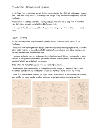
  • 1. Production Diary – B2 Creative Industry Response In this PowerPoint presentation you will find my postproduction diary. This will explain every process have I have done to my products either my posters designs or my documentary on growing up in the Northeast. This diary will be updated every time I edit my products. This helps me to keep track of everything I have done to my products and what I need to focus on next. I will also talk about the challenges I have faced while creating my products and how I have faced them. Day One – Sketching For day one I began sketching and creating different designs of posters for my Identity of the Northeast. I first started with creating different designs for the Newcastle Poster I am going to create. I know for all my poster I wanted to show of identifiable locations for each city and have fading pictures in the background of the past, present and future. I continued with other sketches for Durham, Sunderland, and South Shields. I used popular locations so it will be easily identifiable but also again added different past and present sketches to show the identity of what it was and what it can become. There where not many challenges as I was just sketching ideas down. I experimented with different types of frame polaroid frame designs as I wanted to see if I could make them looked worn and torn to show how old the Northeast is and how we are treated. I spent 30 to 40 minutes on different font styles. I used DaFont website as inspiration as I wanted an sans serif for the modern and a sans font for the old to show the different trends and styles.
  • 2. Production Diary – B2 Creative Industry Response Sketching my poster designs was a very helpful in my process as it gave me the opportunity to see how I could layout my poster but also how I could create different designs but still get my message through about the identity of the Northeast. I designed different types of polaroid frames as many people know that polaroid are a very trendy aesthetic now but also can help me present the 70s retro style. cI wanted the frames too look burnt worn and torn in order to show how old they are but also the change from modern day to the 70s. I began to edit my photograph of monument in Newcastle. I have chosen this photograph to be the main part of my poster as it is landmark in the northeast. I was not able to gather photos of Newcastle due to other commitments and weather, but I was lucky to remember I had a photograph of monument I had taken months before hand. I first began in Canva try to edit the photo to make it look hand drawn or a cartoon. I first began to use different filters as there were no cartoon effects. I tried many different types of filters as you can see but none of them were able to give of the hand drawing effect I wanted for my poster. The closest effect is the Hibiscus filter as I wanted to have a bright background and a hand drawn monument.
  • 3. Production Diary – B2 Creative Industry Response After trying many different filters in Canva, I began to look for other websites that have cartoon or hand drawing filters. I took a while in order to find a website with this effect but also to for it to be free. The website I used was Picsart, they offer many different effects, filters, styles and much more. This website was very easy to use and gave the desired effect that I wanted. I know in the future for this project I will come back to use this because they offer. I will go back to using Canva for layout and text as they offer more range compared to Picsarts. My main idea for my posters was to make them compare past and future, I decided to experiment with different frames they have just to see if any are appropriate and set the right tone for my idea. The second frame is not bad at all but none of them are the best suited for my idea. As they are not torn or can show between past and present, I wanted more of a subtle way. My main idea for my posters was to make them compare past and future, I decided to experiment with different frames they have just to see if any are appropriate and set the right tone for audience. The second frame is not bad at all but none of them are the best suited for my idea. As they are not torn or can show between past and present, I wanted more of a subtle way.
  • 4. Production Diary – B2 Creative Industry Response Day Two - Editing After trying to find an old close of Monument I was unsuccessful, so I decided to use Picsarts again in order to achieve an old photograph effect as many of the old photos I found were from very far away. After changing the effect and style of the photograph, I decided to start experiment with different torn paper frames on Canva and matched the old photograph up to make it match. It was a bit of a difficult as there were many different types of frames to choose. As you can see there were many different pro types of Newcastle posters I have made as I wanted to ensure I have on that shows my theme but also eye catching to the audience. My next step was creating a questionnaire to see which one is the best design I have created. Day three – Idea changing During my time changing the idea for my documentary, I decided that I should change the posters from the identity of the Northeast to promotional posters for my documentary. I believed this would be the best option in order to show cohesive projects but also creating posters for places around the Northeast is a simple idea as many people have done it and it doesn’t show the identity of the Northeast. The pictures I have taken for the original poster’s ideas feel very basic and predictable, so I want to create something different. So, I began to sketch and look at inspirations for a 70s theme posters and magazine covers. I create a pinboard of poster to inspire me by. I was also able to gain photographs of my grandad when he was younger in the Northeast in order to use in the poster.
  • 5. Production Diary – B2 Creative Industry Response After gathering inspiration, I began to sketch and draw different ideas of how I can present the documentary. I know that my target audience rang is 15 to 25 so I need to make something that will interest them while I show the theme of the documentary. After sketching I began to create different types of forms of my sketches in Canva, I experiment with many different types of fonts, styles, colours, and graphics. As so you can Canva offer many different types of fonts but none of them were suitable for this poster as I wanted a 70s theme font, I decided to go onto Dafont as have a look at all of their 70s themed font as was able to find perfect ones for my poster.
  • 6. Production Diary – B2 Creative Industry Response For my poster designs I created many different types of versions of different title fonts while also changing the position of the title as I wanted to see how much effect the title has on certain areas. I am quite fond as the title begin at the bottom of the page as on my inspiration board and from research, I know that in the 70s title’s were normally at the bottom of the poster or the cover it’s able to make the poster more authentic. I also tried to experiment with different placement of the graphics Canva offers, I used these graphics as the four colour strips were very iconic in the 70s and 80s especially with production companies’ logos. I created a google survey with some of the best designs in order to see the audience’s favourite and least favourite. From the results I will be able to tell the audiences likes and dislikes based on the layout of the poster. Each poster was chosen for a certain reason as I chose some based of the title and some based on the layout of the graphics and silhouettes. I showed many people in my class and family members my designs what I had so far and the main one they liked was a plain one of this as it is very simplistic, but they said I could add to it more to make it look from the 70s. Many said they liked the idea of the poster and needed to have more colour as the 70s were very vibrant. After hearing this feedback, I decided to go back into Canva as see what types of graphics and stickers I could use on the poster. I decided to use the rainbow line in all the other posters and turn it on its side to make it look like a road of some sorts. I was fond of these designs as It made it look a road and I was able to place the people in line to make look as they are facing one another. After creating a new poster design, I decided to experiment with other graphics Canva offer such as different text, people graphics and animals. I liked the negative space at the top, but I tried to see if it would look better if there were more graphics. I tried first with adding birds above them I had some positive feedback but other said that it feels as it is too much. In my opinion I am a fan of this design, but I think I can create it better.
  • 7. Production Diary – B2 Creative Industry Response Day Four – Editing After creating a new version of the poster, I decided to start to mess around with all the graphics I could use to make it look more eye catching while still showing the audience what the documentary is all about. Here as some of the version I was able to make from the original design. For the first poster I added an extra person in the back of the poster but that was it but after talking to people they say it did not make the biggest change and looks uneven. For the second poster I decided to change and add a motorcycle in grey in order to give the poster more dimension but also the grey helps the first motorbike how more detail with the grey motorbike. Many did not like this design as it felt of and the grey motorcycles looked out of place on the poster. I understood how they felt as it was not pleasing to the eye. For the final experiment, I decided to take away the lighter red line and make the lines thicker. I feel this design make the poster feel bigger, but the negative space does not change, I changed the lines thinking I could make it look like one biker and one person could be standing on each line as they are ready for a fight. Day Five – Feedback After getting feedback on more of my designs I went back to Canva and created more with the theme still begin the 70s. I first started off with the original design I made. I decided to look at what Canva offered of page borders to see if there were any that fit in with the style. Canva has a wide range of borders as their website is used for all sorts of advertisement and themes. They were many options I could have chosen but I decided to go with one that I believed would be the best suited for a documentary poster about the 70s.
  • 8. Production Diary – B2 Creative Industry Response I first found two different borders that I thought would fit the theme of the 70s. I tried them at the top of the page as they were meant to be a page border. The border was very easy to place as I simply had to size them up and align the borders at the top and bottom. I tried different colour variations, but these are the designs I liked the most out of them as the other colours did not blend in well or just made that poster look overcrowded with colour. After trying with the border around the full poster, I decided to see how they would look around the title of the documentary as it was very plain around it. I simply downsized it with my mouse and lowered it in the right position. It was tricky with the red and yellow design as I had to try and make them the same size and the while trying to blend the red into the red line, so it would appear seamless. In my opinion these posters are not the best designs that I have come up with as there is a lot going on at the bottom but not much on at the top and it makes it look disproportionate. The colour palette of the poster as well it very of setting as it is repetitive colours. I could easily change the colours, but I believe it would not make a difference and make the poster look more uneven and off theme. I have chosen these colours as when asking my interviewee about the 70s, I asked about the main colours and he replied with a turquoise blue, deep and light red and yellow was a staple in the 70s. I showed him the colours as well and he agreed they are the colours normally represented with the 70s. By looking at this retro colour chart I can easily see what types of other colours I can use so I am going to experiment with the colours to see which ones are the optimal for my poster. But before I change the colour, I wanted to get the audiences feedback on which design is the best for my poster, I created a google survey in order to see people’s opinions. In total I was able to get 15 responses from my target audience. In the survey I asked my audience to rate the poster from 1 to 10, 1 begin terrible and 10 being amazing. I wanted to gather a wide range of responses from the audience to see which one has really gain the attention of the audience. At the end I also asked what I could improve in the posters.
  • 9. Production Diary – B2 Creative Industry Response Poster Design One Responses Design one was my original poster idea, it is a very simplistic design. I created this poster as a based design for other poster designs as in the first survey many liked the first poster design. As you can see majority of people enjoyed this design so this information tells me that the audience likes a simplistic poster design. Most gave it a high mark but two people gave it a medium-low mark which tells me some of the audience may not like the design but most do. This fills me with confidence that this could become my final poster design after this feedback. Poster Design Two Response Design two is similar to design one as I have not moved the silhouettes or the graphic line, but I did change the font, size and add a border frame around the title. From the responses from the survey, I gain intel saying that many people did not like this design compared to the first one. Majority voted in the middle range of 3 to 5 suggesting me that this is not the best poster design as more people voted three, closer to terrible. This give me some views that this poster is not want my audience want so I will not be using this design.
  • 10. Production Diary – B2 Creative Industry Response Poster Design Three Response Design three was similar to the first and second design but I added a border style that I believed was on theme for the 70s. I also changed the positions for the silhouettes in order to see if the positions would be more suitable for the audiences. From the response Majority gave it a middle rating but all of the votes have been on the positive side and obtained two amazing tens. This gives me a suggestion that I am heading in the right direction with the posters. This poster style can easily be improved by placing the frames differently or in a different place in order to fill some of the negative space. Poster Design Four Response Design four was a copy of design three but I changed the font as I believed the font may be a better option which I could use for other designs. It is still very simplistic, but I changed the font to more of a sans font more than a sans serif font in order to give the poster more character while also incorporating the 70s style I am going for. From the responses I gathered it seems that many people do not like the font as the bulk of people voted 6 but many others voted on the lower side of the scale. From this information I can easily interpret that the audience does not like the font change so I will stick with the original font I have used in the other posters.
  • 11. Production Diary – B2 Creative Industry Response Poster Design Five responses For design five I decided to take the border frame from design four and flip it and place it at the top of the poster frame in order to see if it has a different effect. I changed the serif font back to the original serif font for this design as I believe a serif Sans would be suitable for this look. I also had to move the graphic line and silhouettes down in order to fit in the border frame. From the responses many people did not like this design as a many voted 2, closer to terrible, and others were undecided as they voted 4 to5 suggesting the poster design is not bad but could be better designed. Poster Design Six Response Design Six is a copy of the original and first poster but I decided to add in bird’s graphics above them to fill in the negative space. I added the birds due to the Northeast begin covered in birds and many people discuss the seagulls and birds that try and take peoples food and how they cover the streets. From the survey, the results shows that this design is not want the audience wants and they do not like it as bulk of the audience voted this design as a one, terrible. This shows that they do not like the birds and not understand my vision. I will not be making this poster design as one of my main poster. The results
  • 12. Production Diary – B2 Creative Industry Response also show me that the smallest change can make the poster less suitable for the audience so I need to be careful with my designs. Poster Design Seven Response The final design, design seven is a copy of the original design but having posters five border at the top but I add more border frames on top of each other in order to add more depth and colour to the poster. This poster is one of my favourite designs I have made as the border looks like it is getting wrapped around the people on the colourful line graphic. From the survey many of the audience liked the design but none of them thought it was amazing, it was mainly high rating for the poster which helps my confidence with this poster but also I believe that the font might needed to change or the positioning of the page needed to change to make everything centre and add space between the title and the graphic. At the end of the survey I asked the audience if there is any feedback they wanted to give me. Many questioned the birds graphic on design six, this just informs me more that the bird design is not be a main poster. Other said that there was no feedback they wished to give which makes me feel better as I know they do not see things wrong with most of the posters. The last couple of feedbacks question the negative space on some of the poster but I feel like the negative space on some of the poster is need as it is more a minimalistic design that is more suited to the audience.
  • 13. Production Diary – B2 Creative Industry Response Day Six – Second and Third Poster Design While editing and creating different types of poster designs for the documentary, I thought to create poster for each group. One for the skinheads and one for the hairies. I first started with the original design of the poster. I wanted to keep a similar background and graphics to the original poster in order to make the designs cohesive with each other. I first started off with the skinheads as I believed it would be an easy design. I easily duplicated the original poster in Canva and then deleted the hairies by selecting and hitting delete on my keyboard. I first began with using the original men silhouettes graphics from Canva, but I decided that something was off with the poster, so I did try and change the colour of the line but it still did not change what I felt. So, I decided to change some of the men silhouettes graphics with some what Canva Offer. I changed the man walking away with another silhouettes graphic of a man standing with a hand in m=his pocket. I chose this graphic as it reminds me of a skinhead due to them wearing blazers and the hair reminded of the main 70s hairstyle people would have. I also opted to add another silhouette with a man holding his hand out. I decided to add this graphic in as it seems like he is having a conversation with the other graphic. I took some inspiration from the original poster, as the graphics are stood on different lines, I thought I would try with this poster to see if the design would look better. I quite like this design than the first one I created as I feel as the first one feels more like a boy band poster, which is not the style of atmosphere for the audience. This new style gives them space from each other, and the poster page is not full by the graphics. I kept the same font as the originals poster as the survey suggested that they like the original font style than the other ones I attempted to use. I also kept the same writing as the original poster as they all about promoting the documentary.
  • 14. Production Diary – B2 Creative Industry Response After creating poster designs for the skinheads, I decided to create one for the hairies using the same poster designs. I decided to still use the same graphics from the original poster as I believed these are the one most suitable for the poster. I placed them on different graphic lines as I could not fir them all on one line as the silhouettes would collide together and you would be able to see them clearly. So I decided to place them on different lines similar to the original poster design but I changed the placement of the bikes. I simple moved the graphics around for both designs. For the second one I lifted the motorbike to make it look like they are doing a wheelie, but I feel like it is not the same as a hairies as the hairies were not a bike gang as much they were a movement and did not really show off like that on their bikes. I still kept the same font as the original again as I know the audience likes this style of font with this poster. I felt while creating these posters that they needed something in the background, so I searched on canvas for inspirations. I looked the 70s graphic they offer but I felt like none of them were suitable to add the poster. After a while of looking at the 70s graphic, I remember that my interviewee mentioned that he normally hung an in alleys ways. So I decided to look at buildings but none of them were suitable until I saw a black and white drawn black wall that remind me of alley ways especially growing up. It was a but difficult to add the bricks walls as on was not big enough to cover the background, so I decided to size it down and then add two more graphics of the wall. I released that I would have to match up the bricks to make them look connected and not smudge together as it would look unprofessional to the audience, and I have put no effort into the design. I quite like the design as the brick wall helps to show the figures to be shown while giving a mystery atmosphere due to the wall. I feel the wall gets rid of the negative space but also gets the audience asking questions about the poster. When a brick wall shows in a poster, my mind always goes to a gang or troublemakers who do not follow the rules as there is a stereotype of people leaning or hanging around a wall is full of trouble due to many rap videos and in movies when the protagonist is in a gang, they are mostly showing leaning against a wall with their friends surrounding them.
  • 15. Production Diary – B2 Creative Industry Response After adding the wall to the skinhead poster design, I decided if I add something in the background for the hairies. I first began looking at more building graphics to see if it would suit them more but none of them really stood out. I did experiment with a couple of the buildings; it was very difficult to find buildings that were drawn in black in white to make the skinhead poster. These buildings did not feel right to me as it did not represent the northeast in my eyes. Then I decided why do not I try to do a landmark of the Northeast either Newcastle, south shields, or Sunderland. I knew that Canva had plenty of drawn light houses so I decided to see if I could create Roker beach in south shields. South shields beach is very popular and known in the Northeast as it is the main place to go in summer, so I know this place would be very recognizable to people in the Northeast. I went on Canva and began to look through different types of light houses, I decided to go for a light house that is in black and white and looks drawn in order to make the skinhead poster as well as not to add much colour to the poster as it would make it to overcrowded. I quite liked this poster design as it adds depth to the background but also to the story of the posters. As you can see the skinheads are almost set in an alley way where as the hairies are set riding in south shields. I know from interviewee that many hairies and hairies club were set in south shields. After creating south shields in the poster, I decided to see if I could find any graphics of the Tyne bridge as that is where the documentary mainly takes place. I was successful in my search in find a graphic, so I had to create a new poster with the graphic. This design has to be one of my favourite ones as it really shows the Northeast of England. The Tyne bridge gives the audience information to where the documentary is set but also the style of the bridge fits in very well with the silhouettes of the hairies.
  • 16. Production Diary – B2 Creative Industry Response After creating this design for the hairies I decided to create another poster for the skinheads with the Tyne and Wear bridge in the background to see if I could add more detail and depth to the background. Instead of just adding the Tyne bridge graphic I decided to also add the buildings into the background in order to see if looks more detailed while staying in simplistic for the audience. This is one of my favourite poster designs of the skinhead poster as it shows where the documentary is mainly set but also the background fills in the negative space while not over crowding the poster. After creating these designs, I wanted the opinions of the audience to see if these posters would be able to make a trio of posters. I have realised through research that most documentaries, movies or tv shows have multiple types of posters to advertise their project so I decided to do the same with these posters. In order to gather the audiences’ opinions, I decided to create another survey in order to gather the information. Design One Feedback For design one I decided to ask the audiences opinions on this poster design as I wanted to see if they would like a more simplistic deign with only the silhouettes in the background. From the results many people did not like this style of poster as I many voted from 1 to 6, none voted for any of the higher. This suggests to me that this poster is not suitable for the audience and simply no the style they want for the poster. I will not be having this as my final poster as the audience do not like it but also it does not feel suitable and very boring, I do not wish to bore my audience.
  • 17. Production Diary – B2 Creative Industry Response I also feel this poster show not a lot of my effort and that I have simply just placed the silhouettes on the page. Design Two Feedback Design two is a poster design I quite enjoy as it shows where the documentary is set but also how far the background goes due to the bridge and the buildings. I am very pleased that all of the audience found this poster design amazing. I can easily see as the chart states that the many voted between 6 to 10, majority voted 10. I will be including this as one of my final poster designs for the documentary from the audience feedback but also, I believe this is a very suitable design for the documentary advertisement. Design Three Feedback Design One for the hairies is a another simple poster design which holds the Tyne bridge in the background. For this poster I did not add the building in the background as many were covered and did not look the same as the skinhead poster and I wanted them to different in simple ways. From the survey I know that many of the audience enjoyed this poster as I got much positive praise from this design. Majority voted for a 10, amazing, and I had none lower than a 7 which fills me with confidence that the audience will like this design for the documentary.
  • 18. Production Diary – B2 Creative Industry Response From the results of the survey, I know this will also become a final poster design for my documentary advertisement. I am very happy that this poster gained so much positive feedback from the audience. Design Two Feedback Design two for the hairies I decided to see the opinion of the audience on was a very simplistic design as it did not hold any depth to the background and only holds the silhouettes of the bikers. I wanted to see if the audience would enjoy a simple design as the original poster design, they loved was a very simple one. From the survey I gather many of the audience did not like this type of design as many voted on the lower side of the scale. Bulk of the audience voted 4 which shows me that many did not enjoy this poster design compared to the first design. From the result of the Survey, I will not be adding this one as one of my final poster designs due to the audience feedback but also I feel as the design is very unprofessional and looks as if I have not much put though or effort into this design which is very unprofessional for my audience. The amount of effort I put into my poster design will also show the effort and time I have put into my documentary. Evaluation Overall, it has been a long process in order to get the final project, but I feel like it was needed in order to get where the design stand now and the audience praise for my final poster designs fills me with much confidence that the rest of the audience will also like the deigns I have made. This process has been very helpful for me to develop my skills but also my confidence with my projects and designs. As at the start I had a set idea of creating media poster to show the identity of the Northeast and then I changed the idea to creating posters for the documentary to help support it but also to keep the full project cohesive to each other.
  • 19. Production Diary – B2 Creative Industry Response