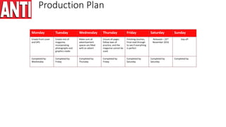
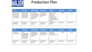
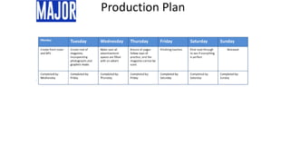
Production Plan
Monday Tuesday Wednesday Thursday Friday Saturday Sunday
Choose content by
going through
events of month
and picking out
most important.
Choose content by
going through
events of month
and picking out
most important.
Out of articles
chosen, choose the
most important one
to cover, making
this the main
headline.
Get team to write
up the articles
including main
article
Get contact with
people who re
wanted to be
featured in the
magazine, and get
consent from them,
ask if an interview is
possible.
Day off Day off
Completed by:
Wednesday
Completed by:
Wednesday
Completed by:
Thursday
Completed by:
Wednesday
Completed by:
Monday
Completed by: Completed by:
Monday Tuesday Wednesday Thursday Friday Saturday Sunday
Arrange and
conduct interview
Send
photographers to
get photographs
which are to be
used throughout
the magazine
Get designers to
create graphics to
be used within
magazine
Do photo shoot
with artist for main
image and DPS
Incorporate
interview into
article of that artist.
Day off Day off
Completed by:
Friday
Completed by:
Thursday
Completed by:
Monday
Completed by:
Friday
Completed by:
Monday
Completed by: Completed by:
Production Plan
Monday Tuesday Wednesday Thursday Friday Saturday Sunday
Create front cover
and DPS
Create rest of
magazine,
incorporating
photographs and
graphics made.
Make sure all
advertisement
spaces are filled
with an advert
Ensure all pages
follow laws of
practice, and the
magazine cannot be
sued.
Finishing touches,
Final read through
to see if everything
is perfect
Released – 23rd
November 2016
Day off
Completed by:
Wednesday
Completed by:
Friday
Completed by:
Thursday
Completed by:
Friday
Completed by:
Saturday
Completed by:
Saturday
Completed by:
Photo shoot Plan - ANTI
Photo Shoot Plan - Major
Test Photography
Interview
• Hello, How are you?
• Hello, I’m very good thanks.
• So, your new album drops next week, how are you feeling about it?
• Pretty positive, I love it and I’m sure my fans will too.
• Any favourites you have from the album?
• Its hard to pick, in my opinion every song is amazing, plus they’re all my creations, choosing a favourite would be like choosing a favourite out of my kids!
• A lot of work has been put into this upcoming album, 5 years in total put into it, is it hard putting so much effort and time into one piece of work?
• Of course, especially when you don’t know if your fans are going to like it or not. But I really feel myself when I’m in the studio so to me it doesn’t really feel like a
job, but a way of life.
• You’re so passionate about music, Does this help when creating your own?
• Definitely, I have fun in the studio making beats and coming up with lyrics, it really doesn’t feel like a job to me at all.
• As well as your new album, you are also going on tour starting next week, Are you Excited?
• Of course! I love being on tour, meeting my fans around the world
• What’s your favourite place to go on tour?
• London, it’s the place I grew up and the atmosphere you get there is like none other. But I do love going to places like New York and seeing that I have such big
support in the US as well as England
• Any necessities you need on tour?
• I wouldn’t say I have any material necessities, but I definitely need my friends with me, we always have a good time touring the world, and dancing on stage
together.
• What everyone wants to know, who is going on tour with you?
• Well I can’t release any information yet, but I can say there’s going to be some surprise appearances from big artists.
• That’s all the questions, thanks for your time
• Its been a pleasure
Magazine Masthead
When I created my masthead I had to ensure that it could capture a
passing by audience as the magazine would be on a shelf where people
would walk by. Therefore I chose red as the main colour as it is bright,
therefore it stands out on the shelf attracting more people to pick it up
and buy. To go along with the bright masthead I chose a bold font to
make sure the name is readable from afar, this means the name and
brand will become recognisable and known.
Final magazine pages
Final Double page spreads
Favourite Magazine
I like this masthead due to it
being red making it stand
out and grab your attention
straight away.
Having exclusive in a box
makes it stand out,
ensuring the reader sees it,
as ‘exclusive’ attracts
people to read.
The list of artists helps attract a larger
audience as their star appeal brings
people to read it. Having a list of them
means more people are targeted as
the different artists have different
fans.
The artists name in large at the top is effective as its
clear for the reader to see even if they are flicking
through the pages.
This quote has been blown up and put in a more
attractive font. This is so the article looks more
attractive, enticing people to read it.
Having a full photo page is important as it breaks up
the text and personalises the article for people who
aren’t aware of who the artist is.
Front Cover Step by Step Guide
1. Set up a canvas, A4 size as this is the size the magazine will
need to be. Then you need to set up ruler lines to create a
bleed, this means when the magazine is printed nothing
important will get cut.
2. Start with the background, I chose to do a grey scale gradient. I
did this by using the gradient tool, this is easy to use you just
select it and drag a line where you want the gradient to be.
3. Then I made the barcode, this was easy to do, I just created a
base for it then went to file, then place and chose a file I had
which was a picture of a barcode. I placed this on the base and
then used the text tool to write the price and issue date
alongside the barcode.
4. Next I created the masthead, I did this by creating a large red
rectangle using the rectangle tool. Then I used the text tool to
write the name of my magazine onto it. To add more detail I
went onto blending options to add a drop shadow to the text
which I made black to stand out against the red background.
1. Then I added the main image, I did this by going to file,
then place and chose the image wanted. I then resized it
to fit the magazine and slightly overlap the masthead, I
didn’t want the image to be warped so I held shift
whenever I was resizing it.
2. Next I added the main headline. This step is very simple, I
just used the text tool to create text and resized it to the
way I wanted it.
3. For the next step, I added the other headlines, I did this by
typing all the artists names separately in the same size
font, then I typed all the descriptions separately in a
smaller font and placed them underneath the artists
name. To add extra detail I used the rectangle tool to
create small dividers between each headline.
4. Finally I created a puff promotion, I did this by using the
ellipse tool whilst holding shift to make a perfect circle.
Then I created some text saying “win!” I made this large so
it can clearly be read from afar, I then used the warped
text tool to make the text curve along the top of the circle.
Next I used normal text to fill the inside of the circle.
Front Cover Step by Step Guide
Risk Assessment
• One risk I had to consider was permissions, I had to make sure that I got the
permission from any people that I took photos of which I was going to publish
in my magazine. I only used one person so I only had to create one form and
send it to that person (Shown in picture on right). This was so if their was any
legal issues regarding the photos it would not e down to the magazine, as the
person has given authorisation. The artist was required to sign showing that it
was them who gave consent, as well as writing down the date, showing that
they are giving consent for this photo-shoot specifically, and it is not an old
consent form for pictures taken in the past which has been reused.
• A second risk I needed to think about was area assessment. This meant that I
had to have checks to ensure that the location of the photo-shoot was safe,
and no harm would be done to either the artist or employees conducting the
photo-shoot. My location was a school hallway, this was good as it meant
there was not many possible risks that had to be looked at, and the location
was deemed safe.
Risk Assessment
• Another risk I had to consider was accidentally stretching the photo, it was important I did not do this
as it would make the artist in the picture look different, and also it would look unprofessional as the
picture would be distorted. The way I avoided this problem was by holding shift when resizing any
image. By holding shift it ensures the dimensions of the image are kept the same so the image looks
the same no matter what size. I also had to consider how I would resize them without pixelating them
as much as possible. The way I found that was most effective was the transform tool, this allowed me
to quickly resize images without affecting the quality
• The final risk I had to think about was inconsistency in my magazines colour. I overcame this risk by
using the eyedropper tool, this tool allows you to select a colour already on the canvas and use that for
whatever you are creating. This allowed me to make sure all the red I used on my anti cover and all the
blue I used on my major cover were the same. However you cannot use the eye dropper tool between
windows, so for my DPS I could not copy the colours from my front cover. The way I got around this was
copying the colours code and pasting it so it was exactly the same.
Conclusion
In conclusion this unit has been successful as it has allowed me
to plan and deliver a presentation and analyse the feedback
received from doing it, this means I could make improvements
and understand what to change if I were to do it again.

Ollie long unit 30 lo3

  • 2.
    Production Plan Monday TuesdayWednesday Thursday Friday Saturday Sunday Choose content by going through events of month and picking out most important. Choose content by going through events of month and picking out most important. Out of articles chosen, choose the most important one to cover, making this the main headline. Get team to write up the articles including main article Get contact with people who re wanted to be featured in the magazine, and get consent from them, ask if an interview is possible. Day off Day off Completed by: Wednesday Completed by: Wednesday Completed by: Thursday Completed by: Wednesday Completed by: Monday Completed by: Completed by: Monday Tuesday Wednesday Thursday Friday Saturday Sunday Arrange and conduct interview Send photographers to get photographs which are to be used throughout the magazine Get designers to create graphics to be used within magazine Do photo shoot with artist for main image and DPS Incorporate interview into article of that artist. Day off Day off Completed by: Friday Completed by: Thursday Completed by: Monday Completed by: Friday Completed by: Monday Completed by: Completed by:
  • 3.
    Production Plan Monday TuesdayWednesday Thursday Friday Saturday Sunday Create front cover and DPS Create rest of magazine, incorporating photographs and graphics made. Make sure all advertisement spaces are filled with an advert Ensure all pages follow laws of practice, and the magazine cannot be sued. Finishing touches, Final read through to see if everything is perfect Released – 23rd November 2016 Day off Completed by: Wednesday Completed by: Friday Completed by: Thursday Completed by: Friday Completed by: Saturday Completed by: Saturday Completed by:
  • 6.
  • 7.
  • 8.
  • 9.
    Interview • Hello, Howare you? • Hello, I’m very good thanks. • So, your new album drops next week, how are you feeling about it? • Pretty positive, I love it and I’m sure my fans will too. • Any favourites you have from the album? • Its hard to pick, in my opinion every song is amazing, plus they’re all my creations, choosing a favourite would be like choosing a favourite out of my kids! • A lot of work has been put into this upcoming album, 5 years in total put into it, is it hard putting so much effort and time into one piece of work? • Of course, especially when you don’t know if your fans are going to like it or not. But I really feel myself when I’m in the studio so to me it doesn’t really feel like a job, but a way of life. • You’re so passionate about music, Does this help when creating your own? • Definitely, I have fun in the studio making beats and coming up with lyrics, it really doesn’t feel like a job to me at all. • As well as your new album, you are also going on tour starting next week, Are you Excited? • Of course! I love being on tour, meeting my fans around the world • What’s your favourite place to go on tour? • London, it’s the place I grew up and the atmosphere you get there is like none other. But I do love going to places like New York and seeing that I have such big support in the US as well as England • Any necessities you need on tour? • I wouldn’t say I have any material necessities, but I definitely need my friends with me, we always have a good time touring the world, and dancing on stage together. • What everyone wants to know, who is going on tour with you? • Well I can’t release any information yet, but I can say there’s going to be some surprise appearances from big artists. • That’s all the questions, thanks for your time • Its been a pleasure
  • 10.
    Magazine Masthead When Icreated my masthead I had to ensure that it could capture a passing by audience as the magazine would be on a shelf where people would walk by. Therefore I chose red as the main colour as it is bright, therefore it stands out on the shelf attracting more people to pick it up and buy. To go along with the bright masthead I chose a bold font to make sure the name is readable from afar, this means the name and brand will become recognisable and known.
  • 11.
  • 12.
  • 13.
    Favourite Magazine I likethis masthead due to it being red making it stand out and grab your attention straight away. Having exclusive in a box makes it stand out, ensuring the reader sees it, as ‘exclusive’ attracts people to read. The list of artists helps attract a larger audience as their star appeal brings people to read it. Having a list of them means more people are targeted as the different artists have different fans. The artists name in large at the top is effective as its clear for the reader to see even if they are flicking through the pages. This quote has been blown up and put in a more attractive font. This is so the article looks more attractive, enticing people to read it. Having a full photo page is important as it breaks up the text and personalises the article for people who aren’t aware of who the artist is.
  • 14.
    Front Cover Stepby Step Guide 1. Set up a canvas, A4 size as this is the size the magazine will need to be. Then you need to set up ruler lines to create a bleed, this means when the magazine is printed nothing important will get cut. 2. Start with the background, I chose to do a grey scale gradient. I did this by using the gradient tool, this is easy to use you just select it and drag a line where you want the gradient to be. 3. Then I made the barcode, this was easy to do, I just created a base for it then went to file, then place and chose a file I had which was a picture of a barcode. I placed this on the base and then used the text tool to write the price and issue date alongside the barcode. 4. Next I created the masthead, I did this by creating a large red rectangle using the rectangle tool. Then I used the text tool to write the name of my magazine onto it. To add more detail I went onto blending options to add a drop shadow to the text which I made black to stand out against the red background.
  • 15.
    1. Then Iadded the main image, I did this by going to file, then place and chose the image wanted. I then resized it to fit the magazine and slightly overlap the masthead, I didn’t want the image to be warped so I held shift whenever I was resizing it. 2. Next I added the main headline. This step is very simple, I just used the text tool to create text and resized it to the way I wanted it. 3. For the next step, I added the other headlines, I did this by typing all the artists names separately in the same size font, then I typed all the descriptions separately in a smaller font and placed them underneath the artists name. To add extra detail I used the rectangle tool to create small dividers between each headline. 4. Finally I created a puff promotion, I did this by using the ellipse tool whilst holding shift to make a perfect circle. Then I created some text saying “win!” I made this large so it can clearly be read from afar, I then used the warped text tool to make the text curve along the top of the circle. Next I used normal text to fill the inside of the circle. Front Cover Step by Step Guide
  • 16.
    Risk Assessment • Onerisk I had to consider was permissions, I had to make sure that I got the permission from any people that I took photos of which I was going to publish in my magazine. I only used one person so I only had to create one form and send it to that person (Shown in picture on right). This was so if their was any legal issues regarding the photos it would not e down to the magazine, as the person has given authorisation. The artist was required to sign showing that it was them who gave consent, as well as writing down the date, showing that they are giving consent for this photo-shoot specifically, and it is not an old consent form for pictures taken in the past which has been reused. • A second risk I needed to think about was area assessment. This meant that I had to have checks to ensure that the location of the photo-shoot was safe, and no harm would be done to either the artist or employees conducting the photo-shoot. My location was a school hallway, this was good as it meant there was not many possible risks that had to be looked at, and the location was deemed safe.
  • 17.
    Risk Assessment • Anotherrisk I had to consider was accidentally stretching the photo, it was important I did not do this as it would make the artist in the picture look different, and also it would look unprofessional as the picture would be distorted. The way I avoided this problem was by holding shift when resizing any image. By holding shift it ensures the dimensions of the image are kept the same so the image looks the same no matter what size. I also had to consider how I would resize them without pixelating them as much as possible. The way I found that was most effective was the transform tool, this allowed me to quickly resize images without affecting the quality • The final risk I had to think about was inconsistency in my magazines colour. I overcame this risk by using the eyedropper tool, this tool allows you to select a colour already on the canvas and use that for whatever you are creating. This allowed me to make sure all the red I used on my anti cover and all the blue I used on my major cover were the same. However you cannot use the eye dropper tool between windows, so for my DPS I could not copy the colours from my front cover. The way I got around this was copying the colours code and pasting it so it was exactly the same.
  • 18.
    Conclusion In conclusion thisunit has been successful as it has allowed me to plan and deliver a presentation and analyse the feedback received from doing it, this means I could make improvements and understand what to change if I were to do it again.