Evaluation
By Fintan Sedgwick
Research This is my research which I went through the different people I like at to try and get my
photography style because I didn’t have a certain look to the type of photography I wanted to
do, for example I talked about Kai Z Feng who although has worked with some very popular
celebrities and brands there is not much known about him which was surprising and was really
hard to find anything about him. But one key thing I found was that he didn’t originally start his
career as a photography. In my opinion one strength which I can see when it comes to my
research would have to be that I looked through many different styles of photography which
didn’t make it because I wanted to do a style which was commonly used but it worked with the
theme of streetwear which I was portraying throughout my entire FMP, I would say this was a
strength because I got to see the good and bad types of photography and which was most
common and least common, by doing this I was able to get an idea of what the audiences like
which was one of the main things which I needed to do. This helped my production because I
chose a fairly modern style of photography, and I took the best possible photos that I could
because I knew what to do when it came to each shot. Also another things which this helped
with would have to be that I had to manage each page around the photo, for example the
colours. I think that the research section of my project has been really effective when it comes to
individual sections of what I have made because I took idea from each of the people I looked
through and other pieces of work brands have made because I wanted some work which was to
a high enough standard alongside their because It would show that I can make something to a
similar level to a professional one.
Someone in this which I thought was kind of a dark horse when it came to how useful they
where in changing my work would have to be ”Virgil Abloh” because it showed me that you
don’t have to make your work look like someone else's, you should make it how you want it to
be.
Research When it came to my research in this project one thing which I think wasn’t done so
well would have to be the style of branding I looked into because some of them where
the complete opposite style which I was aiming for, and didn’t really give me any ideas
on how I wanted to do my work, for example the ”Arnaldo Anaya-Lucca” photography
which is nothing like the one I shot because it doesn’t work with my street theme as
these are very vintage style photography and I didn’t take anything from this because
they have used black and white in their photography which gave it a very different
look to keeping it colourised. The only reason which I think this was my main
weakness would have to be that It didn’t contribute to my entire project at all as there
was nothing which could be taken to improve my existing work. I think that If I was to
redo my research I feel like one thing I could have done better would be to look at
more photographer and branding which worked with the street theme, which would
have improved my work because I could have changed little things in my photography
which could have made my work that little bit better.
I think that my doing these improvements I could change the style off photography
which I have from maybe a street perspective to a more modern style which may open
my work up to a larger audience. Also another weakness would to be the lack of work
which I produced when it comes to larger brand because I have talked about three
different brands which I don’t think is enough because I am not getting the bigger
picture because I could have so many different styles of work which I could have
produced if I only I was to have made these improvements at the beginning of the
project.
Planning This is my planning section of my work where I went over the different things which I
was going to use and do over the next weeks for the production, such as the locations
the camera settings and angles which I can use and other ideas. These really helped me
in my production because with the camera for example I looked at the different
meanings behind the angles because they all say something such as the low angle makes
the person look dominant where as a high angle make the model seem weak, which it
was hard for me to choose from because I wanted a slight mix of all of them throughout
my work but I found it quite difficult to get the high angle because where I shot there
was many locations where I could do this, plus I didn’t really want to make my model
seem weak because you always want the model to be on the same level as the audience
which would be neutral which is an eye level shot which the majority of my pieces apart
from some exceptions. I think that the camera angles and settings really improved my
work because I learnt how to use different things to change the DOF which was
something which I really wanted to integrate into my final pieces because It would show
that I learnt knew things from what I had last year which I have. Also in my opinion
something else which really helped my production work would have to be the ideas and
colour schemes which I came up with because I looked through things which worked and
others which didn’t work well with each other I went down different paths until I found
the right ones, for example I started off wanting a really dark colour scheme being
mainly black and yellow but then after a while I realized that this would be a really bad
idea because I would have to try and use black and white photography which I didn’t
want to and also I felt like I would need to liven it up a little by putting some splash of
colour throughout the booklet I felt like it could help me because I could open up to a
larger audience.
Planning Something which really don’t go very well for this project would have to be the
locations I planned because I didn’t go to any of them because I preferred to do
everything on campus as it is a lot easier because I don’t have to do any booking outside
of college times because a lot of people are working so the timing to get someone for
shoot is quite difficult. So I kind of feel this was quite unnecessary because I only had
one shoot where I wasn’t in the studio because I found it easier and the background
worked with what I wanted which was a police station line up look which was easier
when using a white background. I think something which I could have done to make this
better would be that I could have chosen location which are closer to college for
example behind Tesco or around the college campus because It would allow me to go
out during lesson and gets the right shots and then be back in time to edit them into my
project. One thing this taught me though would have to be that you have to make sure
you know where and when you want to shoot because I didn’t organize my shoots
besides asking the model the day before to make sure that they where in college on
that day, because I prefer doing it this way. Also the location which I chose where really
far a way and where in places which may be difficult for certain people to get to as they
live in the complete opposite direction which would cost them quite a lot of money to
get there which I would have to end up paying for, the one location which I wish I had
gone to shoot at would have to be the staircase near the train station because I would
have had a shot which I didn’t already which would be the high angle where the model
appears weak in comparison to the audience which I think may have given a different
feel to the entire booklet, I feel like If I did this I may have been able to possibly get a
better grade because I have switched it up from the normal.
Problem solving When it comes to my problem solving there are some positives which
are that I talked about things which I needed to learn how to use for
example the different camera settings which I looked out how to use
them and how to fix the problems if any ever happened with the
camera because I could maybe fix them while shooting or would have
to go back to college and get another, also with the problem solving I
went through things which I would require on the shoots and editing
because I needed to know everything I needed for each individual
shoot so that I didn’t get anything wrong and also for example the
battery breaking what I could do, which would be make sure that I
bring another one with me. The equipment section of my problem
solving really helped the big picture because it taught me that I have
to make sure that I am ready for every situation no matter which helps
for when it comes to the future in this career choice, some things
which I put on the list when it came to equipment which I didn’t end
up requiring would be the Reflector and the Tripod because I had
forgotten that in the studio they already have amazing lighting and
then I could get a more steady shot by not using a tripod which was
useful because they can sometimes be tilted slightly which would
mean I would have to redo the shoot entirely. Also looking into the
equipment I checked through the different settings which I was going
to use such as the ISO, and the aperture.
Problem Solving Although there are some positives there are things which I have which I
wish I could have changed such as, the Section where I talked about the
transport because I as I didn’t do any shoots outside of college times I
didn’t need to buy transportation for anyone which was good, but I felt
like is was kind of good to talk about it because at that moment in time
I had no clue when or where I was going to shoot as I had it in my head
that I wanted to shoot in these locations which I didn’t the end but
making sure that I had areas which I could shoot was a priority incase I
couldn’t get other locations. I think that If I where to change these
locations to a better area or only shoot in the studio I could have gone
more into detail about the models which I will be getting and also the
clothing which they are wearing because as I didn’t do that this time
around which made the model look very different to each other and
some of them didn’t have the street style look which I was hoping for
which I wish I could have done because it would have tied down the
entire booklet to the street/urban style which I was going for because
know I don’t know how to label it because it is just a collection of
clothing styles instead of one individual style.
I think that If I where to improve this I would get a better grade and one
thing I would also talk about in more detail or add to would have to be
the software and the different techniques because although I only use
Photoshop and InDesign I think I could have talked about Wix which is a
website maker because I did it right at the last 2 weeks it should have
gone back and talked about it which I wished I had.
Primary and secondary
For the primary research it had to with the audience, such as the
reviews on the products I look at and also getting feedback on
questionnaires, and then talking about the positives and negatives
around it and how this would affect my production in the long run.
An example of the audience research would have to be the question
which asked about the style of clothing which they where from most
to least which gave the style of the entire booklet because I wanted
to give them what they are into because they are my audience. I
think the audience research went well because it has taught me that
you should always make things which appeal to your audience as
they are the people are most interested in your work and are one of
there go to brands, also with the audience research I looked at how
the they feel about certain things in their review which where quite
good because there was a theme throughout all of them which
would have to be each brand has their specific audience whether
that is old or young, male or female, which is are the two main
things to work around when producing work because each audience
like certain things. Also something else which I found would have to
be that you are never going to please absolutely everyone so you
have to make sure to appeal to your audience because you are
always going to get bad feedback and feedback which is quite
harmful and you should just do what you want.
Primary and secondary
For the secondary research I had to go through different existing
products and talk about once again the positives and negatives of
each piece of work, and how they have influenced my work in
different ways. A major positive which I can think of would have to be
that I looked into things which I am actually interested and could help
my FMP such as street style clothing brands and how they portray
they work to their audience in their own individual way, the reason I
said that this is a positive would be that It has really helped me make
something which is similar to this and I have taken little bits from each
thing and tried to integrate it into my own work. The main one which
helped my work would have to be the Off-White images because I
went through how they show of their work in a free book for their
audience, by doing things out of the ordinary which attracts their
audience to their style of work. Something else which was researched
in this was how they make everything work with each whether that
was the colour scheme or the font choice, and I looked at how they
decide them because there is a lot of time that goes into making the
right design for each thing, such as with a brand like vogue they one
very iconic font which is used on everything they make because that is
what they are known for and they don’t want to change that. I
decided to talk about some well known brands and also lesser known
ones because I wanted to see the difference between them and how
they are differently published.
Primary and secondary For both the primary and the secondary research there are some major
improvements which could be made, the first one being about the secondary
research where I talked about vogue which in my opinion is a bit of a red
herring because it has nothing to do with the style of what I am doing and
the only reason I decided to do it because I knew it was booklet/magazine
which does really well and I wanted to know why and how they are so
popular, I feel like if I could go back and change something it would have to
be the vogue one because another one which I have in mind would have to
be something like “Grind” which is a urban fashion magazine which is very
similar to idea which I have in mind when I made this project. The main
reason why the Vogue magazine is a negative would be that it isn't a fashion
magazine and doesn’t fit into the style of the other works of art which I
looked through so If I changed that I think that It would have had a bigger
impact on my work because I would have taken more inspiration from
“Grind” because the type of work they produce is quite relatable to mine
which Is something which I didn’t find in many other pieces of work. Moving
onto the primary research my main concern would have to be the
questionnaire which I sent out because I only sent it to around 5-6 people
which is nowhere near enough people and I sent them to people of different
styles which was a bad idea because I knew that some of them didn’t want to
be in my booklet, also the questions which I put where not very interesting
because they where quite similar to what I asked last year in my FMP
because I didn’t think that there was anything else which I could ask without
being to out there, so if I could improve it I would first of all send it to a lot
more people and also would put more effort into the questions to make
them more interesting and detailed on what I am making for my FMP.
Missed opportunities
When it comes to missed opportunities in this project one which I could think of would have to be that
I didn’t push myself enough to go out and get photographs because I would much rather do it at
college because I didn’t really want to bother people by asking them to go out of their way to do
shoots with me, so if I could do anything again I would change my photoshoots as I didn’t do as much
as I could have. I feel like If I could go back and get shots in these locations which I should have I think I
would have a much better product and better grade because it would have put some diversity into the
photos which I got because a lot of them have a white background which although works for what I
need I feel like some different styles would have really helped this project. Another missed opportunity
I know I had would be only using a short amount of models because I feel like if I had gotten around 6-
8 I would have a much better product because I could have combined the two things being the location
and the models because each model could have had different surroundings which I think would have
been really nice, but the only reason why I didn’t do these things would be that I was comfortable
going outside of my friendship group because I didn’t know them and if they where going to say yes or
no and also some of the people who I previously photographer where not comfortable being in my
FMP this year which I totally understand but it just left me with a shorter list of people I could ask and
knew would say yes, but I think the models I got worked really well because it was a mix of men and
women which I really wanted to do because I wanted to make sure that it was a booklet and website
for both men and women not one individual gender. Also another problem would be that I only chose
people of my age because that is who I am comfortable with which I think was a mistake I feel like it
should have asked people who are 20+ because they would have given a different appeal to work as
they would appeal to the older generation not necessarily the younger generation.
Missed opportunities
More missed opportunities would come down to the methods in which I used and didn’t use
to maybe their full potential, for example with my graphics on the photos being the cartoon
faces, I think I could have gone more in depth with them by doing their facial features and
also any other part of their body which you could see their skin because I think It would have
looked a lot nice because with some of them you can see their neck and face are cartoon but
then the rest of the arms and legs are completely normal which they kind of look out place
and I would go back and change them if I had time to improve them. Also with this method I
don’t think that I made what I originally had in mind because I took the inspiration from both
my fanzine project and a YouTube video because on YouTube they had multiple colours
which I had experimented with but in the end didn’t do because at the time didn’t look very
well because the colours didn’t work alongside each other.
The final method which I missed out on would have to be the style of editing which I used
because I think that I could have used some better effects because one I saw was really nice
was the look of having the photo ripped which would work really well with the theme
because it could have been destroyed and repaired so I think if I could change that I would
because it would shown more skill on my behalf, and also I think that the images I made at
the moment are not as good as they could be because I did the same effect on every single
photo which I put into my booklet.
Final concept
My final piece of work is pretty much exactly what I put in my concept at the start of
the FMP, because I knew I wanted to make something which I was passionate about I
know a lot about as well I worked with what I put down, for example the colour
scheme and the theme throughout the entire booklet, I think that I decided to go with
this concept would have to be that I knew I could pretty much get either a merit or
distinction If I pushed myself hard enough when it came down to it, because I wanted
to continue on with what I did for the last years FMP. But something which I could
have changed when it came to my concept would be that I shouldn't have been
precise on what I wanted to make I feel like I should have given myself a wider option
to make, because it looks like I haven't done anything which I didn’t mention.
I feel like the reason I chose to make the concept so precise was because I knew that I
could make everything in the time which I was given which I had to make sure I did
because I didn’t want to leave anything to late because I wouldn’t be able to finish my
project. For my concept I took a lot of inspiration from different artists because they
have very professional looking work which was my aim because if I can make
something of that quality I can only improve from now on.
Technical problems
When It comes to the technical side of my work I thought it was very mild in comparison to the previous
projects because I didn’t run into many problems which caused a delay in the production of my work. But
one thing which did happen many times would be crashing in the software which I used which would be
Photoshop, which was quite annoying as it would reload from the last time I saved which was annoying
because I couldn’t remember what I had done in that time which meant I had to go through many different
ideas and see which one looked most like the one I had originally, I think this is my fault because I didn’t save
it but I didn't really expect it to crash because it a very reliable piece of software, but I couldn’t do anything
about it. The reason is expect it crashed so often would have to be the size of some of the files, because
some where upward of 300mb and when you tried to save them they would sometimes crash because there
was too much in the file, which once I managed to save I needed to export to a lower size so they would
have many faults with them.
Another issue with my software would have to be the camera which had a broken SD card in it which I hadn’t
noticed once I had started shooting, because I had gone to the studio and then tried to shoot and it didn’t
turn on, so I had to go back to class and then try and get a completely new SD card which took around 5-10
minutes of the time which was a pain, but this only happened once which I was grateful for because
otherwise I would have spent loads of time going back and forth between class trying to get the camera to
work probably.
The last issue which I can think of which I ran into to do with technical side would have to be that on a few
days when we change class in each week sometimes the version of the software wasn’t up to date so it
would either not work or if you made something on that version you couldn’t go back to the other
computers and use it as they used a newer version of certain software's, such as PowerPoint, Word and
Photoshop.
Management problems
A problem which I ran into when it came to the management would have to be that some of the
days which I wanted to shoot, the model couldn’t turn up which delayed my production because I
had to wait for another when I could get photos because I had already had photos with these
models so I didn’t want to change them because the photos which where very good. A way around
this problem could have been get another model but I didn’t want to because I wasn’t that
confident to ask other people because I asked people who I am friends with as I found it easier to
talk to them, I feel like if I had of asked other people on these days where they weren't in I could
have made more work, as I would have both the new models and the previous models which I have
photographed.
The second management problem which occurred during my FMP would have to be that I
sometimes wasn’t able to get the studio for quite a while because I hadn't booked it out which is all
my fault but this left me twiddling my thumbs because in the time I was waiting I couldn’t really do
anything else as without the photos I could do anything because at the time I was getting photos I
hadn't thought about the website yet. But I think when it comes to the future I will make sure that I
am on time with bookings because I got lucky on these times because it wasn’t booked for a long
period of time.
With both of these management problems they where all down to myself because I didn’t really
have a schedule of what I was going to do, so I would just book it the night before and hope that
the model which I wanted where going to be in on that day because otherwise I would be left with
nothing to do which would have been a huge inconvenience.
Emotional problems
For the emotional side of my work I don’t personally think that they where any
problems because there wasn’t anything which caused any inconvenience when
it came to myself. But one which I can think of would have to be stressing on
whether or not I would get my production completed on time because I had left
a lot of work to do till the last week and also the same for when it came to my
evaluation which was my fault because I didn’t take my time during the time I
had off to do any work which would have helped my work massively, but the
only type of work I could have done at work would be my PowerPoints because I
don’t have Photoshop at home. I feel like this is the first time I have been
stressed during this 2 year course because I am really wanting to get a good
grade for this final project, because If I manage to get a distinction on my FMP It
will top of the 2 year course very nicely.
Production For the front cover I went for a slightly different theme from the rest of the
booklet because I had taken inspiration from movies where you defaced
statues do to either an outbreak or an apocalypse and I really liked them so
I decided to use them in my work and also I chose mount Rushmore as it is a
very iconic American landmark which is where the entire booklet has been
set and taken place in because I felt like there is more mystery when it
comes to America as they have a lot to hide from the world. One thing
which I really like about this cover would have to be the tape and paint over
the two faces because I taken away the power which those two have my
simply removing their eyes because It shows that they have been put down
a pedestal, out of the two faces I prefer the one on the left because he is a
much more significant person in history because it is George Washington,
and the one of the right is Thomas Jefferson who was another US president
but not as well know as George Washington. The reason I decided to go with
red and white as colours to cover their faces would have to be that they
both represent different meaning with red meaning of violence and danger
where as white represents innocence and purity which between the colours
are polar opposites in what they mean so I wanted to show that people can
be both pure and violent at the same time, because I have made the cover
represent both the good and the evil within my made up reality.
Although I really like this piece of work something which I would have to say
that could be really improve would be that I think I should have added some
subtle effects to it whether that was a slight rip or a burn mark to make this
document seem all the more realistic, I think by doing this I would have a
piece of work which looks very professional and would put more of an
emphasis and atmosphere on the theme of the booklet.
Production For the second page in my booklet I wanted to have the classic look of a secret
document like they do in the movies by making a redacted looking statement
which talked about how this piece of work is very secretive and only for your eyes.
A huge inspiration for this piece of work would have to be in the movie ‘The Purge’
which in this there are document all over the screen at certain parts in the movie
where they have government documents which have blacked out and this is what I
wanted to go for because I wanted to continue with the theme of classified
because redacted gets rid of anything which would be really damaging or personal
about government things. My work is different because usually with a redacted
statement it doesn’t really make sense because there are just pieces of text on the
page which don’t link with each other when attempted to be read, where as with
mine you can read the entire thing in order without getting confused, which is
something I wanted to do because it gave my audience a heads up on what to
expect from this piece of work which is a classified. When it came to the black
blocks I had many different alternatives which where doing it with a paint to make
it look like it had been gone over with a black marker or tipex, but I decided to the
straight black boxes because they look like they have been put there before the
document has been sent out which shows that there was something to hide
before it had been sent off. Another thing I did with this page would have to be
the paper texture which I have used to make the background so nice would be of
the internet because I could find any videos on how to make the background
which I wish I could have because it would have then been entirely my own
project besides the odd little paint brushes, but the texture which I have used is
completely copyright free as I found it on a stock image website where you are
free to use them at your own will. One thing about this page which I don’t like
would have to be the text which I put because the only thing I said was that this
was private and for your eye only, I didn’t mention anything about this booklet
being about clothing or fashion which was a big mistake of behalf because some
people may not know what I am going to be showing them.
Production For the third page of my booklet I wanted something right before the
audience got to see my work, which was a little bit of text underneath
the us government logo which read “After reading, destroy this
document” to add a little emphasis on the secrecy of the document. I
wanted to have the US government because It links in with the rest of
the pages I have done before as it has everything to do with America
and this logo has been plastered around everywhere when it comes
to movies and tv, so far this is my favourite page because it has
something about it which stands out to me in comparison to the
other pages, the main thing for me would have to be the speckles on
the page because they are a classic for old vintage documents
because the printers lack the colour. Also something else which I like
would be the grainy look to the logo because It also gives that look of
vintage, old printing, the final things about this page which I like
about this page would be the box in the bottom right and the top left,
where it has the ”eyes only access” text which looks very nice because
It looks very similar to redacted pages in documents about the
government. Something which I don’t really like about this page
would have to be that the logo is not in the centre of the page which
for some reason I really don’t like because It looks out of place and
although it is a very small and simple change I think that I would much
prefer the look of it after changing it, also I think I should add more
effects to the page, for example a stain on the page which would
show that it is not that important and has been left there for so long.
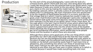
Production For the start of the actual photography, I went with the look of a
criminal record, which I think look very nice. One thing about this which
I really like would have to be the polaroid look to the photo which I have
taken because it looks very similar to the one which I did last year but I
put a twist on this one by making the model look like they are a criminal
by holding a placard, which is actually a piece of card which has had text
edited onto it in photoshop. My main inspiration from this would have
to be the mugshot of David bowie because it is so iconic and also has
that vintage look to it which I tried to replicate but couldn’t make it as
good, once I had finished with the photograph I went onto making the
record which took quite some time because I had to find one online and
then replicate it to the best of my ability, which I think I have done, for
the copy which is the text I had to think of crimes which where bad, but
not to bad, for example with this one I made her break into area 51
which is government which links into the whole theme of the booklet
which would be the US government. I once again used the black bars to
get rid of confidential information, which would have to be people
names and the location in which these acts occurred.
Although there where some good parts of this one thing which I could
personally say I don’t like would have to be the how the new it looks
because you can see the background looks vintage and rustic where as
the piece of paper and the polaroid look brand new which I think was a
mistake on my behalf, and could be easily fixed if I had more time or
allowed to, also something else which I can think of would have to be
that I wish I had put my own spin on the record because it looks
identical to any other one you have seen in either movies or tv which is
a shame because it would have made everything look a lot nicer.
Production
This is my first photo which I taken when it came to production, and is
arguably the best one I have taken all year because it just looks so clear. I
think i found the editing more interesting than the photography because I
was able to let my creativity run wild and this is what I did because I went
through many different designs on this first one because I wanted to it be
amazing as it is pretty much the opening page for the audience. When it
came to the face of the model I decided to completely cover it which would
give them privacy, with the wrap art for the face I did the same thing as I did
when it came to fanzine because I thought than I had some what mastered it
to make it look very professional, which in my opinion It does. The colours
which I have used don’t match anything on the page which was something I
tried to do but the colours where clashing and didn’t look right so I took a
colour which I knew would work which was purple and I think it came out
very well, on the face I decided to put an ”X” which was the original design
for the booklet and I wanted to keep a small part of that in the rest of the
booklet, I decided to do it in white because It shows innocence. For the rest
of the page I went with a home made look which would be having tape on
the photo attaching it to the page which I thought look very nice, as it was
something different from anything I had done before. Also I like the vintage
look to the photo because with what the model is wearing it suits to the old
look because that was a very in style back in the 90s which is around the time
which I based these crimes around.
Something about this piece which I don’t like would be a very small detail on
the photo which would be the shadow underneath the tape because It
doesn’t look right because it feels like the photo is above the tape, so a quick
fix would be to make tape either thicker or delete some of the shadow so
that It doesn’t come underneath the tape.
Production With this photo it is a little different from the previous one in the
way of it has been edited a lot more, because I had decided to
change the background from the original white which It was shot
on, to do I had to cut out the model and put her onto a different
background which I had downloaded from the internet as is
completely copyright free, once I had gotten both of the images I
had to put them together and make it some what realistic because I
didn’t want the model to look out of place on the background.
Something which I like about this photo would have to be the subtle
blur at the bottom of the background which I added to make it look
more realistic, by doing this it adds a depth of field look which I
couldn’t really achieve without photoshop because as I didn’t go
out to get photos I had to add a fake background which Is
something I which I done because it would have made this photo a
lot nicer than it does, because In my opinion you can slightly tell
that it is a fake background because the lighting on the model it
different compared to the background, which is something which I
don’t like about this photo. I did the same thing as I did with the last
photo which was take a random colour to base the face around
because the colours around her don’t work, so I feel like the blue
makes this image pop a little because the background is quite dull in
the fact that there is a lack of any colour, so I decided to spice it by
using blue. In this image something which really bothers me would
have to be tape at the top of the page because I think it looks
absolutely terrible and out of place so out of everything that Is the
one thing I would want to change if I could.
Production For the final image of the first model, I decided to make a piece of work
which describes the outfit which the model was wearing at the time of
the crime because it gave an insight into both the theme of my booklet
and the clothing which Is was the booklet is about. The one thing which I
like about this piece of work would have to be that I had to think about
what went into paragraph on the left because I wanted to make it look
very realistic in the detail of what the criminal was wearing the crime
scene, with this one I talked about how they where found with a denim
jacket and a striped turtle neck. I like this because it shows the audience
what I am talking about which Is something which I am quite proud of.
Also something else about this page which I really like would have to be
the little detail which I have mentioned on the criminal which would be a
little ’X’ tattoo on hear which is something which I have made consistent
throughout every models description, and they all have their individual
things which link them together. Although I like this page something
which I should have changed would have to be the black bars on the text
because with this one, some of the sentences don’t make sense as I have
taken away key words and the words don’t work with each other, which
makes the audience have to think but if they don’t find it very interesting
they might just stop the entire booklet. Also another thing which I don’t
like about this page would be the little ‘X’ on the bottom left because it
doesn’t look right because I made it indented on the page which in real
life wouldn’t work because it paper, so If I could change it I would make it
look like a proper ink stamp.
Production
For the second model I did the same as the first which was start of with the
criminal record, which was different from the original one because it has a
completely different crime and location which I have redacted because I don’t
want the audience to know the exact location, but the crime was aggravated
assault, which I chose because it is a very well known crime which I wanted to
chose because it isn't out of the ordinary. With this criminal record something I
did different would have to be that I used different types of blocks over the
text, because I used a paint brush looking black bar because it makes it look
like it has been added after the printing, because there was stuff which I didn’t
want to include it on the page. But something about this complaint which I
don’t like would have to be the photo in the top left because the model looks
quite strange as the eyes have changed completely when I made it black and
white which is something I wish I could, because although it isn't the most
obvious, if you look straight at the photo you can tell straightaway there is
something wrong with the image.
Also for the last of this models section I went down the same path of
description of the crime and what they are wearing, and also I have added the
date in this one because the reader has to look at the last page to find out
when this crime occurred which is quite nice. Once again I have the ’X’
possession on the criminal which this time would be an ‘X’ on the back of the
models hoodie. Something else I don’t really like about this page would be the
size of the x on the bottom right because I changed it from the last one on the
other model which I shouldn't have done because they don’t work well with
each other, and then the x looks out of place with the emboss which I don’t as
it looks like its coming of the page which I didn’t want to happen.
Production For the photo of the second model I did something different to what I had
done in the previous one, in the idea of I decided to go outside to get photos
because I wanted to mix it up, as I haven't done anything like this before hand.
One thing which I really like about this page would have to be the background
of the model because it contrast what the model is wearing in the way of the
colours which is nice because the dark and light tones bounce of each other,
also something I like about the background would be that as I have edited a
overlay onto it, it changed the colour of the background and added lots of
little tinges to the colours. Also something else about the photo I like would
be the placement of the model because I have made them sit on the stairs
which makes it so I can see the entirety of the model which allows me to see
what they are wearing, which is completely different from any other of the
photos which I have taken. Also the final thing which I really like about this
piece of work would have to be the face of the model because I have made
them look cartoon like the other models, but it is different with this one
because I have put glasses on the model which make the theme very different
in comparison to the other photos. Something which I really don’t like about
this page would be both the tape which I have put on the photo because they
don’t look right as they are really different because one I straight and the
other looks all scrunched up and I wish I could have use the tape for both the
top and bottom, the problem with the shadows which I really don’t like would
be the tape which appears both above and beneath the tape.
Production For this page I also shot it outside right next where the
previous photo was taken, and I is a very nice location because
the background works with the cartoon look of the face and
clothing of the model. Something I like about this page would
have to be the tape in this one because they actually look like
they should be there, unlike any other pages before hand. The
reason why I like the tape would be that the colour of it is very
different to the other ones which I have done because it Is
clear which works better because it doesn’t cut out any part of
the photo. Another part of the image which I like would be the
change which I made in the levels of the photo which has
made the image a lot darker which make the clothing look a
lot better because for some reason it lets you see more details
which looks very nice, as the darks become a lot darker and
the lights have been made look brighter which I didn’t expect
and it has turned out really nice. I don’t think that there is
anything which I dislike about this photo because I taken
everything from the previous photos and then made
something which I really well done and I think I could be
making more images of this quality. I think so far this Is
probably the best image which I have made in the entire
booklet.
Production
For the 3rd model I changed it up a little bit because when it came to
the complaint I changed the photo because I didn’t make it black and
white and it actually looks very nice in contrast to the previous ones
and the reason behind it would have to be that the crime took place in
a more modern time which would the camera quality look a lot nicer
and would actually have some colour in the photo in comparison to the
previous photos which where done before the 2000s which makes
them more likely to be black and white. The one negative part of it the
complaint which I dislike would have to be the lines which are on the
page because I couldn’t make them go down so they looked similar to
the other ones, so I had to change all of them so they look the exact
same so there is some consistency throughout my booklet.
The last page of this models work is different from the other ones
because I have gotten ridden of the little x in the bottom which is a
positive and a negative because it makes it different and also it doesn’t
make it as consistent with the other pages which I have made which
makes it feel different because I think I should have put it there so that
all of these pages work well with each other. The positive with this
page would have to be the photo because it is very different from any
other photo which I have taken because I have placard which he is
holding to my advantage and put the x logo which is made prominent
throughout the entire booklet.
Production This style of the photography was different the other ones which I had
done because I decided to add the background in after I had taken the
photo because I felt like I should add some diversity in the booklet
because I don’t want everything to look the exact same, so by
switching it up I gave a different to this section of my booklet. First of
all the one thing which I think I should have added to this photo would
have to be that I should have made the image a little darker so that you
cant tell that the background is fake because at the moment the
background is darker than the model and also you can see light on the
model which isn't on the background which is something which annoys
because it doesn’t look right, and also alongside the brightness I think I
should have toned down the shadow a little because that Is not how a
shadow should look like. Overall I'm not the biggest fan of this work
which I have made because there is not about which I really like which
says something about this piece of work and I think I should have taken
this out and replaced it with something better so that my audience
knows what I am capable of because this isn't a clear representation.
Also something else I would say looks out of place would have to be
the shadow around the entire image because on the bottom of it looks
like the shadow is white and doesn’t look right so one way to improve
that would be to change the colour, or the opacity and then try and
make sure that you cant see the shadow underneath the tape, and I
think this would make this image a little better.
Production This image is very similar to the other ones in the way of how I have
shot this photo, but at the same time quite different in the style of
photography I chose because I did a longshot with this one, which I
personally didn’t come out as good as I had hoped because with this
page of my booklet it is very blank as there is nothing really on the page
which was something I was trying to sway away from because it makes
my work look worse.
In this photo I decided to go with the red for the appearance of the
model because as there is a serious lack of colour in this photo I felt like
I needed to add some and I decided on red because it is a very positive
colour. Also something I did with this section of my work I made sure
that the model was wearing different things in the photos which I have
taken, which you can see I have done a lot because I wanted to get all
the for each model in one day which was something I regret. Like I have
said before about the lack colour I think that is my main improvement
for this piece of work because in comparison to the other photos which
I have taken in this booklet they all have some colour in them to make
the image pop.
Also something else which I can see which doesn’t look right would
have to be tape because I have used the exact brush for them both and
put them at the exact same position on either corner without changing
the rotation of them, which I think personally makes me look quite lazy
because I have taken more time to put the time and effort into making
this page as good as the previous.
Production For the final model I changed the complaint my making the paper a
different material, which I thinks looks very nice but because I added the
material I had to get rid of the noise, which was the lines down the
centre which I thought look very nice but they didn’t work well with each
other. But one thing which I didn’t think about changing it would have to
be that it doesn’t look right when putting it next to the previous
complaints, which I think would have been a good idea to look at before
making it my final piece. But I cant change it now so I have to make sure
that I am proud of it and cant take things from this which would be
compare it to make sure that it looks right.
The other piece which I changed ever so slightly would have to be the
last page for the model which I decided to tilt the text a little bit along
side the photo, so that it give it a nice look because it would seem more
realistic with the page maybe not staying still when it has been printed
which would make it look more rugged and vintage which I really like,
also with the image I made the model faces completely match the outfit
my choosing the same colour but just making it lighter or darker and I
think it works really well.
This page has the same negative as some of the previous which would be
the 3d look to the x in the bottom corner, because I was attempting to
make an ink stamp but it didn’t work so I just kept that one which was a
bad idea and a way around this would be to look online how to make a
realistic ink stamp, because it would look really nice.
Production
I really like this more than the rest because as you can see I have tried to mimic the models
hair by making it multiple colours which I think came out really well, which I wasn’t
expecting it to. I think that the split colours really change the feel of this page because they
contrast of each other very well and make the screen pop out at you.
Something else about this page which Is quite would have to be that although it quite
simple and plain the colour really brings everything together because the images are quite
dark so the bright colours really contrast and shake things about which I really like about
this.
Something about this which I don’t really works well in comparison to the rest of the page
would have to be the background of the photograph because for some reason it has a
slightly green tinge to it which was intentional and I wish I could go back and change it
because that is the only thing which I dislike besides, the tape because I have used the
exact same layout for both pages which looks like I have copy and pasted it over and not
bother changing which makes it look really bad and even I where to change it around it a
little it would make the images look a lot better.
One thing I wish I could have added to these photos would be to make them a little darker
so that they fit into the theme a little better because at the moment due to the bright
colours on their faces it doesn’t fit in with the dark/mystery theme which I am going for,
but for the moment I think this I a really good piece of work especially the section one
because the shadow underneath the jaw makes the face pop out and make the neck stay
there which I think works very well.
Production For the back cover of my booklet I have decided to keep the text which
I had put in the initials two pages which says ’Destroy this document’
because I thought this really added to the theme of mystery/classified
because the booklet is giving you instructions to do once you have
finished reading this document. I took inspiration from many movies
and tv series when it came to making it look like a document because it
really fits in with everything I put into this booklet.
Something which I really like about this back cover would have to be
the page behind this at the top right because it makes it seem as if you
can see what is inside this product which I thought was really
interesting.
Although I enjoyed this piece of work something which I can say I really
don’t like would have to be the X in the centre because I tried to a
similar effect to the other pages my making it look like it was
embedded into the piece of paper but somehow I have managed to
make it look like its coming off the page, because you can see the
shadow behind like the x isn't actually on the piece of paper.
Also something else which I dislike would have to be the very
minimalistic look I have put on it because it makes it look like I haven't
put much time and effort into which I dislike because I feel like I should
have include more so that the audience has more to look a lot once
they have finished the entire booklet.
Production When it came to the home page of my website I wanted to keep it very
minimalistic which I think I have done quite well, by using images of
the main two models with no faces, and having them facing a way from
each other because I thought that It was very interesting.
Although I wanted it plain, I feel like I went to minimalistic because
there is hardly anything on the page which I think may put people of
because it doesn’t look like much effort had been put into the intro to
the website.
Something else which I don’t like about this page would have to be the
top secret button at the bottom of the page because it is quite useless
because as I decided to completely get rid of the FAQ page because I
didn’t see that as very important, and instead put the word classified
over the entire page which I thought looked quite nice, as if it was a
work in progress and something was to come. The main reason I don’t
like the top secret button would be that I looks out of place because of
both the colour and the font because they don’t match anything else
which is quite annoying.
The only thing which I like about the home page would have to be the
photos of the artists because the one on the right is one which I didn’t
use in my actual work so I had to go back and get more photos so that
this page would work with them looking away from each other, were
as the 1st photo is one which I have already used in my booklet
because I thought that It was a very interesting image and the best of
this model so I thought I would put it into my website.
Production
In my website I decided to make a shop because I felt like it was fitting
because of what I am doing which is fashion. When it came to designing
the images I had a different style than the ones which I have used in the
booklet, because I completely cropped out their face and legs so I just had
their torso in the shot because I have only made it so I am selling t-shirts
and jumpers, because it would have been more difficult for trousers. In
the way of editing I decided to add a different glitch effect around all of
the images because I thought I fitted quite well and I used a little bit of
what I used in my FMP last year to make them look nice, and also the
areas which I changed don’t effect the clothing, also I decided to get a
front, back and side shot of the articles of clothing to make the shop seem
more realistic.
But something which I don’t like about this page would be the layout of
the clothes, because I wanted them to go down instead they have to go
across then down which I didn’t know how to change so I had to stick with
it and I feel like it would make this page look nicer if I could have made
them go down in order or price or most recent.
Also something else which I can think of which I should have done would
be to add more variety of clothing to shop by the ways of maybe hats,
shoes and maybe bottoms because I would have to been able to try
different shooting styles depending on the articles of clothing which is the
only thing which I would say sets this page back a little.
Production When it comes to the website I have decided to put some work on my
website which didn’t make it into my booklet, whether they where not
good enough or they didn’t fit into what I was making. But they all
have their positives and negatives to them, first of all with these
photos on the left there are some of them that are really nice and then
other which are absolutely terrible the main one being the grey picture
of the model where she has been made to look like sketch but it
doesn’t look very good, and would never get into my booklet. Another
piece which I dislike would have to be the first image of the model
where the image is very bright which I did so that I could get rid of the
background and also I thought it would look nice but instead you cant
really tell what is happening because there a light on the entire and
around the model which look out of place, also something else which I
dislike would be that I put the models face in the image which was
something I tried to not do because it gives the model a sense of
privacy.
Out of all of these the one which looks the best would have to be the
statue which I have used a glitch effect which was the original design
for the front before I got a better one, I used a similar effect to what I
did last year when it came to my photography and I wanted to
something similar this year but it doesn’t work with the theme of the
booklet, so instead of completely scrapping it I decided to put It on my
website so my audience can see the pieces which I wasn’t overall fond
about.

Evaluation

  • 1.
  • 2.
    Research This ismy research which I went through the different people I like at to try and get my photography style because I didn’t have a certain look to the type of photography I wanted to do, for example I talked about Kai Z Feng who although has worked with some very popular celebrities and brands there is not much known about him which was surprising and was really hard to find anything about him. But one key thing I found was that he didn’t originally start his career as a photography. In my opinion one strength which I can see when it comes to my research would have to be that I looked through many different styles of photography which didn’t make it because I wanted to do a style which was commonly used but it worked with the theme of streetwear which I was portraying throughout my entire FMP, I would say this was a strength because I got to see the good and bad types of photography and which was most common and least common, by doing this I was able to get an idea of what the audiences like which was one of the main things which I needed to do. This helped my production because I chose a fairly modern style of photography, and I took the best possible photos that I could because I knew what to do when it came to each shot. Also another things which this helped with would have to be that I had to manage each page around the photo, for example the colours. I think that the research section of my project has been really effective when it comes to individual sections of what I have made because I took idea from each of the people I looked through and other pieces of work brands have made because I wanted some work which was to a high enough standard alongside their because It would show that I can make something to a similar level to a professional one. Someone in this which I thought was kind of a dark horse when it came to how useful they where in changing my work would have to be ”Virgil Abloh” because it showed me that you don’t have to make your work look like someone else's, you should make it how you want it to be.
  • 3.
    Research When itcame to my research in this project one thing which I think wasn’t done so well would have to be the style of branding I looked into because some of them where the complete opposite style which I was aiming for, and didn’t really give me any ideas on how I wanted to do my work, for example the ”Arnaldo Anaya-Lucca” photography which is nothing like the one I shot because it doesn’t work with my street theme as these are very vintage style photography and I didn’t take anything from this because they have used black and white in their photography which gave it a very different look to keeping it colourised. The only reason which I think this was my main weakness would have to be that It didn’t contribute to my entire project at all as there was nothing which could be taken to improve my existing work. I think that If I was to redo my research I feel like one thing I could have done better would be to look at more photographer and branding which worked with the street theme, which would have improved my work because I could have changed little things in my photography which could have made my work that little bit better. I think that my doing these improvements I could change the style off photography which I have from maybe a street perspective to a more modern style which may open my work up to a larger audience. Also another weakness would to be the lack of work which I produced when it comes to larger brand because I have talked about three different brands which I don’t think is enough because I am not getting the bigger picture because I could have so many different styles of work which I could have produced if I only I was to have made these improvements at the beginning of the project.
  • 4.
    Planning This ismy planning section of my work where I went over the different things which I was going to use and do over the next weeks for the production, such as the locations the camera settings and angles which I can use and other ideas. These really helped me in my production because with the camera for example I looked at the different meanings behind the angles because they all say something such as the low angle makes the person look dominant where as a high angle make the model seem weak, which it was hard for me to choose from because I wanted a slight mix of all of them throughout my work but I found it quite difficult to get the high angle because where I shot there was many locations where I could do this, plus I didn’t really want to make my model seem weak because you always want the model to be on the same level as the audience which would be neutral which is an eye level shot which the majority of my pieces apart from some exceptions. I think that the camera angles and settings really improved my work because I learnt how to use different things to change the DOF which was something which I really wanted to integrate into my final pieces because It would show that I learnt knew things from what I had last year which I have. Also in my opinion something else which really helped my production work would have to be the ideas and colour schemes which I came up with because I looked through things which worked and others which didn’t work well with each other I went down different paths until I found the right ones, for example I started off wanting a really dark colour scheme being mainly black and yellow but then after a while I realized that this would be a really bad idea because I would have to try and use black and white photography which I didn’t want to and also I felt like I would need to liven it up a little by putting some splash of colour throughout the booklet I felt like it could help me because I could open up to a larger audience.
  • 5.
    Planning Something whichreally don’t go very well for this project would have to be the locations I planned because I didn’t go to any of them because I preferred to do everything on campus as it is a lot easier because I don’t have to do any booking outside of college times because a lot of people are working so the timing to get someone for shoot is quite difficult. So I kind of feel this was quite unnecessary because I only had one shoot where I wasn’t in the studio because I found it easier and the background worked with what I wanted which was a police station line up look which was easier when using a white background. I think something which I could have done to make this better would be that I could have chosen location which are closer to college for example behind Tesco or around the college campus because It would allow me to go out during lesson and gets the right shots and then be back in time to edit them into my project. One thing this taught me though would have to be that you have to make sure you know where and when you want to shoot because I didn’t organize my shoots besides asking the model the day before to make sure that they where in college on that day, because I prefer doing it this way. Also the location which I chose where really far a way and where in places which may be difficult for certain people to get to as they live in the complete opposite direction which would cost them quite a lot of money to get there which I would have to end up paying for, the one location which I wish I had gone to shoot at would have to be the staircase near the train station because I would have had a shot which I didn’t already which would be the high angle where the model appears weak in comparison to the audience which I think may have given a different feel to the entire booklet, I feel like If I did this I may have been able to possibly get a better grade because I have switched it up from the normal.
  • 6.
    Problem solving Whenit comes to my problem solving there are some positives which are that I talked about things which I needed to learn how to use for example the different camera settings which I looked out how to use them and how to fix the problems if any ever happened with the camera because I could maybe fix them while shooting or would have to go back to college and get another, also with the problem solving I went through things which I would require on the shoots and editing because I needed to know everything I needed for each individual shoot so that I didn’t get anything wrong and also for example the battery breaking what I could do, which would be make sure that I bring another one with me. The equipment section of my problem solving really helped the big picture because it taught me that I have to make sure that I am ready for every situation no matter which helps for when it comes to the future in this career choice, some things which I put on the list when it came to equipment which I didn’t end up requiring would be the Reflector and the Tripod because I had forgotten that in the studio they already have amazing lighting and then I could get a more steady shot by not using a tripod which was useful because they can sometimes be tilted slightly which would mean I would have to redo the shoot entirely. Also looking into the equipment I checked through the different settings which I was going to use such as the ISO, and the aperture.
  • 7.
    Problem Solving Althoughthere are some positives there are things which I have which I wish I could have changed such as, the Section where I talked about the transport because I as I didn’t do any shoots outside of college times I didn’t need to buy transportation for anyone which was good, but I felt like is was kind of good to talk about it because at that moment in time I had no clue when or where I was going to shoot as I had it in my head that I wanted to shoot in these locations which I didn’t the end but making sure that I had areas which I could shoot was a priority incase I couldn’t get other locations. I think that If I where to change these locations to a better area or only shoot in the studio I could have gone more into detail about the models which I will be getting and also the clothing which they are wearing because as I didn’t do that this time around which made the model look very different to each other and some of them didn’t have the street style look which I was hoping for which I wish I could have done because it would have tied down the entire booklet to the street/urban style which I was going for because know I don’t know how to label it because it is just a collection of clothing styles instead of one individual style. I think that If I where to improve this I would get a better grade and one thing I would also talk about in more detail or add to would have to be the software and the different techniques because although I only use Photoshop and InDesign I think I could have talked about Wix which is a website maker because I did it right at the last 2 weeks it should have gone back and talked about it which I wished I had.
  • 8.
    Primary and secondary Forthe primary research it had to with the audience, such as the reviews on the products I look at and also getting feedback on questionnaires, and then talking about the positives and negatives around it and how this would affect my production in the long run. An example of the audience research would have to be the question which asked about the style of clothing which they where from most to least which gave the style of the entire booklet because I wanted to give them what they are into because they are my audience. I think the audience research went well because it has taught me that you should always make things which appeal to your audience as they are the people are most interested in your work and are one of there go to brands, also with the audience research I looked at how the they feel about certain things in their review which where quite good because there was a theme throughout all of them which would have to be each brand has their specific audience whether that is old or young, male or female, which is are the two main things to work around when producing work because each audience like certain things. Also something else which I found would have to be that you are never going to please absolutely everyone so you have to make sure to appeal to your audience because you are always going to get bad feedback and feedback which is quite harmful and you should just do what you want.
  • 9.
    Primary and secondary Forthe secondary research I had to go through different existing products and talk about once again the positives and negatives of each piece of work, and how they have influenced my work in different ways. A major positive which I can think of would have to be that I looked into things which I am actually interested and could help my FMP such as street style clothing brands and how they portray they work to their audience in their own individual way, the reason I said that this is a positive would be that It has really helped me make something which is similar to this and I have taken little bits from each thing and tried to integrate it into my own work. The main one which helped my work would have to be the Off-White images because I went through how they show of their work in a free book for their audience, by doing things out of the ordinary which attracts their audience to their style of work. Something else which was researched in this was how they make everything work with each whether that was the colour scheme or the font choice, and I looked at how they decide them because there is a lot of time that goes into making the right design for each thing, such as with a brand like vogue they one very iconic font which is used on everything they make because that is what they are known for and they don’t want to change that. I decided to talk about some well known brands and also lesser known ones because I wanted to see the difference between them and how they are differently published.
  • 10.
    Primary and secondaryFor both the primary and the secondary research there are some major improvements which could be made, the first one being about the secondary research where I talked about vogue which in my opinion is a bit of a red herring because it has nothing to do with the style of what I am doing and the only reason I decided to do it because I knew it was booklet/magazine which does really well and I wanted to know why and how they are so popular, I feel like if I could go back and change something it would have to be the vogue one because another one which I have in mind would have to be something like “Grind” which is a urban fashion magazine which is very similar to idea which I have in mind when I made this project. The main reason why the Vogue magazine is a negative would be that it isn't a fashion magazine and doesn’t fit into the style of the other works of art which I looked through so If I changed that I think that It would have had a bigger impact on my work because I would have taken more inspiration from “Grind” because the type of work they produce is quite relatable to mine which Is something which I didn’t find in many other pieces of work. Moving onto the primary research my main concern would have to be the questionnaire which I sent out because I only sent it to around 5-6 people which is nowhere near enough people and I sent them to people of different styles which was a bad idea because I knew that some of them didn’t want to be in my booklet, also the questions which I put where not very interesting because they where quite similar to what I asked last year in my FMP because I didn’t think that there was anything else which I could ask without being to out there, so if I could improve it I would first of all send it to a lot more people and also would put more effort into the questions to make them more interesting and detailed on what I am making for my FMP.
  • 11.
    Missed opportunities When itcomes to missed opportunities in this project one which I could think of would have to be that I didn’t push myself enough to go out and get photographs because I would much rather do it at college because I didn’t really want to bother people by asking them to go out of their way to do shoots with me, so if I could do anything again I would change my photoshoots as I didn’t do as much as I could have. I feel like If I could go back and get shots in these locations which I should have I think I would have a much better product and better grade because it would have put some diversity into the photos which I got because a lot of them have a white background which although works for what I need I feel like some different styles would have really helped this project. Another missed opportunity I know I had would be only using a short amount of models because I feel like if I had gotten around 6- 8 I would have a much better product because I could have combined the two things being the location and the models because each model could have had different surroundings which I think would have been really nice, but the only reason why I didn’t do these things would be that I was comfortable going outside of my friendship group because I didn’t know them and if they where going to say yes or no and also some of the people who I previously photographer where not comfortable being in my FMP this year which I totally understand but it just left me with a shorter list of people I could ask and knew would say yes, but I think the models I got worked really well because it was a mix of men and women which I really wanted to do because I wanted to make sure that it was a booklet and website for both men and women not one individual gender. Also another problem would be that I only chose people of my age because that is who I am comfortable with which I think was a mistake I feel like it should have asked people who are 20+ because they would have given a different appeal to work as they would appeal to the older generation not necessarily the younger generation.
  • 12.
    Missed opportunities More missedopportunities would come down to the methods in which I used and didn’t use to maybe their full potential, for example with my graphics on the photos being the cartoon faces, I think I could have gone more in depth with them by doing their facial features and also any other part of their body which you could see their skin because I think It would have looked a lot nice because with some of them you can see their neck and face are cartoon but then the rest of the arms and legs are completely normal which they kind of look out place and I would go back and change them if I had time to improve them. Also with this method I don’t think that I made what I originally had in mind because I took the inspiration from both my fanzine project and a YouTube video because on YouTube they had multiple colours which I had experimented with but in the end didn’t do because at the time didn’t look very well because the colours didn’t work alongside each other. The final method which I missed out on would have to be the style of editing which I used because I think that I could have used some better effects because one I saw was really nice was the look of having the photo ripped which would work really well with the theme because it could have been destroyed and repaired so I think if I could change that I would because it would shown more skill on my behalf, and also I think that the images I made at the moment are not as good as they could be because I did the same effect on every single photo which I put into my booklet.
  • 13.
    Final concept My finalpiece of work is pretty much exactly what I put in my concept at the start of the FMP, because I knew I wanted to make something which I was passionate about I know a lot about as well I worked with what I put down, for example the colour scheme and the theme throughout the entire booklet, I think that I decided to go with this concept would have to be that I knew I could pretty much get either a merit or distinction If I pushed myself hard enough when it came down to it, because I wanted to continue on with what I did for the last years FMP. But something which I could have changed when it came to my concept would be that I shouldn't have been precise on what I wanted to make I feel like I should have given myself a wider option to make, because it looks like I haven't done anything which I didn’t mention. I feel like the reason I chose to make the concept so precise was because I knew that I could make everything in the time which I was given which I had to make sure I did because I didn’t want to leave anything to late because I wouldn’t be able to finish my project. For my concept I took a lot of inspiration from different artists because they have very professional looking work which was my aim because if I can make something of that quality I can only improve from now on.
  • 14.
    Technical problems When Itcomes to the technical side of my work I thought it was very mild in comparison to the previous projects because I didn’t run into many problems which caused a delay in the production of my work. But one thing which did happen many times would be crashing in the software which I used which would be Photoshop, which was quite annoying as it would reload from the last time I saved which was annoying because I couldn’t remember what I had done in that time which meant I had to go through many different ideas and see which one looked most like the one I had originally, I think this is my fault because I didn’t save it but I didn't really expect it to crash because it a very reliable piece of software, but I couldn’t do anything about it. The reason is expect it crashed so often would have to be the size of some of the files, because some where upward of 300mb and when you tried to save them they would sometimes crash because there was too much in the file, which once I managed to save I needed to export to a lower size so they would have many faults with them. Another issue with my software would have to be the camera which had a broken SD card in it which I hadn’t noticed once I had started shooting, because I had gone to the studio and then tried to shoot and it didn’t turn on, so I had to go back to class and then try and get a completely new SD card which took around 5-10 minutes of the time which was a pain, but this only happened once which I was grateful for because otherwise I would have spent loads of time going back and forth between class trying to get the camera to work probably. The last issue which I can think of which I ran into to do with technical side would have to be that on a few days when we change class in each week sometimes the version of the software wasn’t up to date so it would either not work or if you made something on that version you couldn’t go back to the other computers and use it as they used a newer version of certain software's, such as PowerPoint, Word and Photoshop.
  • 15.
    Management problems A problemwhich I ran into when it came to the management would have to be that some of the days which I wanted to shoot, the model couldn’t turn up which delayed my production because I had to wait for another when I could get photos because I had already had photos with these models so I didn’t want to change them because the photos which where very good. A way around this problem could have been get another model but I didn’t want to because I wasn’t that confident to ask other people because I asked people who I am friends with as I found it easier to talk to them, I feel like if I had of asked other people on these days where they weren't in I could have made more work, as I would have both the new models and the previous models which I have photographed. The second management problem which occurred during my FMP would have to be that I sometimes wasn’t able to get the studio for quite a while because I hadn't booked it out which is all my fault but this left me twiddling my thumbs because in the time I was waiting I couldn’t really do anything else as without the photos I could do anything because at the time I was getting photos I hadn't thought about the website yet. But I think when it comes to the future I will make sure that I am on time with bookings because I got lucky on these times because it wasn’t booked for a long period of time. With both of these management problems they where all down to myself because I didn’t really have a schedule of what I was going to do, so I would just book it the night before and hope that the model which I wanted where going to be in on that day because otherwise I would be left with nothing to do which would have been a huge inconvenience.
  • 16.
    Emotional problems For theemotional side of my work I don’t personally think that they where any problems because there wasn’t anything which caused any inconvenience when it came to myself. But one which I can think of would have to be stressing on whether or not I would get my production completed on time because I had left a lot of work to do till the last week and also the same for when it came to my evaluation which was my fault because I didn’t take my time during the time I had off to do any work which would have helped my work massively, but the only type of work I could have done at work would be my PowerPoints because I don’t have Photoshop at home. I feel like this is the first time I have been stressed during this 2 year course because I am really wanting to get a good grade for this final project, because If I manage to get a distinction on my FMP It will top of the 2 year course very nicely.
  • 17.
    Production For thefront cover I went for a slightly different theme from the rest of the booklet because I had taken inspiration from movies where you defaced statues do to either an outbreak or an apocalypse and I really liked them so I decided to use them in my work and also I chose mount Rushmore as it is a very iconic American landmark which is where the entire booklet has been set and taken place in because I felt like there is more mystery when it comes to America as they have a lot to hide from the world. One thing which I really like about this cover would have to be the tape and paint over the two faces because I taken away the power which those two have my simply removing their eyes because It shows that they have been put down a pedestal, out of the two faces I prefer the one on the left because he is a much more significant person in history because it is George Washington, and the one of the right is Thomas Jefferson who was another US president but not as well know as George Washington. The reason I decided to go with red and white as colours to cover their faces would have to be that they both represent different meaning with red meaning of violence and danger where as white represents innocence and purity which between the colours are polar opposites in what they mean so I wanted to show that people can be both pure and violent at the same time, because I have made the cover represent both the good and the evil within my made up reality. Although I really like this piece of work something which I would have to say that could be really improve would be that I think I should have added some subtle effects to it whether that was a slight rip or a burn mark to make this document seem all the more realistic, I think by doing this I would have a piece of work which looks very professional and would put more of an emphasis and atmosphere on the theme of the booklet.
  • 18.
    Production For thesecond page in my booklet I wanted to have the classic look of a secret document like they do in the movies by making a redacted looking statement which talked about how this piece of work is very secretive and only for your eyes. A huge inspiration for this piece of work would have to be in the movie ‘The Purge’ which in this there are document all over the screen at certain parts in the movie where they have government documents which have blacked out and this is what I wanted to go for because I wanted to continue with the theme of classified because redacted gets rid of anything which would be really damaging or personal about government things. My work is different because usually with a redacted statement it doesn’t really make sense because there are just pieces of text on the page which don’t link with each other when attempted to be read, where as with mine you can read the entire thing in order without getting confused, which is something I wanted to do because it gave my audience a heads up on what to expect from this piece of work which is a classified. When it came to the black blocks I had many different alternatives which where doing it with a paint to make it look like it had been gone over with a black marker or tipex, but I decided to the straight black boxes because they look like they have been put there before the document has been sent out which shows that there was something to hide before it had been sent off. Another thing I did with this page would have to be the paper texture which I have used to make the background so nice would be of the internet because I could find any videos on how to make the background which I wish I could have because it would have then been entirely my own project besides the odd little paint brushes, but the texture which I have used is completely copyright free as I found it on a stock image website where you are free to use them at your own will. One thing about this page which I don’t like would have to be the text which I put because the only thing I said was that this was private and for your eye only, I didn’t mention anything about this booklet being about clothing or fashion which was a big mistake of behalf because some people may not know what I am going to be showing them.
  • 19.
    Production For thethird page of my booklet I wanted something right before the audience got to see my work, which was a little bit of text underneath the us government logo which read “After reading, destroy this document” to add a little emphasis on the secrecy of the document. I wanted to have the US government because It links in with the rest of the pages I have done before as it has everything to do with America and this logo has been plastered around everywhere when it comes to movies and tv, so far this is my favourite page because it has something about it which stands out to me in comparison to the other pages, the main thing for me would have to be the speckles on the page because they are a classic for old vintage documents because the printers lack the colour. Also something else which I like would be the grainy look to the logo because It also gives that look of vintage, old printing, the final things about this page which I like about this page would be the box in the bottom right and the top left, where it has the ”eyes only access” text which looks very nice because It looks very similar to redacted pages in documents about the government. Something which I don’t really like about this page would have to be that the logo is not in the centre of the page which for some reason I really don’t like because It looks out of place and although it is a very small and simple change I think that I would much prefer the look of it after changing it, also I think I should add more effects to the page, for example a stain on the page which would show that it is not that important and has been left there for so long.
  • 20.
    Production For thestart of the actual photography, I went with the look of a criminal record, which I think look very nice. One thing about this which I really like would have to be the polaroid look to the photo which I have taken because it looks very similar to the one which I did last year but I put a twist on this one by making the model look like they are a criminal by holding a placard, which is actually a piece of card which has had text edited onto it in photoshop. My main inspiration from this would have to be the mugshot of David bowie because it is so iconic and also has that vintage look to it which I tried to replicate but couldn’t make it as good, once I had finished with the photograph I went onto making the record which took quite some time because I had to find one online and then replicate it to the best of my ability, which I think I have done, for the copy which is the text I had to think of crimes which where bad, but not to bad, for example with this one I made her break into area 51 which is government which links into the whole theme of the booklet which would be the US government. I once again used the black bars to get rid of confidential information, which would have to be people names and the location in which these acts occurred. Although there where some good parts of this one thing which I could personally say I don’t like would have to be the how the new it looks because you can see the background looks vintage and rustic where as the piece of paper and the polaroid look brand new which I think was a mistake on my behalf, and could be easily fixed if I had more time or allowed to, also something else which I can think of would have to be that I wish I had put my own spin on the record because it looks identical to any other one you have seen in either movies or tv which is a shame because it would have made everything look a lot nicer.
  • 21.
    Production This is myfirst photo which I taken when it came to production, and is arguably the best one I have taken all year because it just looks so clear. I think i found the editing more interesting than the photography because I was able to let my creativity run wild and this is what I did because I went through many different designs on this first one because I wanted to it be amazing as it is pretty much the opening page for the audience. When it came to the face of the model I decided to completely cover it which would give them privacy, with the wrap art for the face I did the same thing as I did when it came to fanzine because I thought than I had some what mastered it to make it look very professional, which in my opinion It does. The colours which I have used don’t match anything on the page which was something I tried to do but the colours where clashing and didn’t look right so I took a colour which I knew would work which was purple and I think it came out very well, on the face I decided to put an ”X” which was the original design for the booklet and I wanted to keep a small part of that in the rest of the booklet, I decided to do it in white because It shows innocence. For the rest of the page I went with a home made look which would be having tape on the photo attaching it to the page which I thought look very nice, as it was something different from anything I had done before. Also I like the vintage look to the photo because with what the model is wearing it suits to the old look because that was a very in style back in the 90s which is around the time which I based these crimes around. Something about this piece which I don’t like would be a very small detail on the photo which would be the shadow underneath the tape because It doesn’t look right because it feels like the photo is above the tape, so a quick fix would be to make tape either thicker or delete some of the shadow so that It doesn’t come underneath the tape.
  • 22.
    Production With thisphoto it is a little different from the previous one in the way of it has been edited a lot more, because I had decided to change the background from the original white which It was shot on, to do I had to cut out the model and put her onto a different background which I had downloaded from the internet as is completely copyright free, once I had gotten both of the images I had to put them together and make it some what realistic because I didn’t want the model to look out of place on the background. Something which I like about this photo would have to be the subtle blur at the bottom of the background which I added to make it look more realistic, by doing this it adds a depth of field look which I couldn’t really achieve without photoshop because as I didn’t go out to get photos I had to add a fake background which Is something I which I done because it would have made this photo a lot nicer than it does, because In my opinion you can slightly tell that it is a fake background because the lighting on the model it different compared to the background, which is something which I don’t like about this photo. I did the same thing as I did with the last photo which was take a random colour to base the face around because the colours around her don’t work, so I feel like the blue makes this image pop a little because the background is quite dull in the fact that there is a lack of any colour, so I decided to spice it by using blue. In this image something which really bothers me would have to be tape at the top of the page because I think it looks absolutely terrible and out of place so out of everything that Is the one thing I would want to change if I could.
  • 23.
    Production For thefinal image of the first model, I decided to make a piece of work which describes the outfit which the model was wearing at the time of the crime because it gave an insight into both the theme of my booklet and the clothing which Is was the booklet is about. The one thing which I like about this piece of work would have to be that I had to think about what went into paragraph on the left because I wanted to make it look very realistic in the detail of what the criminal was wearing the crime scene, with this one I talked about how they where found with a denim jacket and a striped turtle neck. I like this because it shows the audience what I am talking about which Is something which I am quite proud of. Also something else about this page which I really like would have to be the little detail which I have mentioned on the criminal which would be a little ’X’ tattoo on hear which is something which I have made consistent throughout every models description, and they all have their individual things which link them together. Although I like this page something which I should have changed would have to be the black bars on the text because with this one, some of the sentences don’t make sense as I have taken away key words and the words don’t work with each other, which makes the audience have to think but if they don’t find it very interesting they might just stop the entire booklet. Also another thing which I don’t like about this page would be the little ‘X’ on the bottom left because it doesn’t look right because I made it indented on the page which in real life wouldn’t work because it paper, so If I could change it I would make it look like a proper ink stamp.
  • 24.
    Production For the secondmodel I did the same as the first which was start of with the criminal record, which was different from the original one because it has a completely different crime and location which I have redacted because I don’t want the audience to know the exact location, but the crime was aggravated assault, which I chose because it is a very well known crime which I wanted to chose because it isn't out of the ordinary. With this criminal record something I did different would have to be that I used different types of blocks over the text, because I used a paint brush looking black bar because it makes it look like it has been added after the printing, because there was stuff which I didn’t want to include it on the page. But something about this complaint which I don’t like would have to be the photo in the top left because the model looks quite strange as the eyes have changed completely when I made it black and white which is something I wish I could, because although it isn't the most obvious, if you look straight at the photo you can tell straightaway there is something wrong with the image. Also for the last of this models section I went down the same path of description of the crime and what they are wearing, and also I have added the date in this one because the reader has to look at the last page to find out when this crime occurred which is quite nice. Once again I have the ’X’ possession on the criminal which this time would be an ‘X’ on the back of the models hoodie. Something else I don’t really like about this page would be the size of the x on the bottom right because I changed it from the last one on the other model which I shouldn't have done because they don’t work well with each other, and then the x looks out of place with the emboss which I don’t as it looks like its coming of the page which I didn’t want to happen.
  • 25.
    Production For thephoto of the second model I did something different to what I had done in the previous one, in the idea of I decided to go outside to get photos because I wanted to mix it up, as I haven't done anything like this before hand. One thing which I really like about this page would have to be the background of the model because it contrast what the model is wearing in the way of the colours which is nice because the dark and light tones bounce of each other, also something I like about the background would be that as I have edited a overlay onto it, it changed the colour of the background and added lots of little tinges to the colours. Also something else about the photo I like would be the placement of the model because I have made them sit on the stairs which makes it so I can see the entirety of the model which allows me to see what they are wearing, which is completely different from any other of the photos which I have taken. Also the final thing which I really like about this piece of work would have to be the face of the model because I have made them look cartoon like the other models, but it is different with this one because I have put glasses on the model which make the theme very different in comparison to the other photos. Something which I really don’t like about this page would be both the tape which I have put on the photo because they don’t look right as they are really different because one I straight and the other looks all scrunched up and I wish I could have use the tape for both the top and bottom, the problem with the shadows which I really don’t like would be the tape which appears both above and beneath the tape.
  • 26.
    Production For thispage I also shot it outside right next where the previous photo was taken, and I is a very nice location because the background works with the cartoon look of the face and clothing of the model. Something I like about this page would have to be the tape in this one because they actually look like they should be there, unlike any other pages before hand. The reason why I like the tape would be that the colour of it is very different to the other ones which I have done because it Is clear which works better because it doesn’t cut out any part of the photo. Another part of the image which I like would be the change which I made in the levels of the photo which has made the image a lot darker which make the clothing look a lot better because for some reason it lets you see more details which looks very nice, as the darks become a lot darker and the lights have been made look brighter which I didn’t expect and it has turned out really nice. I don’t think that there is anything which I dislike about this photo because I taken everything from the previous photos and then made something which I really well done and I think I could be making more images of this quality. I think so far this Is probably the best image which I have made in the entire booklet.
  • 27.
    Production For the 3rdmodel I changed it up a little bit because when it came to the complaint I changed the photo because I didn’t make it black and white and it actually looks very nice in contrast to the previous ones and the reason behind it would have to be that the crime took place in a more modern time which would the camera quality look a lot nicer and would actually have some colour in the photo in comparison to the previous photos which where done before the 2000s which makes them more likely to be black and white. The one negative part of it the complaint which I dislike would have to be the lines which are on the page because I couldn’t make them go down so they looked similar to the other ones, so I had to change all of them so they look the exact same so there is some consistency throughout my booklet. The last page of this models work is different from the other ones because I have gotten ridden of the little x in the bottom which is a positive and a negative because it makes it different and also it doesn’t make it as consistent with the other pages which I have made which makes it feel different because I think I should have put it there so that all of these pages work well with each other. The positive with this page would have to be the photo because it is very different from any other photo which I have taken because I have placard which he is holding to my advantage and put the x logo which is made prominent throughout the entire booklet.
  • 28.
    Production This styleof the photography was different the other ones which I had done because I decided to add the background in after I had taken the photo because I felt like I should add some diversity in the booklet because I don’t want everything to look the exact same, so by switching it up I gave a different to this section of my booklet. First of all the one thing which I think I should have added to this photo would have to be that I should have made the image a little darker so that you cant tell that the background is fake because at the moment the background is darker than the model and also you can see light on the model which isn't on the background which is something which annoys because it doesn’t look right, and also alongside the brightness I think I should have toned down the shadow a little because that Is not how a shadow should look like. Overall I'm not the biggest fan of this work which I have made because there is not about which I really like which says something about this piece of work and I think I should have taken this out and replaced it with something better so that my audience knows what I am capable of because this isn't a clear representation. Also something else I would say looks out of place would have to be the shadow around the entire image because on the bottom of it looks like the shadow is white and doesn’t look right so one way to improve that would be to change the colour, or the opacity and then try and make sure that you cant see the shadow underneath the tape, and I think this would make this image a little better.
  • 29.
    Production This imageis very similar to the other ones in the way of how I have shot this photo, but at the same time quite different in the style of photography I chose because I did a longshot with this one, which I personally didn’t come out as good as I had hoped because with this page of my booklet it is very blank as there is nothing really on the page which was something I was trying to sway away from because it makes my work look worse. In this photo I decided to go with the red for the appearance of the model because as there is a serious lack of colour in this photo I felt like I needed to add some and I decided on red because it is a very positive colour. Also something I did with this section of my work I made sure that the model was wearing different things in the photos which I have taken, which you can see I have done a lot because I wanted to get all the for each model in one day which was something I regret. Like I have said before about the lack colour I think that is my main improvement for this piece of work because in comparison to the other photos which I have taken in this booklet they all have some colour in them to make the image pop. Also something else which I can see which doesn’t look right would have to be tape because I have used the exact brush for them both and put them at the exact same position on either corner without changing the rotation of them, which I think personally makes me look quite lazy because I have taken more time to put the time and effort into making this page as good as the previous.
  • 30.
    Production For thefinal model I changed the complaint my making the paper a different material, which I thinks looks very nice but because I added the material I had to get rid of the noise, which was the lines down the centre which I thought look very nice but they didn’t work well with each other. But one thing which I didn’t think about changing it would have to be that it doesn’t look right when putting it next to the previous complaints, which I think would have been a good idea to look at before making it my final piece. But I cant change it now so I have to make sure that I am proud of it and cant take things from this which would be compare it to make sure that it looks right. The other piece which I changed ever so slightly would have to be the last page for the model which I decided to tilt the text a little bit along side the photo, so that it give it a nice look because it would seem more realistic with the page maybe not staying still when it has been printed which would make it look more rugged and vintage which I really like, also with the image I made the model faces completely match the outfit my choosing the same colour but just making it lighter or darker and I think it works really well. This page has the same negative as some of the previous which would be the 3d look to the x in the bottom corner, because I was attempting to make an ink stamp but it didn’t work so I just kept that one which was a bad idea and a way around this would be to look online how to make a realistic ink stamp, because it would look really nice.
  • 31.
    Production I really likethis more than the rest because as you can see I have tried to mimic the models hair by making it multiple colours which I think came out really well, which I wasn’t expecting it to. I think that the split colours really change the feel of this page because they contrast of each other very well and make the screen pop out at you. Something else about this page which Is quite would have to be that although it quite simple and plain the colour really brings everything together because the images are quite dark so the bright colours really contrast and shake things about which I really like about this. Something about this which I don’t really works well in comparison to the rest of the page would have to be the background of the photograph because for some reason it has a slightly green tinge to it which was intentional and I wish I could go back and change it because that is the only thing which I dislike besides, the tape because I have used the exact same layout for both pages which looks like I have copy and pasted it over and not bother changing which makes it look really bad and even I where to change it around it a little it would make the images look a lot better. One thing I wish I could have added to these photos would be to make them a little darker so that they fit into the theme a little better because at the moment due to the bright colours on their faces it doesn’t fit in with the dark/mystery theme which I am going for, but for the moment I think this I a really good piece of work especially the section one because the shadow underneath the jaw makes the face pop out and make the neck stay there which I think works very well.
  • 32.
    Production For theback cover of my booklet I have decided to keep the text which I had put in the initials two pages which says ’Destroy this document’ because I thought this really added to the theme of mystery/classified because the booklet is giving you instructions to do once you have finished reading this document. I took inspiration from many movies and tv series when it came to making it look like a document because it really fits in with everything I put into this booklet. Something which I really like about this back cover would have to be the page behind this at the top right because it makes it seem as if you can see what is inside this product which I thought was really interesting. Although I enjoyed this piece of work something which I can say I really don’t like would have to be the X in the centre because I tried to a similar effect to the other pages my making it look like it was embedded into the piece of paper but somehow I have managed to make it look like its coming off the page, because you can see the shadow behind like the x isn't actually on the piece of paper. Also something else which I dislike would have to be the very minimalistic look I have put on it because it makes it look like I haven't put much time and effort into which I dislike because I feel like I should have include more so that the audience has more to look a lot once they have finished the entire booklet.
  • 33.
    Production When itcame to the home page of my website I wanted to keep it very minimalistic which I think I have done quite well, by using images of the main two models with no faces, and having them facing a way from each other because I thought that It was very interesting. Although I wanted it plain, I feel like I went to minimalistic because there is hardly anything on the page which I think may put people of because it doesn’t look like much effort had been put into the intro to the website. Something else which I don’t like about this page would have to be the top secret button at the bottom of the page because it is quite useless because as I decided to completely get rid of the FAQ page because I didn’t see that as very important, and instead put the word classified over the entire page which I thought looked quite nice, as if it was a work in progress and something was to come. The main reason I don’t like the top secret button would be that I looks out of place because of both the colour and the font because they don’t match anything else which is quite annoying. The only thing which I like about the home page would have to be the photos of the artists because the one on the right is one which I didn’t use in my actual work so I had to go back and get more photos so that this page would work with them looking away from each other, were as the 1st photo is one which I have already used in my booklet because I thought that It was a very interesting image and the best of this model so I thought I would put it into my website.
  • 34.
    Production In my websiteI decided to make a shop because I felt like it was fitting because of what I am doing which is fashion. When it came to designing the images I had a different style than the ones which I have used in the booklet, because I completely cropped out their face and legs so I just had their torso in the shot because I have only made it so I am selling t-shirts and jumpers, because it would have been more difficult for trousers. In the way of editing I decided to add a different glitch effect around all of the images because I thought I fitted quite well and I used a little bit of what I used in my FMP last year to make them look nice, and also the areas which I changed don’t effect the clothing, also I decided to get a front, back and side shot of the articles of clothing to make the shop seem more realistic. But something which I don’t like about this page would be the layout of the clothes, because I wanted them to go down instead they have to go across then down which I didn’t know how to change so I had to stick with it and I feel like it would make this page look nicer if I could have made them go down in order or price or most recent. Also something else which I can think of which I should have done would be to add more variety of clothing to shop by the ways of maybe hats, shoes and maybe bottoms because I would have to been able to try different shooting styles depending on the articles of clothing which is the only thing which I would say sets this page back a little.
  • 35.
    Production When itcomes to the website I have decided to put some work on my website which didn’t make it into my booklet, whether they where not good enough or they didn’t fit into what I was making. But they all have their positives and negatives to them, first of all with these photos on the left there are some of them that are really nice and then other which are absolutely terrible the main one being the grey picture of the model where she has been made to look like sketch but it doesn’t look very good, and would never get into my booklet. Another piece which I dislike would have to be the first image of the model where the image is very bright which I did so that I could get rid of the background and also I thought it would look nice but instead you cant really tell what is happening because there a light on the entire and around the model which look out of place, also something else which I dislike would be that I put the models face in the image which was something I tried to not do because it gives the model a sense of privacy. Out of all of these the one which looks the best would have to be the statue which I have used a glitch effect which was the original design for the front before I got a better one, I used a similar effect to what I did last year when it came to my photography and I wanted to something similar this year but it doesn’t work with the theme of the booklet, so instead of completely scrapping it I decided to put It on my website so my audience can see the pieces which I wasn’t overall fond about.

Editor's Notes

  • #3 What were the strengths of your research? How did your research help your product? What were the weaknesses of your research? What could you have done better/improve? What effect would this have had on your product?
  • #4 What were the strengths of your planning? How did your planning help your product? What were the weaknesses of your planning? What could you have done better/improve? What effect would this have had on your product?
  • #5 Did you manage your time well? Did you complete your project on time or would your products have improved with additional time? What would you have done if you had more time to produce your work?
  • #6 Did you manage your time well? Did you complete your project on time or would your products have improved with additional time? What would you have done if you had more time to produce your work?
  • #7 Compare your work to similar existing products and discuss the similarities and differences Put your final piece(s) in the centre of a page alongside an existing product Use text boxes and arrows
  • #9 Does your work look good? Was it creative? What aspects of your game’s visuals do you like? What would you improve? How would you improve it? Discuss the strengths and weaknesses Put your final piece(s) in the centre of a page and analyse them Use text boxes and arrows
  • #10 Does your work look good? Was it creative? What aspects of your game’s visuals do you like? What would you improve? How would you improve it? Discuss the strengths and weaknesses Put your final piece(s) in the centre of a page and analyse them Use text boxes and arrows
  • #11 Does your work look good? Was it creative? What aspects of your game’s visuals do you like? What would you improve? How would you improve it? Discuss the strengths and weaknesses Put your final piece(s) in the centre of a page and analyse them Use text boxes and arrows
  • #12 How have you appealed to your target audience? What specific bits of content would appeal to your target audience. Refer to your findings from your questionnaire. Put your final piece(s) in the centre of a page and analyse them Use text boxes and arrows