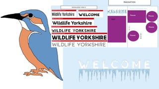
The document provides a summary of the evaluation research conducted for a project with the Yorkshire Wildlife Trust (YWT). In the first week, the researcher chose target audiences of Karen, a single mother living in Hull, and Phoebe based on profiles provided by YWT. Research was conducted on websites to understand the demographics and socioeconomic status of Karen. The second week involved planning ideas including magazines for kids and adults focusing on Askham Bog wildlife. Mood boards were created and fact files researched. The production weeks involved creating illustrations, articles, and designing the magazine template layout. Overall, the researcher felt their research was strong and they created a 24-page magazine on time with their illustrations being a strength but some could have been improved
Simran evaluated her work on a client project for the Yorkshire Wildlife Trust. For research, she analyzed audience profiles and learned about the Trust's work. Her ideas included a newspaper, poster, and guide to appeal to her target audience of 25+ adults interested in nature walks. She created mood boards, schedules, and draft designs. Production involved designing the poster, magazine covers, and multi-page bird guide. The newspaper cover proved most challenging. Overall, Simran reflected on her strengths in researching the client and audience, and areas for improvement in fully explaining her ideas and using feedback to refine her work.
Beth Geldard planned and created a vegan booklet. In the planning process, she conducted secondary research to determine topics to include. She created surveys that showed younger audiences knew little about veganism. She decided to include a factfile on vegan celebrities to attract younger readers. During production, she scheduled her work, received feedback, and made improvements. For example, she reworked a page on the rise of veganism by adding pull quotes and images. Her final booklet aimed to educate audiences aged 16-30 on veganism and related topics through engaging design and celebrity topics.
The document analyzes research conducted to inform the creation of a gender fluid fashion magazine. This includes a target audience survey, interviews, and analysis of existing magazine covers, spreads, and elements. Key findings indicate that images and models are very important for attracting readers. Readers want to see discussions of gender fluid fashion history and stories from people in the community. Brands like Weekday and Boden are considered androgynous. Overall, the research provides valuable insights into audience expectations and preferences to guide the magazine's development.
This document provides daily reflections from April 13th to May 12th about the progress made on a magazine project. Over the weeks, the writer worked on layouts, took photos, wrote articles and interviews, designed spreads, and finished other elements like the contents page and an advert. They summarized research, described challenges faced and solutions found, and reflected on successes each day. The project involved iterative design, editing, and improvements to create a cohesive magazine.
Natasha Sanderson received feedback on her magazine production project. Peer reviewers liked the professional style and aesthetic of the magazine, with a nice look and clear theme. Suggested improvements included adding a back cover to complete the project, fixing inconsistent font sizes on the contents page, and making outfit prices more realistic. Reviewers also noted the front cover looked professional and captured conventions well. One reviewer suggested adding pull quotes from articles on photo pages to grab readers' attention. Overall, the project was well received but could have been improved with a back cover and minor edits.
The document provides an overview of the progress made over 6 weeks in developing an interior design product. In week 1, the author decided to create an interior design book and focused on researching influences. They were worried about having enough interesting content. In week 2, they researched target audiences and created a survey to inform their content. Planning and pre-production occurred in weeks 3-5, including developing style guides. In week 6, the author created a schedule and made progress on a scale model for the book, while adjusting plans due to COVID-19 restrictions.
- The strengths of the research so far have been gaining solid ideas for the graphic design project through learning about the topic. However, more work could be done, like conducting surveys or including more secondary research.
- An unexpected finding was that most graphic design work is now focused online and through social media, rather than print, which was unexpected but makes sense given technology trends.
- This research will specifically impact the project by helping understand what people like and don't like about different graphic designs through their feedback, to test out designs in experiments before finalizing the project.
This document is a weekly log by Leticia Lopes for her interior design product project. In week 1, she decides her product will be a magazine or book for young adults interested in interior design. She worries about having enough interesting content. In week 2, she researches influences and audiences to develop her ideas. She creates a survey to learn about her target audience. In week 3, she analyzes the survey results but realizes she needs more specific audience research. She will focus on tutorials to create a scale model for the project.
The peer feedback praised the graphics for using simple yet distinctive character designs and striking colors that would appeal to younger audiences, though some felt the backgrounds could be more realistic. The use of thought bubbles to show additional story elements was highlighted as effective, while some responses noted the text could be improved and backgrounds varied more across pages. Overall the feedback provided constructive suggestions to consider while also acknowledging positive aspects of the graphics.
The document discusses the student's graphic narrative project evaluating various aspects of their final product such as how well it reflects their original intentions, how they constructed images, used text to anchor images, how suitable it is for the intended audience, and techniques used.
The student feels their final product generally reflects their original intentions as shown through their planning process including mind maps, mood boards, and storyboards. They constructed images using shape tools in Photoshop but note room for improvement. They acknowledge text could have been better anchored to images on some pages. The content is deemed suitable for the 4-6 year old target audience.
The student discusses likes and dislikes of the techniques used, including enjoying the warp tool but finding 2
Hannah McNeill evaluated her magazine project. She conducted research on food, fashion, and teen magazines to inform her design. Her research helped with inspiration, but she should have also researched nature magazines. While her planning included a mind map and mood board, her planning lacked detail. Her time management was generally good, but she struggled to complete her project in the allotted two weeks due to a lack of planning detail. Her magazine has an aesthetically pleasing color scheme and style appealing to teens, but could have been more sophisticated. She included professional-quality photos she took herself to make the magazine look authentic. The target audience was female teens and young adults, who she appealed to through topics, colors, and photos.
This document summarizes Savannah Hardwick's evaluation of her final project where she created three print products - a broadsheet front cover, tabloid front cover, and fanzine. Savannah feels she managed her time well to complete all tasks on schedule. She reviewed her work in progress to ensure it met the briefs and looked like real products. Savannah learned new skills using InDesign and tailored each product to its target audience. Overall, she believes the finished products met her goals and showed the development of her technical, creative, and time management skills.
This document summarizes the process of creating a veganism booklet. The target audience was males and females aged 16-45 as veganism does not have a specific gender. Research was conducted on vegan websites to gather facts for the infographic and fact files. A production schedule was created and followed, with infographics and advertisements prioritized first due to their complexity. Skills in Photoshop and InDesign improved over the course of the project. A simplistic yet natural style was chosen using earth tones. Comparing the booklet to existing materials showed similarities in layout but differences in art style. The consistent style throughout was identified as a strength of the completed booklet.
The document discusses cultural competence in understanding media texts. It explains that cultural understanding is needed to interpret language, signs, and symbols used as visual shorthand. Different cultures attach meaning to signs and symbols in various forms. It provides examples of how a Christmas tree, leather jacket, sports car, and cross take on certain meanings based on shared cultural knowledge and interpretations. The document stresses that while visual representations may appear the same globally, the meanings attached can differ across cultures.
1) The author created a handmade fanzine focused on herbs and nature to learn a new skill during COVID lockdown. Researching modern and historical fanzines helped inspire the idea to make it fully by hand.
2) Planning went well in developing ideas but lacked detail on page designs. Experimenting with page styles would have helped avoid mistakes. Production challenges included a page that strayed from the intended style and inability to fix errors by hand.
3) Time management was difficult due to mental health impacts of COVID, but taking the first steps helped progress. The fanzine appealed to its target audience of teens interested in nature through interactive elements but could have been improved with more photos.
The document provides a template for evaluating a graphic narrative project. It prompts the user to praise strong elements of their work and identify areas for improvement. It suggests including both written explanations and visual examples. The template recommends adding additional slides as needed and deleting any blank slides before submission. It also asks the user to compare their final product to their original plans and intentions.
This document provides planning details for a digital graphic narrative project to create a children's book. It includes sections on costs, available resources, quantity, audience, quality factors, codes of practice, regulation, copyright, ethical issues, and a production schedule. For costs, it notes that since the project is not being published, there will be no expenses. The available resources are the internet, Photoshop, existing children's books, and a camera if needed. The book quantity would be 500-800 copies. The target audience is children ages 6-9 in the UK and Germany. Quality will depend on managing time well. Relevant codes and regulations are also discussed.
This document provides an evaluation and planning details for a booklet on veganism. It discusses the planning and research conducted, including mock designs, researching vegan topics, and interviewing vegan bloggers. It describes the creation of elements like the front cover, a celebrity fact file, and a vegan cupcake infographic. Some challenges are noted, like the front cover taking longer than expected due to Photoshop issues. Feedback from surveys is discussed, with the front cover being a popular element. Overall, the document reflects on the planning and design process for elements within the booklet.
The document summarizes the student's process for creating a crime magazine as part of a school project. Some key points:
- Secondary research was more helpful than primary research for discovering the magazine's style.
- Planning went well and helped develop the style and schedule.
- Production of the magazine pages and cover went as intended and the student is happy with the final product, though some pages could be improved.
- The main challenges were lack of primary images due to the sensitive subject matter, but secondary images were edited to address this.
- Time management was good due to an effective production schedule, though motivation waned towards the end of the project.
- Overall, the final magazine
Here are some key points from the mood board analysis:
- Colors are repeated to represent each season naturally - pastels for spring, brights for summer, oranges/browns for fall, greys for winter.
- Clothing, shoes, hairstyles depicted match what is popular/visual for each season.
- Locations shown will influence photo shoot locations to match season themes.
- Understanding seasonal styles and colors from the boards will help choose clothing/layouts that look good and match the intended season in the magazine.
- The mood boards provide visual references to draw from for realistic seasonal representation in the final product.
The document provides an evaluation of Jess Stanton's planning and production process for creating a booklet on veganism. It describes Jess' research and preparation activities, including mockups, layout planning, and primary research through vegan blogger interviews. It also reflects on challenges faced, such as the front cover taking longer than expected to create in Photoshop due to numerous layers. Feedback indicated the front cover and celebrity fact file were effective elements. Overall, the evaluation examines both the process and outcomes of the project to understand what went well and could be improved.
The document summarizes the student's evaluation of their final magazine project. They found that secondary research was most helpful and validated information across multiple sources. Their final concept was a crime magazine focusing on the Branch Davidians and Ed Gein. Planning went well with style sheets and a schedule. Production went well and they were happy with the cover and layout, though one page could be improved. Post-production experimentation helped with techniques used in production. They overcame technical issues through image editing and managed their time well through planning. Motivation dropped later due to not wanting further education, but they finished to a good standard. Their final product met their intentions.
This document summarizes Amanda Kern's process in creating a self-portrait mind map for her faculty art exhibition. It describes how her previous experiences with mind mapping and a 365 photo project inspired her to create a large, hand-drawn mind map capturing her thoughts. The summary details Amanda's process of compiling thoughts, laying out type, and gradually adding to the mind map over many hours while involving her children. It concludes by explaining how the final piece was a large, printed canvas that received positive feedback at the exhibition.
The document contains weekly production diaries for a final major project creating a streetwear magazine.
In the early weeks, the student focuses on research, including looking at inspiring brands, photographers, and existing streetwear magazines. They create a project proposal and do audience research through an Instagram poll.
Midway, the student continues research and starts problem-solving potential issues like unreliable models or camera problems. They set up a website and experiment with lighting and photo techniques.
In later weeks, the student plans layouts, color schemes, and shoots while acknowledging some aspects may change during production. They begin the production phase with a photo shoot and start on layouts and articles while continuing to reference their planning.
Mel Nuttall evaluated their research, planning, and production process for creating a cosplay website and magazine. Their research included analyzing cosplay magazine covers and websites to inform their design choices. They conducted a survey and interviews to understand their target audience. Their planning involved creating templates and color schemes. They struggled with time management as editing photos and website updates took longer than expected, preventing them from completing a planned video. They are pleased with the final products despite not having time for all planned elements.
Ellie Dawson created a booklet to promote Veganism. In reviewing her work, she found that the overall booklet turned out better than expected. While the theme was generally consistent, she realized some elements could have been more cohesive, such as using the same wooden background texture throughout. Feedback from surveys and peers confirmed some areas for improvement and also indicated that the front cover and "Accidentally Vegan" infographic were very effective. Ellie demonstrated strong planning skills and time management. The project helped develop her technical and creative abilities in Photoshop and InDesign.
This document provides context and planning details for a fanzine project highlighting role models. The student began by researching relevant practitioners like journalist Caitlin Moran and feminist magazine Fem Newsmagazine to spark ideas. Primary research through a survey informed content choices. Planning included a front cover featuring celebrity role model faces in pastels to appeal to the target audience. The student aimed to match aspects of this fanzine to their previous one for consistency.
My work features representations of bears and a young girl in space. The main characters are:
- A father bear who is shown as protective of his family and a little grumpy or angry.
- A mother bear who is gentle and caring.
- A young girl bear who is curious and excited about exploring space.
- A human girl who is the protagonist, shown wearing a spacesuit and exploring space.
My characters could be seen as quite stereotypical - the father bear is grumpy, the mother bear is gentle and caring. However, I aimed to show a variety of ages (adults and a child) and include both male and female roles. I chose bears as they are universally recognizable
This week, the student continued their research for their final major project on a feminist fanzine. They analyzed two additional existing products - the teen magazine "Teen Breathe" and the fanzine "That's What She Said". They also created and distributed an online survey to gather primary audience research. Their research on existing feminist magazines and fanzines helped them identify styles of illustrations and layouts to incorporate. They plan to finish their research this week and begin production experiments and skill development next week.
This document provides a personal evaluation of Rachel O'Connell's final fanzine product. Rachel expresses that she is very happy with how her fanzine turned out, feeling it included all the components she wanted in terms of aesthetic, design, and content. She notes each section has a different style and theme, which was her original aim. Rachel also feels her fanzine combines many of her skills into one product and explores things that interest her personally, making it a very successful product overall.
This document provides a weekly summary of the development of a student's final major project creating a feminist fanzine. In week one, the student conducted research on role models Caitlin Moran and the magazine Fem. They realized they need to conduct more research and prioritize tasks. In week two, the student continued researching feminist theories and existing feminist fanzines and magazines. They created a survey to gather audience feedback. In week three, the student identified potential problems and conducted experiments to solve problems, such as practicing with recording equipment for interviews.
This document provides a weekly development diary for a final major project creating a feminist fanzine. In week one, the student focused on researching potential role models like Caitlin Moran and the magazine Fem. In week two, the student continued research, analyzing existing feminist fanzines and magazines. Primary research in the form of a survey was also conducted. In week three, the student identified potential problems and experiments to conduct to prepare for production, such as practicing interviews.
This document provides a weekly development diary for a student's final major project creating a feminist fanzine. Over the course of 7 weeks, the student focuses on research, planning, and experiments to prepare for production of the fanzine. In week 1, the student prioritizes initial context and proposal work and identifies areas for further research. Weeks 2-3 involve in-depth analysis of existing feminist magazines and fanzines as well as beginning audience research. Week 4 consists of production experiments. Weeks 5-6 are dedicated to planning, including pagination, style sheets, interviews, and copy writing. Week 7 focuses on completing final planning tasks, with production to begin the following week.
This document provides a weekly development diary for a student's final major project creating a feminist fanzine. Over five weeks, the student focused on research, problem solving, experiments, and planning. In week one, the student researched role models and existing fanzines. Week two involved further analyzing existing products and conducting a survey. Week three was spent identifying potential problems and solutions. Experimenting with techniques like photography and graphics occurred in week four. The final week will involve planning interviews and the fanzine format before production begins.
This document provides a weekly development diary for a student's final major project creating a feminist fanzine. Over the course of 7 weeks, the student focuses on research, planning, and experiments to prepare for production of the fanzine. In week 1, the student prioritizes initial context and proposal work and identifies areas for further research. Weeks 2-3 involve analyzing existing feminist magazines and fanzines, as well as conducting a survey for audience research. Week 4 consists of experiments with different production techniques. Weeks 5-6 are dedicated to planning layout, interviews, and developing ideas for the fanzine's content and design. The final week focuses on completing all planning tasks in preparation for starting production the following
This document provides a weekly development diary for a final major project creating a feminist fanzine. In week one, the student focused on researching potential role models like Caitlin Moran and the magazine Fem. They realized they need to conduct more thorough research. In week two, the student continued their research, analyzing existing feminist fanzines and magazines. They created a survey to gather audience feedback. In week three, the student identified potential problems and conducted experiments to solve problems, such as practicing with recording equipment for planned interviews. They reflected on being skilled at problem solving from past projects.
This document provides a weekly summary of the development of a student's final major project creating a feminist fanzine. In week one, the student conducted research on role models Caitlin Moran and the magazine Fem. They realized they need to widen their research to 3 topics. In week two, the student continued researching feminist theories and existing feminist fanzines and magazines. They created a survey to gather audience feedback. In week three, the student identified potential problems like software or funding issues and explored solutions through practice with recording equipment and graphics to prepare for production challenges.
Oliver Keppie wrote about the progress on his filmmaking project over two weeks in his diary. In the first week, he created a pre-proposal and proposal that outlined his ideas in a general way to allow for flexibility later. He researched inspirations from animators and films. In the second week, he conducted research on existing similar products, target demographics like age and gender, and information on depression to inform his animation's content. He created a survey to gather primary audience data and found secondary research helpful but limited. Overall, the diaries showed Oliver's process of exploring ideas and gathering research to develop his filmmaking project.
Abbie began their final major project rotation creating initial plans and mind maps for potential nature-themed products including a photography magazine, calendar, and portfolio. They conducted research on existing nature calendars and photography exhibitions to help inform their product designs. Abbie created surveys and interviews to understand audience preferences, finding that older audiences were more interested in their ideas. Throughout the rotation, Abbie experimented with photography, editing techniques, and early product designs. They worked on pre-production tasks like selecting colors, layout designs, and contingency planning while also catching up on missed work from being ill.
This document outlines the process taken to produce a magazine project over several weeks. In the first week, the author collected research on existing magazines and analyzed their audience profiles, covers, and spreads. In the second week, the author created initial plans including mind maps of potential magazine ideas and a mood board for an indie music magazine. In the third week, the author conducted production experiments on Photoshop to test layouts for the cover and spreads. The author also completed a proposal outlining the target audience, content, and evaluation plans. In the fifth week, pre-production planning was done for styles, fonts, and layouts. The final week consisted of an evaluation of the project's research, plans, time management, quality
Toni Gibson created initial plans for a fashion magazine final major project, including mind maps of three potential ideas focused on photography and fashion. She chose to base the magazine on seasons and created mood boards for each theme. In weeks 2-3, Toni analyzed survey responses, looked at existing products, and conducted Photoshop experiments to learn new skills. She refined her plans based on understanding her target audience better. In weeks 4-8, Toni gathered resources, took photos, and began production of the magazine cover, contents page, and other elements in Photoshop. In weeks 8-9, she evaluated her process, time management, technical skills learned, and areas for potential improvement.
Oliver Keppie wrote about their progress on researching and planning an animated educational product about depression for teenagers. In week 1, they created a pre-proposal and proposal, conducted inspirational research, and gathered sources for their bibliography. In week 2, they did secondary research on the target audience and primary research through a survey. They also researched the causes and symptoms of depression. In week 3, they analyzed the primary research results, looked at where the product could be displayed, and found validation for creating the educational animation, though noted they could do more research on men's mental health.
The student completed their initial plans and proposal for their FMP project in the first week. They felt their idea became clearer as they worked. In the second week, the student conducted research on similar animation styles and surveyed audiences. They found time may be an issue due to the length of animating. In the third week, the student experimented and researched subjects for ideas. Pre-production was started and finished in the fourth week, including shotlists, music planning, and contingency planning. The shotlist was found most useful for visualizing the project.
This document provides a proposed timeline and plan for a student's final major project (FMP) creating a lifestyle magazine. Over the course of 6 weeks, the student will:
1) Conduct research including audience profiles, existing magazine analyses, and production experiments to inform their project concept of a York lifestyle magazine.
2) Create a proposal outlining their magazine concept, target audience of 18-45 year olds, and skills gained from previous rotations to be applied.
3) Engage in pre-production planning such as style sheets, layouts, and health and safety documents.
4) During the first production week, focus on writing articles and capturing photos around York if weather permits.
Hannah evaluated her research and planning process for her magazine production project. She identified some strengths, such as thorough initial plans that guided her final product. However, she also noted weaknesses in her research questionnaire and lack of additional existing product research at the start. For planning, her style sheets and contingency planning were strengths, but flat plans did not match her final layouts. Overall, Hannah felt her planning helped guide her successful production, though some aspects like experiments could have been improved with more time.
Hannah evaluated the strengths and weaknesses of her research process for developing a lifestyle magazine. She analyzed existing magazines to influence her design but found her research could have been improved by examining magazines more similar to her concept. A questionnaire received negative responses that did not reflect her target audience. Profiles of comparable magazines helped define her audience and pricing. Interviews provided useful feedback incorporated into her product. Overall, her initial plans and proposal successfully guided her process, but her research design, namely the questionnaire, could have been improved with a more tailored audience.
Hannah Flowers conducted research on existing fanzines about feminism, coffee, and fashion. She was most inspired by a feminism fanzine that explored relevant topics and used appealing colors and layout. For her own fanzine, she planned to include illustrations and cover topics like feminism in the 1900s through interviews and articles. Hannah created a detailed planning process including idea development, pagination, and article drafts. She felt she managed her time well to complete 36 pages for her fanzine while balancing design elements, illustrations, and articles.
Oliver Keppie kept a diary documenting his progress on creating an animated short film about depression for a school project over 6 weeks. In week 1, he wrote a pre-proposal and proposal, conducted research on animation inspirations. In week 2, he did secondary audience research and created a survey. He researched the causes and symptoms of depression. In week 3, he analyzed the survey results and researched where and how his animation could be shared. He acknowledged needing more research on men's mental health issues. In week 6, he planned fonts, characters, sound, and created a storyboard for his animated film about raising awareness of depression symptoms.
The author created an Instagram account and logo to promote their fanzine and gain followers from feminist accounts. They researched online printing options and chose Mixam, which printed 8 copies of their fanzine for £30.50. The author plans to attend a fanzine event in York in August to showcase and sell their fanzine, and has also uploaded it to Issuu and applied to sell it through People of Print and in the Travelling Man shop in York.
- The initial target audience for the project was females aged 16-26 who are interested in feminism and finding positive role models. No restrictions were placed on race, religion, or marital status.
- The target psychographics included those concerned about how their actions affect the world and wanting to make a positive difference through actions like recycling and fuel efficiency.
- Role models featured in the project were included to ensure the target audience would be familiar with them.
The document discusses the author's process of printing and distributing their fanzine project. They emailed printing companies for quotes and ultimately chose Mixam.com as the cheaper option. The author also researched ways to promote their fanzine, such as attending a fanzine event in York, creating an Instagram account featuring their logo and fanzine photos, and uploading it to the website Issuu. The goal is to attract their target audience and see how popular the fanzine becomes.
The student proposes creating a follow up to their previous feminist fanzine project with the theme of "Role Models". They plan to interview people around the world about their role models and why those people inspire them. The student recognizes evaluation has been a weakness in past projects, so they will keep a development diary and seek peer feedback during production to improve their evaluation. The proposal outlines a 20 week production schedule that includes research, experiments, planning, production, editing, and evaluation. The goal is to create a professional fanzine that highlights inspiring women and that people will enjoy reading.
The document summarizes a student's 36-page feminist fanzine project focused on role models, targeted at females aged 16-26. Through a survey of 11 respondents and examining popular feminist magazines, the student identified design elements to include - plain backgrounds for text/images to stand out, bold colorful front covers. Peer and target audience feedback prompted layout revisions. While wanting to include more features/interviews, time constraints prevented this. The student is pleased with the personal, professionally printed final product and is pursuing display and distribution opportunities.
The document summarizes the target audience, research, peer feedback, edits, and plans for distributing a fanzine project. The initial target audience was females aged 16-26 interested in feminism and positive role models. Research was conducted. Peer feedback suggested adding background color and aligning columns. Edits improved consistency but some text remained bulky. Distribution plans included printing, an event, Instagram, and Issuu.
This document contains feedback from three peers on a fanzine project. The feedback praised the illustrations but suggested improvements to the layout and formatting of text columns. One peer recommended adding more color variation. In response, the creator agreed that layout and text alignment could be improved. They were unsure about adding backgrounds but may try it in some places. The feedback was helpful to identify areas for refinement as the project is further developed.
This document contains peer feedback on a fanzine created by the author. The feedback provides suggestions to improve the layout and formatting of the fanzine, noting that some columns of text are not aligned properly. The art style and illustrations receive praise from peers, while some note the font sizes could be larger. Based on the feedback, the author would look to improve the text column alignment and consider adding background colors on some pages to make the fanzine less plain.
This document contains weekly development diary entries from a student working on their final major project to create a feminist fanzine. Over four weeks, the student focused on research, experiments, and problem solving. Their research included analyzing existing fanzines and magazines, conducting a survey, and secondary research. Experiments involved learning new skills like photography, graphics, and InDesign. The student identified potential problems and solutions, such as reloading software or printing on paper if unable to print the fanzine. They reflected on staying organized and on track during their project work.
The document outlines plans for a fanzine that interviews people about their role models. It discusses ideas for including poems, illustrations, and in-depth interviews in the fanzine. It also covers plans for layout, design elements like colors and fonts, potential interviews, and sample page layouts. The writer aims to create a fanzine they will be proud of that readers will enjoy learning about different role models through.
The document discusses various potential problems and solutions the author has considered for their FMP project creating a fanzine. Some key issues addressed include:
1. Equipment issues like using backup cameras, memory cards, and voice recorders for interviews. Software issues like using different computers if programs crash and saving regularly.
2. Power and computer issues like saving often so not much work is lost if there is a crash, and having backup plans to work manually if needed.
3. Backing up work daily on external drives in case files are lost or corrupted. Saving differently when working on different devices.
4. Allowing extra production time for unexpected issues but having backup plans like working during buffer weeks if
The document discusses potential problems and solutions the student may encounter during their FMP project creating a fanzine. Some key issues addressed include:
1) Equipment issues like camera or voice recorder malfunctions which the student plans to back up with a phone or extra memory cards.
2) Technical problems like computer crashes which the student will prevent by regular saving and using downtime to plan if needed.
3) Theoretical challenges like difficult interviews being solved by scheduling face-to-face meetings and recording video calls if needed.
4) Ensuring production stays on schedule by completing work before the deadline so production time can be fully used.
The finished product was complete and ready for use. It had gone through all stages of development and manufacturing without any issues. Customers would be able to start using and benefiting from the new product immediately.
The document discusses drafts of various titles and products that were developed. It includes 3 drafts each of titles for Michelle Obama, Jacinda Ardern, Jameela Jamil, and Rosa Parks. It also discusses drafts of printed fanzines, with the author noting changes made between drafts such as replacing an image found online with an original illustration to better fit the theme, or redrawing a blurry logo. Comments from reviews of early drafts by "Dave" are mentioned, as well as filters and edits applied to images in later drafts to style them for the fanzine.
Hannah Flowers is pursuing a project titled "The Year of Women" focused on journalism and independent publishing. She plans to create a follow up to her previous feminist fanzine with the theme of "Role Models" by interviewing people around the world about their role models and what inspires them. Hannah aims to improve on evaluating her work by keeping a development diary throughout the project and getting peer feedback midway through production. She provides a detailed schedule across 20 weeks to complete pre-production, production, evaluation, and presentation of her fanzine project.
The document lists drafts of titles for biographies on several prominent figures, including Michelle Obama, Jacinda Ardern, and Jameela Jamil. For each title, there are between one and three drafts listed. The document also indicates that draft one and two were printed, with the printed drafts listed repeatedly, and draft three was similarly printed.
The document discusses the benefits of exercise for mental health. Regular physical activity can help reduce anxiety and depression and improve mood and cognitive functioning. Exercise causes chemical changes in the brain that may help protect against mental illness and improve symptoms.
To me media is about the intensity of words; it can dominate, it can spread ideas to thousands of people; it can make people think about the society which we have all become accustomed to. Becoming a journalist has been a long-held passion for me. I would like to work for a more liberal left leaning paper such as the Guardian and be the type of journalist who stands up for what she believes in. Over two years studying creative media production and technology, I have built my confidence in the media spectrum and gained experience writing for publications and undertaking work experience in journalism. I look forward to pursuing my dream of a career in journalism and believe I am well suited to the demands of a journalism degree because I have a passion
The document is a resume for a student studying Creative Media at York College. It summarizes her education and work experience. She completed her first year of college with a Merit and created a magazine about York with her own photography and articles. She has worked part-time for over 2 years as a café assistant and barista at The Balloon Tree Farmshop and Café, where she takes orders, makes coffee, and serves food. She also has 6 years of experience in a community drama club where she has been the leading lady for 4 years.
The applicant applied to the University of Leeds but declined the offer as they did not want to study so close to home. They applied to Newcastle University without visiting first to use up their last offer. They considered De Montfort University due to their sister attending and its familiarity to help with anxiety. Their firm choice was Salford University due to its location in Media City and equipment, and because visits made them feel they could be happy living there. Their insurance choice was the University of Sheffield for its course and location.
KALYAN MATKA | MATKA RESULT | KALYAN MATKA TIPS | SATTA MATKA | MATKA.COM | MATKA PANA JODI TODAY | BATTA SATKA | MATKA PATTI JODI NUMBER | MATKA RESULTS | MATKA CHART | MATKA JODI | SATTA COM | FULL RATE GAME | MATKA GAME | MATKA WAPKA | ALL MATKA RESULT LIVE ONLINE | MATKA RESULT | KALYAN MATKA RESULT | DPBOSS MATKA 143 | MAIN MATKA
The cherry: beauty, softness, its heart-shaped plastic has inspired artists since Antiquity. Cherries and strawberries were considered the fruits of paradise and thus represented the souls of men.
❼❷⓿❺❻❷❽❷❼❽ Dpboss Matka ! Fix Satta Matka ! Matka Result ! Matka Guessing ! Final Matka ! Matka Result ! Dpboss Matka ! Matka Guessing ! Satta Matta Matka 143 ! Kalyan Matka ! Satta Matka Fast Result ! Kalyan Matka Guessing ! Dpboss Matka Guessing ! Satta 143 ! Kalyan Chart ! Kalyan final ! Satta guessing ! Matka tips ! Matka 143 ! India Matka ! Matka 420 ! matka Mumbai ! Satta chart ! Indian Satta ! Satta King ! Satta 143 ! Satta batta ! Satta मटका ! Satta chart ! Matka 143 ! Matka Satta ! India Matka ! Indian Satta Matka ! Final ank
2. RESEARCH
• At the start of this project, I started my research on the Yorkshire Wildlife Trust (YWT). I think the
best thing to start off with when starting a new project is creating an audience profile. YWT
supplied a brief audience profile, this was extremely helpful. I explored these audience profiles
more, I chose Karen and Phoebe. Karen was a single mum of two, this was an audience which was
extremely interesting for me. I think this audience profile suited the idea I had in mind. I think
researching the correct target audience was vital for my project, this was a main strength of my
research. I used the website cameodynamic.co.uk to find out about Karen, this is like her socio-
economic status, Lifestyle and Characterisation. This was generally quite difficult as I didn't have a
postcode to where Karen lives only the fact that she lives in hull, I took an educated guess with the
fact that she was a single mother who has barely any spare income. My third slide was from a
website called Acorn.co.uk. This was a website which can show the map areas on different subjects.
It backed up that where Karen lives it is in a town which is financially unstainable, this gave me an
idea for my production. I thought that it would be a good idea to research another audience
profile this is, so I can determine which profile is best for the product which I am going to create. I
think the profile for Phoebe was harder to create than Karen’s profile mainly because I was set on
this idea from the first profile, however I tried my best. I used the exact same routine with the first
profile, using the same websites. This helped me decide what I was going to create. I think the only
thing which could have been better in this part of my research would be to research a children's
profile- I think this could have been more beneficial as I would understand what the children would
have wanted. This wasn't the end of my research, I wanted to research more of the YWT. I didn't
know much about the Yorkshire Wildlife Trust as it is, I wanted to know why it was so popular and I
wanted to know more about Askham Bog. To understand YWT I wanted to compare another
wildlife charity to the YWT, I chose the RSPB. I think this was beneficial as looking back as it helped
me understand YWT more than I did before. Overall, I think my research was very strong especially
3. PLANNING
When I started my ideas and planning I wanted to start the way I wanted to carry on,
with the brief kept in my mind. This was my main aim throughout my planning and
production. I started to plan my ideas, I came up with three ideas which I thought
fulfilled the brief. The first idea was the magazine for kids focusing on Askham Bog. I
thought about the gender, the age range and the different colour schemes. Looking at
this now, it is the same colour scheme, and audience. My second idea was a
photography brochure capturing the different wildlife at Askham Bog, this was going
to be generally quite hard because I would have needed a week or so to go to
Askham Bog and it was going to be rather unlikely for me to catch the wildlife which I
wanted to see as well as it not be a rainy day. This was a very unreliable idea, but I
thought it was still a good idea because I've never made a photography brochure. My
third idea was similar to the first, but the age of the reader was different. I wanted to
create some type of print product, so I decided to change the audience for my first
idea and do an adult’s magazine. I think this was quite sensible as I was trying to play
at my strengths to make this project the best for my client. This was probably the
weakness of my planning and ideas, I still feel as though I could have developed my
ideas further and create more ideas which would be stronger. I think if I developed my
ideas further I might have created a better product. However, because of a timescale I
had to carry on planning for my product. I started off with developing my first idea, I
started off with a colour theme, then text. I wanted the typography to be childlike but
not as though it was too childish for it to be uncool. I got a couple of fonts from
dafont.com and starting to change them, I went onto photoshop to find a different
way of making the text stand out, even though I didn’t use this I still found it one of
my strengths because I could experiment and develop my skills more throughout this
4. • Next, I researched the different wildlife which you see during the seasons, I used a mood board
to present this as I felt it showed off the colours which I could use in my product. This was a
really effective of doing some research in my planning, I also found illustrations of the wildlife
to refer back to when I create my own illustrations in the magazine. After completing the 4
mood boards I looked at fact files, this was for ideas for my fact files, I chose the ones I thought
the audience would like as well as what looked professional, this was crucial as it helped me
when I had a brain block on how I wanted to design the fact file. I enjoyed this bit of planning
as I could start to think about the design elements of my magazine. I think my weakness for this
section of planning was the fact that I didn't evaluate why I did this planning throughout the
development, if I did this it might have concluded in a more developed production because I
would know why I designed this page to be like that, instead of not developing my plans
enough through this section. After a long day of writing I wanted to do some production
experiments which might have contributed to my main product. These worked out really well,
at first, I drew a Kingfisher as you can see in my development diary I enjoyed creating this, but
it was quite difficult. I think this was a very good way of separating my day, I had a full day of
planning and I felt I needed a little break. To finish my development I created a pagination for
this developed idea, creating a pagination always helps me imagine my product. Throughout
the production period I kept referring back to this bit of planning, so I could decide what was
going where and to help with my design of the contents page. This idea was the most planned I
felt as I knew that I wanted to create this idea, so the second idea wasn't that developed. The
second idea was the older audience magazine, I kept the colour themes the same and explored
different fonts- one of the fonts which I really liked I ended up using it in the children's
magazine. After looking at different typography I started creating a pagination, this was only a
small magazine compared to the child's magazine but throughout the planning of this idea I
realised what my weaknesses would be creating this type of magazine, this is why I chose the
children's magazine. I think if I put more effort into creating the second developed idea it
would have been a harder decision to make between the first and second developed idea.
PLANNING
5. • Throughout production I felt as though it was all going well. I planned to have four
full weeks of production. Looking back at my development diary I feel as though I
achieved a lot through this process. Throughout this production I had to keep my
concentration as a maximum, I would say the hardest thing which I did in this
production was the illustrations. I am not an arty person at all so creating these
detailed animals was completely out of my comfort zone. However, when I started
drawing I learnt so much, I learnt how to add textures, I have shown this process in
my development diary, I think this was the most useful thing I learnt throughout this
project. I think my main strength was creating a 24-page magazine with 20
illustrations and articles in four weeks. Its sounds like a lot of time but really, I had a
lot of content to create, I had to find the facts about the wildlife, I had to illustrate
the wildlife and find different articles to publish into this magazine. I would say the
first two weeks were devoted to the research and the designing of the magazine
and the two weeks after that were putting it all onto the template, making sure all
the sizes of pages were the same and also making sure I had enough content
without the fanzine looking bare. I would say the last two weeks were the hardest as
I didn’t realise how much I had to do, I kept writing lists of what I needed to do in
the weeks and with my mind creating different concepts it became a big list.
However, I love how my product has turned out, I have used the colours which I said
I would use in my planning, I have kept the same idea from my research and also, I
feel like I have created something that the audience which I have appealed it to will
interact with it and really enjoy it.
PRODUCTION
6. TIME MANAGEMENT
• Time management has always been crucial to me, because I was working for a
client it became even more important to set myself deadlines. You can see from
my ideas and planning PowerPoint I knew what needed to be completed and by
when, I like to keep to my deadlines and with this project I did that. My
production weeks were set accordingly, week one was aimed at my illustrations,
week two my articles and designs, week three the template layout and week four
if needed to be could be for my production or evaluation. From previous
projects I knew how to set up a production schedule realistically, when I created
the schedule I knew how fast I was at creating the illustrations from the
production experiments so I put a week aside to complete it. I think because I
kept week four to be an insurance week, if I needed it I could use it. I only had a
few finishing touches to make in this week, so I feel as though my product
couldn’t have been improved with additional time as I did have additional time
and I tried to make it the best it could be. However, this being said I do think
with additional time I would have been able to get feedback off my client, due to
the time scale unfortunately my client didn’t get back to me with feedback so
instead I took my instinct and asked Dave if I could improve on anything. I think
even if I did have more time to produce my work I wouldn’t have added any
more features in instead I would most likely make the illustrations look better.
7. TECHNICAL QUALITIES
SIMILARITIES
Design elements are similar- the
name, scientific name, threats
etc are all laid out quite similarly.
DIFFERENCES
I wanted to add loads of colour
into my fact file, I think this is
the main difference.
My fact file could have included
a photo but it would have been
extremely difficult to catch a
siskin on the day when I went to
take the photo- hence the
drawing of the bird in the post it
note.
I think my fact file looks more
appealing as the example looks
very boring and isn’t very eye-
catching.
8. TECHNICAL QUALITIES
SIMILARITIES
I would say the main similarity is
the font of the Yorkshire Wildlife
Trust, however the images are
very high quality and both look
very professional.
DIFFERENCES
Looking at a professional cover
compared to my children's
cover, my magazine looks very
bare- there isn’t any mastheads
or anything which does look
very plain compared to this one.
Moreover, i think my front cover
looks brighter and colourful
compared to the pre exciting
cover- this might work in my
favour as most children are
drawn to a colourful
background..
9. AESTHETIC QUALITIES
• Looking at my project I think my work looks creative and bright. I think for the
target audience which it is aimed at it fits perfectly, with the bright colours and the
content I think this is a really good product. I think throughout my magazine the
best thing I like is the illustrations especially the Kingfisher and the Roe Deer, these
were my first illustrations which I designed, and I think they look so similar to the
real wildlife as well as being detailed enough. When flicking through my finished
project I realised that I learnt so much, as I've previously stated I've learn how to add
textures but I've also learnt how to adapt to my target audience, I'm used to
creating projects for adults or teenagers but doing a children’s magazine was
completely different to me but I enjoyed it a lot, it took a lot of research into what
children's magazines looked like but I am really happy with what I have created.
Even though I think some of my illustrations which are good there are one or two
designs which I would have loved to improve on, due to my dedication with my
deadlines I rushed the dragonfly, this is something which in my opinions looks
messy and nothing like the real creature it is, there are a few illustrations which were
rushed but this is the one which I would have improved on. I think this could be
something which I could get better at with time which might be something that I
could look at doing in my FMP.
10. HOW DOES MY WORK APPEAL?
• As I have previously discussed throughout this whole project I have thought about
two things throughout the process- whether it would attract the audience as well as
if it would be good enough for the Yorkshire Wildlife Trust. I think I have successfully
done it. The colours in my magazine are bright so it attracts the reader but also, I
think the main thing which appeals to my audience is the typography. I think the
text of the font is perfect, so the reader can still read it without being incredibly big
it makes them feel like a young child, the font is spaced out and clear which can also
make them feel more mature. The contents inside of the magazine is very basic with
a few pages which could excite the reader, I think the secret mission article could be
the feature which the reader identifies with and thinks it is a real mission, so they
have to carry it out. Although at times the pages look plain because of not having a
colourful background I have substituted it with more colourful text. The clients brief
was to create something which would interest more people in wildlife as well as get
people to contact their local MPs to get more recognition for this new wildlife law, I
think I have achieved this as I made something which will keep the audience
interested and then write at the end there is a little mission which tells them about
how to contact their local MP as well as what to do after you’ve found your MP. I
personally think I have appealed to my audience and the clients brief.
12. WEEK ONE
This week was the start of my research for this project. Monday was a training day, so we weren’t in on that day but on
Wednesday I began to create a clientele for this project. Over the past month or so I have been messaging companies to
see if they want to be involved in this project. At first, I chose a café who at the beginning where extremely keen to be
involved, unfortunately when it came to the time of my project their replies were slower and it seemed as though the
interest was gone- this was extremely hard as I was starting the project immediately. I didn’t want to waste a day waiting
for my client to answer questions about their audience for their business. I decided that I would choose the Yorkshire
Wildlife Trust instead, I emailed the business owner explaining that I couldn’t do her business anymore and then set on
with creating my client’s audience. Luckily, the Yorkshire Wildlife Trust had sent some profiles over to help with our
audience research. I had already wasted quite a lot of time, so it was increasingly helpful that I already had the profiles of
the audience. I started reading every profile thoroughly, when doing this I was thinking about what product I would want
to create and which audience that would appeal to the most. One of the profiles which I chose was Karen. “Karen is a 33-
year-old single Mum living in Hull. Her children, James (5) and Sophie (7) are the centre of her life. She works in retail and
is always up against the clock with managing her family life. She rents a small house with a small garden that consists of
grass and a small area of paving surrounded by unpainted wooden fences that the neighbours can easily see into. She
doesn’t feel particularly empowered, and it’s been a long time since she really asked herself what she wants from life.
Karen voted for Brexit. It was more empowering to vote for change than to keep things the same. She also wanted to
ensure that the NHS was well funded for her children. Karen is oblivious to YWT and is unaware of how it could be relevant
for her or her children.” I thought that I could create something for this profile, as seen as she is a single mother on a low-
income salary she could take the kids to a nature reserve where the kids could have a product which will keep them
interested in the day- this would also get Karen out the house and might give her a new lease of life. I used the website
‘Cameo dynamic’ to help with the demographics for this profile. I used a postcode which is based in Hull to figure out the
socio-economic status as well as the category which she falls under. I also went onto the ‘Acorn’ site and found a
deprivation map for Hull- this shows the areas of Hull which are wealthier than other parts. A larger amount of the map is
coloured in a red/pink colour this represents a ‘financially stretched’ or ‘Urban Adversity’, considering what we know about
Karen being a single mum and with a retail job she probably lives in one of these areas. This would help my product at a
later date as if I want to aim my product at this audience I need to the cost as well as the location of the nature reserve
which I am promoting. Once I got my head round the different websites which I used it started to become easier as I was
getting used to what I was researching for.
13. On Thursday, I started on my other profile who was called Phoebe- “Phoebe is aged 39 and lives in Hebden bridge.
She identifies herself as an activist and has what many would consider an alternative lifestyle. No fitting into the
regular 9-5, she is a-self-employed artisan who creates pottery. Her small terraced house is eclectically furnished and
usually has some incense burning. She has interests in yoga and meditation and is a vegetarian. Phoebe doesn’t feel
that YWT represents her passion and interests. To her it is a very safe, fuddy duddy organisation that doesn’t put its
neck on the line for the big issues that really matter. No word on fox hunting or badger culling! She uses Facebook
and Twitter and is always sharing climate and environmental information and campaigns.”. I chose Phoebe because
she seemed like someone who wants a change and she might benefit from this new law which MPs can enforce.
Maybe if she knew more about the YWT she would go to the nature reserves and be thankful that an organisation is
trying to save wildlife which is going extinct.
After reading through all of the profiles I concluded that I would target Karen’s profile as people in deprived areas
might not know what they can get for free. After collecting evidence of Phoebe and her living demographics, I
started to research the Yorkshire Wildlife Trust. I found out some really interesting facts which I didn’t know- Askham
Bog which is just down the road from college was the first ever nature reserve to be built, they have 825,000
members. I also compared the YWT to RSPB. This would be helpful when I start my production.
Overall, I feel as though this research PowerPoint went really well, when I look back at previous projects I notice that I
don’t think about what I am going to create until after my audience- this time I made sure I had different products
which I could create for the different profiles which I looked at. I feel confident that I have enough research which will
help me when I start to plan as well as start my production.
WEEK ONE
14.
15. WEEK TWO
• This week was dedicated to exploring my ideas and developing them further. I started off by rereading my brief a few times so it was
clear in my mind what I had to create for the Yorkshire Wildlife Trust. I started with thinking of the skills which I am confident in, this
was creating articles and creating a magazine format. My first idea was for a children's fanzine of Askham Bog, I want it to include
puzzles, quizzes and various fact file about the different wildlife which you see at Askham Bog. This idea was something which as I
child I would have liked to see at nature reserves which I went to, otherwise it can get quite boring and tiring. My second idea was a
photography brochure, this would be a concept which I have never done before so it would be interesting to see how it goes.
Looking at this idea now I think it would be much harder to create a photography brochure as you can’t set a day to go take photos
of Askham Bog- it would either be raining or the day you go you won’t see any wildlife at all. Taking this into consideration I
decided for my last idea to create a match of different things. Seen as though it is nearly Christmas time I was going to create little
gifts which would promote the Yorkshire Wildlife Trust. I was going to plan different social media posts as well as create infographics
to promote the brief which was set. This was going to be a very busy few weeks if I was going to choose this idea. However, I chose
to go with the children's fanzine as I believe it is one of my strengths as well as the fact that the generation who dote on nature soon
aren’t going to be here anymore so we need to try get the younger generation more involved. After I thought about my ideas I
started creating my colour theme for the fanzine- this will mainly be browns, greens, blues and oranges but they will all be bright
colours to engage the audience. I then started with my typography. I think typography is very important when it comes to a
magazine, it sets the tone for the whole fanzine. This is why I spent a lot of time looking at different fonts and thinking whether it
would appeal to my audience. I wanted something which would stand out and look mature for the audience. I also wanted to add a
little bit of colour into the font so it didn’t look boring. This worked really well and I came up with a few fonts which would suit the
type of magazine which I am creating. Next, I created a mood board of some of the YWT magazines, this was to give me a general
idea of how the structure the magazine and what type of images would be on the front of the children's magazine. I then started to
look at the different wildlife which you could see at Askham Bog. I was unsure at whether I would do a seasonal fanzine or whether
to do a magazine for the whole year. So instead I decided to research the wildlife for all year round- I collected some illustrations
which I could refer back to when I create my own illustrations. To add more detail into my planning stage I created a pagination. This
is where I can sort all the features which I have into my magazine and decide which is going where. This will be extremely useful
when it comes to my production. In this week I feel as though I have completely a lot of information which is going to be useful
when I start production, I have been on time with everything which I wanted to create. For next week, I have to create another
16.
17. WEEK THREE
At the start of this week, I wanted to create a animal illustration as a little production experiment, I wanted to see how
hard it would be and how long it would take so I could schedule how many days it would take. I had done a lot of writing
over the past few weeks and I felt like I needed a break. I illustrated a Kingfisher and I loved it. I loved creating it, the
details were hard to do in places but after I completed it I loved it! The colours were lovely and I really wanted to add it in
somewhere in my magazine because I was so proud of it. After I had done this then I started to develop mu second idea.
This was around the same idea but aimed at a different target audience. I would have more mature articles and features
inside the magazine. I would have the same colour theme as my first idea- this is because it would still stand out. The
typography would be different- it would be bolder and mature. I then started a pagination plan, this is something which
is extremely useful when it comes to my production. For my contents page I created my own ‘welcome’ headline. I found
a font which had font on the top of each letter, I added a inner shadow and a colour overlay so it stands out against the
background and looks very effective. I wanted to add some icicles underneath the font so it looks professional and cool.
This worked out really well, at first I couldn’t find a set of icicles which I liked but then I came across this icicle design the
first thing which I changed was the colour, I added a colour overlay to it matched the colour of the font. I really enjoyed
creating another developed idea because I could explore so many different ways for my idea. This took me just over two
days, but these two days were filled with research on different fonts, article ideas as well as image ideas. I looked at
different wildlife magazines on issuu and they just filled me with ideas. I think this was the best part of my planning
because I got to look at existing products which will help me so much during my production. After, I had completed my
developed idea I started to assess the rest of my ideas and planning. This was just to reflect on everything which I have
planned, I thought about if the audience would engage in something like my product and if they wouldn’t what I could
change about it to make it appeal. At the start of this project, the client gave me a brief, I feel as though I have kept with
the brief throughout planning, this is something which I also reflected on. In the time which I have, it is going to be very
hard to complete everything by my final deadline. I have set my self a task which will take a lot of detail but I hope to
finish it. To finish off my ideas and planning, I started to sort my deadlines out as well as my production schedule. I find
production schedules very useful as it gives me a aim to what I need to complete. I finished my ideas and planning on
Thursday and I am very ready to start my production on Monday.
18.
19. This week I focused on my illustrations for my fact files, I didn't know exactly what fact files I was going
to do, so I decided that the best thing to do was to create all of the illustrations . This took me a while
to complete, after a brief chat with Dave I started to try new textures out on my illustrations so they
weren’t so generic and similar to other illustrations that there might be. Over the next two days, I had
created 12 illustrations- this took me a while to complete as I wanted to add as much detail as possible.
The first illustration which I made was my deer (this is my favourite one) however the dragonflies and
butterfly was incredibly difficult to create. The little details like the shape of the wings were so tricky to
draw. In the end, I tried my best but I was running out of time so I had to stop with the illustrations. The
next thing which I started to do was research Askham Bog to create my article, I wanted to find different
quotes from when Sir David Attenborough visited Askham Bog. To start of my magazine I wanted to
have a little article for the kids to understand how important the nature is, I also wanted to create a map
of Askham bog so the children can find fun in guiding their families around the nature reserve. I used
the photo from the Askham Bog TripAdvisor to give me a rough guide of the sizes of the different fields
and what order they went in. I think referring back to the map was extremely helpful because I wanted
to make it as real as possible so the audience would enjoy it. I created this on Photoshop, it started off
to be quite difficult to create because I wanted to add as much detail as possible as well as to make it
very realistic. I think this week was quite tough to get the all the details which I wanted to include
perfectly. Overall, I think this week went very well, I was quite slow with getting some of my work done
so next week I need to crack on and try get my fact files done as well as my ‘How to’ articles.
WEEK FOUR- FIRST
PRODUCTION WEEK
20.
21. WEEK FIVE- PRODUCTION
WEEK
This week was my second week of production. This was a very productive week- I focused on articles. I wanted to create a
few how to articles, I wanted something which would interest the reader and make them go adventure. I started to
research how to make butterfly homes and how to do art and crafty wildlife and came across a few tutorials. After writing
the essential article I then laid it out on a photoshop document and added my own little touch. I added a rectangle box
which would bring the readers attention and I also added bold typography into the bits which were important. I really
liked the layout but I felt it looked really bare at the bottom, to add some more colour onto the page I drew a butterfly
and transformed it so it fit perfectly with the text. I then decided to move onto the arts and craft how to- this article was
called ‘How to create a 3D Dragonfly’. This was an incredibly easy tutorial with only 4 steps, I kept the layout the same with
the orange box, the blue title and the drawing at the bottom. The only thing which I felt that needed to be improved was
the background but with all the different colours I had included on the two articles no background looked nice, I just hope
when I print off the magazine these pages don’t look too plain. The next step which I had to do was the fact files, after
researching what a few looked like in my planning I decided to go with a old school look, with a lined paper background
and a paperclip which I made it started to all come together. I chose two colours a light blue and a light green these were
to be used for the text, they would alternate which colour is which throughout the fact files, for example the Siskin fact file
had a blue title where as the roe deer had the title in green. I did this because the background was always the same so
instead of it looking repetitive I changed it up a bit. Another thing which added a little more colour onto the page was the
yellow post it note which had a fun little fact on, I addressed the fact with a little illustration which would represent the
fact. I think this was a really good way of adding more information in as well as adding more colour to the pages. When I
was creating the fact files, I had to research on the go, this meant that every fact file I was doing in the middle of that I
would be on google trying to find the answers to the topics. I think I could have done this research in my ideas and
planning section as I just felt as though I was wasting time. Next week, I need to start making my contents page as well as
my puzzles page.
22.
23. • This week I started on creating my contents page, I added a blue background to make the features stand out. I decided
to use the same font which I had used throughout the magazine to show structure. I created this design on InDesign as
I thought it was easier because I could see the two pages next to each other, I wanted to include a photo from the
feature so I decided to use a circle and add images into it. This turned out to be more work than I thought it would be,
with the David Attenborough, the Dragonfly and the butterfly I had to create new photoshop documents so that the
drawings were by themselves and not in one of the features. Even though this only took a few minutes I hadn’t planned
on doing this so I was quite behind on schedule. The other dilemma with the contents page is the fact that at that stage
I hadn't created the ‘How you can help article’ so I didn’t have an image to add on there, so for the time being I used a
photo off the Yorkshire Wildlife Trusts website. I already spent a day creating the contents page so really I need to be
on with the puzzles. I used various websites to create puzzles but I didn’t like the layout of them, until I came across a
word search creator, this was so easy to do, you could create anything you wanted and have it in any layout. I enjoyed
making the puzzles because it meant that I had to create the topic of the word search, so for a few hours I was routing
around different websites looking for wildlife facts. I put aside two pages for the puzzles so I ended up finding a
butterfly dot to dot and a maze. This was so easy to do and fun as well. The next thing I had to do was to create the
competition entries for this I didn’t have enough time to make any more illustrations so I used some illustrations which I
hadn’t added into the magazine yet, on a separate page I then revealed the new competitions- this is where I added my
beloved Kingfisher in to brighten up the page! This is my favourite page throughout the whole magazine because the
illustration looks really good. At the end of the week I realised that I hadn’t created a front cover and I had no time to
go to Askham Bog and take images. Instead I decided to go onto flickr and search the Yorkshire Wildlife Trust, if I found
an image I really liked I would message the owner and ask them if they wouldn’t find if I used it for my front cover and
luckily I found the perfect image! I asked Robin Denton and he seemed thrilled to be on my front cover, so after a few
alterations in the font my front cover was perfect! Next week I need to hurry along as it is the last possible week for my
production.
WEEK SIX-
PRODUCTION WEEK
24.
25. • This week was my insurance week, I had to have my production completed by Thursday so next week I could get
started with my evaluation. Firstly, I started creating my ‘How can you help’ however it looked boring so I started to
think more out of the box and thought what would appeal to the audience. I decided to create a top secret mission at
the back of the magazine, I create different steps for the children to follow. I thought this was a good way of keeping
the reader interested as well as it matching the brief which YWT sent me. I think the trickiest part of creating this page
was trying to draw a circle free hand. However, I had to move on as I still had a lot of things to be completed by the
end of the week. I started with my back cover, again I used one of Robin Denton’s images again for the background
and added some text in advertising the Yorkshire Wildlife Trust, I used the colours from the King fisher for the
background for the text. This looks really good. After I had done this, I had successfully completed my magazine. I
exported this into a PDF format and emailed it over to Dave so he could print it off. I then asked if he could give me
some feedback seen as though my client still hadn’t responded, he went through and brought to my attention things
which could be improved. There wasn’t many things but by the end of Wednesday I had completed my magazine. I
corrected the free photo page to a page of Robin Denton’s because the first photograph was very low resolution, I
then corrected the contents page adding two new photos in as well as correcting the ‘confidential front page’. I was
incredibly happy with my finishing touches. I printed out of the new magazine which I created and I started with my
evaluation.
WEEK SEVEN-
PRODUCTION WEEK/EVALUATION
Editor's Notes
What were the strengths of your research? How did your research help your product?
What were the weaknesses of your research? What could you have done better/improve? What effect would this have had on your product?
What were the strengths of your planning? How did your planning help your product?
What were the weaknesses of your planning? What could you have done better/improve? What effect would this have had on your product?
Did you manage your time well? Did you complete your project on time or would your products have improved with additional time?
What would you have done if you had more time to produce your work?
Compare your work to similar existing products and discuss the similarities and differences
Put your final piece(s) in the centre of a page alongside an existing product
Use text boxes and arrows
Does your work look good? Was it creative? What aspects of your game’s visuals do you like? What would you improve? How would you improve it?
Discuss the strengths and weaknesses
Put your final piece(s) in the centre of a page and analyse them
Use text boxes and arrows
RESEARCH/IDEA DEVELOPMENT/ PRODUCTION
DRAGONFLY
BUTTERFLY
FACT FILES
CONTENTS
PUZZLES
FRONT COVER
BACK COVER
PRINTED- ASKED DAVE FOR FEEDBACK
TOP SECRET PAGE
UPDATED CONTENTS-
UPDATED THINGS WHICH NEEDED TO BE FIXED