This document outlines the 9 step process for creating a bus stop advertisement, including:
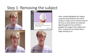
1. Removing the subject from the original background.
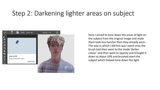
2. Darkening lighter areas on the subject to tone down harsh lighting.
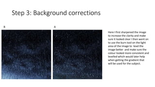
3. Sharpening the image and using burn tools to level the background.
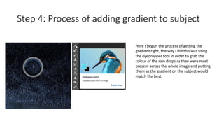
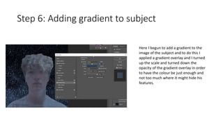
4. Adding a gradient to the subject to match the background rain drops.
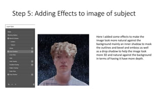
5. Adding effects like shadows and beveling to make the subject look natural.
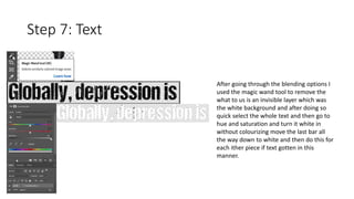
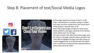
6. Slowly building up the advertisement by placing text and social media logos.
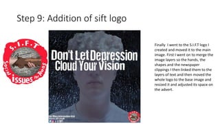
7. Finally adding the SIFT logo to complete the advertisement.


![6. [pro forma] project pro-forma](https://cdn.slidesharecdn.com/ss_thumbnails/6-180126100538-thumbnail.jpg?width=640&height=640&fit=bounds)


