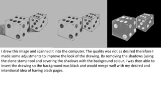
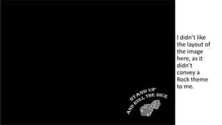
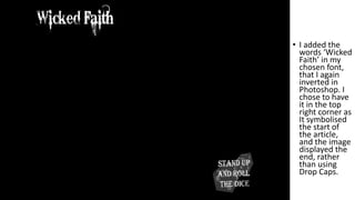
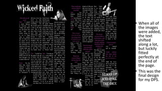
Development of Double Page
Spread
I drew this image and scanned it into the computer. The quality was not as desired therefore I
made some adjustments to improve the look of the drawing. By removing the shadows (using
the clone stamp tool and covering the shadows with the background colour, I was then able to
invert the drawing so the background was black and would merge well with my desired and
intentional idea of having black pages.
I didn’t like
the layout of
the image
here, as it
didn’t
convey a
Rock theme
to me.
• I changed the
arrangement
of the image
and the text
in order to
appeal better
to the eye.
The image of
the dice I
made more
transparent
too in order
for the text to
be seen.
• I added the
words ‘Wicked
Faith’ in my
chosen font,
that I again
inverted in
Photoshop. I
chose to have
it in the top
right corner as
It symbolised
the start of
the article,
and the image
displayed the
end, rather
than using
Drop Caps.
• After writing
my Interview
up in Word,
from the voice
recording I
took of the
interview, I
changed the
key questions
and names into
the continuing
colour theme
purple, but
something still
wasn’t right.
• I began by
inserting one
image of one
member of the
band, as
planned when
I decided to
only put one
member on
the cover. This
looked good,
especially after
changing the
formatting so
the text moved
around the
image. I
thought I
would
continue this
idea with more
images.
• When all of
the images
were added,
the text
shifted
along a lot,
but luckily
fitted
perfectly at
the end of
the page.
• This was the
final design
for my DPS.

Development of dps

  • 1.
  • 2.
    I drew thisimage and scanned it into the computer. The quality was not as desired therefore I made some adjustments to improve the look of the drawing. By removing the shadows (using the clone stamp tool and covering the shadows with the background colour, I was then able to invert the drawing so the background was black and would merge well with my desired and intentional idea of having black pages.
  • 3.
    I didn’t like thelayout of the image here, as it didn’t convey a Rock theme to me.
  • 4.
    • I changedthe arrangement of the image and the text in order to appeal better to the eye. The image of the dice I made more transparent too in order for the text to be seen.
  • 5.
    • I addedthe words ‘Wicked Faith’ in my chosen font, that I again inverted in Photoshop. I chose to have it in the top right corner as It symbolised the start of the article, and the image displayed the end, rather than using Drop Caps.
  • 6.
    • After writing myInterview up in Word, from the voice recording I took of the interview, I changed the key questions and names into the continuing colour theme purple, but something still wasn’t right.
  • 7.
    • I beganby inserting one image of one member of the band, as planned when I decided to only put one member on the cover. This looked good, especially after changing the formatting so the text moved around the image. I thought I would continue this idea with more images.
  • 10.
    • When allof the images were added, the text shifted along a lot, but luckily fitted perfectly at the end of the page. • This was the final design for my DPS.