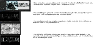
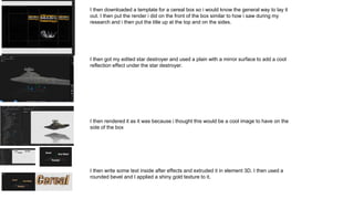
The document provides details on the process for creating various promotional assets for a fictional "Star Wars Mass Effect" property, including:
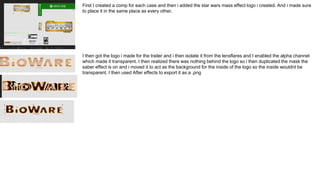
1) Logos were created for studios like EA and Bioware using lens flares and saber effects in After Effects to make them look like holograms.
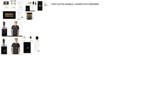
2) Shirts were designed with phrases and imagery incorporating the Reaper enemy from Mass Effect placed over galaxy backgrounds.
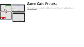
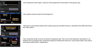
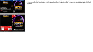
3) Game cases were made using templates found online and filled with the logos and images created earlier.
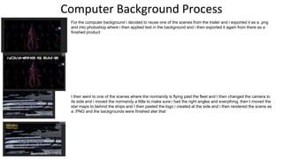
4) Computer backgrounds reused scenes from the fictional trailer by adding text overlays in Photoshop.
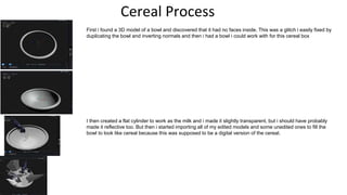
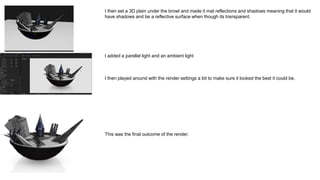
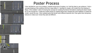
5) Posters were made using 3D models of locations like Cer