1. The document describes the process of creating a magazine cover design for a subject named Kyle.
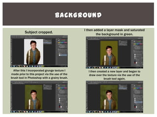
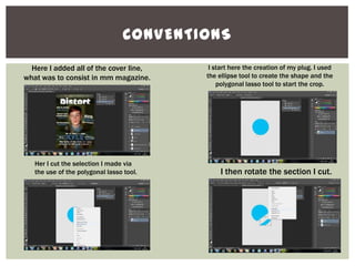
2. Various Photoshop tools like Camera Raw, selection tools, layers, brushes, and effects were used to edit the background, add textures, frame text with shadows, and incorporate designed elements like a masthead and plug.
3. Final touches included adding stickers, textures, and adjusting colors to achieve a grungy, distressed look for the overall cover design.