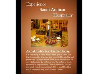
For this next design I made everything left aligned.
This brought the title together. I created more
contrast by using the blue color behind the title. I
then repeated the blue rectangle across the
bottom of the page to create repetition. I then
used a border around the images also in the blue
color for repetition. This helped the pictures
contrast more with the background and brought
the focus to the images. I also changed my
subheading to reflect the message more. I added
more images to help with the message as well.
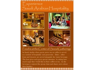
For this next design I used a monochromatic
color scheme using different colors of orange.
The color comes from the images. It helped
create unity in the design. I changed my font
to Papyrus for the heading and the title to
give it more of an Arabic style. I added in
some embellishment. This embellishment
design is common in Arabic architecture and
added to the Arab style of the design. I
included a fourth image to create more
balance. Everything aligns on the left and
right.
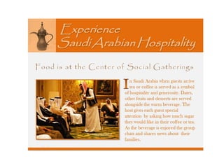
For this next design I added in a picture
word by the title. I feel this picture really
relates to the message and text. I made the
background lighter. I also decided to use
one image and make it bigger. I then placed
the text box beside it. The title uses italics.
The subheading is the same font of the title
but with no italics. I also made the first
letter of the paragraph bigger and bolder. I
tried to make everything left and right
aligned.
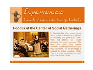
For my final design I started with the previous
design. I used a font more reflective of Arabic
lettering for the title. I made Experience bigger
than the rest of the heading so that it jumps out
more and captures the reader. I used the same
font for the text box and subheading. The
subheading is more bold. It is a plainer text so it
contrast more with the title and is easier to
read. I then added some embellishment to the
rectangle on the bottom that reflects the Arab
style more.
Almatar assignment 9-4

Almatar assignment 9-4

  • 3.
    For this nextdesign I made everything left aligned. This brought the title together. I created more contrast by using the blue color behind the title. I then repeated the blue rectangle across the bottom of the page to create repetition. I then used a border around the images also in the blue color for repetition. This helped the pictures contrast more with the background and brought the focus to the images. I also changed my subheading to reflect the message more. I added more images to help with the message as well.
  • 5.
    For this nextdesign I used a monochromatic color scheme using different colors of orange. The color comes from the images. It helped create unity in the design. I changed my font to Papyrus for the heading and the title to give it more of an Arabic style. I added in some embellishment. This embellishment design is common in Arabic architecture and added to the Arab style of the design. I included a fourth image to create more balance. Everything aligns on the left and right.
  • 7.
    For this nextdesign I added in a picture word by the title. I feel this picture really relates to the message and text. I made the background lighter. I also decided to use one image and make it bigger. I then placed the text box beside it. The title uses italics. The subheading is the same font of the title but with no italics. I also made the first letter of the paragraph bigger and bolder. I tried to make everything left and right aligned.
  • 9.
    For my finaldesign I started with the previous design. I used a font more reflective of Arabic lettering for the title. I made Experience bigger than the rest of the heading so that it jumps out more and captures the reader. I used the same font for the text box and subheading. The subheading is more bold. It is a plainer text so it contrast more with the title and is easier to read. I then added some embellishment to the rectangle on the bottom that reflects the Arab style more.