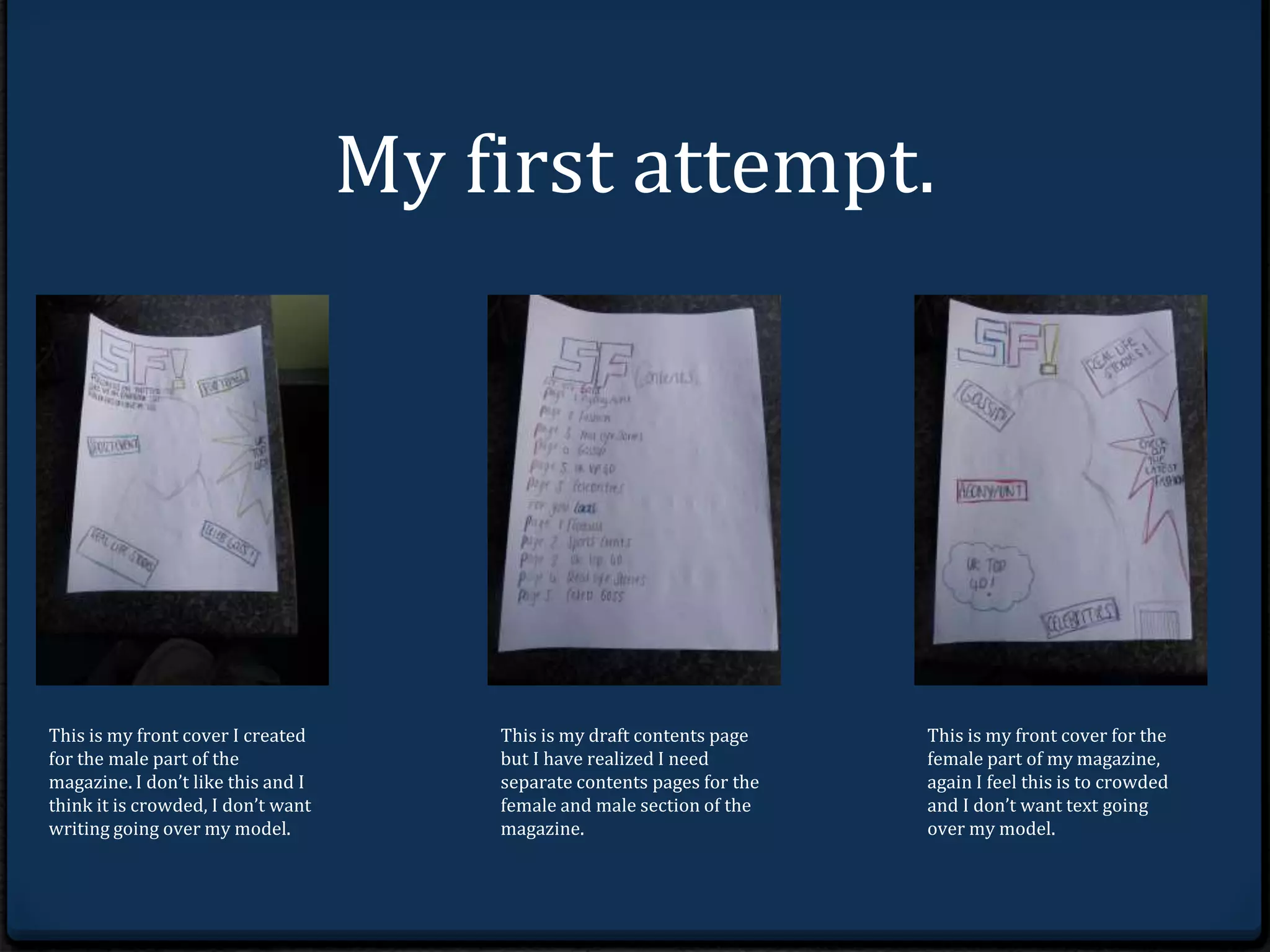
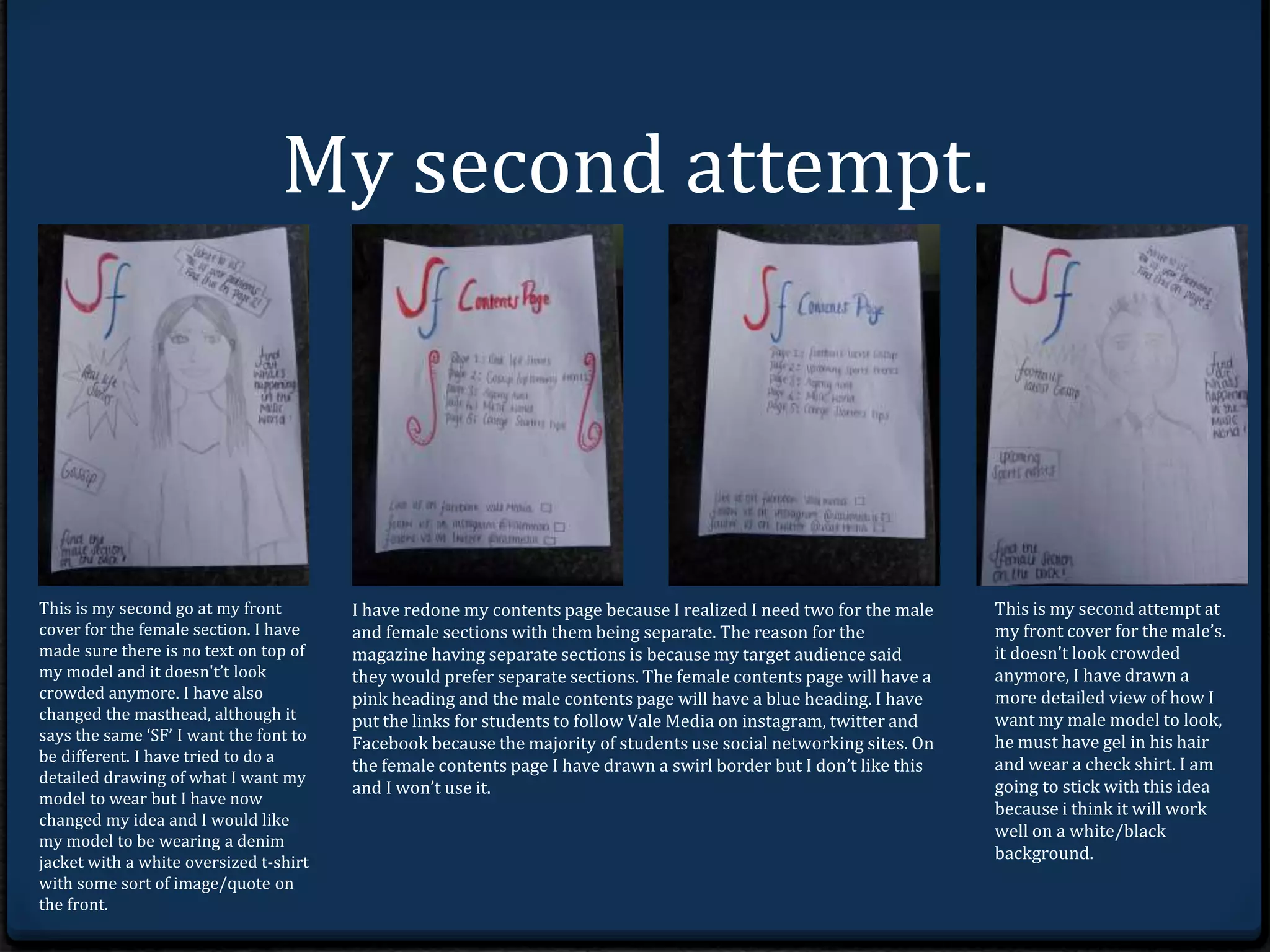
My first attempt. 
This is my front cover I created 
for the male part as there was 
going to be different sections. I 
don’t like this and I think it is 
crowded, I don’t want writing 
going over my model. 
This is my draft contents page 
but I have realized I need 
separate contents pages for the 
female and male section of the 
magazine. 
This is my front cover for the 
female part of my magazine, 
again I feel this is to crowded 
and I don’t want text going 
over my model.
My second attempt. 
This is my second go at my front 
cover for the female section. I have 
made sure there is no text on top of 
my model and it doesn't’t look 
crowded anymore. I have also 
changed the masthead, although it 
says the same ‘SF’ I want the font to 
be different. I have tried to do a 
detailed drawing of what I want my 
model to wear but I have now 
changed my idea and I would like 
my model to be wearing a denim 
jacket with a white oversized t-shirt 
with some sort of image/quote on 
the front. 
I have redone my contents page because I realized I need two for the male 
and female sections with them possibly being separate.The reason for the 
magazine having separate sections is because my target audience said 
they would prefer separate sections. The female contents page will have a 
pink heading and the male contents page will have a blue heading. I have 
put the links for students to follow Vale Media on instagram, twitter and 
Facebook because the majority of students use social networking sites. On 
the female contents page I have drawn a swirl border but I don’t like this 
and I won’t use it. 
This is my second attempt at 
my front cover using a male 
model as I was going to create 
two separate sections in the 
magazine. it doesn’t look 
crowded anymore, I have 
drawn a more detailed view of 
how I want my male model to 
look, he must have gel in his 
hair and wear a check shirt. I 
am going to stick with this 
idea because i think it will 
work well on a white/black 
background.

First draft's

  • 2.
    My first attempt. This is my front cover I created for the male part as there was going to be different sections. I don’t like this and I think it is crowded, I don’t want writing going over my model. This is my draft contents page but I have realized I need separate contents pages for the female and male section of the magazine. This is my front cover for the female part of my magazine, again I feel this is to crowded and I don’t want text going over my model.
  • 3.
    My second attempt. This is my second go at my front cover for the female section. I have made sure there is no text on top of my model and it doesn't’t look crowded anymore. I have also changed the masthead, although it says the same ‘SF’ I want the font to be different. I have tried to do a detailed drawing of what I want my model to wear but I have now changed my idea and I would like my model to be wearing a denim jacket with a white oversized t-shirt with some sort of image/quote on the front. I have redone my contents page because I realized I need two for the male and female sections with them possibly being separate.The reason for the magazine having separate sections is because my target audience said they would prefer separate sections. The female contents page will have a pink heading and the male contents page will have a blue heading. I have put the links for students to follow Vale Media on instagram, twitter and Facebook because the majority of students use social networking sites. On the female contents page I have drawn a swirl border but I don’t like this and I won’t use it. This is my second attempt at my front cover using a male model as I was going to create two separate sections in the magazine. it doesn’t look crowded anymore, I have drawn a more detailed view of how I want my male model to look, he must have gel in his hair and wear a check shirt. I am going to stick with this idea because i think it will work well on a white/black background.