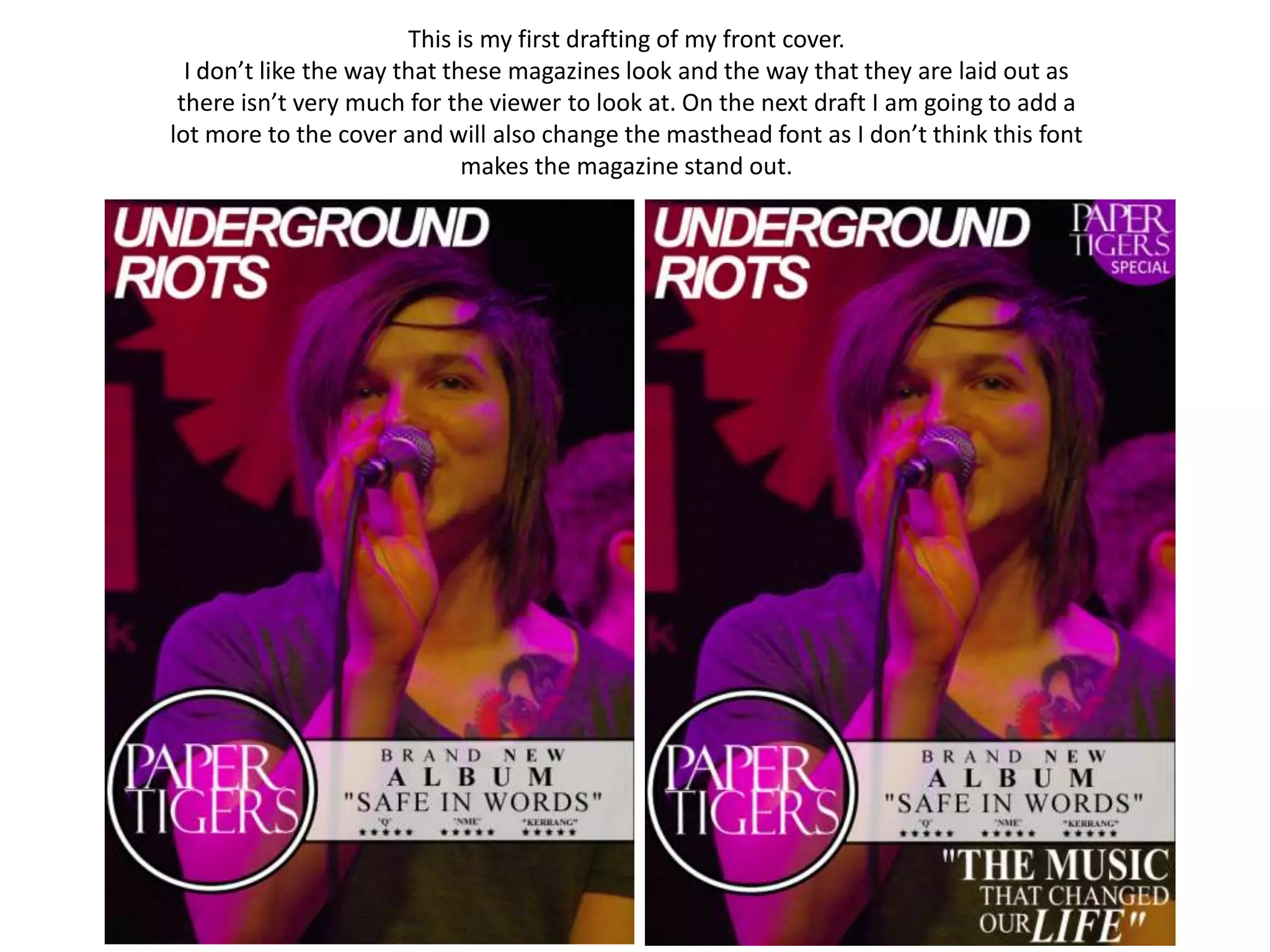
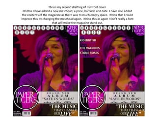
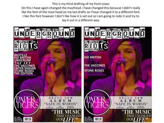
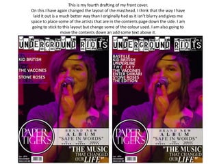
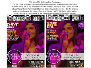
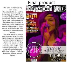
This is my first drafting of my front cover.
  I don’t like the way that these magazines look and the way that they are laid out as
 there isn’t very much for the viewer to look at. On the next draft I am going to add a
lot more to the cover and will also change the masthead font as I don’t think this font
                              makes the magazine stand out.
This is my second drafting of my front cover.
  On this I have added a new masthead, a price, barcode and date. I have also added
 the contents of the magazine as there was to much empty space. I think that I could
improve this by changing the masthead again. I think this as again it isn’t really a font
                        that will make the magazine stand out.
This is my third drafting of my front cover.
On this I have again changed the masthead. I have changed this because I didn’t really
like the font of the mast head on my last drafts so I have changed it to a different font.
  I like this font however I don’t like how it is set out so I am going to redo it and try to
                                lay it out in a different way.
This is my fourth drafting of my front cover.
On this I have again changed the layout of the masthead. I think that the way I have
 laid it out is a much better way than I originally had as it isn’t blurry and gives me
space to place some of the artists that are in the contents page down the side. I am
 going to stick to this layout but change some of the colour used. I am also going to
                  move the contents down an add some text above it.
This is my fifth drafting of my front cover.
 On this I have again kept the layout of the masthead as it makes the magazine stand
out and allows me to use extra space for the contents. I felt that after I added the text
above the contents that I needed to make it stand out to the reader. I did this by then
 going on to changing the colour of the text that says “ACTS TO”. I also added a plug
  under the title as it adds more to the cover instead of being plain down one side.
Final product
     This is my final draft of my
             front cover.
  I have decided to choose this
as my cover for many different
reasons. The first reason that I
chose this is that the masthead
  is the most important part to
   the page and on this cover it
stands out. It also allows me to
 use the other space for things
like the plug on the right hand
  side and the contents on the
               left side.
   I said that I would be using a
 colour scheme that used reds,
whites and blacks. I decided to
   move away from that colour
  scheme and use colours that
  are in the main image. I then
 decided to develop it by then
     using colours that contrast
with these colours. I think that
    this colour scheme is much
                better.

Front cover drafting

  • 1.
    This is myfirst drafting of my front cover. I don’t like the way that these magazines look and the way that they are laid out as there isn’t very much for the viewer to look at. On the next draft I am going to add a lot more to the cover and will also change the masthead font as I don’t think this font makes the magazine stand out.
  • 2.
    This is mysecond drafting of my front cover. On this I have added a new masthead, a price, barcode and date. I have also added the contents of the magazine as there was to much empty space. I think that I could improve this by changing the masthead again. I think this as again it isn’t really a font that will make the magazine stand out.
  • 3.
    This is mythird drafting of my front cover. On this I have again changed the masthead. I have changed this because I didn’t really like the font of the mast head on my last drafts so I have changed it to a different font. I like this font however I don’t like how it is set out so I am going to redo it and try to lay it out in a different way.
  • 4.
    This is myfourth drafting of my front cover. On this I have again changed the layout of the masthead. I think that the way I have laid it out is a much better way than I originally had as it isn’t blurry and gives me space to place some of the artists that are in the contents page down the side. I am going to stick to this layout but change some of the colour used. I am also going to move the contents down an add some text above it.
  • 5.
    This is myfifth drafting of my front cover. On this I have again kept the layout of the masthead as it makes the magazine stand out and allows me to use extra space for the contents. I felt that after I added the text above the contents that I needed to make it stand out to the reader. I did this by then going on to changing the colour of the text that says “ACTS TO”. I also added a plug under the title as it adds more to the cover instead of being plain down one side.
  • 6.
    Final product This is my final draft of my front cover. I have decided to choose this as my cover for many different reasons. The first reason that I chose this is that the masthead is the most important part to the page and on this cover it stands out. It also allows me to use the other space for things like the plug on the right hand side and the contents on the left side. I said that I would be using a colour scheme that used reds, whites and blacks. I decided to move away from that colour scheme and use colours that are in the main image. I then decided to develop it by then using colours that contrast with these colours. I think that this colour scheme is much better.