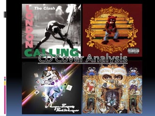
2. The Clash – London Calling “london Calling” was the debut album of The Clash and probably there most iconic cover. The Clash were an English punk rock band in the late 1970’s. The title “London’s Calling” is a reference to the March 1979 accident at a nuclear reactor at Three Mile Island in Pennsylvania. It is also a reference to problems of rising unemployment, racial conflict and drug use in Britain This single shot has been voted the greatest rock and roll album cover by rolling stones . I think it gives you a clear view what the band are about pure rock and roll. The cover image is of a man, the man to be exact is Paul Simonon, he was the bass player for the band. It is a long shot of him smashing his bass guitar to the stage ground, this was at a live gig in New York while they were on tour. As a punk rocker he is dressed in punk rock clothing skinny jeans and denim ripped shirt with black military boots, this could tell the audience about the band and there music from the way they are dressed and presented. The shot itself shows a lot of emotion and body language from the way he is positioned just before he is about to smash his guitar I think capture the essence of rock and roll, it is a well known signature move of rock and roll bands at the end of concerts to smash up the instruments. It shows passion and anger I think in the shot. The colours are also important as it is a black and white photograph I think this makes the picture more effective as it has all the different shades of the black and white and the lighting on the bass player makes him look almost symbolic and puts more emphasizes on him. The writing on the page and style has been seen before in Elvis Presley also debut album, this could have been used to draw people in as they could have seen the icon album cover before. The target audience for the album would predominantly be fans of rock and roll and fans of the clash maybe between 15-30 and they could be from all different walks of life. The clash were at the times of miner strikes in the UK and this had a lot of influence on the people they rebelled and a new culture was made with mods and rockers.
3. Michael Jackson - Dangerous The music genre of Michael Jacksons album “dangerous” does not have an obvious genre it is a very abstract and unusual picture. It doesn’t really tell you what kind of music it represents which I think was done on purpose. As I think it helps to represent Michael Jackson and his personality as we know he’s very elaborate and over the top and at the time he was going through his height of fame maybe this signified the madness in fame. MJ is not shown on the cover accept for his eyes which are centred in the middle of the cover this has the effect on the audience or viewer as it looks as if he is starting directly at you. The title for the album itself is “dangerous” this may be referring to fame in my eyes as this was just before MJ started to slip from a king of pop. The setting of the picture looks a little like a amusement park, with a roller coast on the two sides of the page entering the tunnel and out the other side. In the middle of the whole thing there is the world almost at the centre driving the machine maybe the reference of the title suggest the world itself is dangerous. It is a very peculiar picture. There is also lots of animals and creatures plotted around the the picture, it looks almost child like and make believe. A dog and bird look like they are representing kings and queens and there is a child holding what looks like an dragons skull I think the image as a whole represent Michael Jackson and his own personality almost showing us inside his head. It’s not so much showing us a genre of music. It’s more of a portrait. The ideas and mood could only be described as strange in my eyes it looks a little like something from Alice and wonderland. I don’t really think it would have a typical and fan or gender. It is more of a statement to all of us.
4. Lupe Fiasco – Food & Liquor The Music Genre of Lupe Fiasco’s “Food & Liquor” looks like a RnB/ Rap album due to the clothes he is wearing and props around him. He is holding a speaker box which is usually related to the streets and ghettos which people will recognize. Then there is Lupe Fiasco himself pictured in the middle in Nike dunks leather jackets, loose fit jeans and a graphical tee which is commonly a style worn by rappers such as Kanye west and Jay Z so people could associate him with them. The background to this image looks like it was taken from space. With stars and cuts of different colours like shooting stars. Lupe Fiasco himself is floating with the objects around him floating into him, it makes me think it signifies him being the god as it were of the objects around him. He’s facial expressions look as if he is empowered as he is glaring out, looking down on something. The glow around him makes him look almost alien. The shot of him is an obvious long shot and he is positioned in the centre this was done on purpose so all attention is directed to him. The target market for this album cover could be teens as many of things around him would be associated with teens like the Nintendo DS and Mobile phone, CD’s, Adult Magazine etc. are common items teenagers use. The gender looks predominately male as there is nothing there to me that stands out as a female, It is very masculine and male photography. The title of the album itself could be a play on words as it could be referring to teenagers “food & Liquor” which would be there DS their CD collection Their magazine’s. However if it was an adult it could actually be food and liquor as it is essential to them.
5. Kanye West – The College Dropout The Actually name for the album “College Dropout” was about Kanye’s own experience dropping out of college at the age of 20 he quoted it was more about having the guts to embrace who you are, rather than following the path society has carved out for you. The music genre for Kanye West album is a mix bag as this was his first debut album it doesn’t really go for a typical Rap Album. Like most Rap albums with the main artist featured on the front maybe with a gun or looking intimidating for example 50 Cent’s album “guess who’s back” this would be a common looking Rap album. Kanye however used a College mascot this directly links to the college dropout title of the album cover. Kanye Is Dressed as a Teddy bear mascot which he later used as his icon. He is sitting on what looks like gym benches which would be commonly seen in college’s. The Graphic’s around the picture gives it a retro feeling look to the photo. The camera is a slight low angle as if we are looking down on him his body language also suggests this with his head titled down almost to signify his failure. The reason I think Kanye Used the mascot theme as people can relate to it. In their life he is not popular but everyone knows him as the joker and people have expectations he’s not on the football team but he’s a mascot. This may signify his failure looking posture. The colours in the picture are very rich and deep colours which add to the effect of the Album cover, A typical fan would obviously be teenagers or young adults with a mascot they can relate to their school or sports team.