
Recommended
More Related Content
What's hot
What's hot (20)
Viewers also liked
Viewers also liked (14)
Similar to Student Digipak Analysis
Similar to Student Digipak Analysis (20)
More from harrisoncattell123
Student Digipak Analysis
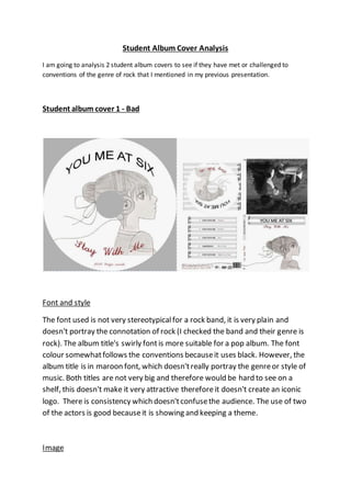
- 1. Student Album Cover Analysis I am going to analysis 2 student album covers to see if they have met or challenged to conventions of the genre of rock that I mentioned in my previous presentation. Student album cover 1 - Bad Font and style The font used is not very stereotypical for a rock band, it is very plain and doesn't portray the connotation of rock (I checked the band and their genre is rock). The album title's swirly font is more suitable for a pop album. The font colour somewhat follows the conventions because it uses black. However, the album title is in maroon font, which doesn't really portray the genre or style of music. Both titles are not very big and therefore would be hard to see on a shelf, this doesn't make it very attractive therefore it doesn't create an iconic logo. There is consistency which doesn't confuse the audience. The use of two of the actors is good because it is showing and keeping a theme. Image
- 2. The image used is not really relevant to the genre. The picture of the anime girl doesn't not bring around connotation of rock and there is no use of instruments and the picture doesn't really suit the lyrics. There is no picture of the band which fails to make it noticeable. Overall the image doesn't really link in with the genre but they have kept it consistent throughout. Camera The photo in the centre of the album cover structure has used a mid-shot and does show the actors, this follow the conventions however it doesn't really follow the genre very well. The main image isn't a photograph so I can't comment on it. Framing and Layout The album is framed really well, the back and front covers are not cluttered, the information's is clearly laid out and visible. There is a lot of blank space on the front cover that could of been used a bit more but overall its very professional done in terms of photoshop-ing. Iconography There is no real iconography used in this album cover, the main image is pretty boring and not relevant to the genre, I'm guessing the picture is more about showing off the drawer's skill rather than actually make something that is appropriate to the genre. Costume In the image on the back, the 2 actors are very casual clothed. This connotes there laid back attitude with is a common stereotype of rock. The actors are wearing jeans and a top which fits in with certain conventions. This is the area where the album excess in its place in the rock genre. Colours The colours used in this album sort of follows the conventions. The use of grey scale suits because it connote a memory, most rock songs are about an event in the past. The red colour in the album name can also connote the outrageous
- 3. aspects of rock, even though the font used is very girly. The colours are consistent which is a good aspect. Audience The font used and the image doesn't really fit in with the genre and also doesn't fit with the target audience. The image of the girl is more targeted towards a younger TA and the girly font isn't very suitable neither. Composition The continuous use of the theme of music and using the treble clef as the surrounding of the track list and the title follows the conventions of the rock genre album covers, the use of an instrument theme presents the audience with the instruments as the main focus. The front and rear cover are joined by the headphone cable brings you nicely to the back of the album. Also the headphones connote the theme and also allows the actually music to be the main focus. Conclusion Overall, I think this is a very bad album cover, it doesn't follow a lot of the conventions and I think its prime goal is to show of the drawer's work. The image, font style and colour doesn't not fit in with the genre. They have clearly taken no time to think about these aspects and how it fits in with the genre.
- 4. Student album cover 2 - Good Font and Style The font used in this album cover is very big and bold, it connotes a brash expression in the music, which is common in Madness songs. The font colour is dark which follows the conventions of rock album cover. The font is used throughout and the same colour is used as well and is a perfect match for the genre and speaks volumes about the music in the album to the audience giving it a positive re-enforcement. Image The front image is of the band. The picture uses a mid shot to clearly view all the band members. There facial expressions are neutral, this connotes there almost un-emotional like appearance, this allows the audience to separate them from normal people because they are seen to have no emotions which puts them across as being highly regarded. The main band member is also used on the lyrical page. This focus on the band members and not irrelevant art work really follows the conventions, it allows the band members to be the main focus which is very stereotypically of the rock genre,. The music and the band isn't the most important part. Framing and Layout The album is framed really well as well, the main picture is centrally framed and the text is clearly presented around it. The border on the back cover is not offset and is very effective as a border to the text. The copy right information
- 5. and the barcode is a bit squashed together because of the border which kind of gives it an amateur feel. Camera The picture used has been taken very centrally, this focus the attention of the audience primarily on the people on the cover and establishes them as they are also the band members in the music video Iconography Madness are always remembered for wearing suits and smart clothing. This album covert sticks with the iconography of there original albums. This very iconic dress and style adds definition to the cover and also makes it stand out and recognisable to the audience. This is a great example of following the conventions of iconography which makes this album so good and professionally done. Costume The costumes used in this album cover are outstanding, they not only follow the conventions of costume in rock album covers, but also stick to the typical dress for the official band. This style of clothing is present of the lyrical page as-well. This group have clearly done the research into the band and the genre. Colours There colours used in the cover is mainly black, the is continued throughout the whole album. Madness is famed for being a rebellious band, there lyrics can connote there rebelliously feelings. The use of black in the album cover re-enforces that connotations of rebelliousness and portrays the genre very appropriately. Audience Unlike the first album cover, this one really suits the audience it is intended for. The image of the band is very appealing to the TA because they will recognise who the band is, the lack of silly drawings is very refreshing and allows a retro feel to be added which complements the cover very nicely. Composition
- 6. The way the album is structured is pretty amazing, it is clear that there are separate areas but the art does bring them all together. The border around the track list complements the border around the front. Consistency is key in a roc album cover, this cover is perfectly consistent, the colours and font match very well. The position of key elements such as the barcode and the copyright info has been professional done so it is clearly and uncluttered for the audience. Conclusion Overall, this album cover is one of the best I have seen. it is very clear that the designers have looked around at other rock covers and also researched into the official band and there covers. It follows nearly all the conventions perfectly which makes it a memorable cover which its own little quirks with the creativity.